You’ve spent hours on a design. The colors look great. The layout feels balanced. But something still feels off.
Nine times out of ten, it’s the typography.
Bad type choices can tank an otherwise solid design faster than anything else. The good news? Most typography problems are easy to spot once you know what to look for, and even easier to fix.
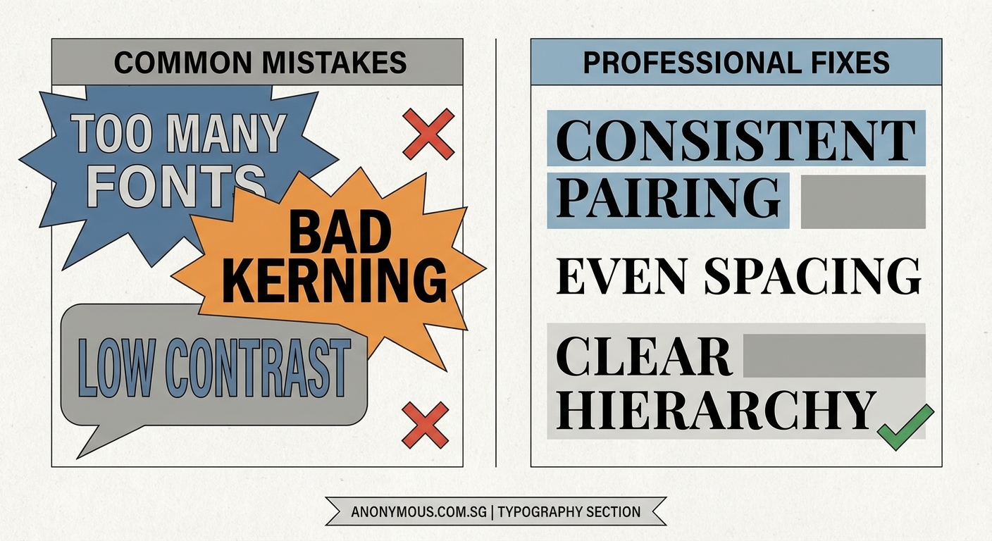
Typography mistakes like poor font pairing, bad spacing, and low contrast make designs look unprofessional. Most issues stem from using too many typefaces, ignoring hierarchy, cramming text together, or choosing decorative fonts for body copy. Fix these seven common problems to instantly improve your design’s credibility and readability without needing advanced skills or expensive software.
Using Too Many Fonts in One Design
Beginners love fonts. I get it. There are thousands of beautiful typefaces out there, and it’s tempting to use them all.
But restraint wins every time.
Professional designs rarely use more than two or three font families. One for headings, one for body text, and maybe one for accents or special callouts.
When you mix four, five, or six different fonts, your design starts to look like a ransom note. Each typeface carries its own personality and visual weight. Too many voices talking at once creates chaos, not sophistication.
Here’s a simple rule: pick one strong display font for headlines and one clean, readable font for everything else. If you need a third, make sure it serves a specific purpose and doesn’t fight with the other two.
“Typography is what language looks like. When you use too many fonts, you’re making your message harder to hear, not easier.” — Ellen Lupton, graphic designer and author
Ignoring Visual Hierarchy
Not all text deserves equal attention. Your job as a designer is to guide the reader’s eye through your content in a logical order.
Visual hierarchy tells people what to read first, second, and third.
When everything is the same size, same weight, and same color, readers don’t know where to start. They’ll either skim randomly or give up entirely.
Create clear levels of importance:
- Make your main headline the largest and boldest element
- Use subheadings that are smaller than the main title but larger than body text
- Keep body copy at a comfortable reading size with enough line spacing
Play with font weight, size, and color to create contrast between these levels. A well-structured hierarchy doesn’t need to shout. It just needs to be clear.
Terrible Letter and Line Spacing
Spacing is invisible until it’s wrong. Then it’s all anyone can see.
Two spacing problems kill more designs than almost anything else: tracking that’s too tight and leading that makes text feel cramped.
Tracking controls the space between individual letters. When letters crowd together, words become harder to read. When they’re too far apart, text looks disconnected and awkward.
Leading is the vertical space between lines of text. Cramped leading makes paragraphs feel dense and uninviting. Too much space and your text loses cohesion.
Here’s what works:
- Body text usually needs 120% to 150% leading (line height)
- Headlines can go tighter, around 100% to 120%
- Longer line lengths need more leading to help eyes track from one line to the next
- All caps text needs extra letter spacing to stay readable
Most design software defaults to spacing that’s too tight. Don’t accept the defaults. Adjust until your text breathes.
Poor Font Pairing Choices
Some fonts were meant to be together. Others should never share a page.
Bad font pairing happens when typefaces are either too similar or too different. If two fonts are almost identical, they look like a mistake. If they clash wildly, they create visual tension in all the wrong ways.
Good pairings create contrast without conflict.
| Pairing Strategy | Example Combination | Why It Works |
|---|---|---|
| Serif + Sans Serif | Georgia + Helvetica | Classic contrast, clear roles |
| Geometric + Humanist | Futura + Open Sans | Different structures, similar weights |
| Display + Neutral | Playfair Display + Roboto | Personality + reliability |
| Same Family | Montserrat Bold + Montserrat Regular | Built-in harmony, different weights |
The easiest approach? Use fonts from the same family but in different weights and styles. A font family is designed to work together, so you’re starting with built-in harmony.
If you want to mix families, pair a distinctive display font with a neutral workhorse. Let one font carry personality while the other handles readability.
Using Decorative Fonts for Body Text
Script fonts are beautiful. Ornate display faces are eye-catching. But neither belongs in your paragraph text.
Decorative fonts are designed for headlines, logos, and short bursts of text. They grab attention because they’re distinctive and expressive.
That same distinctiveness makes them exhausting to read in long passages.
Your body text needs to be invisible. Not boring, just unobtrusive. Readers should absorb your message without fighting to decode fancy letterforms.
Save the decorative choices for:
- Main headlines
- Pull quotes
- Logo text
- Short callouts or labels
- Accent elements
For everything else, choose a clean, well-designed text face. Times New Roman might feel boring, but there’s a reason it’s been used for decades. It works.
Modern alternatives like Georgia, Merriweather, or Source Serif Pro give you personality without sacrificing readability.
Insufficient Color Contrast
Light gray text on a white background might look sophisticated in your design software. But it’s nearly impossible to read on an actual screen, especially in bright light or for anyone with vision challenges.
Contrast isn’t just about aesthetics. It’s about accessibility and usability.
The Web Content Accessibility Guidelines recommend a contrast ratio of at least 4.5:1 for normal text and 3:1 for large text. That sounds technical, but it basically means your text needs to be dark enough to read comfortably.
Common contrast mistakes:
- Gray text on gray backgrounds
- Colored text on colored backgrounds without enough tonal difference
- White or light text on photos without a dark overlay
- Thin fonts in light weights that disappear against busy backgrounds
Test your designs in different lighting conditions. Look at them on your phone, not just your computer monitor. If you have to squint or adjust your screen brightness, your contrast is too low.
When placing text over images, add a semi-transparent overlay, blur the background, or darken the image in that area. Your text will thank you.
Inconsistent Formatting Throughout
Nothing screams amateur louder than inconsistent typography. One section uses 16px body text, another uses 18px. Headings are bold in one place and regular weight in another. Line spacing changes randomly.
These inconsistencies might seem small, but they add up to a design that feels sloppy and unfinished.
Professional designers create systems, not one-off choices.
Before you start designing, establish your typographic rules:
- Define your heading styles (H1, H2, H3) with specific sizes, weights, and spacing
- Set your body text specifications and stick to them
- Create consistent spacing rules for margins and padding
- Decide on one approach for emphasis (bold, italic, or color) and use it throughout
Many design tools let you save these as text styles or paragraph styles. Use them. They’ll keep you consistent and speed up your workflow.
Think of your typography like a uniform. Every element should look like it belongs to the same team.
Making Your Type Work for You
Typography mistakes are easy to make but just as easy to fix once you see them clearly.
Start with one design you’ve already created. Look for these seven problems. Pick the biggest offender and fix just that one thing. You’ll be amazed how much better your design looks with a single improvement.
Then fix the next one. And the next.
Good typography isn’t about following rigid rules or having expensive fonts. It’s about making intentional choices that help your message come through clearly. Your readers might not consciously notice great typography, but they’ll definitely feel the difference.