You’ve probably heard both terms thrown around in design meetings, print shops, and software menus. DPI. PPI. Sometimes used interchangeably. Sometimes debated with surprising passion. But here’s the thing: they’re not the same, and mixing them up can cost you time, money, and print quality.
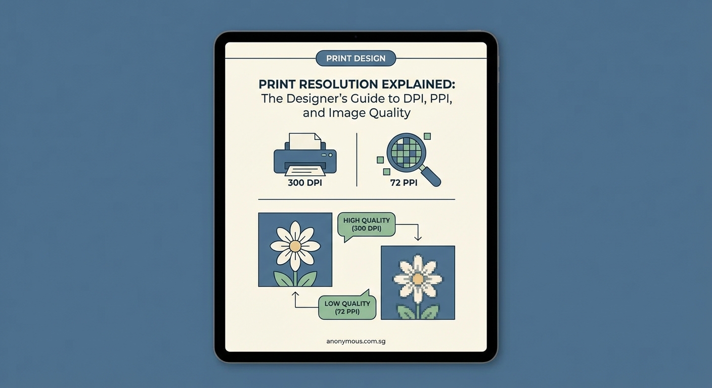
DPI and PPI measure different things. PPI refers to pixels in a digital image, while DPI describes how printers lay down ink dots. Understanding both helps you prepare files that print sharp and clear. For most professional projects, 300 PPI at final print size is your baseline. Printers handle DPI automatically based on their hardware capabilities.
What PPI actually measures
PPI stands for pixels per inch. It describes the density of pixels in a digital image.
When you open a photo in Photoshop or any image editor, the software shows you dimensions in pixels. A 3000 x 2000 pixel image contains exactly that many pixels, no more, no less.
PPI comes into play when you assign a physical size to those pixels. If you tell your software to print that 3000 x 2000 pixel image at 10 inches wide, the PPI becomes 300 (3000 pixels divided by 10 inches).
Change the print size to 20 inches wide? The PPI drops to 150. Same number of pixels, different density.
Here’s what matters: PPI determines how much detail your image can hold at a given size. Higher PPI means more pixels packed into each inch, which translates to sharper, more detailed prints.
For professional printing, 300 PPI at final size is the standard. This gives you crisp edges, smooth gradients, and fine detail reproduction.
You can sometimes get away with 150 to 200 PPI for large format prints viewed from a distance, like posters or banners. But for anything viewed up close (business cards, brochures, magazine spreads), stick with 300 PPI or higher.
How to check and set PPI in your files
Most design software lets you view and adjust PPI settings. Here’s how to do it in common applications:
- Open your image in Photoshop
- Go to Image > Image Size
- Look at the resolution field (this shows PPI)
- Make sure “Resample” is unchecked if you want to maintain pixel count
- Adjust either the physical dimensions or the resolution
- Click OK to apply changes
In Illustrator or InDesign, you set resolution when placing raster images. The software displays warnings if placed images fall below your document’s output resolution.
Always check your image resolution before sending files to print. Upsampling a low-resolution image rarely produces acceptable results. You can’t add detail that wasn’t captured in the original.
What DPI actually measures
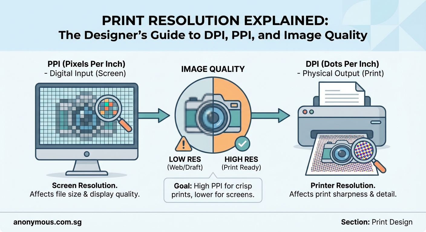
DPI stands for dots per inch. It describes how printers reproduce images using tiny dots of ink or toner.
Printers create the illusion of continuous tone by laying down microscopic dots in patterns. More dots per inch means smoother color transitions and finer detail.
But here’s the key difference: DPI is a printer hardware specification, not something you control in your image files.
A 1200 DPI printer can lay down 1200 individual dots of ink per inch. That’s a mechanical capability of the printing device itself.
Your image file doesn’t have DPI. It has pixels and a PPI setting that tells the printer how large to reproduce those pixels.
The printer then uses its DPI capability to render those pixels as accurately as possible. A single pixel in your image might be represented by dozens or hundreds of printer dots, especially in areas with subtle color gradations.
Why printers use multiple dots per pixel
Printers typically work with a limited set of ink colors (cyan, magenta, yellow, black, plus sometimes additional spot colors).
To create the full range of colors and tones you see in your digital file, printers use a technique called halftoning. They arrange dots of different colors in patterns that your eye blends together.
A light pink area might be created by spacing out magenta dots with lots of white paper showing through. A darker pink uses more densely packed dots.
This is why printer DPI numbers are much higher than image PPI numbers. The printer needs extra resolution to simulate continuous tone using discrete dots.
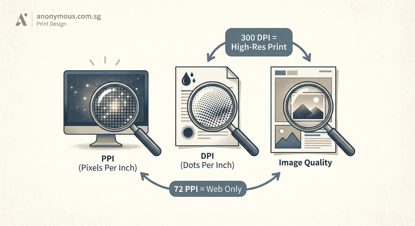
The practical difference between DPI and PPI
Let’s clear up the confusion with a simple breakdown:
| Aspect | PPI | DPI |
|---|---|---|
| What it measures | Pixels in a digital image | Ink dots from a printer |
| Who controls it | You, the designer | The printer hardware |
| Where you set it | Image editing software | Printer driver settings |
| Typical values | 72 (screen), 300 (print) | 600, 1200, 2400+ |
| What it affects | Image detail and size | Print rendering quality |
When preparing files for print, you work with PPI. You ensure your images have enough pixels at the size they’ll be printed.
The print shop or printer handles DPI based on their equipment capabilities. You don’t need to specify it in your files.
This is why print specifications always ask for “300 DPI images.” They’re technically asking for 300 PPI, but the terms have become mixed in common usage. What they mean is: provide images with 300 pixels per inch at final print size.
Setting up files for professional printing
Getting your resolution right from the start saves headaches later. Here’s a systematic approach:
- Determine your final print dimensions first
- Multiply width and height (in inches) by 300
- Create or resize your image to those pixel dimensions
- Set the document resolution to 300 PPI
- Work at this size throughout your design process
- Export your final file maintaining the 300 PPI setting
For example, designing a 5 x 7 inch postcard:
– Width: 5 inches x 300 = 1500 pixels
– Height: 7 inches x 300 = 2100 pixels
– Create a 1500 x 2100 pixel document at 300 PPI
Always add bleed if your design includes elements that extend to the edge. Most printers require 0.125 inches of bleed on all sides. That means adding 0.25 inches to both width and height (0.125 on each side).
For that 5 x 7 postcard with bleed:
– Width: 5.25 inches x 300 = 1575 pixels
– Height: 7.25 inches x 300 = 2175 pixels
Working with photos and placed images
When placing photos into your layout, check their effective resolution. This accounts for any scaling you’ve applied.
If you place a 3000 x 2000 pixel photo (300 PPI at 10 x 6.67 inches) and then scale it up to 150% in your layout, the effective resolution drops to 200 PPI.
Your software can show you effective resolution:
– InDesign: Select the image and check the Links panel
– Illustrator: Select the image and look at the Document Info panel
– Photoshop: This doesn’t apply since you’re working directly with the image
Keep effective resolution at 300 PPI or higher for best results. If you need to enlarge a photo significantly, go back to the source and export a larger version.
Common resolution mistakes and how to avoid them
Even experienced designers sometimes trip up on resolution issues. Here are the most frequent problems:
Using screen resolution images for print
Images downloaded from websites or screenshots are typically 72 PPI. They look fine on screen but print blurry and pixelated.
Always source images at print resolution or higher. Stock photo sites let you download high-resolution versions specifically for print.
Upsampling low-resolution images
Increasing the PPI of an image in Photoshop doesn’t add real detail. The software just interpolates (guesses) what the extra pixels should look like.
Results are rarely acceptable for professional printing. Start with high-resolution sources instead.
Ignoring viewing distance
Not everything needs 300 PPI. Large format prints viewed from several feet away can use lower resolution.
- Posters viewed from 3-4 feet: 150 PPI works fine
- Banners viewed from 10+ feet: 100 PPI is often sufficient
- Billboards viewed from 50+ feet: 30-50 PPI can be acceptable
The key is matching resolution to viewing distance. When preparing files for setting up print files that won’t get rejected by printers, always confirm resolution requirements with your print provider.
Mixing resolution in the same document
Using 300 PPI for some images and 150 PPI for others in the same layout creates inconsistent quality. Viewers will notice the difference.
Maintain consistent resolution across all raster elements in your design.
Vector graphics and resolution
Here’s some good news: vector graphics don’t have resolution limitations.
Vectors are defined by mathematical paths rather than pixels. They scale infinitely without quality loss.
Logos, icons, and type created in Illustrator or as vector objects in InDesign remain sharp at any size. This is one reason why avoiding logo design mistakes includes creating logos as vectors rather than rasters.
When you export a vector to a raster format (PNG, JPEG, TIFF), that’s when resolution comes into play. Export at 300 PPI at the size you need for your specific application.
For print projects, keep as much as possible in vector format. Convert to raster only when necessary (for effects that require it, or for final output).
File formats and resolution
Different file formats handle resolution information differently:
JPEG and PNG
These formats can store resolution metadata, but it’s often ignored or stripped out when images are shared online. Always verify resolution when receiving these files.
TIFF
Professional print workflows prefer TIFF files. They reliably store resolution information and support CMYK color mode.
PDF
PDFs preserve both vector and raster elements with their resolution intact. This makes them ideal for print-ready files.
When exporting PDFs from InDesign or Illustrator for print, use the PDF/X-1a or PDF/X-4 presets. These maintain proper resolution and color settings for professional printing.
“The most common file rejection I see is resolution issues. Designers assume their file is print-ready, but images are actually 72 PPI or have been scaled up too much. Always check effective resolution before export, and when in doubt, ask your printer for their specific requirements.”
— Print production manager, commercial print shop
Screen resolution and the 72 PPI myth
You’ve probably heard that screen resolution is 72 PPI. This is outdated information.
The 72 PPI standard came from early Macintosh displays. Modern screens have much higher pixel densities.
- Standard HD monitors: roughly 100 PPI
- 4K displays: 150-200 PPI
- Retina displays: 220+ PPI
- Smartphone screens: 300-500+ PPI
For screen design, work in pixels rather than inches. A button that’s 44 x 44 pixels will be 44 x 44 pixels regardless of PPI settings.
The PPI setting in your file doesn’t affect how images display on screen. Screens show one image pixel per screen pixel (at 100% zoom). A 1000 pixel wide image takes up 1000 pixels of screen width.
This is different from print, where PPI directly affects physical size.
Checking resolution in your workflow
Build resolution checks into your design process. Don’t wait until files are at the printer.
During design:
– Check placed image resolution as you work
– Flag any images below 300 PPI for replacement
– Keep a list of image sources so you can re-export if needed
Before handoff:
– Run a preflight check in InDesign (File > Preflight)
– Review the Links panel for resolution warnings
– Export a proof PDF and zoom in to check sharpness
At the printer:
– Request a proof if it’s a critical project
– Review the proof for any unexpected quality issues
– Ask questions if something doesn’t look right
Most print shops will also preflight your files and alert you to resolution problems. But catching issues yourself first saves time and rush fees.
When to break the 300 PPI rule
Rules exist for good reasons, but sometimes you need flexibility.
Intentional artistic effects
Deliberately low-resolution or pixelated aesthetics can work for certain designs. Just make sure it’s clearly intentional, not a mistake.
Extremely large prints
A 20-foot banner at 300 PPI would require an enormous file size. Work with your printer to determine the minimum acceptable resolution for your specific viewing distance.
Budget constraints
Lower resolution printing costs less at some providers. If budget is tight and quality is less critical (internal documents, draft prints), you might accept lower resolution.
Technical limitations
Sometimes you’re stuck with a low-resolution source image and can’t get a better version. In these cases, consider redesigning to use the image smaller, applying artistic effects to disguise the low resolution, or finding an alternative image.
Always communicate with your printer about any resolution compromises. They can advise whether your files will produce acceptable results or need adjustment.
Resolution and color management
Resolution and color management work together to create quality prints. Having sharp 300 PPI images won’t help if colors are wrong.
Make sure your files are in the correct color mode:
– CMYK for offset printing
– RGB for some digital printing (check with your printer)
Include proper bleed and crop marks. Maintain consistent brand colors that actually convert across your printed materials by using the same color values in every file.
Embed color profiles in your PDFs so printers can accurately reproduce your intended colors.
Why getting resolution right matters
Poor resolution wastes resources. You might need to:
– Reprint entire runs at your expense
– Rush new files at premium rates
– Settle for lower quality than you wanted
– Explain to clients why their project looks unprofessional
Getting it right the first time protects your reputation and your budget.
Professional designers build resolution management into their standard workflow. It becomes automatic, like setting up proper margins or checking spelling.
Your print projects represent your work and your clients’ brands. Sharp, clear reproduction shows attention to detail and professional standards.
Making resolution work for you
Understanding DPI vs PPI isn’t just technical knowledge. It’s practical skill that directly impacts your work quality.
Set up your files correctly from the start. Check resolution throughout your design process. Communicate clearly with print providers about specifications and requirements.
These habits take minutes to build but save hours of corrections and reprints. Your projects will come back from the printer looking exactly as you intended, sharp and professional every time.