
You’re staring at a blank Figma canvas, ready to design your first app. But where do you start? Which elements do you actually need to build a functional, user-friendly interface?
The answer lies in understanding the core building blocks that make every digital product work. These foundational elements appear in every app, website, and software you use daily. Master them, and you’ll have the toolkit to design almost anything.
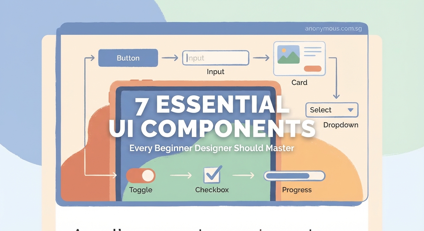
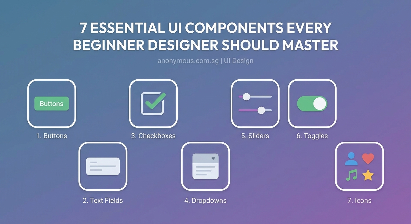
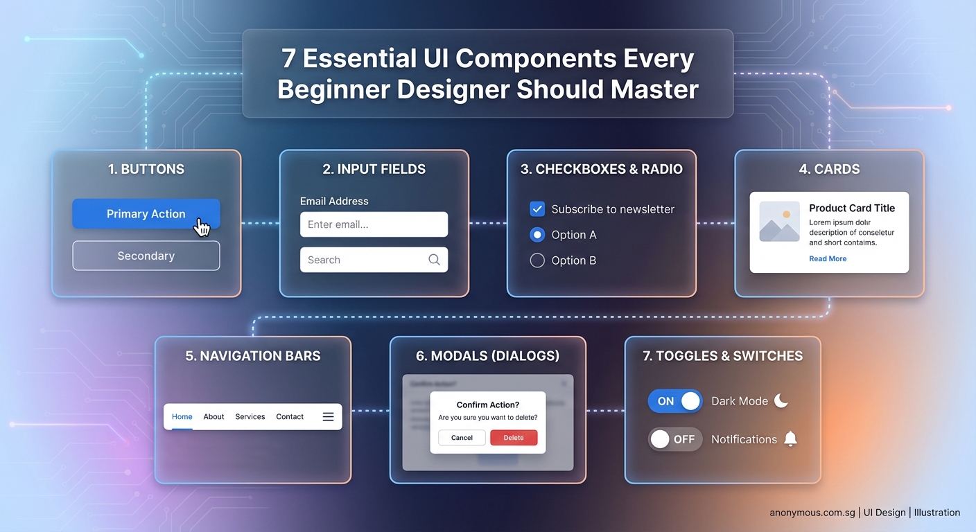
Essential UI components for beginners include buttons, input fields, navigation menus, cards, modals, dropdowns, and toggles. These seven elements form the foundation of modern interface design. Understanding their purpose, behavior, and best practices lets you create functional, intuitive designs that users can navigate effortlessly. Start with these components before moving to complex patterns.
Buttons Make Things Happen
Every interface needs buttons. They’re the primary way users take action, whether submitting a form, confirming a purchase, or opening a menu.
Good button design follows three principles. First, buttons should look clickable. Use solid fills, rounded corners, and subtle shadows to create depth. Second, button hierarchy matters. Primary buttons get bold colors and prominent placement. Secondary buttons use outlines or muted tones. Tertiary buttons might appear as simple text links.
Third, button states communicate feedback. A hover state shows the button is interactive. An active state confirms the click registered. A disabled state prevents accidental actions when conditions aren’t met.
Size affects usability too. Mobile buttons need at least 44×44 pixels to accommodate finger taps. Desktop buttons can be smaller but should still feel substantial. Leave breathing room around buttons so users don’t accidentally hit the wrong one.
Label your buttons with clear action verbs. “Save changes” beats “OK” every time. “Delete account” is better than “Confirm.” Users should know exactly what happens when they click.
Input Fields Collect Information
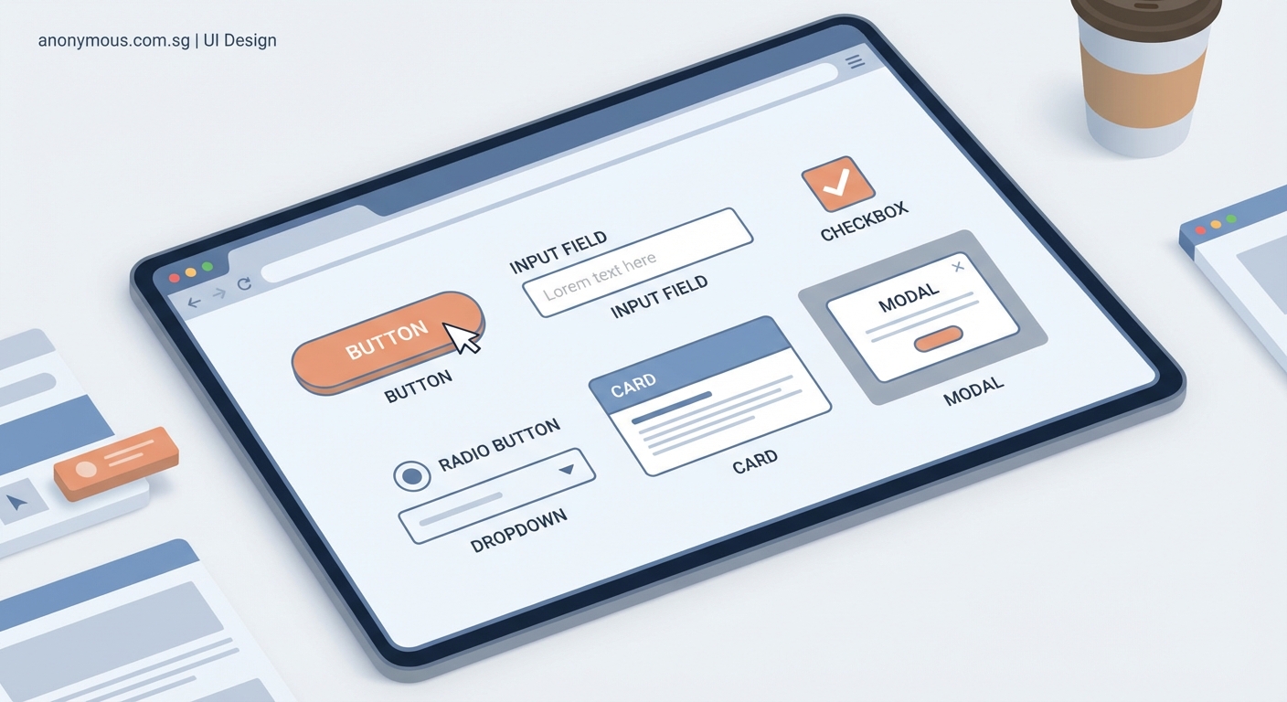
Forms are how users give you data. Input fields need to be obvious, accessible, and forgiving.
Start with clear labels above or beside each field. Placeholder text inside the field can provide examples, but never replace proper labels. Screen readers need those labels to help visually impaired users.
Field states guide users through completion:
- Default state shows the field is ready for input
- Focus state highlights the active field with a border or glow
- Filled state displays entered information clearly
- Error state shows validation problems with red borders and helpful messages
- Success state confirms correct input with green indicators
Validation timing matters. Don’t show errors before users finish typing. Wait until they move to the next field or submit the form. Then provide specific, actionable feedback. “Email must include @” helps more than “Invalid input.”
Group related fields together. Shipping address fields should cluster separately from payment information. Use visual spacing to create these logical sections.
Consider input types carefully. Date pickers work better than free text for birthdays. Dropdown menus prevent typos in state selection. Toggle switches suit binary choices better than radio buttons.
Navigation Guides the Journey
Navigation structures your entire product. Users need to know where they are, where they can go, and how to get back.
Top navigation bars work well for desktop sites with 5-7 main sections. Place your logo on the left, primary links in the center, and account actions on the right. This pattern feels familiar because most sites use it.
Hamburger menus save space on mobile but hide options. Use them when you have many menu items, but consider tab bars for apps with 3-5 core sections. Tab bars keep key functions visible and accessible with one tap.
Breadcrumbs show the path from homepage to current page. They’re essential for websites with deep hierarchies like e-commerce sites or documentation. Format them as Home > Category > Subcategory > Current Page.
Search bars help users find specific content without clicking through menus. Place them prominently in the header. Make the search field wide enough to display typical queries.
“Good navigation disappears. Users shouldn’t think about how to find things. They should just find them.” — Design principle from Nielsen Norman Group research
Cards Organize Content
Cards contain related information in a compact, scannable format. They’re everywhere: social feeds, product listings, article previews, and dashboard widgets.
Each card should work as a standalone unit with a clear purpose. Product cards show an image, title, price, and rating. Article cards display a thumbnail, headline, excerpt, and publish date. Profile cards include a photo, name, bio, and action buttons.
Maintain consistent card dimensions within the same view. Grid layouts feel orderly and professional. Variable heights work for masonry layouts but require careful implementation to avoid awkward gaps.
Cards need visual hierarchy. The most important element, usually an image or title, should dominate. Supporting details use smaller text. Action buttons sit at the bottom or corner.
Hover states on desktop add interactivity. A subtle lift effect or border change shows the card is clickable. On mobile, the entire card should be tappable without requiring users to hit a tiny button.
Modals Demand Attention
Modals interrupt the main interface to show critical information or request immediate decisions. Use them sparingly because they disrupt user flow.
Good modal design follows specific rules:
- Darken the background with a semi-transparent overlay to focus attention on the modal
- Include a clear close button, usually an X in the top-right corner
- Allow users to dismiss the modal by clicking outside it or pressing Escape
- Keep content focused on one task or message
- Provide clear action buttons that explain what happens next
Size your modals appropriately. Small modals work for simple confirmations like “Delete this item?” Medium modals suit forms with several fields. Large modals or full-screen overlays handle complex workflows.
Never stack modals on top of each other. If you need multiple steps, use a single modal with pagination or a stepper component.
Confirmation modals prevent destructive actions. When users try to delete something permanent, show a modal asking them to confirm. Make the destructive action visually distinct, often with red styling.
Dropdowns Offer Choices
Dropdown menus let users select from predefined options without cluttering the interface. They work best when you have 4-15 options. Fewer than 4 options? Use radio buttons. More than 15? Add search functionality.
The dropdown trigger should clearly indicate it’s interactive. A downward arrow icon is standard. When clicked, the menu expands to show all options.
Menu items need enough padding for comfortable selection. Highlight the hovered or focused option with a background color change. Show the selected option with a checkmark or different styling.
Consider these dropdown variations:
| Type | Use Case | Example |
|---|---|---|
| Single select | Choose one option from a list | Country selector |
| Multi-select | Choose multiple options | Email filters |
| Autocomplete | Type to filter long lists | City search |
| Nested | Organize options in categories | Product categories |
Mobile dropdowns often trigger native OS pickers for better thumb accessibility. Let the device handle the interaction pattern users already know.
Toggles Switch States
Toggle switches control binary settings: on/off, enabled/disabled, show/hide. They provide immediate visual feedback about the current state.
Design toggles with clear visual distinction between states. The “on” position typically shows a colored background with the switch knob on the right. The “off” position uses gray with the knob on the left.
Labels should describe what happens in the “on” state. “Email notifications” is clearer than “Notifications toggle.” Place labels to the left of the toggle for left-to-right languages.
Toggles should take effect immediately without requiring a save button. Users expect instant response. If you need confirmation for critical settings, use a checkbox instead.
Disabled toggles appear grayed out and don’t respond to clicks. This prevents users from changing settings they don’t have permission to modify.
Consider these toggle alternatives:
- Checkboxes for settings that need explicit saving
- Radio buttons when showing multiple related options
- Segmented controls for 2-3 mutually exclusive choices
Bringing Components Together

Understanding individual components is just the start. Real interfaces combine these elements into cohesive screens that solve user problems.
Practice building common patterns. A login screen uses input fields for username and password, a primary button to submit, and a text link to recover forgotten passwords. A product page combines cards for related items, buttons for adding to cart, dropdowns for size selection, and navigation to browse categories.
Study apps and websites you use daily. Identify which components they use and how they’re arranged. Notice the spacing, colors, and interaction patterns. Screenshot examples that work well and analyze why they succeed.
Build a component library as you learn. Create a Figma file with your versions of each component in different states. This becomes your reference and speeds up future projects.
Start simple. Don’t try to design innovative new patterns before you understand the standard ones. Users have learned these conventions through years of digital product use. Fighting familiar patterns creates friction.
Test your designs with real people. Watch them interact with your buttons, fill out your forms, and navigate your menus. You’ll spot confusion you never anticipated. Iterate based on what you observe.
The seven components covered here appear in virtually every digital interface. Master them, and you’ll have the foundation to design products people can actually use. Build your skills one component at a time, and you’ll be creating complete interfaces before you know it.