
You’ve picked a color palette. You’ve laid out your design. But when you step back, something feels off. Text looks muddy. Buttons disappear. Users squint at your interface. The problem isn’t your color choices. It’s your contrast.
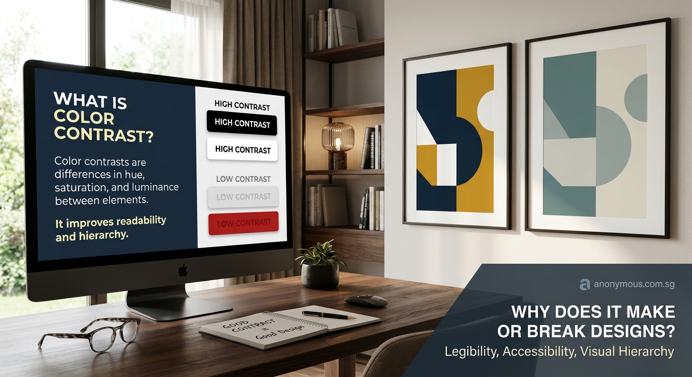
Color contrast measures the difference in luminance between two colors, typically expressed as a ratio. Strong contrast makes text readable, guides user attention, and ensures accessibility compliance. Poor contrast causes eye strain, reduces conversion rates, and excludes users with visual impairments. Understanding and applying proper contrast ratios transforms designs from frustrating to functional, meeting WCAG standards while maintaining aesthetic appeal.
Understanding color contrast in design
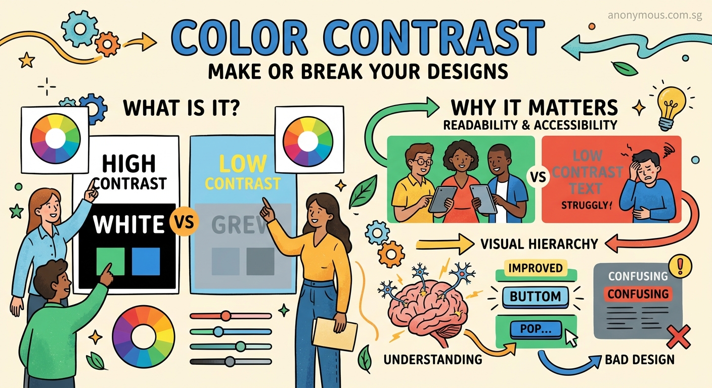
Color contrast refers to the difference in brightness between two colors when placed next to each other. It’s not about how different the colors look. It’s about how much light each color reflects.
A white background reflects nearly all light. Black text absorbs most light. That creates high contrast. A light gray background with slightly darker gray text? Low contrast. The colors might look different, but they don’t have enough brightness difference to be easily distinguished.
Designers measure contrast using a ratio. The scale runs from 1:1 (no contrast at all, like white text on white) to 21:1 (maximum contrast, like black text on white). The higher the ratio, the easier it is to distinguish between the two colors.
Your eyes process contrast before they process color. That’s why you can read black text on white paper even in dim lighting. The brightness difference does the heavy lifting. Color just adds information on top.
Why contrast ratios matter for accessibility
The Web Content Accessibility Guidelines (WCAG) set specific contrast requirements. These aren’t arbitrary numbers. They’re based on how human vision works, particularly for people with low vision or color blindness.
For normal text (under 18pt or 14pt bold), WCAG requires a minimum contrast ratio of 4.5:1 for Level AA compliance. For large text, the requirement drops to 3:1. Level AAA compliance demands 7:1 for normal text and 4.5:1 for large text.
These ratios ensure that text remains readable for users with:
- Low vision conditions
- Color blindness (affecting roughly 8% of men and 0.5% of women)
- Age-related vision changes
- Screen glare or poor lighting conditions
- Older or lower-quality displays
Meeting these standards isn’t just about legal compliance. It’s about reaching your full audience. When you fail contrast requirements, you’re actively excluding potential users. They can’t read your content, can’t click your buttons, and can’t complete your forms.
How to calculate and test contrast ratios
You don’t need to do math to check contrast. Several free tools handle the calculations for you.
Browser extensions like WAVE or axe DevTools scan entire pages and flag contrast failures. Online checkers like WebAIM’s Contrast Checker let you input hex codes and instantly see if your combination passes. Design software like Figma includes built-in contrast checking plugins.
Here’s how to test contrast in three steps:
- Identify your foreground color (usually text) and background color
- Input both colors into a contrast checker tool
- Review the ratio and WCAG compliance level displayed
The tool calculates the relative luminance of each color, then applies the contrast ratio formula. You get immediate feedback on whether your combination meets AA or AAA standards.
For designers working in brand style guides, documenting approved color combinations with their contrast ratios saves time. You won’t need to retest the same pairings repeatedly.
Common contrast mistakes that break designs
Designers make predictable contrast errors. Recognizing these patterns helps you avoid them.
Light text on light backgrounds tops the list. Pale gray text on white might look elegant in your design mockup, but it fails accessibility standards and frustrates readers. The same applies to dark text on dark backgrounds.
Overlaying text on images without proper treatment causes problems. A photo might have light and dark areas. Text that contrasts well with one section disappears against another. Solutions include adding semi-transparent overlays, blurring the background, or using text shadows.
Relying on color alone to convey information excludes colorblind users. If your error messages only turn text red without changing the text itself, some users won’t notice the error. Always pair color with text labels, icons, or other visual indicators.
Ignoring interactive states creates confusion. If your button has sufficient contrast in its default state but loses contrast when hovered or focused, users can’t tell where they are in your interface.
Here’s a comparison of common mistakes and their fixes:
| Mistake | Why It Fails | Better Approach |
|---|---|---|
| Light gray text (#AAAAAA) on white | 2.3:1 ratio, fails WCAG AA | Dark gray (#595959) reaches 7:1 |
| Colored text on colored backgrounds | Often below 3:1 ratio | Test every combination, add white or black overlay |
| Transparent overlays under 50% opacity | Background shows through too much | Use 70% opacity or higher, or solid colors |
| Text over busy patterns | Contrast varies across image | Add blur, gradient, or solid background behind text |
Building accessible color palettes from the start
Starting with accessibility in mind saves revision time later. When choosing brand colors, test contrast ratios during the selection process, not after.
Pick a primary brand color first. Then select at least two additional colors that meet contrast requirements when paired with white and with each other. This gives you flexibility for different design contexts.
For each color in your palette, document which backgrounds it works on. A bright blue might pass contrast requirements on white but fail on light gray. Knowing this upfront prevents mistakes.
Test your colors in the contexts where they’ll actually appear. A color that works for large headings might fail when used for body text at 16px.
Consider creating tints and shades of your brand colors specifically for text use. Your primary brand color might be perfect for logos and graphics but too light for readable text. A darker version of the same hue solves this while maintaining brand consistency.
Building accessible palettes doesn’t mean sacrificing visual appeal. It means being intentional about which colors go where.
Contrast in user interface design
UI design demands particular attention to contrast. Users need to instantly identify interactive elements, read labels, and understand system feedback.
Buttons require sufficient contrast both for the button itself against its background and for the text inside the button. A blue button on a white page might have great contrast, but if the button text is light blue on that darker blue background, it becomes unreadable.
Form inputs need clear boundaries. Low-contrast borders make it hard to see where input fields begin and end. This particularly affects users filling out forms on mobile devices in bright sunlight.
Focus indicators must be visible. When users tab through your interface with a keyboard, they need to see which element currently has focus. A subtle 1px outline in a low-contrast color doesn’t cut it. WCAG 2.2 requires focus indicators to have a 3:1 contrast ratio against adjacent colors.
Navigation elements guide users through your site. If your navigation links have poor contrast, users can’t find their way around. This applies to both the links themselves and any hover or active states.
The typography hierarchy in your UI depends on contrast. Headings, body text, captions, and labels should all maintain readability while establishing clear visual importance.
Contrast considerations for print design
Print design follows different rules than digital design. You’re working with reflected light instead of emitted light, and colors behave differently in CMYK than in RGB.
Pure black (100% K) on white paper provides maximum contrast in print. But pure black can look harsh in some designs. Many designers use rich black (a mix of CMYK values) for large text blocks, which provides slightly less contrast but feels more refined.
Light text on dark backgrounds requires more care in print than on screen. Ink coverage affects how solid dark backgrounds appear. Insufficient ink coverage creates a mottled look that reduces effective contrast.
Colored text on colored paper demands testing. A color combination that works on coated gloss paper might fail on uncoated matte stock. The paper absorbs ink differently, affecting how colors appear and how much they contrast.
When setting up print files, always request a proof. What looks perfect on your calibrated monitor might have insufficient contrast when printed. Physical proofs reveal contrast issues before you commit to a full print run.
Testing contrast across different devices and conditions
Your design doesn’t exist in a vacuum. Users view it on various devices, in different lighting conditions, with screens of varying quality.
Mobile devices often get used outdoors. Bright sunlight washes out screens, reducing effective contrast. Colors that pass WCAG standards indoors might become unreadable outside. Testing your designs in bright light reveals these issues.
Older monitors and cheaper displays have lower contrast ratios than premium screens. Your design might look crisp on your 4K monitor but muddy on a budget laptop. If possible, test on multiple devices.
Dark mode presents unique contrast challenges. Colors that work perfectly in light mode might fail in dark mode. You can’t just invert your color scheme and call it done. Each mode needs its own tested color combinations.
Screen readers don’t care about visual contrast, but they serve users who often have low vision. These users might use screen readers alongside visual browsing. Ensuring both sufficient contrast and proper semantic markup serves them best.
Practical tools for checking contrast
Several tools make contrast checking straightforward. Each has different strengths.
Browser DevTools include contrast checkers in Chrome, Edge, and Firefox. Inspect any text element, and the color picker shows you the contrast ratio. This works great for testing live sites.
Figma plugins like Stark or A11y Color Contrast Checker let you test contrast without leaving your design file. They highlight failing combinations and suggest fixes.
Color palette generators like Coolors now include accessibility features. You can generate palettes that meet specific contrast requirements from the start.
Automated testing tools scan entire pages or design systems. They’re useful for auditing large projects but can’t catch every issue. Manual testing remains important.
Mobile apps let you check contrast on the go. Point your phone camera at a design, and apps like Color Contrast Analyzer show you the ratio in real time.
Keep multiple tools in your workflow. No single tool catches everything. Browser DevTools work for inspecting existing sites. Design software plugins help during creation. Mobile apps assist with print materials and environmental testing.
Balancing contrast with visual design
High contrast doesn’t mean ugly design. You can meet accessibility standards while maintaining sophisticated aesthetics.
Use contrast strategically. Not every element needs maximum contrast. Your main content and interactive elements should meet WCAG standards. Decorative elements and disabled states can have lower contrast, as long as they’re not conveying essential information.
Layered contrast creates depth. A page with uniform high contrast everywhere looks flat. Varying contrast levels between primary, secondary, and tertiary content establishes visual hierarchy while keeping important elements accessible.
Color temperature affects perceived contrast. Warm colors on cool backgrounds (or vice versa) create visual separation even when luminance contrast is moderate. This doesn’t replace proper contrast ratios but enhances them.
Typography choices influence required contrast. Thin, light fonts need higher contrast than bold, heavy fonts. If you’re using a delicate typeface, compensate with stronger contrast.
White space amplifies contrast. Generous spacing around high-contrast elements makes them more prominent without increasing the contrast ratio itself. This works particularly well in minimalist designs.
When to break the rules (carefully)
WCAG guidelines represent minimum standards, not absolute laws. Some situations warrant different approaches, but only with careful consideration.
Logo text sometimes uses brand colors that don’t meet contrast standards. This is generally acceptable because logos aren’t body text and appear in limited contexts. However, when the logo contains essential information (like a company name users need to read), contrast matters more.
Large decorative text can work with lower contrast. A massive hero headline at 72pt remains readable at 3:1 contrast even though it technically fails WCAG standards for normal text. The size compensates for reduced contrast.
Artistic or editorial designs might intentionally use low contrast for effect. Magazine layouts and portfolio sites sometimes prioritize aesthetics over accessibility. This is a choice, not an oversight, but it limits your audience.
Disabled form elements often use low contrast to indicate they’re not interactive. This is standard practice, but consider adding other visual indicators like opacity changes or different borders.
When you choose to break contrast rules, document why. Make it a conscious decision, not an accident. And always provide alternative ways for users to access the information.
Making contrast part of your design process
Checking contrast shouldn’t be an afterthought. Build it into your workflow from the start.
During the concept phase, test color combinations before committing to them. It’s easier to adjust colors early than to redesign around contrast failures later.
When creating design systems, document approved color pairings with their contrast ratios. Developers can reference this documentation instead of guessing which combinations work.
Include contrast testing in design reviews. Make it a standard checklist item alongside other quality checks. Someone should verify contrast before designs move to development.
Add contrast checks to your development workflow. Automated testing can catch regressions when new features get added or colors get modified.
Train your team on contrast basics. Designers, developers, and content creators should all understand why contrast matters and how to check it. This prevents issues from being introduced in the first place.
Your contrast checklist for every project
Before you ship any design, run through this contrast verification process.
First, identify all text elements. Check body text, headings, labels, button text, and form placeholders. Each needs testing against its background.
Second, test interactive elements. Buttons, links, and form inputs should meet contrast requirements in all states (default, hover, focus, active, disabled).
Third, verify non-text elements that convey information. Icons, charts, and form borders need 3:1 contrast against adjacent colors under WCAG 2.1.
Fourth, check your design in different contexts. Test in bright light, on different devices, and in dark mode if applicable.
Fifth, document your results. Note which combinations pass, which fail, and what fixes you applied. This creates a reference for future work.
If you find failures, you have three options. Darken the text, lighten the background, or choose different colors entirely. Sometimes a small adjustment (changing #777777 to #595959) makes the difference between passing and failing.
Designing with confidence through better contrast
Understanding color contrast changes how you approach every design decision. You stop guessing and start making informed choices. Your designs become more readable, more accessible, and more effective.
The best part? Better contrast often improves design quality for everyone, not just users with visual impairments. Higher contrast reduces eye strain during long reading sessions. It makes interfaces easier to use in challenging lighting. It helps users find what they need faster.
Start checking contrast today. Pick one current project and audit its color combinations. You’ll likely find opportunities for improvement. Make those adjustments, test them, and notice the difference. Your users will thank you, even if they don’t know why things suddenly feel easier to read.