You open a website and instantly know where to look. Your eye moves from the headline to the subhead, then down to the body text without conscious effort. That’s typographic hierarchy at work, and it’s one of the most powerful tools in your design arsenal.
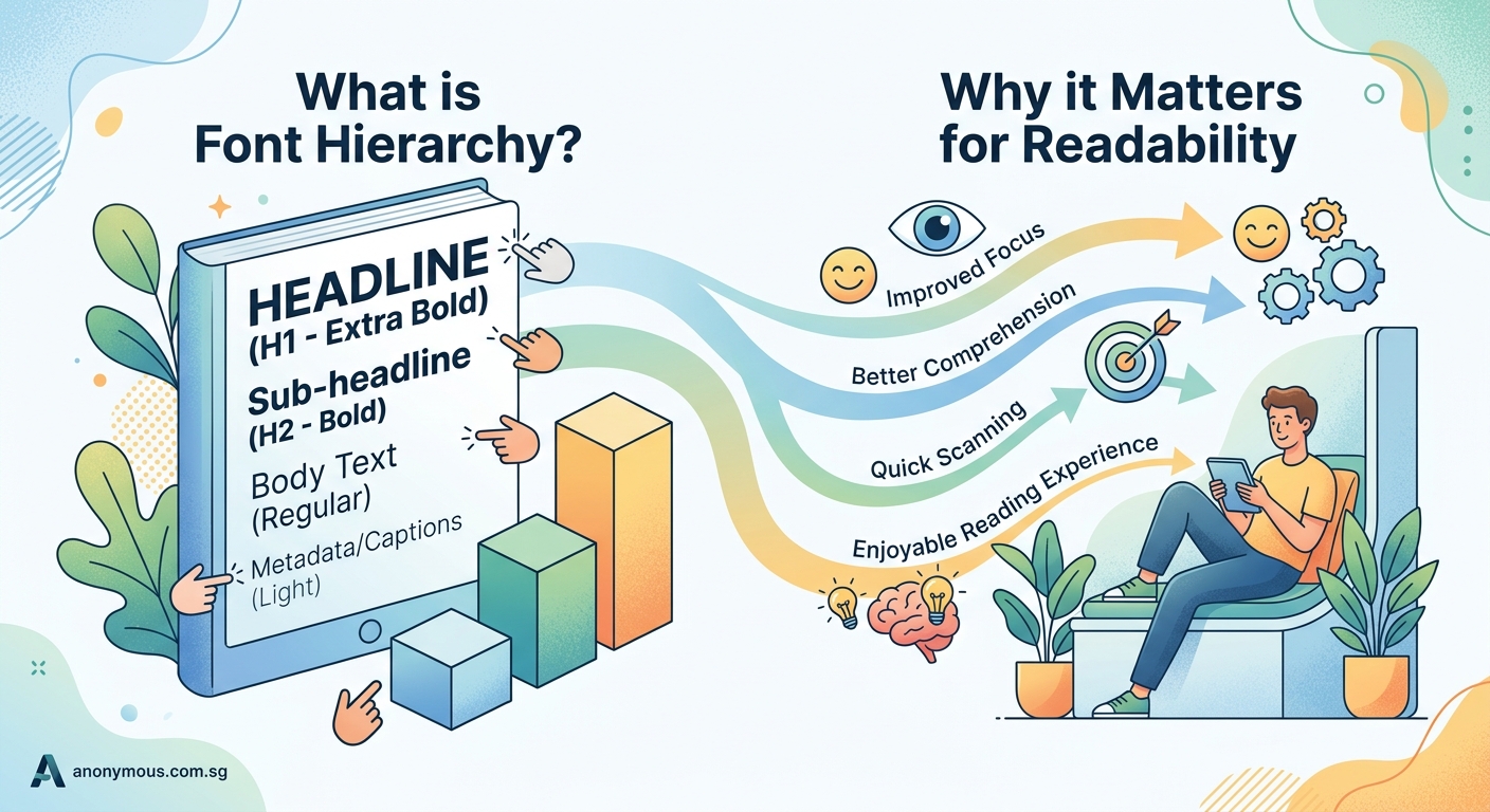
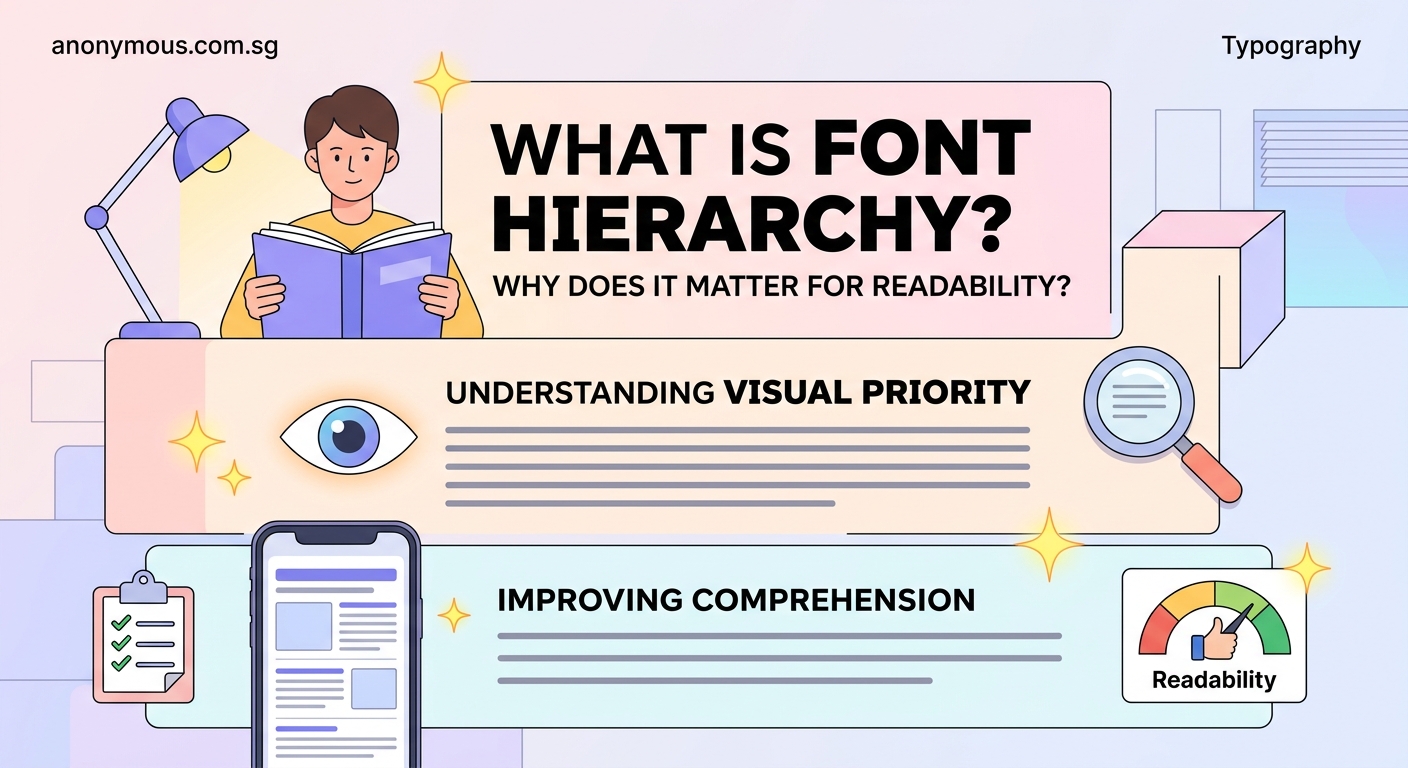
Typographic hierarchy is the [visual system](https://en.wikipedia.org/wiki/Visual_hierarchy) that guides readers through content by using size, weight, spacing, and contrast to establish importance. It helps people scan information efficiently, understand relationships between content sections, and absorb your message without confusion. Good hierarchy is invisible but essential, making every design from websites to posters instantly more readable and professional.
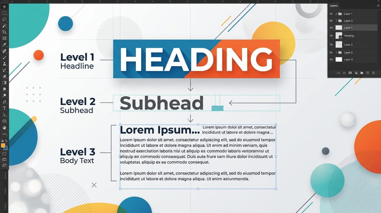
What typographic hierarchy actually means
Typographic hierarchy organizes text so readers understand what matters most at a glance.
Think of it like a newspaper. The main headline grabs attention. Subheadings break up sections. Body text delivers details. Captions add context. Each level serves a specific purpose, and the visual differences between them create a roadmap through the content.
Without hierarchy, everything competes for attention equally. Your reader gets overwhelmed and leaves.
With hierarchy, you control the reading experience. You decide what gets noticed first, second, and third. You create a clear path from entry point to call to action.
The system works through contrast. Big versus small. Bold versus light. Tight spacing versus generous spacing. Each contrast signals a different level of importance.
The building blocks that create hierarchy
Several typographic elements work together to establish clear levels.
Size is the most obvious tool. Larger text naturally draws the eye first. A 48px headline dominates a 16px body paragraph. The difference in scale creates instant separation.
Weight adds another layer. Bold text stands out from regular text even at the same size. A bold subheading at 24px creates a clear break from 24px body text set in regular weight.
Spacing controls how text breathes. More space around a headline isolates it and increases its importance. Tighter line spacing in body text creates dense blocks that signal detailed information.
Color and contrast guide attention through visual intensity. Dark text on a light background creates high contrast that’s easy to read. Lighter text recedes, perfect for supporting information like captions or metadata.
Case and style provide subtle cues. All caps headlines feel bold and declarative. Italic text suggests emphasis or attribution. Each choice communicates something about the content’s role.
The often stem from ignoring these fundamental elements.
How to build effective hierarchy in three steps
Creating clear hierarchy doesn’t require guesswork. Follow this process.
-
Map your content levels before designing. List every type of content in your document. Main headline. Section headers. Subheadings. Body text. Captions. Quotes. Labels. Each needs its own visual treatment. Knowing all your levels upfront prevents adding inconsistent styles later.
-
Establish clear contrast between adjacent levels. Your main headline should be noticeably larger than your section headers. Section headers should clearly differ from subheadings. Aim for at least a 2:3 ratio between levels. If your body text is 16px, make subheadings at least 24px. Make section headers 36px or larger. The contrast should be obvious, not subtle.
-
Test by squinting at your design. Blur your eyes slightly and look at your layout. Can you still see distinct levels? Do the important elements still stand out? If everything blends together, you need more contrast. If one element dominates everything else, dial it back. The hierarchy should create a clear visual rhythm, not chaos or monotony.
This systematic approach works whether you’re designing a or laying out a simple blog post.
Common hierarchy patterns that work
Certain structures appear repeatedly because they solve real problems.
The inverted pyramid puts the largest, boldest element at the top and decreases size and weight as you move down. News articles use this pattern. Readers get the most important information first, then progressively more detail.
The modular grid creates hierarchy through positioning and size within defined sections. Each module has its own internal hierarchy, but the grid itself establishes relationships between modules. Magazines and modern websites rely on this approach.
The progressive disclosure pattern reveals information in layers. A large headline and deck introduce the topic. Subheadings break content into scannable chunks. Body text provides depth for engaged readers. Each layer serves a different reading mode.
The typographic scale uses mathematical ratios to create harmonious size relationships. A 1.5 ratio means each level is 1.5 times larger than the level below it. 16px body text, 24px subheads, 36px section headers, 54px main headline. The consistent ratio creates visual coherence.
Understanding these patterns helps you make intentional choices rather than arbitrary ones.
Why hierarchy matters for different design contexts
Different mediums demand different hierarchical approaches.
Web design requires flexible hierarchy that works across screen sizes. Your headline might be 72px on desktop but needs to scale down to 32px on mobile while maintaining its dominance. Responsive typography means thinking in ratios and relationships, not fixed sizes. The addresses these specific challenges.
Print design offers more control but demands precision. You know exactly how large your headline will appear on the page. You can fine-tune spacing down to fractions of a point. This control means readers expect polish. Sloppy hierarchy stands out immediately.
Social media graphics need instant clarity. Viewers scroll fast. Your hierarchy must communicate the main message in under a second. This usually means one dominant element, minimal supporting text, and aggressive contrast.
Presentation slides balance hierarchy with readability from a distance. Text that works on your laptop screen might disappear in a conference room. Bigger sizes, bolder weights, and more spacing become necessary.
Each context changes the rules slightly, but the principles remain constant.
The relationship between hierarchy and readability
Good hierarchy makes content easier to process mentally.
Readers don’t read every word. They scan. They look for entry points and signposts. Clear hierarchy provides both.
A well-structured article lets someone skim the headings and understand the main points in 30 seconds. If they want details, the body text is there. If they need specific information, they can jump to the relevant section.
Poor hierarchy forces readers to work harder. They have to read everything to figure out what matters. They waste mental energy decoding structure instead of absorbing content.
The cognitive load difference is real. Studies show that properly structured content gets read more thoroughly and remembered more accurately. People literally understand your message better when hierarchy is clear.
This applies to every design discipline. A confusing menu hierarchy makes apps frustrating. A flat visual hierarchy makes posters forgettable. A weak typographic hierarchy makes websites feel amateur.
Mistakes that destroy hierarchy
Several common errors undermine even well-intentioned designs.
Too many levels creates confusion instead of clarity. If you have main headlines, section headers, sub-subheadings, body text, emphasized body text, captions, and footnotes all with different treatments, readers can’t track the system. Limit yourself to four or five distinct levels maximum.
Insufficient contrast between levels makes them blend together. A 16px subheading and 18px body text look nearly identical. Make differences obvious. If you’re unsure whether the contrast is enough, it isn’t.
Inconsistent application breaks the pattern readers learn. If section headers are bold and 28px on page one but regular weight and 24px on page three, you’ve created two competing systems. Consistency builds trust and comprehension.
Overemphasis happens when everything tries to be important. Five different text elements all screaming for attention creates visual noise. Hierarchy requires restraint. Some elements must recede so others can dominate.
The principles apply here too. Pairing requires contrast and harmony in balance.
Practical techniques for stronger hierarchy
These specific tactics improve hierarchy immediately.
- Use weight before color. Bold text creates hierarchy more reliably than colored text. Color can enhance hierarchy, but weight should do the heavy lifting.
- Increase line height for headings. Headlines set with 1.2 to 1.3 line height feel more open and important than body text at 1.5 or 1.6 line height.
- Add vertical space strategically. More space above a heading than below it connects the heading to the content that follows. Equal space on both sides creates ambiguity.
- Limit font variations. One font family with multiple weights often creates clearer hierarchy than multiple font families. Fewer variables mean stronger contrast where it counts.
- Align consistently. Left-aligned text creates a strong vertical edge that organizes content. Centered text works for headlines but gets messy for longer passages.
These aren’t rules to memorize. They’re tools to apply based on your specific needs.
How hierarchy interacts with other design elements
Typography doesn’t exist in isolation.
Color contrast amplifies or diminishes typographic hierarchy. A light gray subheading has less visual weight than a black subheading, even at the same size. Use this deliberately. Reduce contrast for less important elements. Increase it for critical information.
Layout and spacing provide context for typographic choices. A headline surrounded by white space gains importance. The same headline crammed between other elements loses impact. Your spatial decisions affect how typography functions.
Visual elements like images, icons, and rules compete with or complement type. A large photo can overpower your headline unless you adjust the typographic scale accordingly. Everything in your layout contributes to the overall hierarchy.
The guide explains how contrast works across all design elements, not just type.
Testing your hierarchy before publishing
Don’t trust your instincts alone. Validate your decisions.
The squint test mentioned earlier reveals whether your hierarchy has enough contrast. Blur your vision and see what stands out. The most important elements should remain visible.
The five-second test shows whether your message gets through. Show your design to someone for five seconds. Ask what they remember. If they can’t recall the main point, your hierarchy isn’t working.
The scan test mimics real reading behavior. Can someone understand the content structure by reading only the headings? If not, your hierarchy needs work or your headings need better content.
The distance test works for presentations and posters. View your design from across the room. Can you still read the important information? Physical distance exaggerates hierarchy problems.
These simple tests catch issues before your audience sees them.
Building hierarchy into your design system
Consistent hierarchy requires documentation.
Define your type scale explicitly. List every level with its size, weight, line height, spacing, and usage guidelines. Make this part of your or brand documentation.
Create reusable styles or components. In design software, set up text styles for each hierarchy level. In code, create semantic HTML tags or CSS classes. Reusing predefined styles ensures consistency across projects.
Include examples showing each level in context. Show how a main headline, section header, and body text look together. Demonstrate proper spacing. Provide both good and bad examples.
Document the reasoning behind your choices. Explain why you chose specific size ratios or weight combinations. Future you (or your teammates) will appreciate the context when making decisions.
Real-world hierarchy examples
Look at designs you encounter daily with fresh eyes.
News websites demonstrate aggressive hierarchy. The lead story dominates with a huge headline and large image. Secondary stories get smaller headlines. Tertiary content shrinks to simple text links. The visual difference between levels is dramatic because readers need to process information fast.
Books use subtle hierarchy. Chapter titles are larger than section headers, which are larger than body text. But the differences are measured, not extreme. Readers have time and attention for nuance.
Marketing emails compress hierarchy into tight spaces. Subject lines act as headlines. Preview text serves as deck copy. Body text stays concise. Buttons use color, size, and spacing to stand out as calls to action.
Mobile apps rely on hierarchy for navigation. Tab labels, screen titles, section headers, and content all occupy different visual levels. Without clear hierarchy, apps feel confusing and hard to use.
Study these examples. Notice what works and what doesn’t. Apply those lessons to your own projects.
Common hierarchy questions answered
Here’s a reference table addressing frequent concerns:
| Question | Effective Approach | Common Mistake |
|---|---|---|
| How many hierarchy levels do I need? | Use 3-5 distinct levels based on content complexity | Creating 7+ levels that confuse readers |
| Should I use all caps for headlines? | Use sparingly for short, impactful headlines | Overusing all caps reduces readability |
| Can I mix multiple font families? | Yes, but limit to 2-3 with clear role separation | Using 4+ fonts creates visual chaos |
| How much bigger should headlines be? | Aim for 1.5-2x the size of body text minimum | Making headlines only slightly larger |
| When should I use color for hierarchy? | After establishing hierarchy through size and weight | Relying only on color to show importance |
| Do I need different hierarchy for mobile? | Yes, scale proportionally but maintain relationships | Using identical sizing across all devices |
Typography hierarchy as a design foundation
Mastering typographic hierarchy transforms your work from amateur to professional.
It’s not about following rigid rules. It’s about understanding how visual contrast guides attention and comprehension. Once you grasp the principles, you can adapt them to any project, any medium, any audience.
Start with the basics. Establish clear size differences. Use weight strategically. Control spacing deliberately. Test your decisions against real user behavior.
“Good typography is invisible. Readers shouldn’t notice the hierarchy system. They should simply find it effortless to navigate your content and absorb your message.”
The best hierarchy feels natural and inevitable, as if the content couldn’t possibly be arranged any other way. That’s the goal.
Your designs already contain multiple levels of information. The question isn’t whether to use hierarchy. It’s whether to use it intentionally or let it happen accidentally. Intentional hierarchy serves your readers. Accidental hierarchy confuses them.
Making hierarchy work for you right now
You don’t need to redesign everything immediately.
Pick one project. Map out the content levels. Establish clear visual differences between them. Test the result. Refine based on what you learn.
Apply those lessons to your next project. Build a small library of hierarchy patterns that work for your typical needs. Document what you discover.
Over time, good hierarchy becomes second nature. You’ll see weak hierarchy everywhere and know exactly how to fix it. You’ll design with structure from the start instead of adding it as an afterthought.
That shift in thinking separates designers who struggle with layout from those who make it look easy. Typographic hierarchy is the foundation that makes everything else work better.