Your logo will appear on business cards, websites, social media profiles, packaging, and maybe even billboards. It needs to work everywhere. But before you can design it, you need to answer one fundamental question: should it be minimalist or detailed?
This isn’t about personal preference. It’s about strategy.
The debate between minimalist vs detailed logos comes down to how your brand needs to communicate, where your logo will live, and who needs to remember it. Both approaches work beautifully when matched to the right context. Both fail spectacularly when forced into the wrong one.
Minimalist logos excel at scalability, digital applications, and instant recognition across platforms. Detailed logos shine when storytelling, craftsmanship, and visual richness matter more than versatility. Your choice depends on where your logo appears most, what your audience expects, and how much visual information you need to communicate. Neither style is inherently better. The right answer lives in your brand’s specific needs and constraints.
What makes a logo minimalist or detailed
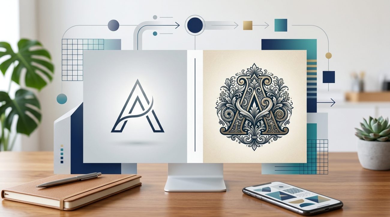
Minimalist logos strip away everything except the essential elements. They use simple shapes, limited colors, clean lines, and plenty of negative space. Think Apple, Nike, or Target. You can draw them from memory. You recognize them at thumbnail size.
Detailed logos pack in visual information. They include intricate linework, multiple colors, textures, gradients, or illustrative elements. Think Starbucks, Harley-Davidson, or craft brewery badges. They reward closer inspection. They tell richer stories.
The spectrum between these two extremes offers plenty of middle ground. Most logos fall somewhere between ultra-minimal wordmarks and ornate crests. Understanding where your brand belongs on this spectrum requires honest assessment of your needs.
When minimalist logos work best
Minimalist designs dominate digital-first brands for good reason. They scale perfectly from favicon to billboard without losing clarity. They load fast. They reproduce cleanly across every medium and background color.
Tech companies, startups, and modern service businesses often choose minimalism because it signals innovation, efficiency, and forward thinking. A simple geometric mark feels contemporary. It adapts easily as the brand evolves.
Minimalist logos also cost less to reproduce. Fewer colors mean lower printing costs. Simple shapes embroider cleanly on apparel. Single-color versions work on any background without complex adjustments.
A logo that works at 16 pixels will work everywhere. A logo that needs 500 pixels to be recognizable will constantly fight you.
If your brand lives primarily on screens, minimalism offers massive practical advantages. Social media profile pictures appear tiny. Mobile interfaces demand clarity at small sizes. A minimalist approach ensures your logo remains identifiable no matter where it appears.
Consider minimalism when:
- Your brand is digital-first or tech-focused
- You need maximum versatility across applications
- Your audience skews younger or values modern aesthetics
- You want timeless design that won’t feel dated
- Budget constraints limit printing to one or two colors
- Your brand name carries more weight than visual symbolism
When detailed logos make sense
Detailed logos communicate heritage, craftsmanship, and authenticity. They work beautifully for brands where tradition, artisanship, or storytelling matter more than digital versatility.
Restaurants, breweries, law firms, and luxury brands often use detailed marks because they need to convey specific qualities: established history, meticulous attention to detail, or premium positioning. An ornate logo signals that the brand values depth over speed.
Physical products benefit from detailed logos. A craft beer label has room for intricate illustration. A leather goods hang tag can showcase fine linework. A storefront sign can display elaborate typography. These applications don’t face the same size constraints as digital platforms.
Detailed logos also differentiate in crowded markets. When every competitor uses a minimal geometric mark, a richly illustrated logo stands out. It gives people something to look at, remember, and talk about.
Choose detail when:
- Your brand emphasizes heritage, tradition, or craftsmanship
- Physical applications (packaging, signage) dominate
- Your industry expects or values ornate design
- You need to stand out in a sea of minimal competitors
- Your audience appreciates visual complexity
- The logo needs to tell a specific story or include symbolic elements
The practical reality of logo applications
Your logo doesn’t exist in isolation. It lives across dozens of applications with different technical requirements. This reality should drive your decision more than aesthetic preference.
Create a list of every place your logo will appear. Be specific:
- Website header (what pixel dimensions?)
- Social media profile pictures (Instagram, LinkedIn, Facebook)
- Email signatures (typically very small)
- Business cards (front and back)
- Packaging or product labels
- Storefront signage or vehicle wraps
- Apparel or promotional items
- Print advertisements or brochures
- Presentation slides or documents
- Mobile app icons
Now evaluate each application honestly. Will a detailed logo remain legible at 40 pixels square? Can you afford four-color printing on every business card? Does your website background change, requiring logo versions for light and dark contexts?
This audit reveals whether minimalism is a practical necessity or if you have room for detail. Many brands discover they need a simplified version for small digital applications even if their primary logo includes detail.
Common mistakes when choosing logo complexity
| Mistake | Why it fails | Better approach |
|---|---|---|
| Copying competitor style | You blend in instead of standing out | Analyze what competitors do, then consider the opposite |
| Choosing based on personal taste | Your preferences may not match audience expectations | Test concepts with actual customers in your target market |
| Ignoring reproduction costs | Complex logos cost more to print and produce | Calculate actual costs across all planned applications |
| Designing only for one medium | Logo fails when applied elsewhere | Test designs at multiple sizes and contexts before finalizing |
| Adding detail to look premium | Complexity doesn’t equal quality | Premium positioning comes from execution quality, not intricacy |
| Oversimplifying to follow trends | Minimal logos can feel generic or forgettable | Find the simplest version that still feels distinctive |
The biggest mistake is treating this as a purely creative decision. Logo complexity has practical, financial, and strategic implications that matter more than whether you personally prefer clean or ornate design.
Testing your logo at different levels of detail
Before committing to a direction, create versions at different complexity levels. Start with your most detailed concept, then systematically simplify it.
Version 1 might include illustration, texture, gradients, and multiple colors. Version 2 removes textures and gradients but keeps the illustration. Version 3 simplifies the illustration to basic shapes. Version 4 strips it down to a wordmark or single geometric element.
Now test each version across your application list. Print them at actual business card size. View them at favicon dimensions. See them reversed on dark backgrounds. Place them on busy photographs.
This exercise reveals which level of detail actually works for your needs. You might discover that your detailed concept falls apart at small sizes. Or that your minimal version feels too generic among competitors. The right answer becomes obvious when you see real-world applications.
Many successful brands maintain both detailed and simplified versions. The detailed version appears on packaging, signage, and marketing materials where space allows. The simplified version handles small digital applications, social media, and single-color printing. This approach offers flexibility without compromise, though it requires careful documentation in your brand style guide.
Industry expectations and audience psychology
Different industries carry different visual expectations. Financial services typically use restrained, professional marks. Creative agencies often choose bold, distinctive designs. Understanding these unwritten rules helps you decide whether to follow or break them strategically.
Conservative industries (law, finance, healthcare) tend toward minimalism because it signals trustworthiness and stability. Clients in these fields often want reassurance, not surprise. A clean, professional logo meets that psychological need.
Creative industries (design, food, entertainment) have more freedom to use detail because audiences expect visual interest. A craft coffee roaster can use an ornate illustrated mark because customers associate that complexity with artisanal quality.
But these are tendencies, not rules. Breaking category expectations can differentiate your brand powerfully. A law firm with a warm, detailed mark might attract clients tired of cold corporate imagery. A tech startup with heritage-inspired design might stand out among minimal competitors.
Consider what your specific audience values. Psychology-backed design principles show that people remember distinctive marks better than generic ones, regardless of complexity level. The key is matching your visual approach to audience expectations while maintaining enough distinction to be memorable.
Scalability challenges you’ll actually face
Scalability isn’t theoretical. It’s the difference between a logo that works everywhere and one that requires constant adaptation.
Detailed logos face three main scalability problems. First, fine lines disappear at small sizes. That intricate scrollwork looks beautiful on a poster but vanishes in an Instagram profile picture. Second, multiple colors create reproduction headaches. Four-color printing costs more than two-color. Screen printing gets expensive with color counts above three. Third, busy designs compete with backgrounds. A complex logo needs careful placement and often requires a containing shape or background treatment.
Minimalist logos have different challenges. They can feel cold or generic if not executed thoughtfully. They offer less room for storytelling or symbolic meaning. They rely heavily on color, typography, or geometric precision to create distinction, which means small execution flaws become obvious.
The middle ground offers practical benefits. A logo with moderate detail, limited colors, and clear hierarchy scales reasonably well while maintaining visual interest. This balanced approach works for brands that need both digital versatility and physical presence.
Test your concepts at these specific sizes:
- 16px × 16px (favicon)
- 40px × 40px (social media profile)
- 180px × 180px (website header on mobile)
- 2 inches × 2 inches (business card)
- 12 inches × 12 inches (t-shirt print)
- 4 feet × 4 feet (trade show banner)
If your logo remains clear and recognizable across this range, you’ve found the right complexity level.
Color complexity and production costs
Color count directly impacts reproduction costs and versatility. This practical consideration often tips the balance between minimalist and detailed approaches.
Single-color logos (black or one spot color) cost least to reproduce. They work on any background. They embroider cleanly. They screen print cheaply. Many minimalist logos use this approach for maximum flexibility.
Two-color logos add visual interest while maintaining reasonable costs. They allow for simple hierarchy and depth without complex printing requirements.
Full-color logos (four-color process or multiple spot colors) offer rich visual possibilities but create practical constraints. Printing costs increase. Embroidery becomes complex or impossible. Small-size reproduction suffers as colors blend together.
Detailed logos often need multiple colors to work properly. That intricate illustration loses impact in single-color reproduction. But this isn’t always true. Some detailed logos use sophisticated single-color linework that maintains richness without color.
Calculate actual costs before deciding. Get quotes for business cards, apparel, and signage in both single-color and full-color versions. The price difference might be negligible or it might be substantial enough to influence your design direction.
Smart brands design for single-color reproduction first, then add color as an enhancement. This ensures the logo works in its most constrained application. If it succeeds in black and white, color versions will only improve it.
Making your final decision
You’ve audited your applications. You’ve tested different complexity levels. You’ve considered industry norms and audience expectations. You’ve calculated reproduction costs. Now make the call.
Choose minimalism if:
- Digital applications dominate your brand presence
- You need maximum flexibility across contexts
- Budget limits printing to one or two colors
- Your brand values modernity and simplicity
- Scalability matters more than storytelling
- Your industry expects clean, professional design
Choose detail if:
- Physical applications (packaging, signage) are primary
- Your brand story requires visual richness
- You’re differentiating from minimal competitors
- Your audience values craftsmanship and tradition
- You have budget for quality reproduction
- The logo needs symbolic or illustrative elements
Choose a balanced approach if:
- You need both digital and physical presence
- Your brand spans traditional and modern contexts
- You want visual interest without scalability problems
- Your budget allows for moderate printing complexity
- You’re building a flexible brand system with multiple logo versions
Remember that this decision isn’t permanent. Brands evolve. Apple’s original logo was detailed and illustrative. They simplified to the minimal mark we know today as their focus shifted to digital products. Conversely, some brands add detail as they mature and want to communicate heritage.
The best logo for your brand right now might not be the best logo forever. Design for your current needs while building in room to evolve. Avoid common logo design mistakes that lock you into approaches that don’t serve your actual business goals.
Your logo lives in the real world
The minimalist vs detailed logos debate resolves when you stop thinking about design trends and start thinking about where your logo actually needs to work.
A beautiful, intricate logo that fails at favicon size isn’t beautiful. It’s impractical. A perfectly minimal logo that feels generic among competitors isn’t minimal. It’s invisible.
The right choice emerges from honest assessment of your applications, audience, budget, and brand story. Design for reality, not for portfolio pieces or design awards. Your logo needs to work on Tuesday morning when you’re ordering business cards, not just in presentation mockups.
Start with your constraints. Let them guide you toward the level of complexity that serves your brand’s actual needs. Test ruthlessly across real applications. Choose the approach that works everywhere your logo needs to appear.
Your brand deserves a logo that functions as hard as it looks good.