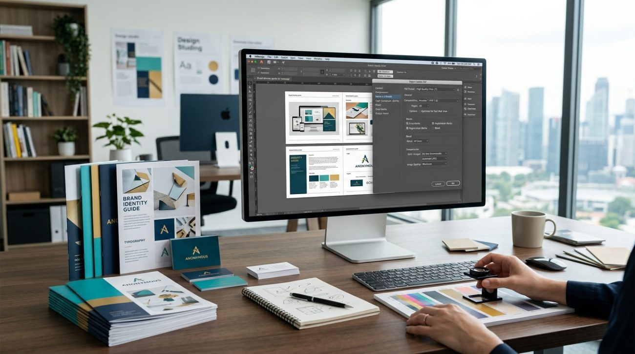
Your design looks perfect on screen. Colors pop, text is crisp, and every detail sits exactly where you want it.
Then the printed version arrives. The colors are muddy. The edges look pixelated. Your client is frustrated, and you’re scrambling to figure out what went wrong.
Most print quality issues happen during export. The wrong resolution, color mode, or file format can turn professional work into an amateur mess. But once you understand the settings that matter, you’ll never send a bad file to print again.
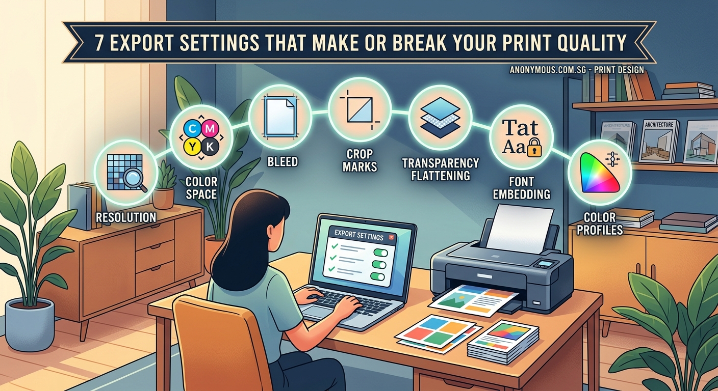
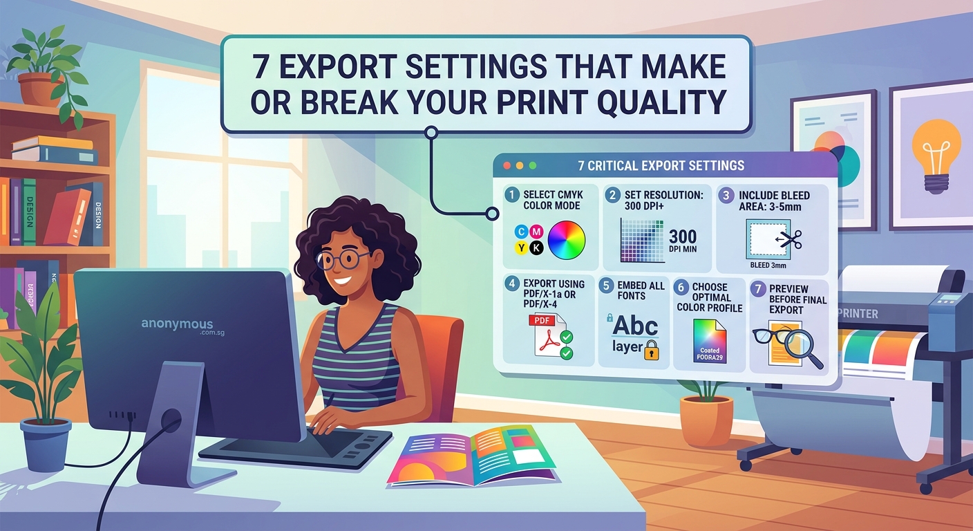
Professional print quality depends on seven critical export settings: resolution (300 DPI minimum), [CMYK](https://en.wikipedia.org/wiki/CMYK_color_model) color mode, proper bleed (usually 3mm), correct file format (PDF/X-1a or TIFF), embedded fonts, flattened transparency, and accurate crop marks. Missing even one setting can result in rejected files, wasted money, and disappointed clients. This guide walks you through each setting with practical examples you can apply immediately.
Resolution matters more than you think
Your screen displays images at 72 to 96 pixels per inch. Print needs at least 300 dots per inch.
That’s not a suggestion. It’s the minimum standard for professional print work.
When you export at screen resolution, the printer has to stretch those pixels across physical paper. The result looks blurry, pixelated, or both. Text becomes fuzzy. Photos lose detail. Gradients show visible bands.
Here’s what you need for different print applications:
- Standard print projects: 300 DPI (brochures, business cards, posters)
- Large format prints: 150 to 200 DPI (banners, billboards viewed from distance)
- High-end publications: 350 to 400 DPI (art books, premium magazines)
- Screen printing: 200 to 250 DPI (t-shirts, fabric applications)
Check your resolution before you start designing, not after. Upscaling a 72 DPI file to 300 DPI doesn’t add detail. It just makes the blur bigger.
Color mode will make or break your prints
Screens use RGB (red, green, blue). Printers use CMYK (cyan, magenta, yellow, black).
The colors you see on screen will never match print exactly. But using the wrong color mode makes the problem worse.
RGB contains colors that CMYK can’t reproduce. Bright blues, vibrant greens, and neon colors look stunning on screen but turn muddy in print. If you design in RGB and convert at export, you’re gambling with color accuracy.
CMYK vs RGB: when to use each color mode for print projects explains this in detail, but here’s the practical approach:
- Start your project in CMYK mode from the beginning
- Use Pantone or spot colors for brand-critical elements
- Proof your colors with a calibrated monitor or physical samples
- Never trust screen colors for final approval
If you’re working with brand colors that need consistency across print and digital, document both RGB and CMYK values in your style guide. This prevents surprises when the same design moves between media.
“The biggest mistake designers make is assuming their screen shows them what the print will look like. It doesn’t. It can’t. Design in the color space you’ll print in, and you’ll avoid 90% of color problems.” — Print production manager with 15 years at commercial presses
Bleed and crop marks prevent white edges
Printing presses can’t print to the exact edge of paper. They print on oversized sheets and trim them down.
Without bleed, you get thin white lines where the trimmer missed by a fraction of a millimeter. With proper bleed, your design extends past the trim line so those tiny variations don’t matter.
Most printers require 3mm (about 0.125 inches) of bleed on all sides. Some large format printers want 5mm. Always check with your specific printer before finalizing files.
Here’s how to set up bleed correctly:
- Create your document with bleed area included (if your finished size is 210mm × 297mm, make the canvas 216mm × 303mm)
- Extend all background colors and images to the bleed edge
- Keep important text and graphics at least 3mm inside the trim line (this is called the safe zone)
- Add crop marks to show the printer where to cut
What is bleed and why does every print designer need it covers the technical details, but the practical rule is simple: anything that touches the edge of your design must extend into the bleed area.
File format affects quality and compatibility
Not all file formats preserve print quality. Some compress images. Others flatten layers in ways that create problems. The wrong format can make a perfect design unprintable.
Here’s what works for professional printing:
| Format | Best For | Avoid For |
|---|---|---|
| PDF/X-1a | Final print files, most reliable | Editable files, ongoing work |
| PDF/X-4 | Files with transparency, modern workflows | Older print systems |
| TIFF | High-quality images, photography | Multi-page documents |
| EPS | Legacy systems, spot colors | Modern workflows (outdated) |
| JPEG | Never for professional print | Everything (lossy compression) |
PDF/X-1a is the gold standard. It embeds fonts, flattens transparency, and includes all the technical specifications printers need. Most commercial printers prefer it because it reduces errors.
When you export to PDF, use these settings:
- Preset: PDF/X-1a:2001 or PDF/X-4:2010
- Compression: None for line art, ZIP for images
- Marks and bleeds: Include crop marks, bleed marks, and color bars
- Output: Convert to CMYK, embed all fonts
Some design software defaults to web-optimized PDFs. Those compress images and strip out print specifications. Always select a print preset or manually configure export settings.
Font embedding prevents text disasters
Your fonts won’t magically appear on the printer’s computer. If you don’t embed them in your file, the printer’s software substitutes different fonts. Your carefully chosen typography turns into Arial or Times New Roman.
Even worse, sometimes the printer’s software can’t find a substitute at all. Text disappears completely or shows up as error boxes.
Embedding fonts solves this problem. The font data gets packaged inside your PDF or print file so it displays and prints exactly as you designed it.
Here’s what you need to know:
- Embed all fonts: Not just the ones you think might cause problems
- Check licensing: Some fonts don’t allow embedding (use alternatives)
- Subset fonts: Only embed the characters you actually use (reduces file size)
- Outline as backup: Convert text to outlines for small amounts of display type
Be careful with outlining text. It prevents editing and can cause thin strokes to look different at print resolution. Use it for logos and headlines, not body copy.
If you’re working on typography for brand identity, make sure your chosen fonts allow commercial embedding. Check the license before you commit to a typeface.
Transparency settings require special attention
Transparency looks simple on screen. One layer shows through another. Easy.
For printers, transparency is complicated. Different software handles it differently. If you don’t flatten transparency correctly, you get white boxes where transparent areas should be, or colors that shift unexpectedly.
Modern PDF formats (PDF/X-4) preserve transparency better than older versions. But many printers still prefer flattened files because they’re more predictable.
When you flatten transparency:
- Use your design software’s built-in flattener (don’t just merge layers)
- Set raster/vector balance to 100 for maximum quality
- Keep text as vectors when possible
- Check the flattened preview before exporting
Common transparency problems include:
- Drop shadows that turn into solid gray boxes
- Blending modes that change colors after flattening
- Transparent gradients that show visible steps
- Overprinting issues where colors mix unexpectedly
Test your flattened file by opening it in a different PDF viewer. If it looks wrong, your printer will have the same problem.
Image compression destroys print quality
Compression reduces file size by throwing away data. For web images, that’s usually fine. For print, it’s a disaster.
JPEG compression creates artifacts: blocky areas, color shifts, and fuzzy edges. These barely show on screen but become obvious in print, especially in solid colors and gradients.
Use lossless compression instead:
- ZIP compression: Reduces file size without losing quality
- LZW compression: Another lossless option for TIFF files
- No compression: Best quality, larger files
If your images already have JPEG compression (from a camera or stock photo site), you can’t remove it by converting to a different format. The damage is permanent. Start with the highest quality source images you can find.
For photographs, shoot or source RAW files when possible. Convert them to TIFF or high-quality PDF for print. Never save a print file as JPEG.
Print resolution explained: the designer’s guide to DPI, PPI, and image quality covers the relationship between compression and resolution in more detail.
Pre-flight checks catch problems before printing
Professional printers run pre-flight checks on every file. These automated tests look for common problems: missing fonts, low-resolution images, incorrect color modes, missing bleed.
You should run the same checks before you send files. Most design software includes pre-flight tools. Use them.
Here’s a practical pre-flight checklist:
- Check resolution: All images 300 DPI or higher
- Verify color mode: Everything in CMYK (unless using spot colors)
- Confirm bleed: 3mm minimum on all sides
- Test fonts: All embedded or outlined
- Review transparency: Properly flattened with no artifacts
- Validate format: PDF/X-1a or printer-specified format
- Inspect file size: Reasonable for the project (not suspiciously small)
Open your exported file in Adobe Acrobat or another PDF viewer. Zoom to 400%. Check edges, text, and image quality. If something looks wrong at high magnification, it will print wrong.
5 pre-flight checks every designer should run before sending files to print provides a more detailed workflow, but these seven points catch most problems.
Common export mistakes and how to fix them
Even experienced designers make export mistakes. Here are the ones that cause the most problems:
Mistake 1: Exporting at 72 DPI
Fix: Set document resolution to 300 DPI before you start designing. Check image resolution in your export settings.
Mistake 2: Forgetting to convert RGB to CMYK
Fix: Design in CMYK from the beginning, or convert before export. Check your color mode in the export dialog.
Mistake 3: Not including bleed
Fix: Set up bleed in your document settings. Extend backgrounds and images to the bleed line.
Mistake 4: Using the wrong PDF preset
Fix: Select PDF/X-1a or your printer’s recommended preset. Never use “Smallest File Size” or web presets.
Mistake 5: Forgetting to embed fonts
Fix: Check “Embed All Fonts” in export settings. Verify in Acrobat that fonts are embedded, not substituted.
Mistake 6: Leaving transparency unflattened
Fix: Use PDF/X-1a (which flattens automatically) or manually flatten transparency before export.
Mistake 7: Over-compressing images
Fix: Use ZIP or no compression. Avoid JPEG compression for print files.
Keep a checklist next to your computer. Run through it every time you export a print file. The two minutes you spend checking settings saves hours of reprinting and thousands in wasted materials.
Software-specific export settings
Different design tools handle export differently. Here’s what to watch for in popular applications:
Adobe InDesign:
– Use File > Export > Adobe PDF (Print)
– Select PDF/X-1a:2001 preset
– Enable “Use Document Bleed Settings”
– Check “All” under Marks and Bleeds
– Verify CMYK conversion in Output settings
Adobe Illustrator:
– Use File > Save As > Adobe PDF
– Choose PDF/X-1a:2001 preset
– Set bleed to 3mm (0.125 in)
– Enable “Preserve Illustrator Editing Capabilities” only for working files, not final print
– Convert to CMYK in Edit > Edit Colors
Adobe Photoshop:
– Use File > Save As > Photoshop PDF
– Set resolution to 300 pixels/inch
– Convert to CMYK via Image > Mode > CMYK Color
– Flatten image or save as TIFF for print
– Include crop marks if needed
Affinity Designer/Publisher:
– Use File > Export > PDF (for print)
– Set DPI to 300
– Enable bleed (3mm recommended)
– Choose PDF/X-1a or PDF/X-4
– Embed all fonts
Canva:
– Download as PDF (Print)
– Request flattened PDF from print shop
– Double-check resolution (Canva sometimes optimizes for web)
– Verify CMYK conversion with your printer
If you’re using templates from free design libraries, always check their export settings. Many free templates default to web specifications.
When to ask your printer for specifications
Every print shop has preferences. Some want PDF/X-1a. Others accept PDF/X-4. Large format printers might want TIFF files. Custom packaging might require spot colors.
Before you start a project, ask for print specifications:
- Preferred file format
- Required resolution
- Bleed dimensions
- Color mode (CMYK, spot colors, or both)
- Crop mark preferences
- Maximum file size
- Delivery method (email, file transfer, physical media)
Most professional printers provide a specification sheet. Read it. Follow it exactly. When specifications conflict with general best practices, follow the printer’s requirements. They know their equipment better than anyone.
For specialty printing (foil stamping, embossing, die cutting), you might need separate files for each process. Ask about layer organization and file naming conventions.
How to set up print files that won’t get rejected by printers covers the complete file preparation process, including how to communicate with print shops.
Testing prints before full production
Never run a full print job without testing first. Print one copy. Check it carefully. Fix any problems before printing 1,000 copies.
Professional printers offer several testing options:
- Digital proof: Low-cost print that shows layout and color (not exact match)
- Press proof: Actual print on production equipment (expensive but accurate)
- Contract proof: Color-calibrated proof that serves as legal standard for production
For most projects, a digital proof is enough. For color-critical work (product packaging, brand materials, photography), invest in a press proof.
When you review a proof, check:
- Colors match your expectations (remember, they won’t match your screen exactly)
- Text is sharp and readable at actual size
- Images show good detail without pixelation
- Bleed extends properly with no white edges
- Crop marks align correctly
- Nothing is cut off that should be visible
Mark corrections directly on the proof. Be specific. “Make blue darker” is vague. “Increase cyan by 10%” gives the printer actionable direction.
Your export settings checklist
Print this checklist and keep it visible:
Before export:
– [ ] Document set to 300 DPI minimum
– [ ] All colors in CMYK mode
– [ ] 3mm bleed on all sides
– [ ] Text and graphics in safe zone
– [ ] All images high resolution
– [ ] Fonts embedded or outlined
– [ ] Transparency flattened
During export:
– [ ] PDF/X-1a or printer-specified format
– [ ] No JPEG compression
– [ ] Crop marks enabled
– [ ] Color bars included
– [ ] All fonts embedded
– [ ] CMYK output selected
After export:
– [ ] Open file in PDF viewer
– [ ] Zoom to 400% and check quality
– [ ] Verify file size is reasonable
– [ ] Run pre-flight check
– [ ] Review with fresh eyes
– [ ] Send test file to printer if possible
Save this checklist as a template. Customize it for your specific workflow and printer requirements.
Getting your export settings right the first time
Print problems are frustrating. They waste time, money, and damage client relationships. But they’re also preventable.
Most print failures happen because someone rushed through export settings or didn’t understand what each option does. Now you know better.
Set up your documents correctly from the start. Use CMYK. Design at 300 DPI. Include bleed. Check your settings before you export. Run pre-flight tests. Send a proof before full production.
These steps take an extra 10 minutes per project. They save you from reprinting entire jobs because of a simple setting you overlooked.
Your designs deserve to look as good in print as they do on screen. With the right export settings, they will.