You’ve designed the perfect logo. Your client loves it. Now they’re asking for the files, and you freeze. What formats do they actually need? How many versions should you send? And what’s the difference between all those file extensions anyway?
Getting logo file formats right isn’t just about technical specs. It’s about setting your clients up for success across every platform they’ll use, from business cards to billboards. Send the wrong formats, and you’ll field support requests for months. Send the right package, and your client can confidently hand files to any printer, web developer, or social media manager without coming back to you.
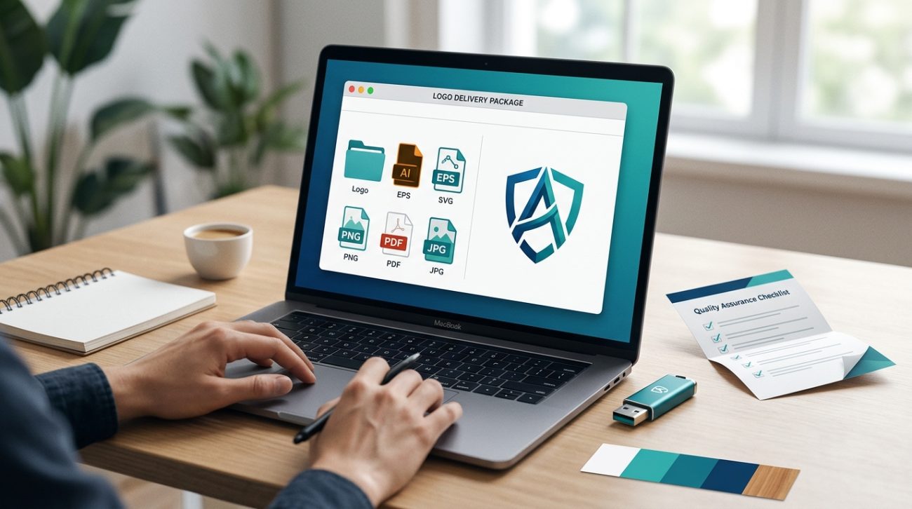
Deliver both vector files (AI, EPS, SVG, PDF) for scalable use and raster files (PNG with transparency, JPG for photos) at multiple sizes. Include full-color, single-color, and reversed versions. Organize everything in clearly labeled folders with a simple usage guide. This complete package prevents client confusion and eliminates endless file requests down the road.
Understanding vector vs raster formats
Before you export anything, you need to understand the fundamental difference between vector and raster files.
Vector files use mathematical paths instead of pixels. You can scale them infinitely without losing quality. A logo built in vectors looks crisp whether it’s printed on a pen or a building wrap. These files include AI, EPS, SVG, and PDF formats.
Raster files are made of pixels. They have fixed dimensions. Enlarge them too much, and they get blurry. These include PNG, JPG, and TIFF formats. Clients need raster files for most digital applications, but they should always have vectors as the source.
Think of vectors as the master recipe and rasters as the finished dish served at specific portion sizes.
Most client confusion happens when someone tries to enlarge a PNG logo for print. The file pixelates, looks terrible, and your client panics. Having proper vectors prevents this entirely.
The essential vector formats every client needs
Your client needs at least three vector formats in their logo package.
AI files are Adobe Illustrator’s native format. Any professional designer or print shop can open and edit these files. They preserve layers, colors, and effects exactly as you created them. This is your working file format.
EPS files are universal vector files that open in almost any design software. Older printers and sign shops often request EPS because it’s been the industry standard for decades. These files are slightly less flexible than AI files but far more compatible.
SVG files are built for web use. Developers need SVG files to display logos on websites that look sharp on any screen, from phones to 4K monitors. SVG files are also tiny in file size, which helps websites load faster.
PDF files serve double duty. When saved properly from Illustrator, PDFs preserve vector data while being viewable by anyone with a free PDF reader. Clients can preview their logo without design software and send it to vendors who can extract the vector data.
Always save PDFs with “Preserve Illustrator Editing Capabilities” enabled. This keeps the vector data intact while making the file universally viewable.
The raster formats that cover digital needs
Even with perfect vectors, clients need raster files for everyday use.
PNG files with transparent backgrounds are non-negotiable. Your client will use these constantly for presentations, social media, email signatures, and web use. Export at least three sizes: small (500px wide), medium (1500px wide), and large (3000px wide).
Transparency matters because clients need to place logos over photos, colored backgrounds, and various designs. A white background box around a logo screams amateur hour.
JPG files work for situations where transparency isn’t needed and file size matters. Some older email systems struggle with large PNGs. A high-quality JPG gives clients a lightweight alternative for photo backgrounds or simple applications.
Export JPGs at maximum quality settings. The file size savings from lower quality aren’t worth the visual degradation.
TIFF files occasionally come up for high-end print work, though they’re less common than they used to be. If your client works with traditional publishers or premium packaging, include a high-resolution TIFF (300 DPI minimum).
Color variations clients actually use
A complete logo package includes multiple color treatments, not just your primary version.
- Full-color version is your main logo with all brand colors intact
- Single-color black version for when printing in one color or on light backgrounds
- Single-color white version for dark backgrounds and reversed applications
- Grayscale version for black-and-white printing situations
Each of these should exist in both vector and raster formats.
The reversed white version catches many designers off guard. Clients inevitably need to put their logo on a dark photo or colored background. Without a proper white version, they’ll try to add white fills themselves and create a mess.
When you’re working on how to build a brand style guide that actually gets used, document exactly when to use each color variation.
File naming that prevents confusion
Your client isn’t a designer. They won’t remember what “logo_final_v3_CMYK.ai” means six months from now.
Use clear, descriptive names that explain the file’s purpose at a glance.
Good naming structure: BrandName_Logo_ColorVersion_FileType.extension
Examples:
– Acme_Logo_FullColor_Vector.ai
– Acme_Logo_White_Transparent.png
– Acme_Logo_Black_Print.eps
Include the brand name in every filename. Clients work with multiple vendors and files get mixed into crowded folders. A generic “logo.png” disappears. “Acme_Logo_FullColor.png” stays identifiable.
Add size indicators to raster files: Acme_Logo_FullColor_Small.png, Acme_Logo_FullColor_Large.png. This prevents clients from using a tiny social media version for a banner print.
Organizing your delivery folder structure
How you organize files matters as much as which files you include.
Create a clear folder hierarchy:
Brand_Logo_Package/
├── Vector_Files/
│   ├── AI_Files/
│   ├── EPS_Files/
│   ├── SVG_Files/
│   └── PDF_Files/
├── PNG_Files/
│   ├── Full_Color/
│   ├── Black/
│   └── White/
├── JPG_Files/
└── Usage_Guide.pdf
Group by format first, then by color variation within each format folder. This structure makes it easy for clients to grab what they need without hunting through dozens of files.
The usage guide is critical. It’s a simple one-page PDF explaining which files to use when. Something like “Use PNG files for PowerPoint and social media. Give EPS files to your printer. Send SVG files to your web developer.”
Most clients won’t read detailed documentation, but they will reference a single-page visual guide when they’re stuck.
Common format mistakes that create problems
Even experienced designers make these delivery errors.
Mistake 1: Sending only raster files. Clients will eventually need to scale their logo. Without vectors, they’re stuck. Always include both vector and raster options.
Mistake 2: RGB-only files for print projects. Your client hands an RGB logo to a printer, and the colors look completely wrong when printed. Include CMYK versions for print use, especially if brand colors are critical. Understanding why your color choices look different on screen vs print helps you explain this to clients.
Mistake 3: Outlined text in the only editable file. If you outline text in your AI file before sending it, the client can never edit the company name if it changes. Send one version with outlined text and one with live, editable text.
Mistake 4: Sending files that require specific fonts. Unless you’re also delivering the font files (with proper licensing), make sure your final files don’t depend on fonts the client doesn’t own.
Mistake 5: No transparent background on PNG files. Clients will place logos on colored backgrounds. A white box around the logo looks unprofessional and limits usability.
Size specifications for different uses
Clients ask “what size should this be?” constantly. Give them specific guidance upfront.
| Use Case | Format | Recommended Size | Notes |
|---|---|---|---|
| Website header | PNG or SVG | 200-300px height | SVG preferred for retina displays |
| Social media profile | PNG | 500x500px | Square format, transparent background |
| Email signature | PNG | 150-200px wide | Keep file size under 50KB |
| Business cards | Vector (EPS/AI) | N/A | Provide vector, let printer scale |
| Letterhead | Vector (EPS/AI/PDF) | N/A | Vector preferred for print clarity |
| Billboard | Vector (EPS/AI) | N/A | Only vector works at this scale |
| PowerPoint | PNG | 1500px wide | High enough for projectors |
| Favicon | PNG | 512x512px | Square, simplified version often works better |
Notice that print applications always get vectors. Digital applications can use rasters at appropriate sizes.
For social media specifically, check the ultimate guide to social media image dimensions for 2024 since platforms update their specs regularly.
Special formats for specific industries
Some clients need additional formats based on their industry.
Embroidery files: Apparel companies need digitized embroidery files (DST, PES, or EXP formats). You’ll typically work with an embroidery digitizer who converts your vector logo. Provide them with a simplified, single-color version since complex gradients don’t translate to thread.
Vinyl cutting: Sign shops and vehicle wrap installers need clean vector files, preferably EPS or AI. Avoid tiny details that won’t cut cleanly at small sizes.
Screen printing: Provide separated color versions. Each color prints as a separate layer, so a four-color logo needs four separate black-and-white files showing where each color appears.
Animation: If clients plan motion graphics or video intros, provide AI files with organized, named layers. Animators need to manipulate individual logo elements.
Ask about intended use during your initial client meetings. It’s easier to prepare specialty files upfront than to retrofit them later.
The minimum viable logo package
If you’re short on time or working with a tight budget, here’s the absolute minimum package that covers most client needs:
- AI file (full color, editable)
- EPS file (full color, outlined)
- SVG file (full color)
- PNG files (full color, black, white) at three sizes each
- Simple usage guide PDF
This gives clients vectors for professional use and rasters for everyday digital needs in the most common color variations.
You can always provide additional formats later if specific needs arise. This core package prevents the most common client problems.
How to explain file formats to non-designers
Your client doesn’t need to understand Bézier curves. They need to know which file to use when.
Use analogies that connect to their experience:
“Vector files are like a recipe. You can make the dish any size you want. Raster files are like a photo of the finished dish. It looks great at that size, but if you blow it up too much, it gets blurry.”
“Think of the AI file as your master copy. Keep it safe. The PNGs are like photocopies you can use every day without worrying about damaging the original.”
“SVG files are for your website. PNG files are for everything else digital. EPS files are for your printer.”
Simple, practical explanations work better than technical accuracy. Your goal is confident file usage, not design education.
Including a usage guide that clients actually read
Most logo usage guides are overwhelming 30-page PDFs that nobody opens. Create something simpler.
Your usage guide should fit on one page and include:
- Visual examples of each file type in use
- A decision tree (“Are you printing this? Use EPS. Is it going on a website? Use SVG or PNG.”)
- Minimum size specifications
- Color codes (RGB, CMYK, HEX values)
- Clear space requirements around the logo
- Examples of incorrect usage
Make it visual. Show the right way and the wrong way side by side. Clients remember pictures better than paragraphs.
Include your contact information at the bottom. When clients have questions, you want them reaching out to you instead of making their best guess.
This guide becomes part of a larger brand style guide that actually gets used for comprehensive brand management.
File delivery methods that work
How you send files matters almost as much as what you send.
Cloud storage links work best for large packages. Dropbox, Google Drive, or WeTransfer let you share an organized folder structure that clients can download in one click. Links don’t expire in their email inbox like attachments do.
ZIP files compress your entire package into a single download. Name it clearly: Acme_Logo_Package_2024.zip. Clients can store it easily and find it months later when they need files again.
Client portals on your website create a professional experience. Clients log in, download their files, and access them anytime. This works well if you deliver multiple projects to the same client over time.
Avoid email attachments for complete packages. Email file size limits force you to send multiple messages, and clients lose track of which email contained which files.
Send a follow-up message a few days after delivery asking if they’ve successfully accessed the files and if they have questions. This catches problems early before they become urgent.
When clients need additional formats later
Despite your best planning, clients will occasionally request formats you didn’t include.
Build this into your process from the start. Your contract should specify what’s included in the initial delivery and what constitutes additional work.
Common after-delivery requests:
– Animated versions for video
– Embroidery files for apparel
– Specialty print formats
– Simplified versions for small-scale use
– Alternative layouts for unusual spaces
Some designers include one round of additional formats in their original quote. Others charge hourly for post-delivery requests.
Document these requests and your responses. Patterns emerge. If three clients in a row ask for embroidery files, start including them in your standard package.
Protecting your files and your work
Logo files are valuable intellectual property. Take basic precautions.
Watermark preview files that you send before final payment. Remove watermarks only from the final delivery after payment clears.
Embed copyright metadata in your vector files. This doesn’t prevent misuse, but it establishes ownership if disputes arise.
Keep master files with layers intact. Send clients flattened versions for use but retain your layered working files. If they need revisions later, you’re not starting from scratch.
Clarify licensing in your contract. Does the client own the logo outright? Are there restrictions on modification? Can they resell products featuring the logo? Clear agreements prevent ugly surprises.
Consider keeping a backup of every client package you deliver. Hard drives fail. Cloud accounts get deleted. A simple archive of past deliveries saves you from recreating files years later.
Setting up templates for faster delivery
After delivering a few logo packages, you’ll notice you’re doing the same tasks repeatedly. Templatize them.
Create an export action in Illustrator that generates all your standard sizes and formats with one click. Set up your folder structure as a template you can duplicate and rename for each client.
Build a usage guide template where you swap in the new logo and brand colors but keep the structure and explanations consistent.
These templates don’t just save time. They reduce errors. You won’t forget to include a critical format when you’re following a checklist.
Making your package stand out
Most designers send a folder of files with minimal explanation. You can do better without much extra effort.
Add a personalized welcome PDF at the top level of your delivery folder. Include a brief thank-you message, a reminder of what’s included, and your contact information for questions.
Create custom folder icons that use the client’s brand colors. It’s a small touch that makes the delivery feel more premium.
Record a brief video walkthrough showing clients where to find files and how to use them. A three-minute Loom video prevents hours of support questions and makes clients feel supported.
These extras take minimal time but dramatically improve the client experience. Happy clients refer more clients.
Keeping your delivery process current
File format standards evolve. New formats emerge. Old formats fade away.
WebP images are becoming more common for web use. AVIF format is on the horizon. SVG capabilities keep expanding.
Review your standard delivery package annually. Are you still including formats nobody uses? Are you missing formats clients increasingly request?
Follow design industry blogs and forums. When you see the same format question appearing repeatedly, that’s a signal to update your package.
Your delivery process should evolve with technology and client needs. What worked perfectly in 2020 might need adjustments by 2024.
Why getting file delivery right matters for your business
Proper file delivery isn’t just good client service. It’s good business.
Clients who receive complete, well-organized packages don’t come back with urgent file requests. You avoid the constant interruptions of “Can you send me the logo for my website?” or “My printer says this file won’t work.”
Professional delivery builds trust. Clients see you as thorough and competent. They’re more likely to hire you for future projects and recommend you to colleagues.
Clear file organization prevents scope creep. When everything is documented and delivered properly, clients can’t claim they never received certain files or formats.
Think of your delivery package as the final impression of your project. You’ve spent hours or weeks crafting the perfect logo. Don’t undermine that work with a sloppy, confusing file delivery.
Your file package represents your professionalism just as much as the design itself. Make it count.