You’ve invested time and money into your business, but your brand still doesn’t feel quite right. Customers scroll past your social posts. Your website looks dated compared to competitors. And that logo you designed yourself? It’s starting to feel like a liability.
Most small business owners make the same branding mistakes. The good news is that these errors are fixable, and you don’t need a massive budget to correct them.
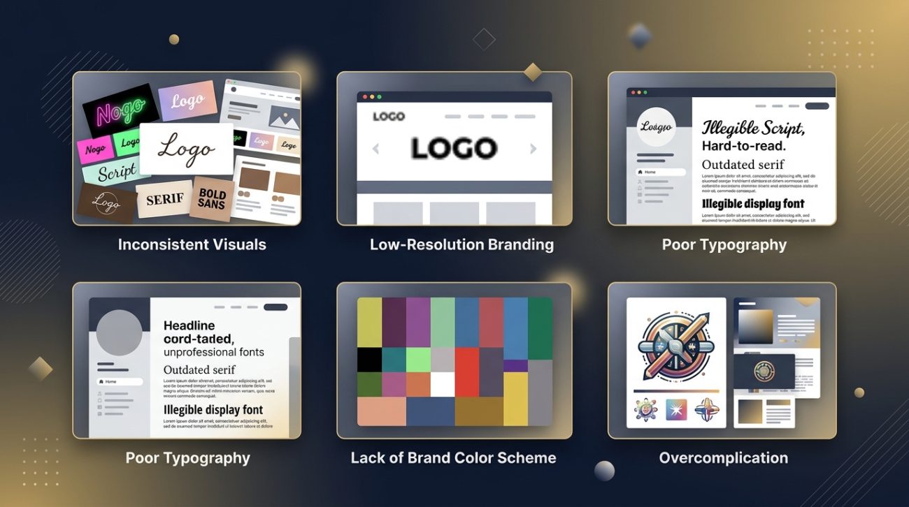
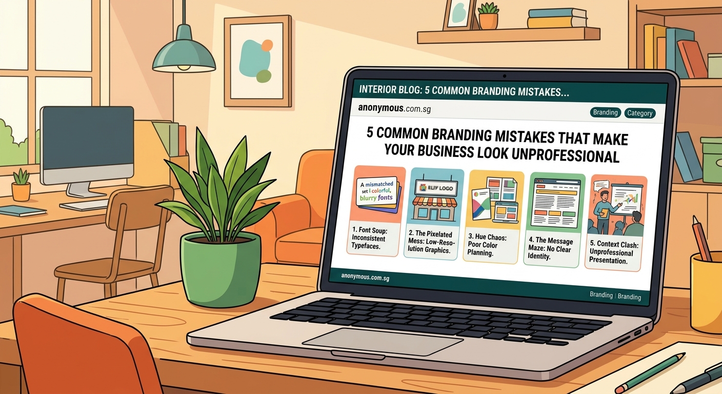
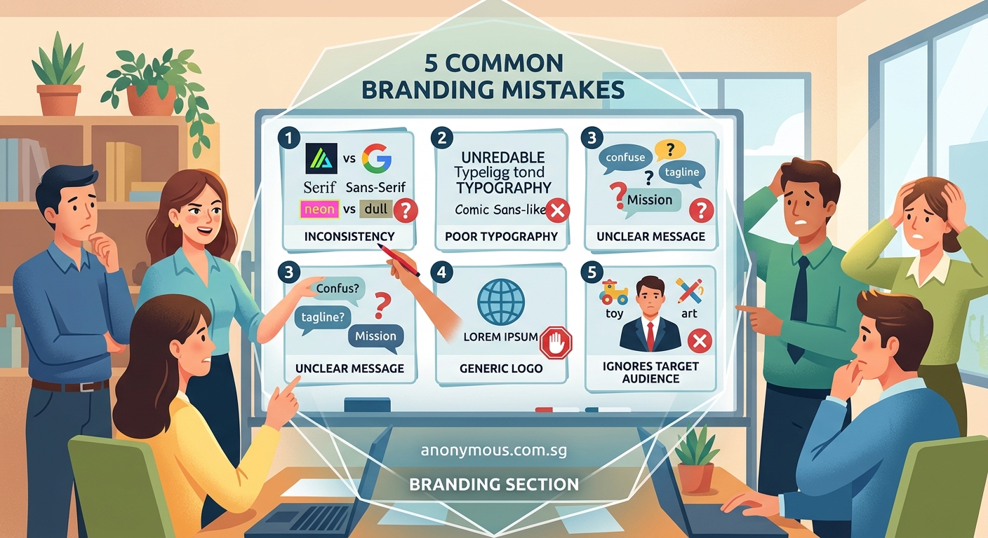
Common branding mistakes like inconsistent visual elements, poor font choices, and lack of brand guidelines make businesses appear unprofessional and forgettable. Small business owners can fix these issues by establishing clear brand systems, choosing appropriate typography, maintaining color consistency, and documenting their visual identity standards. Professional branding doesn’t require huge budgets, just thoughtful planning and consistent execution across all customer touchpoints.
Inconsistent visual identity across platforms
Your Instagram uses one logo version. Your website displays another. Your business cards feature a third variation with different colors.
This inconsistency confuses potential customers and erodes trust.
Brand recognition depends on repetition. When people see your visual elements repeatedly in the same format, they start to remember you. Change those elements constantly, and you’re starting from zero every single time.
Here’s what inconsistency looks like in practice:
- Different logo variations on social media, website, and print materials
- Color palettes that shift between platforms
- Varying typography choices across digital and physical touchpoints
- Mismatched image styles and filters
- Inconsistent tone in visual content
The fix starts with documentation. Create a simple reference file that specifies exactly which logo to use where, what your exact brand colors are (including hex codes and RGB values), and which fonts belong in your system.
Why your small business needs a brand system, not just a logo explains how to build this foundation properly.
How to audit your current brand consistency
- Screenshot every place your brand appears online (website, social profiles, email signatures, ads)
- Gather physical materials (business cards, packaging, signage, promotional items)
- Compare them side by side and note every variation
You’ll probably find more inconsistencies than you expected. That’s normal.
Using too many fonts (or the wrong ones)
Typography communicates more than words. It sets the tone before anyone reads a single sentence.
Many small businesses make one of two mistakes: they use too many different fonts, creating visual chaos, or they choose fonts that clash with their brand personality.
A professional brand typically uses two to three fonts maximum. One for headings, one for body text, and occasionally a third for accents or special purposes.
But choosing the right fonts matters just as much as limiting the number.
| Font choice | What it communicates | Best for |
|---|---|---|
| Serif fonts (like Georgia) | Traditional, trustworthy, established | Law firms, financial services, publishers |
| Sans-serif fonts (like Helvetica) | Modern, clean, approachable | Tech companies, startups, minimalist brands |
| Script fonts | Elegant, personal, creative | Boutiques, wedding services, luxury goods |
| Display fonts | Bold, unique, attention-grabbing | Headlines only, never body text |
The biggest mistake? Using decorative or script fonts for body text. They’re nearly impossible to read in paragraphs.
Another common error is pairing fonts that compete for attention. Your heading font and body font should complement each other, not fight.
How to choose the perfect font pairing for your logo design walks through the pairing process step by step.
“Typography is the detail and the presentation of a story. It represents the voice of an atmosphere, or historical setting of some kind. It can do a lot of things.” — Cyrus Highsmith, type designer
Skipping the brand style guide entirely
You know what your brand should look like. It’s all in your head.
The problem? Your head isn’t accessible to your team, contractors, or future employees.
Without documented guidelines, every person who touches your brand makes their own interpretation. Your virtual assistant picks different shades of your brand colors. Your graphic designer uses fonts that feel “close enough.” Your web developer adds elements that don’t match anything else.
A brand style guide doesn’t need to be a 50-page document. Even a simple one-page reference solves most problems.
Your basic style guide should include:
- Logo variations and clear usage rules
- Exact color specifications (hex codes, RGB, CMYK)
- Typography choices with size and spacing guidelines
- Image style preferences and examples
- Tone of voice descriptions
- What NOT to do (examples of incorrect usage)
How to build a brand style guide that actually gets used provides a practical template you can implement today.
The time investment pays off immediately. Instead of answering the same questions repeatedly or fixing inconsistent materials, you point people to the guide.
Choosing colors without strategy
Color psychology is real. Colors trigger emotional responses and influence purchasing decisions.
But many small businesses choose brand colors based on personal preference alone, without considering their target audience or industry context.
Your favorite color might be purple. But if you run a lawn care service, green makes more strategic sense. If you operate a financial advisory firm, purple might actually work better than the overused blue that every competitor uses.
Strategic color selection considers:
- Industry expectations and norms
- Target audience preferences and cultural associations
- Competitor differentiation
- Accessibility and readability requirements
- Versatility across different media
Another mistake is choosing too many colors. A strong brand palette typically includes:
- One primary color (your main brand color, used most frequently)
- One or two secondary colors (supporting colors for variety and hierarchy)
- Neutral colors (usually variations of black, white, or gray for backgrounds and text)
Brands that use seven different colors in their marketing materials look chaotic and amateur.
The 60-30-10 color rule provides a simple formula for balanced color application across your materials.
Testing your color choices
Before committing to a palette, test it across different contexts:
- Print it in black and white (does it still work?)
- View it on different screens (phone, tablet, desktop)
- Check contrast ratios for accessibility
- Apply it to mockups of real materials (business cards, website, social posts)
If your colors fail any of these tests, refine them before rolling them out across your entire brand.
Neglecting your logo’s scalability and versatility
Your logo looks great on your website header. Then you try to use it as a social media profile picture, and it becomes an unrecognizable blob.
Or you attempt to embroider it on shirts, and the intricate details turn into a muddy mess.
Logo versatility problems usually stem from these issues:
- Too much detail for small sizes
- Horizontal layouts that don’t work in square spaces
- Color combinations that fail in single-color applications
- Thin lines that disappear when scaled down
- Text that becomes illegible at small sizes
Professional logos work at every size, from favicon to billboard. They function in full color, single color, and black and white. They adapt to horizontal, vertical, and square formats.
You need multiple logo versions:
- Primary full-color version
- Simplified version for small applications
- Horizontal version for website headers
- Stacked version for square spaces
- Single-color versions (black and white)
- Reversed version for dark backgrounds
Many small businesses create one logo and try to force it into every context. Then they wonder why it looks unprofessional on certain applications.
7 logo design mistakes that make your brand look unprofessional covers the technical aspects of creating adaptable logos.
Test your logo by placing it on different backgrounds, at different sizes, and in different color modes. If it fails any test, you need additional versions.
Ignoring how your brand translates to digital platforms
Your printed business cards look fantastic. Your storefront signage is beautiful. But your social media graphics look like they belong to a completely different company.
Digital branding requires different considerations than print. Screen resolution, file formats, responsive design, and platform-specific dimensions all affect how your brand appears online.
Common digital branding mistakes include:
- Using print-resolution files on websites (causing slow loading times)
- Ignoring platform-specific image dimensions
- Choosing colors that look different on screens than in print
- Creating graphics that don’t work on mobile devices
- Forgetting about dark mode compatibility
Your brand needs to work seamlessly across:
- Website (desktop and mobile)
- Social media platforms (each with different requirements)
- Email signatures and newsletters
- Digital ads
- Video content
- Mobile apps
Each platform has technical requirements. Instagram prefers square images. LinkedIn works better with horizontal formats. Twitter profile images display as circles.
Understanding what is color contrast and why does it make or break your designs helps ensure your brand remains readable across all digital platforms.
Creating a digital brand asset library
Organize your digital brand files systematically:
- Logo files in multiple formats (PNG, SVG, JPG)
- Color swatches saved in design software
- Font files and web font links
- Template files for common graphics
- Platform-specific sized versions
- Brand photography and image assets
Store everything in a cloud folder that team members can access. Name files clearly so anyone can find what they need.
Copying competitors instead of differentiating
Your competitor has a sleek, minimalist website with lots of white space and sans-serif fonts. So you build something similar.
Another competitor uses bold colors and playful illustrations. You add some of that too.
The result? A brand that looks like everyone else in your industry, with no distinctive personality.
Differentiation separates memorable brands from forgettable ones. When you look too similar to competitors, customers choose based on price alone because they see no other difference.
Study your competitors, but identify gaps rather than copying their approaches. Find the visual territory they’re not occupying.
If everyone in your industry uses blue, consider a different color. If every competitor uses modern sans-serif fonts, perhaps a well-chosen serif font sets you apart. If your industry defaults to serious and corporate, maybe approachable and friendly gives you an edge.
What makes a brand memorable? 7 psychology-backed design principles explains how to create distinctive brands that stick in customers’ minds.
Differentiation doesn’t mean being weird for the sake of being different. It means finding authentic ways to stand out that align with your actual business values and customer needs.
Treating branding as a one-time project
You created a logo five years ago. You’ve used the same colors and fonts since you started. Your brand guidelines (if you have them) haven’t been updated since 2019.
Meanwhile, your business has evolved. You’ve added new services. Your target audience has shifted. Your competitors have rebranded twice.
Brands need periodic evaluation and refinement. Not constant changes that confuse customers, but thoughtful updates that keep pace with business growth.
Signs your brand needs a refresh:
- Your visual identity looks dated compared to current competitors
- Your business has significantly evolved from its original focus
- You’re attracting the wrong customers
- Your materials feel inconsistent because they were created at different times
- You’re embarrassed to show certain brand materials
When should you rebrand? 6 clear signs it’s time for a visual identity refresh helps you determine whether you need minor updates or a complete overhaul.
Even if you don’t need a full rebrand, review your brand materials annually. Update outdated examples in your style guide. Refresh photography that no longer represents your current work. Add guidelines for new platforms or materials you didn’t use before.
Your brand deserves better than guesswork
These common branding mistakes share a root cause: treating brand design as an afterthought rather than a strategic business asset.
Your brand is often the first impression potential customers get. It’s the visual shorthand for your business values, quality, and professionalism.
Start with one fix. Audit your brand consistency. Document your current standards. Choose better fonts. Whatever improvement feels most urgent, do that first.
Small, intentional changes compound over time. A year from now, your brand can look completely different, just from addressing these fundamental issues one at a time.
Your business is too valuable to let amateur branding hold it back.