Your business card gets about three seconds to make an impression. That tiny rectangle needs to communicate who you are, what you do, and why someone should keep it instead of tossing it in the nearest trash can. Most people treat business card creation like a checkbox task, rushing through templates without understanding the workflow that separates amateur cards from professional ones.
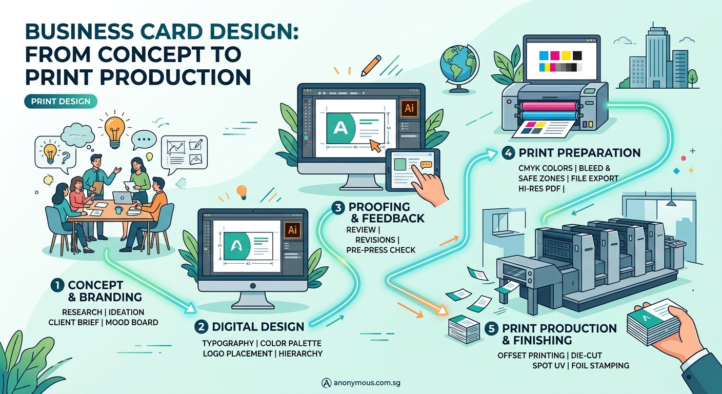
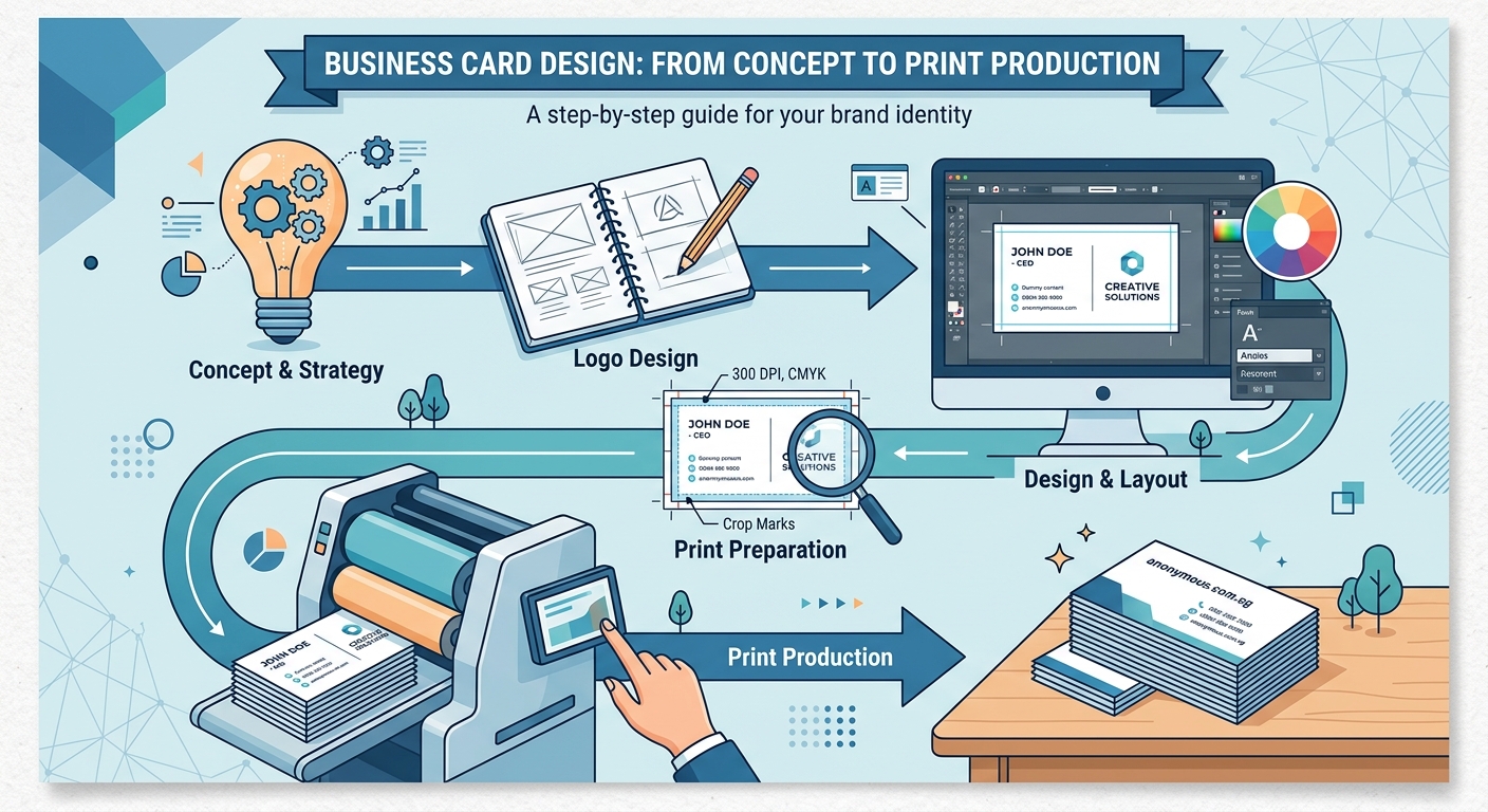
The business card design process involves five core stages: research and strategy, conceptual design, refinement and feedback, technical preparation, and [print production](https://www.iso.org/standard/36576.html). Understanding each phase helps you create cards that represent your brand accurately while avoiding costly printing mistakes. This workflow applies whether you’re designing for yourself or working with a designer, giving you control over quality and outcomes.
Understanding the complete workflow
The business card design process isn’t just about picking colors and fonts. It’s a structured approach that ensures your final product works in the real world.
Most failed business cards share a common problem: they skip critical steps. Someone jumps straight into Canva, picks a template, changes the name, and sends it to print. Then they wonder why the colors look wrong, the text is too small to read, or the printer rejects their files.
A proper workflow prevents these issues. It gives you checkpoints where you can catch problems before they become expensive mistakes.
The process breaks down into five distinct phases. Each one builds on the previous stage, creating a foundation for the next. Skip one, and you compromise the entire project.
Phase 1: Research and strategic planning
Before you touch any design software, you need clarity on what your card should accomplish.
Start by defining your audience. Are you handing cards to corporate executives at conferences? Creative professionals at gallery openings? Potential clients at networking events? The context shapes every design decision.
Next, audit your existing brand materials. If you already have a logo, website, or marketing collateral, your business card needs to match. Inconsistent branding confuses people and weakens recognition. Consider creating a brand style guide if you don’t have one yet.
List the essential information your card must include:
- Your name and title
- Company name (if applicable)
- Phone number
- Email address
- Website or portfolio URL
- Physical address (optional)
- Social media handles (selective)
Many people try to cram too much onto a business card. Every additional element competes for attention. Choose what matters most to your specific audience.
Research competitors and industry standards. Look at 20-30 business cards from your field. Notice patterns in layout, information hierarchy, and design style. You’re not copying, you’re understanding expectations so you can meet or exceed them strategically.
“A business card should answer three questions in under five seconds: who you are, what you do, and how to reach you. Anything else is decoration.” – Paula Scher
Phase 2: Conceptual design and layout
Now you start creating actual designs. This phase focuses on structure and hierarchy, not final polish.
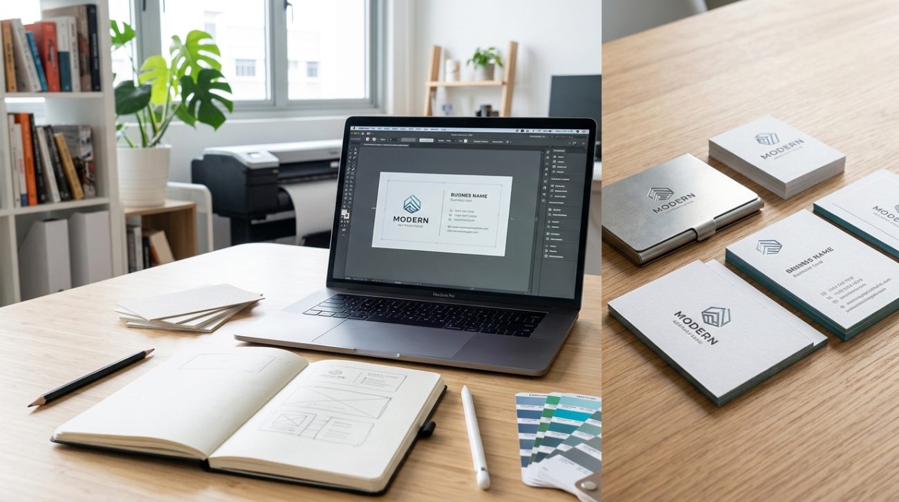
Begin with rough sketches. Use paper, a whiteboard, or basic digital rectangles. Work at actual size (3.5″ x 2″ for standard US cards, 90mm x 55mm for international). This keeps you realistic about how much space you actually have.
Create three to five different layout concepts. Each should explore a different approach:
- Traditional layout: Name top left, contact info bottom right, logo centered or top right
- Minimalist approach: Maximum white space, minimal information, single focal point
- Bold statement: Large typography or graphic element as primary feature
- Split design: Different front and back designs with distinct purposes
- Unconventional structure: Vertical orientation, asymmetric layout, or unexpected element placement
For each concept, establish visual hierarchy. What should someone notice first? Second? Third? Use size, weight, color, and position to guide the eye through information in the right order.
Typography choices matter enormously at this stage. Body text smaller than 8pt becomes difficult to read on a physical card. Stick to one or two font families maximum. Font pairing can make or break readability on small formats.
Color selection should align with your brand identity. If you don’t have established brand colors, choose colors that convert based on your industry and audience psychology.
Test your concepts by printing them on regular paper at actual size. Hold them in your hand. Show them to colleagues. Ask which one communicates most clearly.
Phase 3: Refinement and feedback collection
You’ve chosen your strongest concept. Now you refine it into a polished design.
Pay attention to alignment. Every element should relate to other elements through invisible grid lines. Misaligned text or graphics look sloppy, even if viewers can’t articulate why.
Adjust spacing carefully. Breathing room around text improves legibility. Cramped layouts feel desperate and cheap.
Check color contrast between background and text. Light gray text on white backgrounds might look elegant on screen but disappears when printed. Aim for sufficient contrast that ensures readability in various lighting conditions.
Gather feedback from three groups:
- People in your target audience
- Design-savvy colleagues or friends
- Someone completely outside your industry
Each group provides different insights. Your target audience tells you if the card resonates. Design-aware people catch technical issues. Outsiders reveal whether your message is clear to people unfamiliar with your field.
Ask specific questions:
- What’s the first thing you notice?
- Can you read all the text easily?
- What do you think this person does?
- Would you keep this card or throw it away?
- Does anything look off or unprofessional?
Avoid asking “Do you like it?” Preference is subjective and unhelpful. Focus on function and clarity.
Make revisions based on patterns in feedback. If one person mentions something, it might be personal taste. If three people mention the same issue, fix it.
Phase 4: Technical preparation for print
This is where many DIY business cards fail. Print production requires specific technical standards that differ from digital design.
Setting up your document correctly
| Specification | Requirement | Why It Matters |
|---|---|---|
| Color mode | CMYK, not RGB | RGB colors look different when printed |
| Resolution | 300 DPI minimum | Lower resolution produces blurry, pixelated results |
| Bleed | 0.125″ (3mm) on all sides | Ensures no white edges after cutting |
| Safe zone | 0.125″ (3mm) margin from edges | Prevents important elements from being trimmed |
| File format | PDF with embedded fonts | Ensures consistent reproduction |
Understanding bleed prevents one of the most common print disasters. Your design extends beyond the final card size, then gets trimmed. Without bleed, you risk white slivers along edges.
Convert all fonts to outlines or embed them in your PDF. This prevents font substitution if the printer doesn’t have your exact typeface.
Check that all images are high resolution. A logo that looks crisp on your website might be only 72 DPI. It will look terrible when printed. Source or recreate images at 300 DPI minimum.
Set up your print files properly to avoid rejection and delays. Most print shops provide templates with correct specifications. Use them.
Common technical mistakes to avoid
- Using spot colors without specifying Pantone numbers
- Forgetting to convert text to outlines
- Leaving important text or logos too close to trim edges
- Using effects that don’t translate to print (like screen blending modes)
- Saving files in wrong color space
Run through essential pre-flight checks before submitting files. Most design software includes preflight tools that catch technical errors automatically.
Phase 5: Print production and material selection
Choosing the right printing method and materials affects both cost and final quality.
Printing methods explained
Digital printing works best for small quantities (under 500 cards). It’s cost-effective, fast, and allows easy customization. Quality is excellent for most business applications.
Offset printing becomes economical at higher quantities (500+). It offers superior color accuracy and consistency. Setup costs are higher, but per-unit costs drop significantly at volume.
Letterpress creates tactile, debossed impressions. It’s expensive but memorable. Best for creative professionals where the card itself becomes a portfolio piece.
Paper stock decisions
Choosing the right paper stock dramatically impacts how your card feels and performs.
Standard options include:
- 14pt cardstock: Basic, economical, appropriate for most uses
- 16pt cardstock: Thicker, more substantial feel, slightly higher cost
- 18pt cardstock: Premium weight, conveys quality and permanence
- Textured or specialty stocks: Linen, felt, kraft, or metallic finishes add character
Coating choices affect durability and appearance:
- Matte finish: Sophisticated, easy to write on, shows fingerprints less
- Gloss finish: Vibrant colors, scratch-resistant, feels slick
- Uncoated: Natural texture, absorbs ink differently, best for letterpress
- Spot UV or soft-touch: Premium coatings that highlight specific elements
Request physical samples before committing to large print runs. Paper that looks good in a catalog might feel wrong in your hand.
Proofing before final production
Always order a proof before printing your full quantity. Digital proofs on screen don’t show you how colors actually print or how paper feels.
Physical proofs reveal:
- Actual printed colors (which differ from screen colors)
- Text legibility at final size
- How coating affects appearance
- Overall tactile quality
- Any technical issues that survived preflight
Review your proof in different lighting conditions. Fluorescent office lights, natural daylight, and warm indoor lighting all affect color perception.
If colors are off, work with your printer to adjust. They can often tweak CMYK values to get closer to your intended result.
Testing your cards in real situations
Print a small batch first. Use them at actual networking events or meetings before ordering 1,000 copies.
Watch how people interact with your card. Do they squint to read text? Do they immediately ask what you do? Do they pocket it or set it down?
These real-world observations reveal issues that focus groups miss. Maybe your clever minimalist design is too subtle. Maybe your bold colors make the card memorable but hard to read.
Adjust based on actual usage, then print your full quantity.
Making your business card design process repeatable
Document your workflow for future updates or reprints. Save all source files, fonts, and color specifications in one organized folder.
Create a simple checklist covering each phase:
- [ ] Research complete, audience defined
- [ ] Essential information finalized
- [ ] 3-5 concepts sketched
- [ ] Strongest concept selected
- [ ] Feedback collected and incorporated
- [ ] Technical specs verified (CMYK, 300 DPI, bleed, safe zone)
- [ ] Fonts converted to outlines
- [ ] PDF exported with correct settings
- [ ] Physical proof reviewed and approved
- [ ] Final print order placed
This checklist prevents skipped steps when you’re rushing to reorder or update information.
Understanding why prints look different from screens helps you set realistic expectations for future projects too.
From concept to confident handoff
The business card design process transforms a vague idea into a tangible marketing tool. Each phase builds on the previous one, catching problems early when they’re easy to fix rather than expensive to correct.
You don’t need to be a professional designer to create effective business cards. You just need to follow a structured process that accounts for both creative and technical requirements. Start with clear strategy, develop multiple concepts, refine based on feedback, prepare files correctly, and choose appropriate production methods.
Your business card represents you when you’re not in the room. Make it count by giving it the thoughtful attention the process deserves. The three seconds someone spends looking at your card can open doors or close them. A solid workflow ensures those seconds work in your favor.