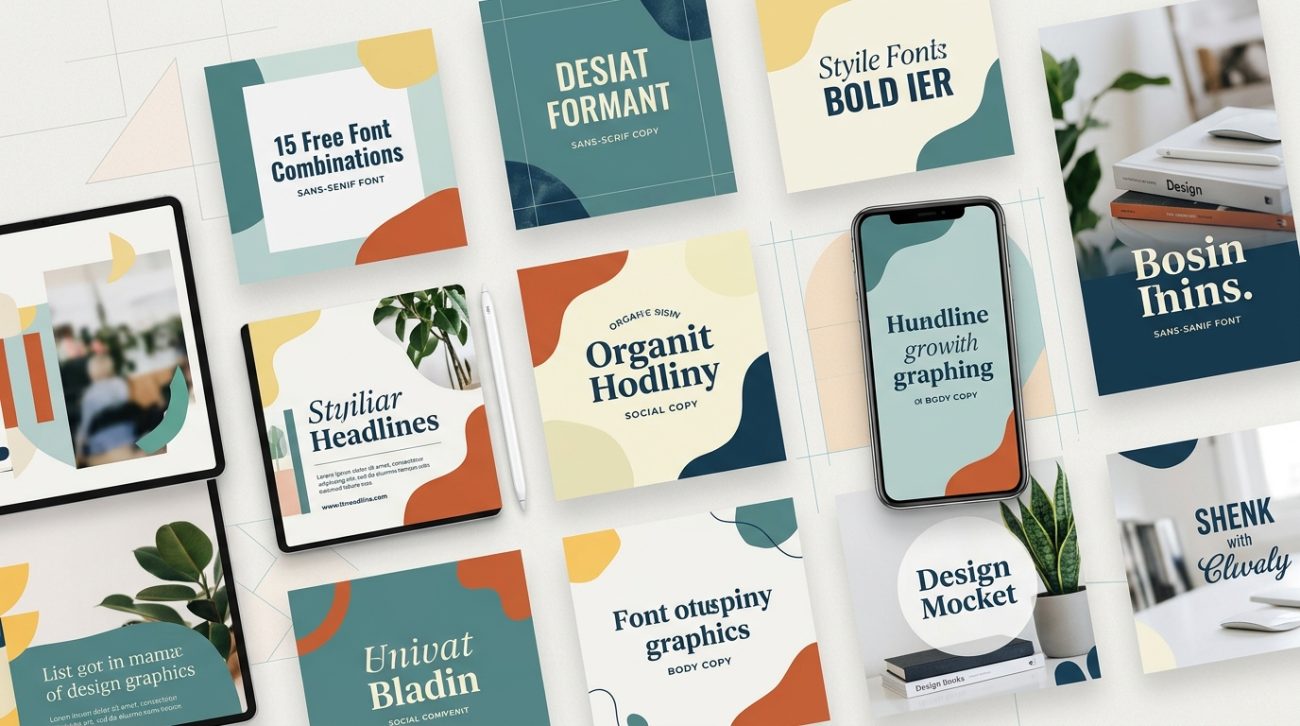
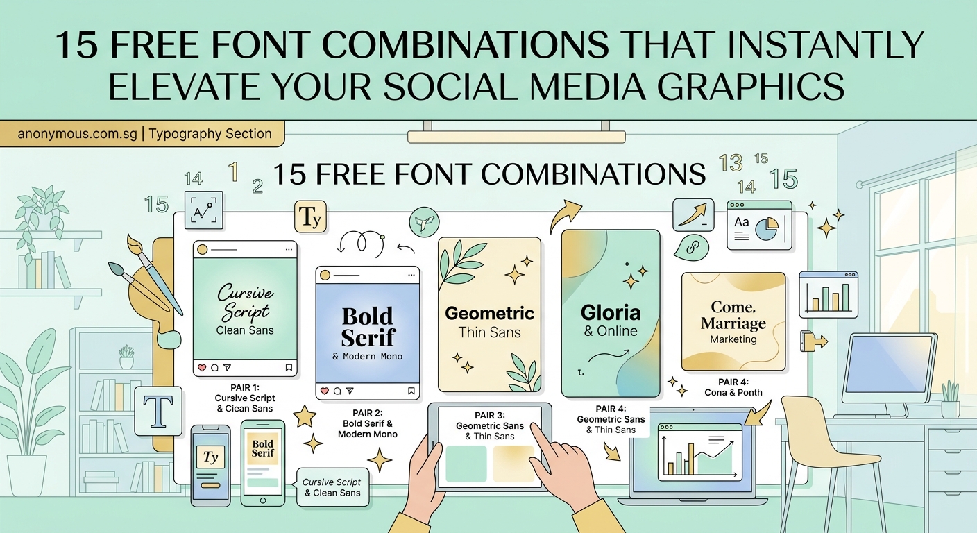
Choosing the right font combinations can feel overwhelming when you’re staring at hundreds of typefaces. You know your social media graphics need better typography, but pairing fonts that actually work together is harder than it looks. Most small business owners and social media managers end up using the same safe combinations over and over, or worse, mixing fonts that clash and make their brand look amateur.
Font combinations work best when you pair contrasting styles with complementary personalities. This guide teaches you the foundational rules for pairing fonts, shows you where to find free combinations that already work, and gives you a simple framework for testing your choices. You’ll learn to spot bad pairings before they damage your brand and build a small library of go-to combinations you can reuse across all your visual content.
Why most font pairings fail before you even start
Bad font combinations usually fail for one of three reasons.
First, the fonts are too similar. When you pair two sans-serif fonts that have nearly identical weights and proportions, they look like a mistake instead of an intentional choice. Your audience can’t tell if you meant to use two different fonts or if you accidentally mixed them up.
Second, the fonts fight for attention. Pairing two decorative display fonts creates visual chaos. Neither font gets to shine, and your message gets lost in the noise.
Third, the fonts have clashing personalities. A playful rounded font paired with a serious serif creates cognitive dissonance. Your brand message becomes unclear because the typography sends mixed signals.
Understanding these failure modes helps you avoid them from the start.
The three-rule system for pairing fonts successfully
Professional designers rely on a simple framework when combining fonts.
Rule 1: Create contrast through classification
Pair fonts from different categories. The most reliable combinations match a serif with a sans-serif, or pair a display font with a neutral sans-serif. This creates clear visual hierarchy and makes each font’s role obvious.
Rule 2: Match the mood and era
Both fonts should support the same emotional tone. A geometric sans-serif from the Bauhaus era pairs beautifully with a modern slab serif, but clashes with an ornate Victorian script. Think about the historical period and cultural associations each font carries.
Rule 3: Limit your palette
Stick to two or three fonts maximum. One font for headlines, one for body text, and optionally one accent font for special elements. More than three fonts makes your design look chaotic and unprofessional.
These rules work across every design project, from social media graphics to full brand systems.
How to test if your font pairing actually works
Before committing to a font combination, run these practical tests.
-
Set them side by side at different sizes. Type your headline in the display font and body text in your secondary font. Look at them together at actual usage sizes, not just at 72pt.
-
Check the x-height relationship. The x-height is the height of lowercase letters like “x” or “a”. Fonts with drastically different x-heights can look mismatched even if they’re from complementary categories.
-
Test with real content. Don’t just type “The quick brown fox.” Use actual headlines and paragraphs from your business. You’ll spot problems faster with realistic content.
-
View it on multiple devices. What looks great on your desktop monitor might fail on a phone screen. Test your combinations at mobile sizes before finalizing them.
-
Show it to someone outside your business. Fresh eyes catch problems you’ve become blind to. Ask them what mood the fonts convey and whether the text is easy to read.
If your pairing passes all five tests, you’ve found a winner.
Where to find pre-made font combinations that already work
You don’t have to start from scratch. These resources offer tested combinations you can use immediately.
Google Fonts provides a “Popular Pairings” section for each font. When you select any typeface, scroll down to see which fonts other designers commonly pair with it. These combinations have been battle-tested across millions of websites.
FontJoy uses machine learning to generate font pairings. Adjust the contrast slider to control how different the fonts look from each other. Lock any font you like and generate new options for the others.
Fontpair showcases Google Font combinations with live examples. Each pairing includes a preview showing headlines, subheadings, and body text together. You can copy the font names directly into your design tool.
Typ.io displays font combinations from real websites. Browse by style, browse by font, or search for specific use cases. Seeing fonts in context helps you understand how they’ll work for your brand.
Canva offers font pairing suggestions built into their template system. When you change a headline font, Canva recommends complementary options for body text. This works even in their free plan.
Learning how to pair fonts effectively matters for every visual touchpoint, which is why building a brand style guide that actually gets used should document your chosen combinations.
Common font combination mistakes and how to fix them
| Mistake | Why It Fails | The Fix |
|---|---|---|
| Using two condensed fonts | Creates a cramped, uncomfortable reading experience | Pair one condensed font with a regular-width font |
| Mixing too many font weights | Looks indecisive and cluttered | Stick to 2-3 weights from the same family |
| Pairing fonts with similar personalities | No contrast means no hierarchy | Choose fonts with opposing characteristics |
| Using decorative fonts for body text | Reduces readability dramatically | Reserve decorative fonts for headlines only |
| Ignoring line spacing | Even good fonts look bad with poor spacing | Adjust leading to match your font pairing |
These mistakes show up constantly in DIY designs. Fixing them instantly makes your graphics look more professional.
Building your personal font combination library
Smart designers don’t reinvent the wheel for every project. They build a small library of reliable combinations they can reuse and adapt.
Start by choosing three to five font pairings that match your brand personality. Test each combination across different use cases: social media posts, website headers, printed materials, presentations.
Document each pairing with notes about where it works best. Maybe one combination is perfect for Instagram quotes but too casual for client proposals. Another might work beautifully in print but fail at small screen sizes.
Save examples of each pairing in a design file or folder. Include samples at different sizes, with different text lengths, and in various layouts. This reference library saves time and ensures consistency across all your content.
Understanding what is font hierarchy and why does it matter for readability helps you apply your chosen combinations more effectively.
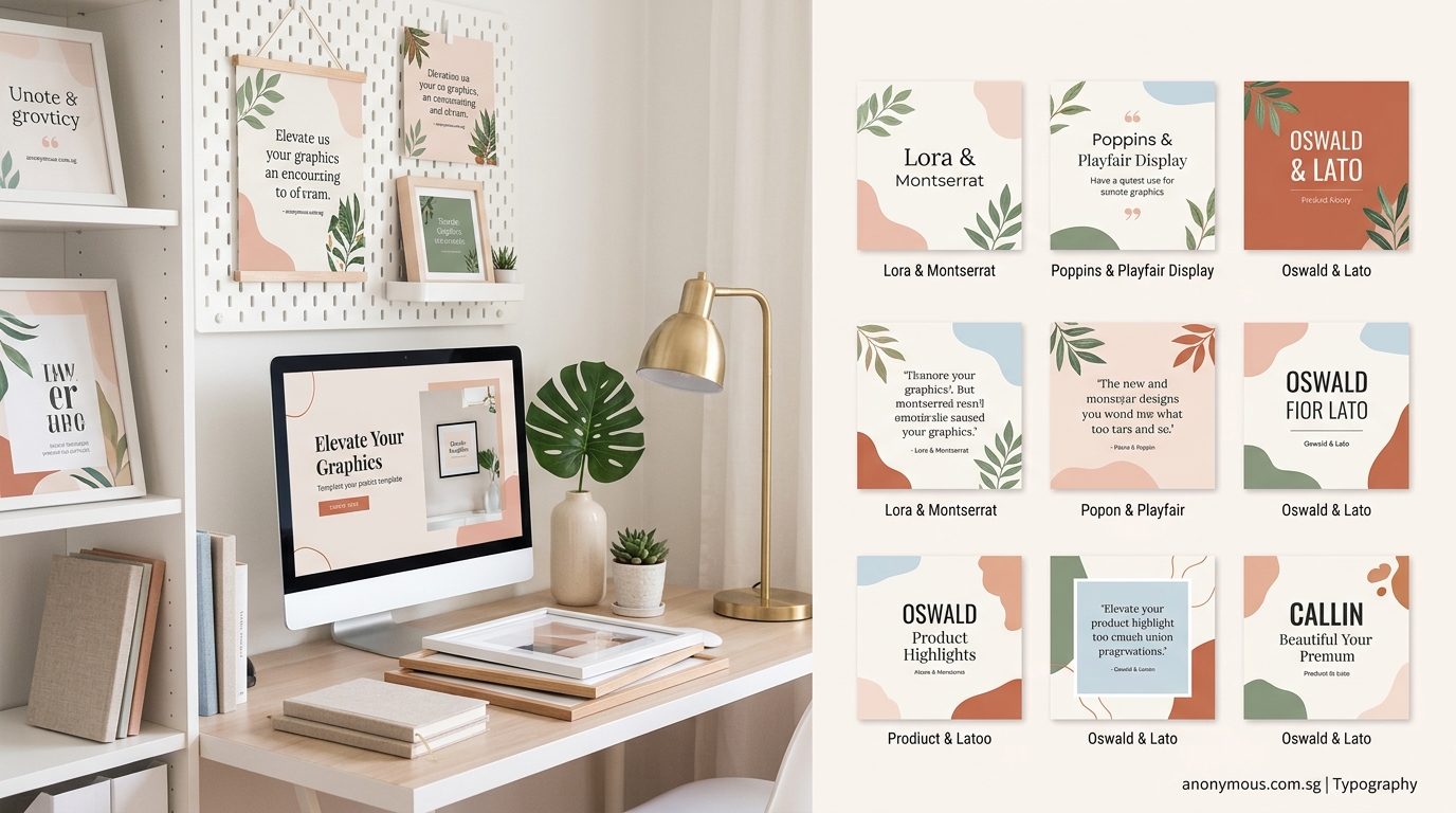
Free font combinations worth bookmarking right now
These specific pairings work across most business contexts and are completely free to use.
Montserrat + Merriweather creates a modern, approachable feel. The geometric sans-serif headlines pair beautifully with the friendly serif body text. Perfect for coaching businesses and creative agencies.
Raleway + Lato offers clean sophistication. Both fonts are highly readable at small sizes, making this combination ideal for websites and long-form content.
Playfair Display + Source Sans Pro balances elegance with accessibility. The high-contrast serif headlines make a statement while the neutral sans-serif keeps body text readable.
Oswald + Lora provides strong contrast. The condensed sans-serif creates bold headlines while the serif body text remains warm and inviting. Great for editorial designs and blog graphics.
Poppins + Open Sans delivers friendly professionalism. Both fonts are geometric but different enough to create clear hierarchy. Works well for tech companies and modern brands.
If you’re working specifically on logo projects, how to choose the perfect font pairing for your logo design offers targeted advice for that specific use case.
How to adapt font combinations for different platforms
Your font pairings need to work across multiple contexts. Here’s how to adapt them.
For social media graphics, prioritize impact over subtlety. Use higher contrast between your headline and body fonts. Instagram posts need fonts that remain readable when viewed on a phone screen in bright sunlight.
For websites, optimize for screen reading. Choose fonts with generous x-heights and open counters (the enclosed spaces in letters like “e” and “o”). Test your combinations at 16px for body text and ensure they remain crisp on retina displays.
For print materials, consider how ink spreads on paper. Thin font weights can disappear on uncoated paper stock. If you’re printing business cards or brochures, test your combinations with your actual printer before committing to a large run.
For presentations, ensure readability from a distance. Fonts that work perfectly in a document might fail when projected on a screen. Your audience in the back row should be able to read every word comfortably.
For email newsletters, stick to web-safe combinations. Many email clients have limited font support. Choose combinations that degrade gracefully to fallback fonts.
The ultimate guide to pairing Google fonts like a pro goes deeper into platform-specific considerations.
When to break the font pairing rules
Rules exist to guide you, not restrict you. Sometimes breaking them creates exactly the effect you need.
Use multiple fonts from the same family when you need subtle variation without introducing new typefaces. A font family with many weights and styles (regular, italic, bold, condensed) can create sufficient contrast on its own.
Pair two sans-serifs when you want a modern, minimalist aesthetic. Choose fonts with distinctly different proportions or weights. A geometric sans-serif headline with a humanist sans-serif body creates contrast through structure rather than classification.
Use a single font for everything when working with a highly distinctive typeface. Some fonts are so well-designed they include enough internal variety for complete projects. This approach works particularly well for minimalist brands.
Combine three or more fonts in complex layouts like magazines or annual reports. Additional fonts help differentiate sections and create visual interest across many pages. Just ensure each font has a specific, consistent role.
The key is breaking rules intentionally, not accidentally. Know why you’re deviating from standard practice.
Maintaining consistency across your brand touchpoints
Font combinations only work when you use them consistently. Inconsistent typography makes your brand look disorganized and unprofessional.
Create simple usage guidelines for your chosen combinations. Specify which font to use for headlines, subheadings, body text, captions, and call-to-action buttons. Include size recommendations and spacing rules.
Share these guidelines with everyone who creates content for your brand. Your team, contractors, and vendors all need access to the same information. Consistency breaks down when people guess instead of following documented standards.
Set up templates in your design tools with your font combinations already applied. Pre-made templates with proper typography prevent mistakes and speed up content creation.
Audit your existing materials periodically. Look for places where your font usage has drifted from your guidelines. Update old content to match your current standards.
Many businesses find that common branding mistakes that make your business look unprofessional often stem from inconsistent typography choices.
Making font combinations work in real business scenarios
Theory matters less than practical application. Here’s how to use font combinations in actual business situations.
Social media graphics: Use your display font for the main message and your body font for supporting details or calls to action. Keep text minimal so your fonts remain readable at thumbnail sizes. Consider how 10 free font pairings that make your social graphics look expensive can elevate your content.
Website headers: Your headline font should dominate the hero section. Use your body font for navigation menus and descriptive text. Maintain consistent sizing across all pages so visitors develop familiarity with your typography.
Email signatures: Stick to your body font for email signatures. Display fonts rarely render correctly across all email clients. Simple, readable typography works better for this use case.
Business cards: Use your display font for your name and your body font for contact details. This creates natural hierarchy and makes the most important information stand out.
Presentations: Apply your display font to slide titles and your body font to bullet points. Avoid using more than two font sizes on any single slide. Too much variation creates visual confusion.
“The best font combinations are invisible. Your audience should absorb your message without consciously noticing the typography. When fonts work well together, they support your content instead of competing with it.”
Typography tools that simplify font pairing decisions
The right tools make font pairing faster and more reliable.
WhatFont (browser extension) identifies fonts on any website. See a combination you like? WhatFont tells you exactly which fonts the designer used. This tool helps you learn from real-world examples.
Adobe Fonts offers filtered browsing by classification, properties, and language support. The preview tool shows multiple fonts simultaneously, making it easier to compare options side by side.
Font Squirrel provides a matcherator tool that identifies fonts from images. Upload a screenshot of a design you admire and find similar free alternatives.
Figma includes built-in font pairing suggestions. When you select text, Figma recommends complementary fonts based on your current choice. This feature works across their free and paid plans.
Fonts In Use showcases typography in real design projects. Browse by typeface, designer, format, or industry. Seeing fonts in context teaches you how professionals combine them.
These tools reduce guesswork and help you make confident typography decisions faster.
Typography decisions that support accessibility
Good font combinations should be readable for everyone, including people with visual impairments.
Choose fonts with clear letterforms and generous spacing. Avoid condensed fonts for body text. Letters that are too narrow or tightly spaced create reading difficulties for people with dyslexia and other reading challenges.
Ensure sufficient contrast between your text and background. Light gray text on white backgrounds might look sophisticated but fails accessibility standards. Aim for a contrast ratio of at least 4.5:1 for body text.
Avoid using font combinations where the two typefaces are too similar. Clear distinction between headline and body fonts helps screen reader users understand content hierarchy.
Test your combinations at larger sizes. People with low vision often increase text size in their browsers. Your font pairings should remain readable and well-proportioned when scaled up to 200% or more.
Consider how typography mistakes that make your designs look unprofessional often overlap with accessibility issues.
Your font pairing action plan
Start building better font combinations today with these concrete steps.
-
Audit your current typography. List every font you’re currently using across all your materials. Look for inconsistencies and places where fonts clash.
-
Choose one reliable pairing. Pick a single combination that matches your brand personality. Test it across three different use cases before committing.
-
Create a reference document. Show your chosen fonts at different sizes with sample headlines and body text. Include notes about where to use each font.
-
Update your most visible materials first. Start with your website homepage and most popular social media templates. Consistency matters more than perfecting everything at once.
-
Build slowly. Add one or two more combinations only after you’ve successfully implemented your first pairing. A small library of well-tested combinations beats a large collection of untested options.
The goal is not to become a typography expert overnight. You just need a few reliable combinations that work for your specific business needs.
Making typography decisions that stick
Font combinations shape how people perceive your brand. The right pairings make your content look polished and professional. The wrong ones make even great ideas look amateurish.
Start with the three-rule system: create contrast through classification, match the mood, and limit your palette. Test every combination with real content at real sizes. Build a small library of pairings you can reuse confidently.
Remember that perfect typography doesn’t require expensive fonts or years of design training. Free fonts paired thoughtfully beat premium fonts used carelessly. The combinations that work best are the ones you’ll actually use consistently across all your content.
Your audience might not consciously notice good typography, but they’ll definitely feel its effects. Clear hierarchy guides their attention. Readable body text keeps them engaged. Consistent font usage builds brand recognition. These small details compound into a professional presence that sets you apart from competitors still using random font combinations.
Pick one pairing today. Test it on your next social media post or email newsletter. Notice how much clearer your message becomes when your typography supports it instead of fighting it.