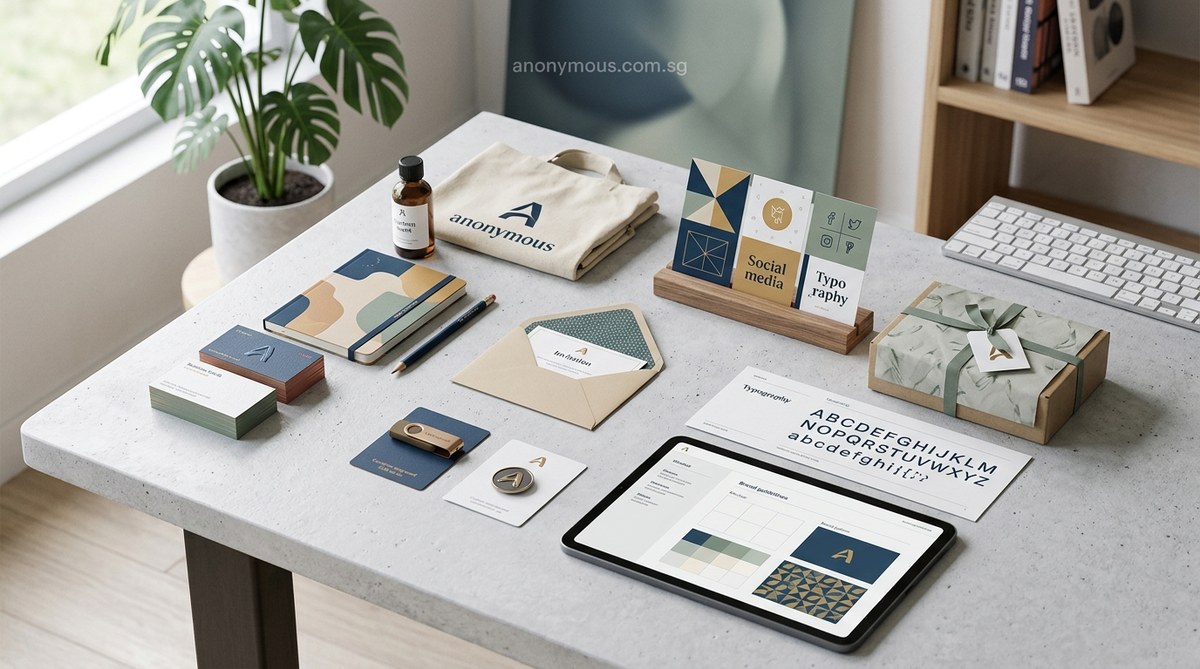
Most brand audits start and end with the logo. You check the colors, make sure the font is consistent, and call it a day. But a real brand identity is a living system. It includes everything from the way your email signature looks to the sound your app makes when a user completes a task. If you are only looking at the big pieces, you are leaving money on the table. Let’s fix that.
A strong brand identity goes far beyond a logo and a color palette. In 2026, marketing managers and brand strategists must audit overlooked elements like micro-copy tone, iconography systems, audio branding, and digital asset formats. This guide walks through ten hidden components that make or break brand recognition. Use the included checklist to close gaps in your visual system today.
The Hidden Gaps in Your Visual System
Think of your brand identity like a house. The logo is the front door. Your color palette is the paint. But what about the doorknobs? The light switches? The way the floorboards creak? Those small details create the total experience.
Most teams pour energy into the hero assets and forget the supporting cast. That is where inconsistency creeps in. A customer sees a polished website, then opens a PDF invoice that uses a different font. Trust erodes. It happens slowly, but it happens.
Let’s walk through the specific brand identity elements you might be missing.
1. Micro-Copy and Tone of Voice Guidelines
Your brand voice does not live in a vacuum. It shows up in every button label, error message, and confirmation email. Many style guides define the “big picture” tone but skip the micro-copy layer.
What to check in your brand identity elements:
- Do your error messages sound like your brand or like a robot?
- Are your button labels consistent? (e.g., “Get Started” vs. “Sign Up” vs. “Join Now”)
- Do your 404 pages reflect your personality?
A good rule of thumb is to write out the ten most common user interactions and audit the language. If your brand is playful, your “something went wrong” message should match. If your brand is professional, keep it clean and direct.
“Micro-copy is where brand personality meets usability. Most teams write it last, but it should be designed first.” – Kinneret Yifrah, author of Microcopy: The Complete Guide
2. Secondary and Tertiary Color Palettes
Your primary brand colors get all the love. But what about the colors you use for data visualizations, hover states, and backgrounds? A full brand identity needs a hierarchy of colors.
A practical color system includes:
- Primary palette (2-3 colors)
- Secondary palette (2-3 supporting colors)
- Neutral palette (grays, off-whites, blacks)
- Accent palette (for alerts, links, and highlights)
- Data visualization palette (for charts and graphs)
Without this, your team will invent colors on the fly. That is how you end up with five different blues across your marketing materials.
3. Iconography and Illustration Style
Icons are silent ambassadors. They guide users, communicate features, and reinforce your visual language. But many brands treat icons as an afterthought.
Common icon mistakes:
- Mixing line icons from one set with filled icons from another
- Using inconsistent stroke weights
- Ignoring corner radius consistency
Your icon set should feel like it belongs to the same family. If you use rounded corners on your logo, your icons should match. If your brand uses bold outlines, your icons should follow suit.
For a deeper look at visual systems, read our guide on what makes a brand memorable. It covers the psychology behind consistent visual cues.
4. Audio and Motion Identity
Brand identity is not just visual anymore. In 2026, audio branding matters more than ever. Think about the sound your app makes, the music in your video ads, and the voice of your automated phone system.
Elements of an audio identity:
- A brand jingle or sonic logo (3-5 seconds)
- Notification sounds that match your brand personality
- Background music tempo guidelines for video content
- Voice talent specifications (age, accent, energy level)
Motion design also needs rules. How fast do your transitions happen? What easing curve do you use? Do your animations feel bouncy or smooth? Documenting these details prevents a disjointed user experience.
5. Spacing and Layout Grid Systems
Your brand identity should include a defined grid system. This goes beyond “make sure things are aligned.” It means setting specific margins, gutter widths, and column structures for every medium.
Why this matters:
- A consistent grid makes layouts feel professional
- It reduces decision fatigue for your design team
- It ensures your Instagram posts match your website layout
Without a grid, every new piece of content becomes a guessing game. Your brand starts to look different on every platform.
| Element | What Most Brands Do | What Strong Brands Do |
|---|---|---|
| Logo | One file, used everywhere | Multiple versions (horizontal, stacked, icon-only) |
| Colors | 3-5 hex codes | Full palette with use cases and accessibility ratios |
| Typography | 2 fonts | Font family with weights, sizes, and line-height specs |
| Spacing | “Keep it clean” | Defined 8px grid with margin and padding rules |
| Imagery | “Use photos” | Photo style guide with lighting, composition, and editing specs |
6. Photography and Image Treatment Guidelines
Stock photos are fine. But if every image on your site looks like a different brand, you have a problem. Your photography style is a core brand identity element.
Define these rules:
- Lighting: High-key or low-key? Natural or studio?
- Color grading: Warm tones or cool tones? Desaturated or vibrant?
- Composition: Centered subjects or off-center? Negative space rules?
- Subject matter: People or products? Smiling or serious?
Document these rules so anyone on your team can select or create images that fit your brand.
7. File Naming Conventions and Asset Organization
This one sounds boring. But it is a massive source of friction. When your team cannot find the right logo file, they grab whatever is handy. That leads to wrong formats, wrong colors, and wrong sizes.
A simple naming convention:
[brand]_[asset-type]_[color-variant]_[size].[extension]
Example: acme_logo_primary_horizontal_300px.png
This small change saves hours of searching and prevents embarrassing mistakes.
For more on keeping your assets organized, check out how to maintain brand consistency across multiple platforms.
8. Digital and Print File Format Specifications
Your brand guidelines should tell people exactly which file format to use for each situation. Do not assume people know the difference between PNG and SVG.
Format cheat sheet for your brand identity elements:
- Web graphics: SVG for logos, PNG for photos, WebP for performance
- Print: CMYK PDF with bleeds and crop marks
- Social media: PNG at recommended platform dimensions
- Presentations: PNG with transparent backgrounds for logos
Include a table like this in your brand guide. It eliminates guesswork.
9. Branded Templates and Component Libraries
Every time someone builds a presentation from scratch, they risk breaking your brand. The fix is simple: create templates for everything.
Templates to build for your brand identity:
- Slide decks (Google Slides and PowerPoint)
- Email signatures
- Social media posts (Instagram, LinkedIn, Facebook)
- Business cards and letterhead
- Invoice and proposal documents
- Internal memos and reports
A strong template library makes it easy for your team to stay on brand without design skills.
10. Accessibility Standards and Inclusive Design Rules
Accessibility is not optional. It is a core part of your brand identity. If your colors fail contrast checks or your fonts are too small, you are excluding a significant portion of your audience.
Accessibility elements to document:
- Minimum contrast ratios for text and backgrounds (WCAG AA or AAA)
- Minimum font sizes for body text (16px is a good baseline)
- Alt text guidelines for images
- Focus state styles for interactive elements
- Language and reading level guidelines
Inclusive design shows that your brand cares about all users. That builds trust and loyalty.
A Simple Process to Audit Your Brand Identity Elements
You do not need to overhaul everything at once. Use this step-by-step process to find and fix gaps.
- Collect everything. Gather every piece of branded material you have. Websites, emails, PDFs, social profiles, packaging, signage.
- Map the gaps. Compare each piece against your brand guidelines. Note where things drift.
- Prioritize fixes. Focus on high-visibility touchpoints first. Your website and email are usually the biggest offenders.
- Document the rules. Add the missing elements to your style guide. Be specific.
- Build templates. Create ready-to-use files for the most common scenarios.
- Train your team. Share the updated guide and explain why each element matters.
If you want a structured approach, try our brand audit checklist. It walks through each element with scoring criteria.
Common Mistakes That Undermine Your Brand Identity
Even experienced teams make these errors. Watch out for them.
- Using too many fonts. Stick to two or three. More than that creates visual noise.
- Ignoring white space. Crowded layouts feel cheap. Give your content room to breathe.
- Forgetting about dark mode. Your colors should work on light and dark backgrounds.
- Skipping the favicon. That tiny icon in the browser tab is a brand touchpoint.
- Mismatched photo styles. Mixing warm lifestyle photos with cold product shots looks disjointed.
For a full list of pitfalls, read about 5 common branding mistakes that make your business look unprofessional.
Bringing Your Brand Identity Elements Together
A complete brand identity is not about having more things. It is about having the right things, documented clearly, and used consistently. Start with the elements that impact your customers the most. Fix the micro-copy. Define your icon style. Build those templates.
Your brand is a promise. Every element you overlook is a broken promise waiting to happen. Audit your system today. Find the gaps. Fill them. Your audience will notice the difference, even if they cannot name it.
Take one element from this list and work on it this week. Just one. That small step will make your brand stronger than it was yesterday.
