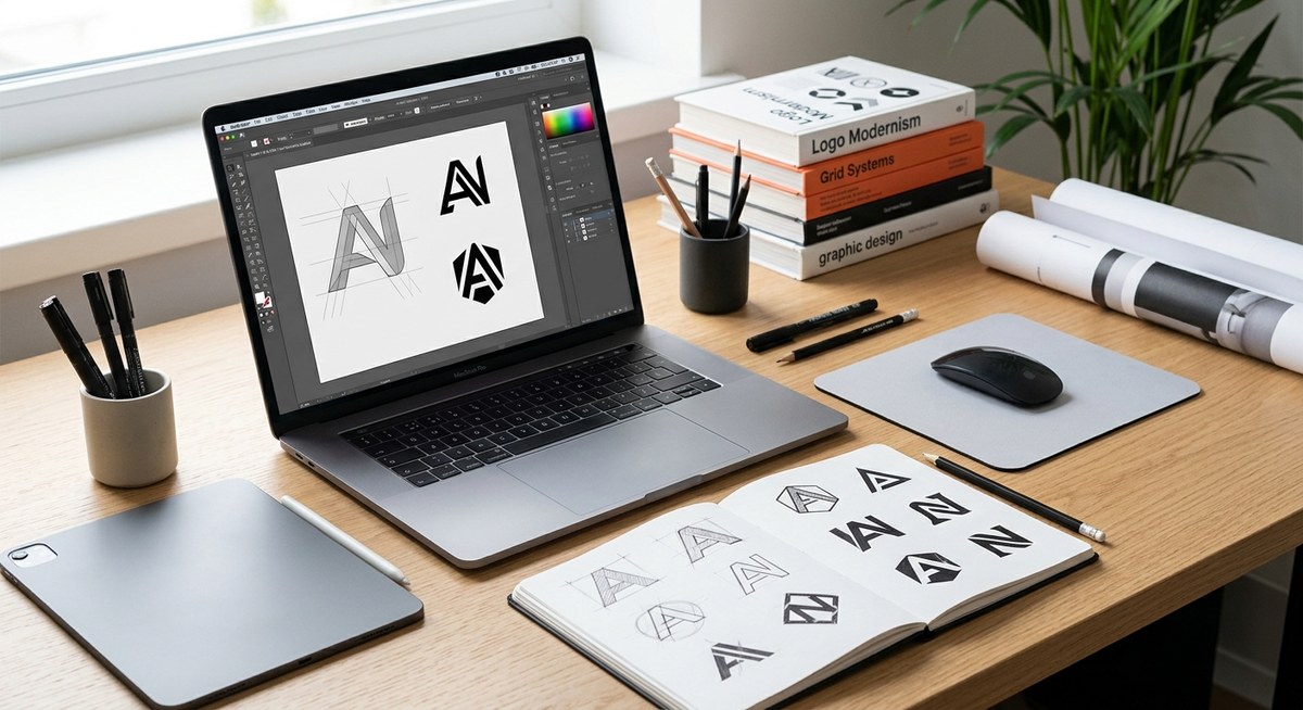
You sit down to design a new logo for your brand. You pick a gorgeous blue, a warm orange, and a clean white background. It looks perfect on screen. Then you print it on a one-color flyer, or a customer sees it in a newspaper ad, and your beautiful mark turns into a muddy gray blob. That is why starting with a black and white logo design is not a restriction. It is a superpower.
Designing in black and white first forces you to focus on shape, contrast, and silhouette. A logo that works without color will always be more versatile, more memorable, and more professional. This guide walks you through a practical process to test your concept, avoid common mistakes, and create a mark that shines on a business card, a billboard, or a favicon.
Why Black and White Comes First
Color is emotional. It grabs attention. But it can also hide weak shapes. When you strip away every hue, your logo has to stand on its own two feet. A strong silhouette, clear spacing, and a distinct outline become non-negotiable.
Think about the brands you see every day. The Nike swoosh. The Apple apple. The Target bullseye. Each one is instantly recognizable in pure black on white. That recognition is not an accident. These logos were built to work in monochrome long before anyone added a color palette.
If your logo only works in full color, you are limiting your brand. Your mark will appear on receipts, shipping labels, fax covers, newspaper ads, and embroidered patches. Many of those applications use one or two colors at most. A black and white logo design ensures you never lose your identity in those moments.
The Practical Process: 3 Steps to a Monochrome-Ready Logo
Here is a simple process you can follow today. Grab a pencil, a piece of paper, or open your design software. Work through these three steps in order.
-
Start with a single black shape. Do not think about color at all. Sketch your icon or wordmark using only solid black on a white background. Focus on the outline. Is it simple enough to draw from memory? Does it have a unique silhouette? If it looks good as a solid black stamp, you are on the right track.
-
Test the negative space. Look at the white areas inside and around your shape. Are they clear? Do they accidentally form another shape? A classic example is the FedEx logo, where the negative space between the E and the x creates an arrow. That trick only works because the designer thought about the white space first.
-
Scale it down to 16 pixels. Resize your black and white logo to the size of a favicon. Can you still tell what it is? If the shape turns into a blurry dot, simplify it. Remove thin lines, small gaps, and tiny details. A logo that reads at 16 pixels will read at any size.
Common Mistakes That Kill Black and White Logos
Even experienced designers make these errors. Here is a table of the most common problems and how to fix them.
| Mistake | Why It Fails | The Fix |
|---|---|---|
| Thin lines and hairline strokes | They disappear when scaled down or printed on rough paper. | Use strokes at least 2 points thick. Better yet, use solid shapes. |
| Low contrast between elements | A light gray on white looks invisible in monochrome. | Use only pure black (or a very dark value) against white. |
| Relying on gradients or shadows | Gradients turn into flat gray bands without color. | Design flat shapes first. Add effects only after the black and white version is solid. |
| Too many small details | They create visual noise and make the logo hard to remember. | Reduce the number of elements. Aim for one strong focal point. |
| Using color to separate overlapping shapes | Two shapes that touch may merge into one blob in black and white. | Add a thin white gap (called a knockout) between overlapping shapes. |
A Checklist for Your Monochrome Test
Before you finalize any logo, run through this bulleted list. It will catch most issues before they reach a printer.
- Print the logo in black ink on plain white paper.
- View it from across the room.
- Look at it on a phone screen at the smallest size.
- Show it to someone who has never seen it before and ask them to describe what they see.
- Invert the colors: put a white version on a black background.
- Make a one-color version using only your brand’s darkest color (like a dark navy instead of black).
- Place it next to five other black and white logos. Does yours stand out or blend in?
“A logo is not a painting. It is a sign. A sign must be readable in a split second, in rain, on a moving vehicle, or on a crumpled receipt. If it fails in black and white, it fails everywhere.” — A principle every print designer learns early.
How to Handle Logos With Color
You do not have to abandon color forever. The goal is to make sure your logo works without it. Here is how to build a color system that respects your black and white foundation.
First, design your primary logo in solid black. That is your master version. Then create a single-color version using your brand’s strongest accent color. Finally, build a full-color version that uses your entire palette.
The key rule is this: the color version should never change the shape or silhouette of the black and white version. Color should enhance the structure, not define it. If you remove all the color and the logo falls apart, you need to go back to the drawing board.
This approach also makes life easier when you need to create variations. You can generate a white version for dark backgrounds, a small version for social media avatars, and a horizontal version for website headers, all from the same black and white foundation.
When Color Is Not an Option
Consider all the places your logo will appear without color. These are real scenarios for any small business or freelancer.
- A black and white newspaper ad.
- A fax cover sheet.
- A receipt or invoice.
- A watermark on a document.
- A stamp on a cardboard box.
- An embroidered logo on a uniform (often one thread color).
- A photocopy of your business card.
- A monochrome screen on a receipt printer.
Each of these touchpoints is a chance to build recognition. But only if your logo is legible without color.
A Simple Template for Testing Contrast
You do not need fancy tools to test your black and white logo design. Here is a template you can recreate in any design app.
Create four squares on one artboard. In the first square, place your logo in black on white. In the second, place it in white on black. In the third, use a mid-tone gray background (around 50% gray) with your logo in black. In the fourth, use the same gray background with your logo in white.
If the logo is hard to read in any of these four scenarios, you have a contrast problem. Adjust the thickness of your shapes or the spacing between elements until all four versions are clear.
Building a Brand System That Lasts
A black and white logo is the foundation of a larger brand system. Once you have a mark that works in monochrome, you can build everything else around it. Your color palette, typography, and imagery all support that core shape.
For a deeper look at how to organize all those pieces, check out our guide on how to build a brand style guide that actually gets used. It will help you document your black and white logo rules so your team or clients never misuse them.
You may also want to review the 7 logo design mistakes that make your brand look unprofessional. Many of those mistakes are rooted in ignoring the monochrome test.
And if you are still deciding between a minimalist or detailed approach, read should your logo be minimalist or detailed? A decision framework. The answer often comes down to how well the design works in black and white.
Your Next Step
Take the logo you are working on right now. Convert it to grayscale. Print it. Look at it. If it does not make you smile, start over with a single black shape. Keep it simple. Keep it bold. Keep it readable.
That black and white logo design will serve you for years, across every medium, without ever losing its power. Color is a bonus. Shape is the real foundation. Build that first, and everything else will fall into place.
