Brands often think that choosing a unique font makes their identity stand out. But is that always true? Do custom fonts hurt brand recognition? The answer depends on how you select and implement fonts in your branding system. When done right, custom fonts can strengthen your brand’s personality. When misused or poorly designed, they can create confusion or dilute your message. Let’s unpack the truth about fonts and brand perception.
Why fonts influence how people see your brand
Fonts are more than just style; they communicate personality and emotion. A playful typeface instantly feels friendly, while a serif font might look more authoritative. These impressions are made before a single word is read.
If your font doesn’t align with your brand’s core values, it can create inconsistency. This inconsistency makes your brand less recognizable and trustworthy. That’s why choosing the right typeface is crucial. It’s not about vanity but about shaping perception.
Common myths about custom fonts and brand recognition
Many believe that custom fonts are a vanity project or unnecessary cost. Some think that using a popular font like Helvetica or Times New Roman is safer because it’s familiar. But these assumptions overlook the power of typography.
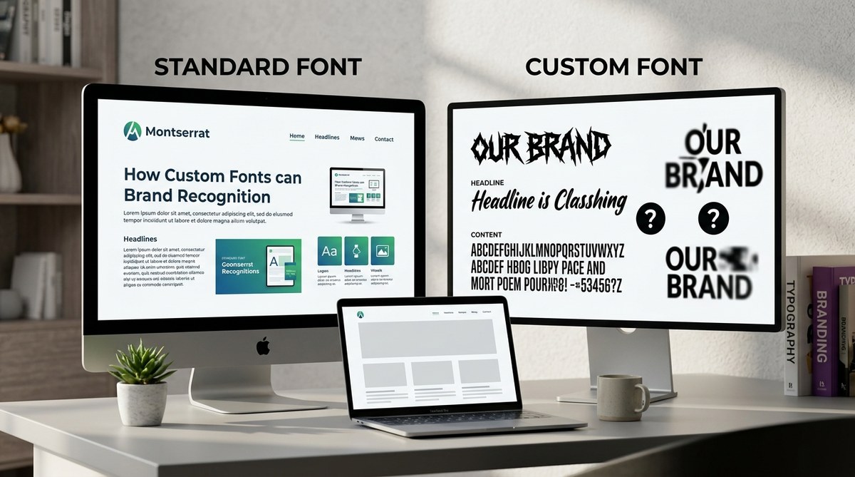
In fact, a well-crafted custom font can become a signature element. It can give your brand an ownable look that’s instantly recognizable across all touchpoints. Conversely, a poorly designed or overly complex font can confuse your audience or even hurt readability.
“The right font choice is an extension of your brand voice. It should amplify your message, not distract or confuse,” advises branding expert Sarah Lee.
When custom fonts may hurt your brand
Custom fonts can hurt recognition if they are:
- Too complicated or hard to read at small sizes.
- Inconsistent across different media or platforms.
- Too similar to competitors’ fonts, causing confusion.
- Poorly designed, with inconsistent letterforms or spacing.
These issues reduce clarity and make your brand less memorable. It’s important to balance uniqueness with usability.
How to use custom fonts without risking recognition
Using custom fonts effectively involves a strategic process:
-
Define your brand personality: Know whether your brand is playful, sophisticated, authoritative, or innovative. Your font should reflect this personality.
-
Prioritize readability: Ensure your font is legible at different sizes and on various screens or print materials. Test it across contexts.
-
Maintain consistency: Use your custom font across all touchpoints. Create a style guide that details font weights, sizes, and spacing.
-
Pair with complementary typefaces: Combine your custom font with simpler fonts for body text or secondary elements. This prevents overload and improves clarity.
-
Avoid over-customization: Don’t make your font so unique that it sacrifices readability. A custom font should serve your message, not hinder it.
-
Test with your audience: Gather feedback on how your font is perceived. Adjust if it causes confusion or misalignment with your brand.
Practical process for integrating custom fonts
Here’s a step-by-step guide to ensure your font choice supports your brand:
-
Research existing fonts that align with your personality. Use tools like Google Fonts or Adobe Fonts for inspiration.
-
Create a mood board to visualize how fonts complement your brand assets.
-
Design or commission a custom font with a professional type designer if you want something truly ownable.
-
Test your font in real-world scenarios—website headers, social media posts, packaging, etc.
-
Develop a style guide that specifies font usage, sizes, line heights, and spacing rules.
-
Implement gradually across all channels, monitoring recognition and readability.
Mistakes to avoid with custom fonts
| Techniques to aim for | Common mistakes to avoid |
|---|---|
| Use a font that matches your brand personality | Choosing fonts based solely on trends without considering your brand voice |
| Ensure font legibility at all sizes | Using overly decorative fonts for body text |
| Maintain consistency across platforms | Mixing too many fonts, causing confusion |
| Pair with simple, clean fonts for balance | Overly complex custom fonts that hinder readability |
| Test your font with real users | Launching without feedback, risking misinterpretation |
How custom fonts can strengthen your brand system
When selected carefully, a custom font acts as a visual signature. It ties together your logo, packaging, website, and marketing materials into a cohesive system. This consistency boosts recognition and trust.
However, it is vital to remember that font choice is just one part of your overall brand identity. Combining typography with color, imagery, and tone creates a memorable experience.
“Your font is a personality trait for your brand. Use it wisely to build connections, not confusion,” notes designer Alex Kim.
Final thoughts on do custom fonts hurt brand recognition
The real question isn’t whether custom fonts can hurt your recognition but how you choose and apply them. When you invest in a well-designed, aligned font, it can become a powerful asset. It amplifies your personality and makes your brand memorable.
Avoid common pitfalls by focusing on clarity, consistency, and audience testing. Think of your font as a voice—clear, authentic, and aligned with what your brand stands for.
Your next step in crafting a strong visual identity
Take the time to analyze your brand’s personality and select fonts that support it. Collaborate with professional designers if needed, and always test your choices in real-world conditions. With thoughtful application, your custom fonts will enhance recognition and deepen the connection with your audience.
Your brand’s visual language is a vital part of storytelling. Use it to communicate who you are with confidence and clarity.