The default is rarely the best. Arial ships with every operating system, every browser, and every word processor on the planet. It is the path of least resistance. But for designers and developers who care about craft, that is precisely the problem. Arial signals that no decision was made. It suggests you took the first option handed to you. In a world where brand perception matters more than ever, your typography should never be an afterthought. Let’s talk about why Arial is holding your work back and exactly which fonts you should use instead.
Arial ships with everything, which is exactly why it says nothing. It is the visual equivalent of a plain white t-shirt: safe, but forgettable. Modern alternatives like Inter and Satoshi offer better readability, distinct personality, and technical sophistication. Swapping Arial for a purpose-driven typeface is the fastest way to elevate your brand’s visual credibility. Do it today.
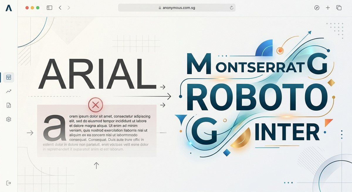
Why Arial Fails Modern Design Standards
Arial was not designed for the way we read today. It was created in 1982 as a cheaper alternative to Helvetica for IBM printers. Microsoft bundled it with Windows in the early 90s, and it became a default. That historical accident does not make it good.
It lacks visual balance. Compare a lowercase “a” in Arial to a font like Inter. Arial’s letterforms feel crude and uneven. The spacing between characters (kerning) is inconsistent, which forces you to manually adjust type in a way modern fonts handle automatically.
It communicates laziness. This is harsh but true. When a client or user sees Arial, they subconsciously register that the creator did not try. It screams default. In design, every element speaks. Arial says “I did not care enough to choose.”
It fails on modern screens. Arial was made for 72 DPI laser printers. Today we have retina displays, variable refresh rates, and dark mode. Fonts optimized for screen use (like Inter or Figtree) are built with higher x-heights and clearer counters. They simply look better on the devices your audience uses.
The 2026 Alternatives to Arial
You have incredible options. Many are free, open source, or available through Google Fonts. They load fast, support multiple languages, and come in variable formats. Here are the fonts you should use instead of Arial, broken down by use case.
The Shortlist
| Use Case | Arial Alternative | Why This Swap Works |
|---|---|---|
| Website body copy | Inter | Inter was designed specifically for computer screens. It offers excellent readability at small sizes, whereas Arial was adapted from print. |
| Brand headlines | Satoshi | Satoshi has a distinct geometric character that builds a modern identity instantly. Arial looks generic next to it. |
| Data dashboards | Manrope | Manrope saves space without sacrificing legibility. Its geometric shapes work better in dense UI layouts than Arial. |
| Social media graphics | Figtree | Figtree is warm and friendly. It makes text feel approachable and boosts engagement compared to Arial’s neutral tone. |
| Editorial and print | Cabinet Grotesk | Its condensed grotesque style creates elegant, space saving headlines with high visual impact on the page. |
Personality Matters
Each of these fonts brings something Arial does not: a voice.
- Inter feels technical and neutral. It is the perfect choice for SaaS products and professional services.
- Satoshi blends geometric precision with a touch of warmth. It works for fashion, tech, and creative agencies.
- Figtree is approachable and human. Use it for blogs, lifestyle brands, and educational content.
- Manrope is efficient and modern. It shines in financial tools, newsletters, and data heavy applications.
- Cabinet Grotesk is bold and editorial. It commands attention in headlines and hero sections.
How to Make the Transition Smooth
Swapping a font across an entire brand sounds daunting. It is not. Follow this simple process over a weekend.
-
Audit all brand touchpoints. Where does Arial currently live? Check your website CSS, email signatures, pitch decks, social media templates, and internal documents. Make a complete list.
-
Select one primary font and one secondary font. Pick a workhorse for body text (Inter or Figtree) and an expressive font for headlines (Satoshi or Cabinet Grotesk). Keep it simple. Two fonts are all you need to start.
-
Update your design system. Write a new font stack in your CSS. Import the font via Google Fonts or a CDN. Set clear rules in your brand guide for when to use each weight and style. Test the new stack across Chrome, Safari, and Firefox on mobile and desktop.
-
Replace static assets. Update your social media templates, email headers, and PDF documents. This is the most time consuming step, but it is a one time task. Once it is done, it is done forever.
-
Communicate the change. Let your team or clients know about the update. Explain why it matters. Typography changes are subtle, but they build trust over time.
“Typography is the voice of your design. If you speak in Arial, you sound like everyone else. Spend the 15 minutes it takes to swap it out. Readers notice.” – Typography Lead, Anonymous Design
Pairing Your New Fonts With Confidence
Once you drop Arial, you need a plan for hierarchy. A modern sans serif like Inter pairs beautifully with a serif like EB Garamond for long form reading. For a fully modern look, stick with a single family like Satoshi and use its multiple weights to create contrast.
Avoid using too many fonts. Stick to one or two families. That cleaner approach is what separates amateur work from pro work. If you need a deeper framework, read our guide on mastering font pairing for stunning visual hierarchy.
Common Mistakes to Avoid During the Swap
- Forgetting fallbacks. Always include a generic
sans-serifin your font stack. If your font fails to load, the browser will fall back gracefully. - Ignoring licensing. Most fonts on this list are open source, but double check. Commercial projects still require proper attribution or licensing for some typefaces.
- Using a heavy weight for body text. A light or regular weight is easier to read in paragraphs. Reserve bold weights for headlines and emphasis.
- Neglecting line height. Modern fonts like Inter need enough breathing room. Set your line height to at least 1.5 for body text. This improves readability significantly.
For a deeper look at what can go wrong, check out this resource on 7 typography mistakes that make your designs look unprofessional.
Your Brand Deserves Better Than Defaults
Arial was never a choice. It was a default. Defaults are for software installers, not for brand identities. You work hard on your designs, your copy, and your user experience. Do not let the font be the weak link.
The alternatives exist. They are free, they are beautiful, and they are ready to use today. Whether you choose Inter for its engineering precision, Satoshi for its character, or Figtree for its warmth, you are making a conscious decision to stand out.
Take one afternoon this week. Make the swap. Update your CSS. Change your templates. Your audience will not say anything, but they will feel the difference. And that feeling is trust.
Go make your text something people want to read.