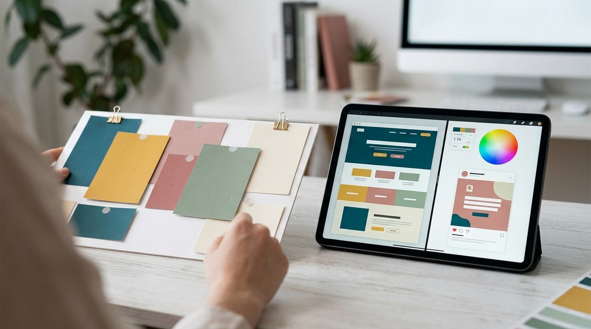
Getting your color palette just right can feel like walking a tightrope. You want your colors to look beautiful, work well together, and be accessible for everyone. But how do you know if your choices actually hit the mark before you lock them in? Testing your color palette effectiveness is a vital step in the design process. It saves you from costly revisions later and ensures your visual message is clear, inclusive, and impactful.
Validating your color palette through testing ensures visual harmony, accessibility, and emotional impact. Use contrast checks, user feedback, and real-world applications to confirm effectiveness before finalizing your design. This approach minimizes revisions and enhances user experience.
Why testing your color palette is a game-changer
Choosing colors for a project is more than just picking shades that look good together. It’s about ensuring your colors communicate the right message and are usable by everyone. A poorly tested palette can lead to issues like poor readability, accessibility violations, or a brand that feels off-balance. Testing helps you see how your palette performs under real conditions and from different perspectives.
Practical steps to evaluate your color choices
-
Assess contrast and readability
One of the first things to verify is that your text and background colors contrast sufficiently. Tools like WebAIM’s contrast checker can help. Aim for a contrast ratio of at least 4.5 to 7 for body text and higher for headings or important elements. Remember, accessibility standards are not just a legal requirement but also a way to ensure everyone can engage with your content comfortably. -
Gather user feedback
Conduct informal usability tests or surveys with real users. Show your palette in context, such as on a website mockup or app screen. Ask questions like how the colors make them feel, if they find anything hard to read, or if the palette fits the brand’s personality. Feedback from your target audience reveals how your palette resonates on a practical level. -
Apply your palette in real-world scenarios
Test your colors across different elements—buttons, backgrounds, typography, icons—inside your design or prototype. Check how they perform in various lighting conditions and on different screens. If possible, print your design to see how colors translate into print. The goal is to simulate actual use and observe how your palette holds up. -
Use accessibility tools and techniques
Tools like Color Oracle simulate how your design appears to users with color vision deficiencies. This helps you identify problematic color combinations. Additionally, consider testing with grayscale modes to verify if your design still communicates effectively without color cues. -
Perform contrast and usability tests systematically
Create a checklist or a table to evaluate each color pairing. For example:
| Technique | What to look for | Common mistake |
|---|---|---|
| Contrast check | Sufficient contrast for readability | Using pastel text on light backgrounds |
| User testing | Emotional and functional response | Overly vibrant colors that cause visual fatigue |
| Accessibility tools | Color blindness simulation | Relying solely on color to convey information |
“Remember, your palette should serve your users, not just your aesthetic preferences. Testing ensures your colors work for all, not just for the designer’s eye.”
Common pitfalls and how to avoid them
- Ignoring contrast standards: Low contrast can make content unreadable. Always verify with contrast analyzers.
- Overusing bright or saturated colors: They can cause visual fatigue or make important elements hard to see. Use them strategically.
- Relying only on visual appeal: Always test accessibility and usability. Colors should be functional as well as attractive.
- Not testing in context: A palette that looks good in isolation might clash with other design elements. Always apply your colors in situ.
Techniques and mistakes at a glance
| Technique | What to do | Common mistake |
|---|---|---|
| Contrast testing | Use tools like Color Contrast Checker | Ignoring contrast ratios for text readability |
| Real-world application | Apply colors to prototypes or mockups | Testing only on screens with controlled lighting |
| User feedback | Gather opinions from actual users | Relying solely on personal judgment or client approval |
| Accessibility simulation | Use tools like Color Oracle | Overlooking color vision deficiencies |
Final tips for a confident color palette
- Test early and often. Don’t wait until the final stages to check your colors.
- Combine multiple methods for a thorough evaluation. Contrast checks, user feedback, and real-world testing complement each other.
- Keep an open mind. Be ready to tweak your palette based on test results.
- Document your findings. Record which combinations work well and which don’t. This helps in future projects.
Bringing clarity to your color choices
Taking the time to test your color palette before finalizing ensures your design communicates effectively and inclusively. It minimizes costly revisions, boosts user confidence, and strengthens your brand’s visual impact. Remember, colors are powerful tools—use them wisely and verify their effectiveness through real-world testing. Use contrast checkers, gather feedback, and apply your palette in context. Your future self will thank you for the effort.
Apply these steps with confidence. When you approach your next project, treat color testing as an essential part of your workflow. It’s an investment in quality that pays off by creating designs that look good, read well, and reach everyone.