Designing with color is an exciting part of creating eye-catching visuals. However, piling on too many colors can backfire, making your work look chaotic rather than captivating. When you understand the effects of mixing too many colors in design, you can make smarter choices that enhance harmony and clarity instead of confusion. This guide will walk you through what happens when color overload occurs and how to strike the right balance in your projects.
Using too many colors in your design can create visual chaos, reduce clarity, and harm overall harmony. Learning to balance colors helps your message stand out and keeps viewers engaged.
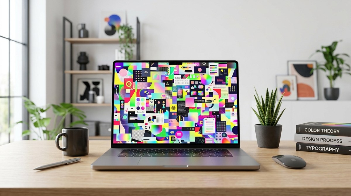
Why so many colors can harm your design
When you add excessive colors to a design, it often results in a cluttered, overwhelming look. Instead of guiding the viewer’s eye smoothly across the layout, too many hues compete for attention. This can cause confusion and make it hard for the audience to focus on the main message.
Color overload can also lead to a phenomenon called “visual mud.” Just like mixing too many paint colors creates a dull, brownish mess, overusing colors in digital or print design can muddy the overall aesthetic. It diminishes contrast, making important elements less distinguishable and reducing readability.
Another key issue is that an overabundance of colors can break your visual hierarchy. When everything is colorful, nothing stands out. This dilutes the impact of focal points and hampers the viewer’s ability to prioritize information. As a result, your design loses its purpose and clarity.
Effects of mixing too many colors in design
1. Reduced visual harmony
A harmonious design feels balanced and pleasant to look at. When you overload your palette with colors, it disrupts this balance. The eye struggles to find a resting point, and the overall aesthetic becomes discordant.
2. Increased cognitive load
Too many colors demand more mental effort from viewers. They have to decipher which elements are important and which are just decorative. This extra effort can make your message less effective, especially if the viewer becomes overwhelmed or distracted.
3. Diminished brand consistency
In branding, consistency is key. Using a limited palette helps reinforce your identity. If you throw in random colors, it can dilute your brand’s recognition and create confusion about your visual language.
4. Lack of focus and clarity
Colors should direct attention to critical parts of your design. When every element is brightly colored or contrasting, it’s hard to tell what really matters. This lack of focus can cause viewers to miss your main message.
5. Risk of making “muddy” visuals
Just as mixing too many paint colors results in a dull, unappealing hue, excessive digital colors can make your design look dirty or unprofessional. This is especially true in print where color accuracy matters.
6. Longer design process and revisions
Fighting against a chaotic palette often leads to more revisions. You may spend extra time trying to tame the visual chaos, which delays your project timeline.
Practical tips to avoid color overload
To keep your design visually appealing and effective, follow these strategies:
1. Stick to a limited palette
Choose a core set of colors—usually three to five—that reflect your brand or theme. Use shades and tints of these colors to add variety without chaos.
2. Use the 60-30-10 rule
This classic rule suggests allocating 60% of your design to a dominant color, 30% to secondary hues, and 10% to accent colors. It creates balance and guides viewers naturally.
3. Prioritize contrast
Make sure your main elements stand out by contrasting them against backgrounds. Use a small set of contrasting colors rather than a multitude of competing hues.
4. Limit the number of accent colors
Use accent colors sparingly to highlight important information or calls to action. Too many accents dilute their effectiveness.
5. Use color psychology
Select colors that evoke the right emotions and reinforce your message. Avoid random color choices that don’t align with your brand or purpose.
6. Test your palette
Use online tools like color palette generators or contrast checkers to ensure your colors work well together and are accessible.
Common mistakes when mixing too many colors
| Mistake | Explanation | How to fix it |
|---|---|---|
| Overusing bright hues | Bright colors draw attention but can overwhelm if used excessively | Use bold colors for accents only |
| Ignoring contrast | Low contrast makes elements hard to distinguish | Adjust shades and tints for better separation |
| Random color choices | Picking colors without a cohesive plan | Develop a color palette based on your brand or theme |
| Cluttering with multiple hues | Too many colors competing for attention | Limit your palette and stick to it |
| Not considering accessibility | Colors that clash or are hard to see for some users | Check contrast ratios and use accessible combinations |
“A well-balanced color scheme guides the viewer’s eye and enhances readability. Less is often more when it comes to colors in design.” — Color expert Jane Doe
How to maintain harmony while using multiple colors
While limiting your palette is often safest, sometimes you need more colors to convey complex ideas. Here are ways to do it without chaos:
- Use analogous colors, which are next to each other on the color wheel, for a harmonious look.
- Apply the 60-30-10 rule to distribute colors evenly.
- Reserve bold hues for key elements, keeping the rest subdued.
- Incorporate neutral shades like white, gray, or black to balance brighter colors.
- Consider the color context and background to ensure readability.
Final thoughts on balancing colors
Balancing color in your design is both an art and a science. Recognize the effects of mixing too many colors and learn to use a strategic palette. Focus on clarity, contrast, and harmony to create visuals that communicate effectively. Remember, your goal is to guide viewers effortlessly through your message, not to distract or confuse them.
Practice applying these principles in your next project. Experiment with limited palettes, test contrasts, and always step back to evaluate your work. With a thoughtful approach, your designs will be more impactful and visually pleasing.
Keep your colors in check for powerful designs
Mastering the effects of mixing too many colors in design helps you craft visuals that are clear, balanced, and engaging. Use the tips and techniques shared here to refine your color choices. Your audience will thank you for delivering messages that are easy to understand and pleasing to look at. Happy designing!