Thinking about how to make your designs stand out? Choosing the right fonts and pairing them effectively can transform a simple layout into a visual masterpiece. Good font pairing isn’t just about mixing pretty typefaces; it’s about creating harmony, contrast, and clarity. Whether you’re designing a website, a poster, or branding materials, understanding font pairing guides can help you communicate your message with impact.
A well-executed font pairing guide helps you combine fonts that complement each other, establish clear visual hierarchy, and enhance readability. Focus on contrast, consistency, and purpose when selecting fonts for your projects to achieve professional, eye-catching results.
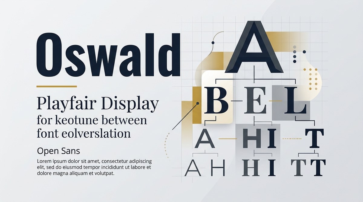
Why good font pairing makes a difference
Typography is a fundamental part of design that influences how viewers perceive your message. When fonts work together harmoniously, they guide the reader smoothly through the content and reinforce your brand story. Poor pairings can cause confusion, reduce readability, or even look amateurish. A thoughtful font pairing guide provides you with principles to make confident choices, whether you’re working on a logo, a website, or printed materials.
How to choose effective font pairings in three steps
-
Identify your design’s purpose and personality
Before selecting fonts, ask what the design needs to communicate. Is it formal or casual? Playful or serious? For example, a luxury brand might favor elegant serif fonts paired with clean sans-serifs for a refined look, while a children’s educational site might lean towards fun, rounded typefaces. -
Establish contrast and harmony
Contrast helps create visual interest. Pair a bold display font with a simple body text font. Use size, weight, style, or classification differences to your advantage. For instance, combining a script font with a straightforward sans serif can produce a lively yet balanced look. -
Test and refine your pairings
Once you have a couple of options, test them in real context. Check their legibility at different sizes and ensure they work well across various media. Adjust weights or spacing if needed. Remember, what looks good on screen might need tweaking for print or mobile.
Practical tips for successful font pairing
- Limit your number of fonts. Stick to two or three at most. Too many fonts dilute your message and create visual noise.
- Use classification contrast. Mix serif with sans serif, or decorative with neutral. This contrast helps establish hierarchy and focus.
- Maintain consistency. Use the same font pairs across your project to reinforce your branding and avoid visual chaos.
- Check x-heights. Pair fonts with similar x-heights for better visual alignment. Mismatched x-heights can make your text look uneven.
- Consider font weights. Use different weights to differentiate headings from body text. This adds depth without cluttering.
Techniques and common pitfalls in font pairing
| Technique | Description | Mistake to Avoid |
|---|---|---|
| Contrast pairing | Combine fonts with different styles or classifications | Using fonts that look too similar, causing confusion |
| Hierarchical emphasis | Use size and weight variations to create visual order | Overusing multiple font styles, leading to clutter |
| Complementary pairing | Match fonts with similar mood or personality | Mixing fonts that clash in tone, breaking harmony |
An expert once said, “The secret to successful font pairing is understanding the role each typeface plays. Contrast and cohesion must work together to craft a unified message.”
Inspiration for pairing fonts in various projects
- Brand logos: Pair a strong serif with a sleek sans serif to communicate stability and modernity.
- Web layouts: Use a readable serif for headings and a neutral sans serif for body copy for clarity.
- Print materials: Combine decorative fonts sparingly with simple fonts to add personality without sacrificing legibility.
Common mistakes that weaken your design
| Mistake | Why it hurts | How to fix it |
|---|---|---|
| Using too many fonts | Causes visual chaos | Limit to two or three fonts for consistency |
| Ignoring contrast | Reduces readability | Pair contrasting styles intentionally |
| Overstyling text | Distracts from content | Use font weights and sizes instead of excessive decoration |
Fine-tuning your font pairing guide
To help you make informed decisions, here are some popular pairings and their purposes:
- Serif + sans serif: Classic combination for professional and approachable designs.
- Decorative + neutral: Add personality while maintaining clarity.
- Bold + light: Establish hierarchy and focus on key information.
Remember, always test your fonts in real-world scenarios. What looks good on a monitor may not work as well on paper or mobile screens. Adjust spacing, size, and weight to optimize readability.
Final words on creating your own font pairing system
Designing a harmonious typography setup takes practice and patience. Use your font pairing guide as a starting point, but stay flexible. Your project’s context, audience, and message should guide your choices. With consistent application, your layouts will look more professional, inviting, and visually balanced.
Start experimenting today. Play with different font combinations, compare their effects, and refine your approach. Over time, your eye for effective pairing will sharpen, making every project look more polished and intentional.
Keep your typography strategies fresh and functional
Typography is a powerful tool in your design toolkit. Incorporate a font pairing guide into your process to ensure every piece you craft communicates clearly and looks compelling. Remember, the best font pairings are those that serve your content and resonate with your audience. Keep testing, learning, and refining your approach. Your layouts will thank you for it.