Foil stamping looks magical when it lands right. A perfectly placed gold logo on a business card. Raised silver lettering on a wedding invite. But we all know the feeling when a beautiful file comes back from the printer and the foil is misaligned, patchy, or just flat. That wasted time costs money. It damages trust with clients. The good news? Most of those problems start in the design file, not on the press. You can fix them before you hit send.
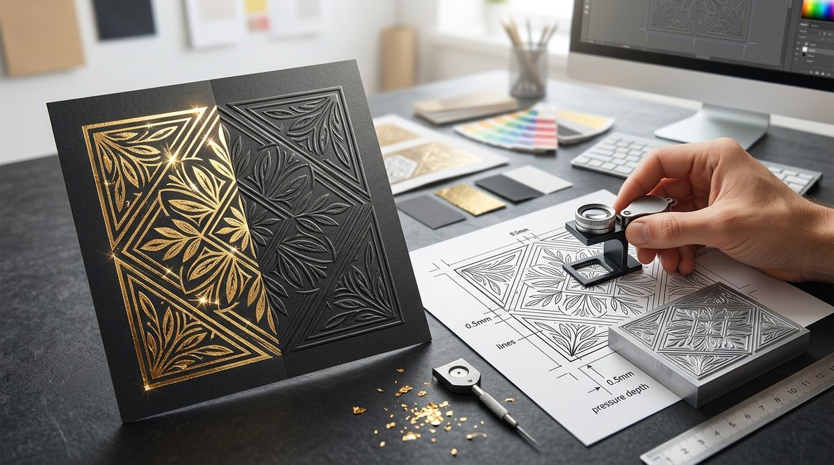
Successful foil stamping design relies on precise file preparation. Use a dedicated spot color layer, set strokes to 100% intensity, and add a 0.5pt trap to prevent misregistration. For embossing, create a separate die line with no stroke and a solid fill. Always convert fonts to outlines and confirm the minimum stroke width (0.5pt) with your printer. These steps eliminate guesswork and guarantee print-ready results.
What Exactly Is Foil Stamping Design Today?
Foil stamping is a specialty print process that uses heat, pressure, and a metal die to apply a metallic or pigmented foil to a surface. It is different from digital foil, which uses toner or inkjet adhesive. Traditional foil stamping gives you real metal on paper. That depth and reflectivity cannot be fully replicated.
Designers today use foil stamping design to elevate packaging, business cards, book covers, and marketing collateral. It signals premium quality. But the process is mechanical. There is no room for fuzzy files or gradient washes.
“The biggest mistake I see in file prep is using a 30% tint of gold instead of a 100% spot color. Foil has no tint. It is either all there or it isn’t.” * Senior Print Technician, Anonymous
Foil requires binary thinking. Each foil application is a single solid layer. You cannot feather it. You cannot soften it. That constraint is actually a creative advantage once you understand how to set up your file.
Setting Up Your File for Foil Success
These are the actionable steps you need to take in your vector software (Adobe Illustrator, InDesign, or Affinity Designer). Follow them exactly.
Step 1: Start with a Dedicated Foil Layer
Create a new layer and name it clearly. Something like FOIL_STAMP or GOLD_FOIL. Lock all other layers. Only put the elements on this layer that will receive the foil treatment.
This keeps your base artwork clean. It also helps the prepress team quickly identify what needs the die. If they have to guess, your file gets delayed.
Step 2: Use Spot Colors, Not Process Colors
Foil is not CMYK. You cannot build a metallic gold using yellow and magenta. You must assign a spot color swatch.
In Illustrator, open your Swatches panel. Create a New Swatch. Set the Color Type to Spot Color. Name it something specific like “FOIL_GOLD.” Set the Color Mode to CMYK and fill the fields with any values you want. But that does not matter. The printer will ignore those CMYK values and run the actual foil.
Do not use build-in metallic gradients. They will not separate correctly. Use a solid spot color fill at 100%.
Step 3: Convert Text and Strokes to Outlines
Foil stamping needs exact alignment. Any missing fonts on the press operator’s system will cause the file to fail. Before you export, select all text on your foil layer and create outlines.
The same rule applies to strokes. In your Stroke panel, set the weight. The minimum is usually 0.5pt. Check with your printer. Anything thinner can break during the stamping process.
Step 4: Set the Right Trap (Choke or Spread)
This is the most technical step. Trapping compensates for press misregistration. When the paper shifts slightly, you can get a tiny sliver of unprinted paper between the foil and the ink.
To prevent this, you have two options:
1. Choke (Spread Inward): The foil area shrinks slightly so it sits inside the inked area.
2. Spread (Outward): The foil area expands slightly so it overlaps the inked area.
The standard trap value is 0.5pt. In Adobe Illustrator, use the Offset Path effect. Apply a negative value (-0.5pt) for a choke, or a positive value (+0.5pt) for a spread. Always ask your printer which direction they prefer.
Step 5: Communicate with Your Printer
Before you finalize anything, email your printer and ask for their specifications. Every shop has different tolerances. Some can hold 0.25pt lines. Others need 1pt minimum. Some prefer a choke. Others prefer a spread.
This saves you from remaking plates.
Embossing vs. Debossing: Designing for Depth
Foil stamping is often combined with embossing or debossing. You need a separate die line for the depth layer.
| Technique | Vector Setup | Line Art Rules | Common Mistake |
|---|---|---|---|
| Foil Stamping | Spot color swatch, 100% fill. No stroke. | Minimum 0.5pt stroke width. | Using metallic CMYK gradients. |
| Embossing (Raised) | Solid fill die line on a separate layer. No stroke. | Minimum 1pt gap between elements. | Hairline strokes that disappear. |
| Debossing (Recessed) | Same as embossing, inverted. | Ensure the type is wide enough. | Text smaller than 6pt. |
| Blind Emboss | No ink. Just a solid die line. | Must rely on paper depth. | Forgetting to label the die layer. |
For embossing, do not put a stroke on your vector. A stroke will create an unintended edge. Use a solid fill. The printer will use the edge of that fill to create the bevel of the emboss.
Common Foil Stamping Design Mistakes to Avoid
These errors cause reprints and unhappy clients. Cross them off your list.
- Forgetting the Trap. Misregistration looks cheap. A 0.5pt trap prevents the halo effect around your text.
- Using Hairline Strokes. They vanish under pressure. Standard offset presses struggle with anything under 0.5pt. Go thicker.
- Ignoring the Substrate. Coated stock holds sharp details. Uncoated or textured paper blurs fine lines. Adjust your design accordingly.
- Sending Hidden Fonts. Always outline your fonts. No exceptions. If you forget, the printer might substitute a default font that ruins your layout.
- Using the Wrong Color Space. RGB or CMYK metallic builds will not separate correctly. You must use a spot color.
Practical Design Considerations for Different Substrates
The paper or material you choose changes the rules of your foil stamping design.
Dark Paper: You need opaque foil. Metallic foils like silver, gold, or copper block out the dark substrate. Pigment foils are also available. Do not try to use a transparent overlay foil on black paper. It will disappear.
Light or Uncoated Paper: You have more options. Transparent foils look beautiful on white or cream stock. They let the paper grain show through. But uncoated paper absorbs more of the adhesive. This means fine serifs can look fuzzy. Use a bolder, wider typeface.
Plastic or Synthetic Substrates: Not all foils adhere to plastic. You need a specialty bonding foil. Check with your printer about surface tension requirements. You may need to widen your trap values for synthetic materials.
Textured Paper: The paper texture will interrupt the foil surface. Linen or felt finishes create a subtle, uneven sheen. This can be beautiful, but it reduces sharpness. Avoid fine details on textured paper.
Making Your Foil Stamping Design Last: Final File Check
Use this numbered checklist before you export your final PDF.
- Are all fonts converted to outlines?
- Is the foil layer assigned a 100% spot color swatch?
- Are your stroke widths above the printer’s minimum (usually 0.5pt)?
- Did you apply a 0.5pt trap (choke or spread) to the foil layer?
- Did you label your layers clearly (e.g., FOIL, EMBOSS_DIE)?
- Did you confirm the die tolerance with your print partner?
- Is the document in CMYK mode (not RGB)?
- Did you include 0.125in bleed on all sides?
Following a strict pre-flight checklist saves time and stress. It works the same way as other print projects. You should always check things like print resolution and image quality before sending files.
Your Next Step in Foil Stamping Design
You now know exactly what your file needs. Open up Illustrator or InDesign. Create that spot color layer. Name it FOIL. Apply the 0.5pt trap. Double check your stroke widths.
The best designers treat the print partner as a collaborator. Send them a clean, labeled file. Ask for their input. They will respect your professionalism. And the final result will be a foil stamped piece that looks exactly like what you saw on your screen. No guesswork needed.