A subtle animation when a user hovers over a button. A loading bar that pulses instead of sitting still. These tiny moments might not seem important, but they separate a generic interface from one that feels crafted. Users may not notice micro-interactions consciously, but they notice when they are missing. Without them, your UI feels stiff, unresponsive, and cheap.
Micro-interactions UI design is the secret ingredient that makes digital products feel human and responsive. This guide covers five specific interactions you can add today: hover feedback, animated progress indicators, inline form validation, smooth toggles, and comforting empty states. Each one builds trust and delight without complexity.
What Are Micro-Interactions and Why Do They Matter?
Micro-interactions are tiny, event-driven moments inside a user interface. They happen when a user performs an action and the system responds. Think of the heart button that bounces when you like a post, or the subtle shake of a password field when you type the wrong credentials. These moments turn a static screen into a conversation.
Great micro-interactions do four things: trigger, feedback, rules, and loops. The trigger is the user’s action. The feedback is the visible change. The rules define how the interaction behaves. The loop sets timing and repetition. When all four work together, the interaction feels natural.
In 2026, users expect these small behaviors. Apps like Apple’s iOS and Google’s Material Design have set the bar high. Skipping micro-interactions now makes your product feel outdated.
Five Micro-Interactions That Transform Your UI
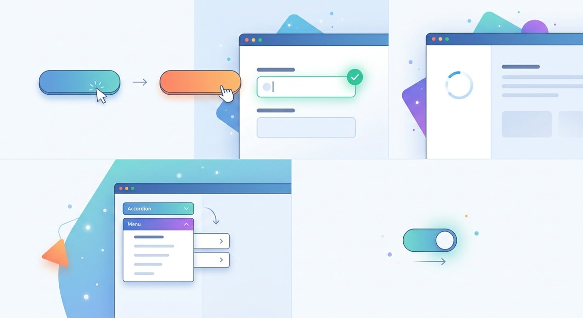
1. Hover Feedback with Purpose
Hover states are the most common micro-interaction, yet many designers still use a simple color change. That is a missed opportunity. Instead, try scaling the button up slightly (1.02 to 1.05) with a soft shadow. Add a 200-millisecond transition with an ease-out curve. The button feels tactile, almost physically responsive.
For underline links, animate the underline from left to right instead of just appearing. This small motion signals “this is clickable” and adds personality. Keep the animation duration under 300 milliseconds to avoid feeling sluggish.
2. Progress Indicators That Feel Alive
A static spinning wheel is boring. A progress bar that fills smoothly and bounces at the end is satisfying. For uploads or data processing, show a linear bar with a slight overshoot at 100% before settling. This mimics the real world, where a liquid fills a container and sloshes a bit.
For multi-step forms, use a segmented progress bar that animates between steps. Each segment fills with a staggered delay. The user sees the journey and feels progress. This reduces abandonment during long flows.
3. Form Validation That Doesn’t Frustrate
Nobody likes submitting a form only to see a wall of red errors at the top. Inline validation is a micro-interaction that saves the user time. As soon as the user moves to the next field, check the previous one. Show a checkmark or a gentle error message next to the field.
Better still, use a subtle shake animation for invalid fields. Combine it with a soft color change (red border) and an icon. The shake should be small (10 pixels left and right) and last 400 milliseconds. This communicates “try again” without anger.
4. Toggle and Switch Animations
Switches and toggles are binary, but they don’t have to feel binary. When a toggle slides from off to on, animate the knob with a bounce. The background color should transition smoothly from a neutral gray to your brand’s active color. The entire animation should take around 250 milliseconds.
Add a micro-interaction on the label too. When the toggle is active, the label text can shift in weight or opacity. This reinforces the state change.
5. Empty States That Comfort
An empty state appears when there is no content yet, like a blank inbox or a new project dashboard. Instead of a grey box, design an illustration that reacts to the user. For example, a small character that waves when the page loads. Or a simple animation of a pencil drawing itself.
Pair the visual with helpful copy and a call to action. The micro-interaction here is the entrance animation of the empty state itself. Use a fade-in with a slight upward slide (20 pixels over 500 milliseconds). It signals that the product is ready and waiting.
Common Micro-Interaction Mistakes vs. Best Practices
The table below shows typical pitfalls and how to fix them.
| Mistake | Why It Hurts | Best Practice |
|---|---|---|
| Animation too slow | Users feel delayed, abandon task | Keep motions under 300 ms for UI feedback |
| Animation too fast | Users miss the feedback entirely | Use at least 150 ms for hover states |
| Inconsistent timing | Interface feels chaotic | Define a timing scale (e.g., 100, 200, 300 ms) |
| No easing | Motions look robotic | Use ease-out for entries, ease-in-out for transitions |
| Only visual feedback | Accessibility suffers | Add audio or haptic feedback on critical actions |
| Over-animation | Users feel dizzy, distracted | Use moderation; 80% of interactions should be subtle |
Use this table when reviewing your prototypes. Print it and pin it near your desk.
A Practical Process for Adding Micro-Interactions
Working micro-interactions into your UI design workflow doesn’t have to be complicated. Follow these three steps.
-
Audit your key flows. Open your design and identify every moment where a user triggers a response: clicking a button, filling a field, switching a toggle, loading data. List at least ten moments.
-
Prioritize by impact. Focus on interactions that reduce confusion or delight the user. For example, form validation helps prevent errors, so it should be high priority. A landing page particle effect is nice but not essential.
-
Prototype and test. Use tools like Figma’s Smart Animate, Protopie, or Principle to build prototypes. Test with real users. Watch their facial expressions. If they smile or relax, you nailed it.
One designer I know runs a “micro-interaction audit” every quarter. They go through their app with fresh eyes and replace any stale animations. It keeps the product feeling current.
Tools to Help You Prototype Micro-Interactions
Here are some reliable tools designers use in 2026.
- Figma – Use Smart Animate with variants for state-based transitions.
- Protopie – Great for complex gestures and device-level interactions.
- Lottie – Export lightweight animations from After Effects directly into your codebase.
- Haiku Animator – For creating Lottie animations with a timeline interface.
- CSS animations prototype – If you code, use CodePen to test easing curves.
“The best micro-interactions are the ones you don’t notice until they are gone. They exist to support the user, not to show off your animation skills.” – Design Lead at a major tech company, paraphrased from a 2025 conference talk.
How to Avoid Overdoing Micro-Interactions
More is not better. Too many animations can overwhelm the user and slow down performance. Follow these rules.
- Limit motion to functional moments. If an animation does not communicate state or provide feedback, cut it.
- Respect user preferences. Support
prefers-reduced-motionin your CSS. For mobile, allow a “reduce motion” toggle in settings. - Test on slower devices. A fancy bounce that works on your MacBook Pro might lag on a two-year-old Android.
- Use delays for sequences. If three elements appear one after another, stagger them by 50 to 100 milliseconds. Never more than 200 milliseconds between steps.
For a deeper look at building cohesive UI systems, check out the ultimate UI checklist to see where micro-interactions fit into the bigger picture.
Your Next Step: Audit One Screen Today
Pick one screen in your current project. It could be a login page, a settings panel, or a product card. Open it right now. Look at each element and ask: “What happens when someone touches this?” If the answer is “nothing,” that is a gap waiting to be filled.
Add one micro-interaction. A button that lifts. A toggle that bounces. A loading dot that pulses. Then test it with a friend. Watch them use it. You will see the difference in their face.
Micro-interactions UI design is not about flashy effects. It is about showing users that your interface listens. That builds trust. And trust is what makes a product feel truly professional.