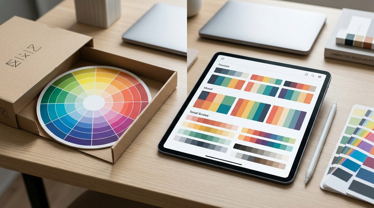
The color wheel has been the default tool for picking colors for as long as most of us can remember. Art schools teach it. Design books preach it. Every blog post about color theory starts with it. But here is the thing: the color wheel is a simplification of how our eyes actually see color. It is based on 18th-century theory, not on how light or pigment behaves in the real world. If you have ever followed the color wheel rules perfectly and still ended up with a muddy painting, a flat photograph, or a design that just feels wrong, you are not alone. There is a better way.
The traditional color wheel relies on outdated RYB primary theory and misses how human vision actually processes contrast, saturation, and temperature. This article introduces a value-first color curation method that uses real-world references, perceptual contrast checks, and mood-driven constraints. You will learn a repeatable 4-step process that replaces guesswork with reliable, beautiful color selection every time.
Why the Classic Color Wheel Lets You Down
The color wheel you probably own is based on the RYB (red, yellow, blue) model. That model works okay for kindergarten painting, but it falls apart under real conditions. Red and green are not perfect opposites the way the wheel suggests. Mixing yellow and blue does not always give you a clean green. And the wheel completely ignores the most important factor in any composition: value contrast.
Photographers know this well. Two colors that sit opposite each other on the wheel can look identical when converted to grayscale. That means your composition loses depth. Your subject blends into the background. The color wheel gives you hue relationships but says nothing about how light or dark those colors will appear.
Designers face the same problem when building brand palettes. You might pick a perfect complementary pair from the wheel, but when you place them next to each other on a screen or a printed page, they vibrate in an uncomfortable way. The wheel could not predict that because it does not account for saturation, temperature, and perceptual context.
A Better Alternative: Value-First Color Curation
The alternative method is surprisingly simple. Instead of starting with hue relationships, you start with value relationships. You build your palette from real-world references rather than from an abstract circle. And you use your own eyes plus a few practical tools to test whether the colors actually work together.
I call this the Value-First Color Curation method. It is not a new invention. Professional painters, cinematographers, and brand designers have been using it for decades. They just rarely explain it in blog posts because it sounds less magical than “complementary color harmony.” But it produces better results.
Let me walk you through the process.
Step 1: Start With a Reference, Not a Wheel
Pick a reference image that contains the mood you want. This could be a photograph you took, a still from a movie, a piece of fabric, or even a screenshot of a room you like. The reference should already have the emotional tone you are aiming for: calm, energetic, moody, bright, etc.
Do not worry about matching exact colors yet. You are looking for the overall value structure. A good reference has clear lights, midtones, and darks.
Step 2: Extract the Core Values
Convert your reference to grayscale. Yes, remove all the color. What you are left with is the skeleton of the image. Count the distinct value bands. Most strong compositions have three to five clear value steps from lightest to darkest.
Write those values down. For example: very light (almost white), light midtone, dark midtone, very dark (almost black). These values will be your anchor points.
Step 3: Assign Hues to Your Value Slots
Now bring color back in. For each value slot, pick a hue that fits the mood you want. The key rule is this: keep the value relationship intact. A dark midtone in grayscale must stay a dark midtone after you add hue. If you pick a pale yellow for a dark midtone slot, the whole structure breaks.
This is where most beginners go wrong. They fall in love with a hue and force it into the wrong value slot. The color wheel does not warn you about that mistake. Value-First Curation makes it impossible to ignore.
Step 4: Check Against Your Constraints
Once you have assigned hues to each value slot, run three tests:
-
Grayscale test. Convert your palette to grayscale. Do the original value relationships hold? If two colors that should be different values now look the same, adjust the saturation or lightness.
-
Temperature test. Are you using warm and cool intentionally, or by accident? A palette with all warm hues can feel cozy or claustrophobic. A palette with all cool hues can feel calm or cold. Mix temperature with purpose.
-
Mood test. Does the palette still match the emotional tone of your original reference? If your reference was a foggy morning and your palette looks like a carnival, you drifted. Pull it back.
Common Mistakes When Using This Method
| Mistake | What Happens | How This Method Fixes It |
|---|---|---|
| Choosing hues before checking values | Colors clash or blend into each other | Value-First forces you to lock in contrast before picking hues |
| Using too many value steps | The palette looks chaotic and unfocused | You limit yourself to 3 to 5 value bands, which creates cohesion |
| Ignoring temperature mixing | The palette feels flat or one-note | The temperature test adds intentional warmth or coolness |
| Copying reference colors exactly | The palette feels derivative or disconnected from your project | You extract only the value structure and choose your own hues |
| Skipping the grayscale test | You only discover contrast problems after the design is done | The grayscale test is built into step 4 before you commit |
Why Value Trumps Hue in Every Medium
“The color wheel tells you which colors are related. But it does not tell you which colors are readable. Value is what makes a design legible from across the room. Value is what makes a photograph hold depth. Value is what makes a painting feel like light is moving through it. If you only learn one thing about color, learn to see value.” – Annie L. design director and educator
This advice holds true whether you work in digital, print, photography, or painting. A logo that passes the grayscale test will work on a business card, a billboard, and a mobile app icon. A photograph with strong value contrast will grab attention in a crowded Instagram feed. A painting with deliberate value bands will feel solid and intentional, even if the hues are unconventional.
The color wheel alternative method I am describing here is not about abandoning color theory. It is about prioritizing what matters most. Contrast comes first. Mood comes second. Hue relationships come third.
How to Build a Personal Library of References
One of the best things you can do as a designer or artist is to build a reference library organized by mood. Save images that represent the feelings you want your work to convey. Do not organize them by color. Organize them by emotional tone: peaceful, tense, playful, luxurious, nostalgic, etc.
When you start a new project, pull up the folder that matches the mood you need. Extract the value structure from those references. Then choose your hues freely within that structure.
This approach gives you creative freedom within a defined framework. You are not copying. You are borrowing a structure and filling it with your own voice.
Practical Tools That Support This Method
You do not need expensive software to use Value-First Color Curation. Here are a few tools that help:
- Any photo editing app that has a grayscale or desaturate filter. Use it on your reference and on your palette.
- A physical value finder. These are small cards with holes that let you isolate a single color and compare it to a grayscale strip. They cost about ten dollars and are worth every penny.
- Your phone camera. Take a photo of your palette in black and white mode. If the values blur together, adjust.
- A simple sketchbook and pencil. Sketch your composition in grayscale before adding color. This forces you to design the light first.
When to Ignore the Value Rules (Intentionally)
Every rule has exceptions. Some of the most memorable designs break value contrast on purpose. A pastel-on-pastel layout can feel dreamy and soft. A photograph with a narrow value range can feel atmospheric and cinematic. A brand identity that uses two similar values might stand out precisely because it is unusual.
The difference between a happy accident and a mistake is intentionality. If you break the value rules on purpose and you know why, go for it. If you break them by accident because you never checked, you are gambling.
Bringing This Method Into Your Daily Workflow
The easiest way to start using this color wheel alternative method today is to pick one project and follow the four steps. Do not try to overhaul your entire process at once. Just run the grayscale test on your next palette. See what you learn.
Here is a summary of the process in bullet form for quick reference:
- Find a reference image that matches your desired mood
- Convert it to grayscale and identify 3 to 5 value bands
- Assign a hue to each value band while keeping the value intact
- Test your palette with grayscale, temperature, and mood checks
- Adjust saturation or lightness until all three tests pass
You can apply this method to logo design, social media graphics, brand color palettes, painting, photography color grading, and even interior design. It works anywhere that color matters.
If you want to go deeper on related topics, check out our guide on how to choose brand colors that actually convert customers or the 60-30-10 color rule for balanced designs. Both approaches pair naturally with the value-first method described here.
Your Palette Deserves Better Than a Circle
The color wheel is not wrong. It is just incomplete. It gives you one slice of the color puzzle and asks you to pretend that is the whole picture. Value, temperature, saturation, and context all matter just as much. By adopting a color wheel alternative method that starts with value and uses real-world references as your guide, you skip the guesswork and build palettes that actually work.
Try it on your next project. Pick one reference image. Extract the values. Assign your hues. Run the three tests. You will see the difference immediately. And you will wonder why nobody taught you this sooner.