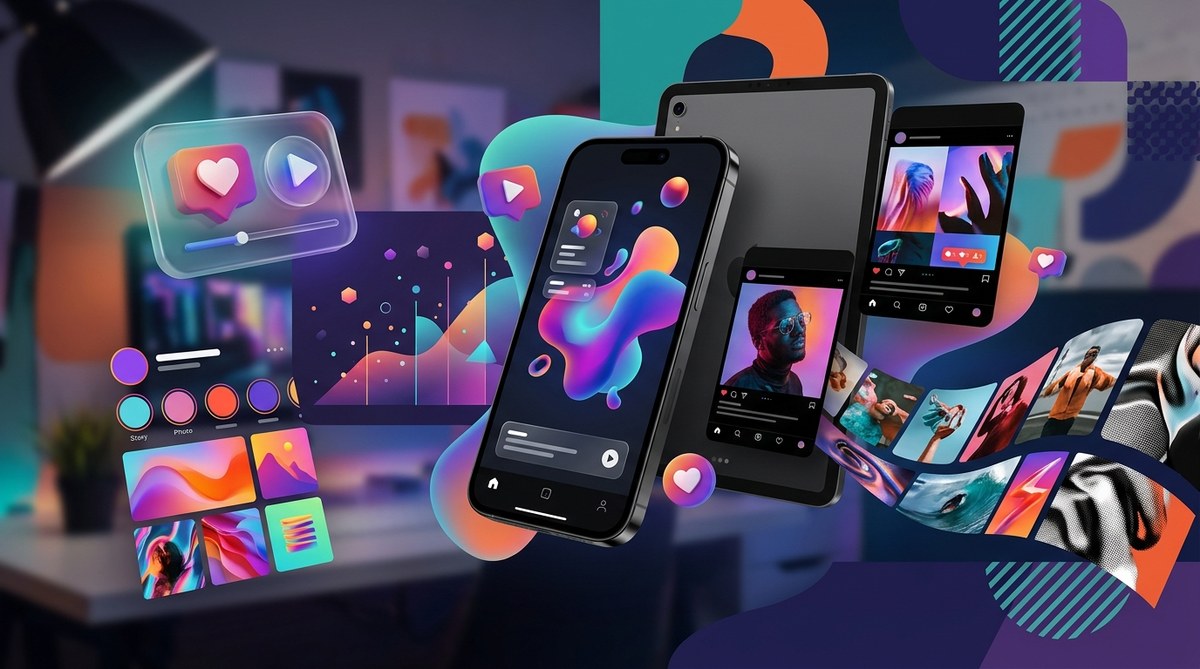
The social media feed is getting louder every day. In 2026, standing still in your design strategy means getting buried. The brands that win attention are the ones that take risks with bold typography, chaotic nostalgia, and a dash of human imperfection. But you don’t need a complete rebrand every quarter. You need a smart, trend-aware approach that feels natural to your audience. Let’s walk through the six social media design trends shaping 2026 and, more importantly, how to use them without losing your brand’s identity.
Social media design in 2026 rewards authenticity over perfection. The biggest trends include AI-assisted workflows, maximalist Y2K nostalgia, bold oversized typography, intentionally unpolished visuals, micro-animations, and accessibility-first layouts. The key is to pick two or three trends that align with your brand voice and test them consistently. Use the practical tools and checklists inside to start today.
AI Is Your Design Copilot, Not Your Replacement
Artificial intelligence isn’t just for generating weird images anymore. In 2026, social media managers use AI tools to speed up repetitive tasks while keeping the human touch front and center. Think of AI as your brainstorming buddy and your efficiency engine. It helps you generate color palette variations, resize assets for different platforms instantly, and even suggest layout options based on your brand’s style guide.
Here’s a three-step process to integrate AI into your social design workflow without losing authenticity:
- Start with a clear prompt. Describe your brand’s tone, the platform (Instagram, LinkedIn, TikTok), and the emotion you want to evoke. For example: “Create three square layouts for a wellness brand on Instagram using muted greens, serif body text, and a hand-drawn icon style.”
- Use AI for asset generation and variations. Let the tool create background patterns, texture overlays, or multiple font combinations. Pick the best and then refine manually.
- Always add a human edit. Adjust the lighting, tweak the text hierarchy, and inject your brand’s voice. AI can give you 80% of the way; the last 20% is what makes it feel like you.
One caution: avoid letting AI make all the creative decisions. Your audience can sense when something is fully generated. Aim for a hybrid workflow that saves time but keeps your brand’s personality intact. For more on building a solid foundation, check out how to build a brand style guide that actually gets used.
Maximalism and Chaotic Nostalgia
The clean, airy minimalism that dominated the 2010s is taking a back seat. In 2026, social media feeds are embracing maximalism. Think layered textures, clashing patterns, neon accents, and a healthy dose of Y2K and Frutiger Aero revival. This trend is about visual excitement and personality. It’s messy, loud, and unapologetically human.
Key characteristics of maximalist social design:
- Overlapping elements, text on top of text, and busy backgrounds.
- Retro tech references: pixelated graphics, glitch effects, and early 2000s interface motifs.
- Bright, saturated color palettes that break the 60-30-10 rule intentionally.
- Hand-drawn doodles, stickers, and cut-out collage aesthetics.
This style works especially well for brands with a younger audience or those in entertainment, fashion, and gaming. But even if your brand is more professional, you can borrow one element, say a retro font or a pop of neon, to add personality without going full chaos. For a deeper look at using colors strategically, read how to choose brand colors that actually convert customers.
Bold, Oversized Typography That Commands Attention
Small, delicate typefaces are fading away. In 2026, social media designers are going big with typography. Literally. Oversized headlines, thick sans-serif fonts, and creative letter spacing are used to make text the hero of the post. This trend is practical too: on mobile screens, big type is easier to read and instantly communicates your message.
| Do | Don’t |
|---|---|
| Use one super-bold font for headlines and a simpler font for body copy. | Squeeze too much text into one graphic. Keep it to a single bold statement. |
| Experiment with vertical or diagonal text for visual interest. | Rotate text so much that it becomes unreadable. |
| Use color contrast for maximum legibility (light on dark or vice versa). | Rely on font weight alone; thin weights get lost on small screens. |
| Animate the text slightly (fade in, slide up) to increase engagement. | Overuse motion effects that distract from the message. |
When done right, bold typography can stop the scroll in under a second. It also pairs beautifully with maximalist backgrounds because the heavy type anchors the chaos. For more tips on font pairing without looking amateur, see how to choose the perfect font for your brand identity.
The Unpolished Human Touch
There’s a growing hunger for imperfection. People are tired of overly retouched, factory-polished visuals. In 2026, social media design embraces the “naive” look: hand-drawn illustrations, uneven shapes, pencil textures, and elements that look like they were made by a human, not a machine. This trend is called naive design, and it’s a direct reaction to the perfection of AI-generated imagery.
“Design that looks ‘done by hand’ signals authenticity. It tells your audience, ‘A real person made this for you.’ In a world saturated with AI, that human mark is a superpower.” — Lindsay Marsh, design educator
This doesn’t mean messy for the sake of messy. The best examples still have intentional composition. They just replace perfect geometric shapes with wonky, organic ones. Use this trend for story stickers, quote graphics, or product announcements to build a sense of warmth and trust. For guidance on maintaining a consistent look across posts, see designing consistent social media templates for your brand in under an hour.
Micro-Animations and Motion That Feels Natural
Static posts are still valid, but adding a touch of motion can lift engagement significantly. In 2026, micro-animations are everywhere. Think of subtle hover effects, gentle parallax scrolling, looping GIFs that tell a mini-story, and Lottie animations embedded directly into carousels. The goal is not to distract but to delight.
Examples you can try:
- An icon that bounces once when the user scrolls past.
- A product image that slowly zooms in on a carousel.
- A text element that fades in letter by letter (paced for reading).
- A background gradient that shifts colors over a few seconds.
Keep animations short (under 3 seconds) and small in file size. Platforms like Instagram and LinkedIn now support lightweight animations natively, so you don’t need coding skills to use them. For a step-by-step on creating engaging posts, check out how to design eye-catching Instagram carousel posts that stop the scroll.
Accessible and Inclusive Design Is Non-Negotiable
The most important social media design trend of 2026 isn’t a style. It’s a mindset. Accessibility and inclusivity are moving from “nice to have” to “must have.” This means designing with contrast ratios that meet WCAG (Web Content Accessibility Guidelines), ensuring all text is readable against backgrounds, and adding descriptive alt text to every image. It also means using clear simple language in graphics and providing captions for video content.
Common accessibility mistakes in social graphics:
- Low contrast between text and background (like light gray on white).
- Very small font sizes (under 14px) that pinch your eyes.
- No alt text on images, leaving screen reader users with no context.
- Auto-playing video without captions.
Fixing these issues is often simpler than you think. Use a contrast checker tool before you post. Set a minimum font size of 16px for body text. Write alt text that describes the image’s purpose, not just its appearance. For a full rundown on color contrast, read what is color contrast and why does it make or break your designs.
Your 2026 Social Media Design Toolkit
You don’t need to adopt every trend at once. Pick two or three that resonate with your brand’s voice and your audience’s expectations. Here’s a simple checklist to get started:
- Review your last 10 posts. Which ones got the most engagement? Do they already lean toward one of these trends?
- Pick one trend to test. Try bold typography on your next Instagram Story or add a naive hand-drawn element to a carousel.
- Update your template library. Make sure your templates include space for larger text, a high-contrast checker, and an accessible font stack.
- Add micro-animation to one post per week. Use a simple tool like Canva or Figma to add a subtle motion.
- Write alt text for everything. Make it a habit before hitting publish.
Trends come and go, but the goal stays the same: connect with your audience in a way that feels genuine and human. Whether you lean into maximalist chaos or the warm embrace of naive design, the best social media in 2026 will look like it was made by people, for people. So open your design tool, try one of these ideas, and see what happens. Your next viral post might be just one trend away.