A brand mood board isn’t just a collage of pretty pictures. It’s a strategic tool that translates your brand’s personality into visual language. When done right, it keeps your team aligned, your clients on board, and your final designs consistent. But most mood boards fail because they’re too vague, too trendy, or completely disconnected from strategy. This guide will show you how to create a brand mood board that acts as a real north star for every design decision you make.
A brand mood board is a decision-making compass, not an art project. Start with your brand’s emotional core, gather intentional inspiration, test it with real feedback, and extract concrete guidelines. Avoid the common trap of collecting random images. When you build mood boards strategically, they become the foundation for every logo, color palette, and layout you create.
Why most mood boards miss the mark
A typical mood board screams “aesthetic” but whispers nothing about purpose. It’s full of gorgeous photography, trendy fonts, and a color palette that feels fine. But ask the designer why they chose a certain texture or image, and the answer is often “it just feels right.” That’s not enough.
Without a clear connection to your brand strategy, a mood board becomes a decoration, not a guide. Stakeholders start subjective debates. “I don’t like that font.” “Can we make it more modern?” Suddenly you’re redesigning based on personal taste instead of data.
“A mood board is your brand’s visual mission statement. If it doesn’t communicate why you picked each element, it’s just decoration.” – Brand strategist Sarah Chen
To avoid that, your process must start with strategy, not style.
What every brand mood board needs
Before you open a single tab or save an image, define these three pillars:
- Brand personality traits – Is your brand playful or serious? Minimalist or rich? List three to five adjectives.
- Target audience preferences – What visual styles appeal to your ideal customer? A tech founder might prefer clean, modern lines; a wellness brand might lean organic and warm.
- Emotional response goal – How should someone feel when they see your brand? Trust, excitement, calm, rebellion?
Write those down. They’ll act as filters for every image, color, and texture you consider later.
How to create a brand mood board in 6 steps
Here’s a repeatable process that turns inspiration into actionable design direction.
1. Gather raw inspiration without judgment
Start collecting images, patterns, textures, typography samples, and color palettes that resonate with your brand’s emotional goal. Use sources like:
- Pinterest boards (search for “brand mood board inspiration”)
- Design platforms like Behance and Dribbble
- Real-world photography (your own or stock libraries)
- Magazine layouts and packaging you admire
Don’t edit yet. Aim for 30 to 50 pieces of raw material. The variety will help you spot patterns later.
2. Filter everything through your brand’s core
Now apply your three pillars. For each piece of inspiration, ask:
- Does this match our brand personality?
- Would our audience connect with this?
- Does it evoke the right emotion?
Delete anything that fails even one test. This is where most people get attached to a beautiful image that has nothing to do with their brand. Be ruthless. You’re not decorating your living room; you’re building a design system.
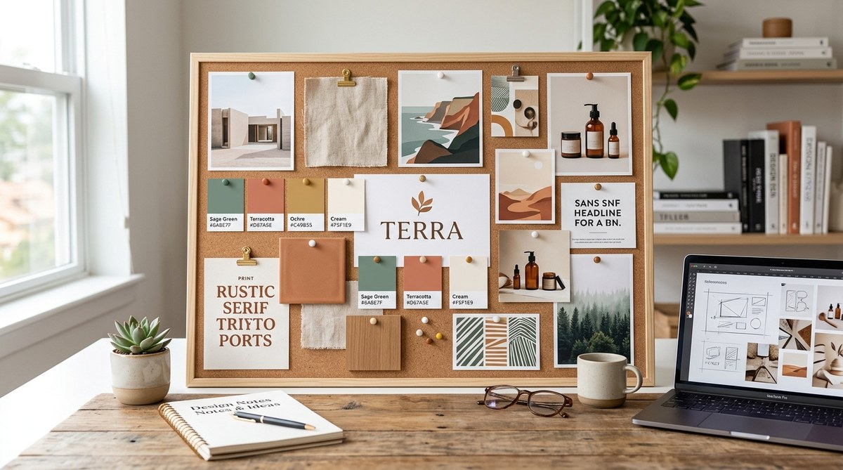
3. Identify repeating themes and patterns
Once you’ve filtered down to about 15 to 20 strong pieces, look for common threads. Maybe you notice a lot of soft neutrals with one bold accent color. Or a pattern of clean sans serif fonts paired with hand-drawn illustrations. Group those into categories.
| Category | What to look for | Example |
|---|---|---|
| Color palette | Dominant hues, accents, undertones | Earthy greens with terracotta accents |
| Typography | Font styles (serif/sans), weights, moods | Playful rounded sans + elegant italic serif |
| Texture & imagery | Photography style, grain, patterns, illustration type | Warm, grainy photography with rough paper textures |
| Layout & spacing | Grids, negative space, alignment tendencies | Lots of white space, asymmetrical arrangements |
4. Arrange your board with intention
Now place your filtered elements on a digital canvas (Figma, Canva, or even a dedicated tool like Milanote). The layout matters. Group related items visually. Use a grid or freeform layout that tells a story: start with the emotional anchor (a core image that embodies the brand), then surround it with supporting colors, textures, and typography.
Avoid overcrowding. Leave white space between groups so each element can breathe. Your goal is a board that someone can glance at and immediately feel your brand’s vibe.
5. Add notes and rationale
For every major element, include a short annotation. Explain why it’s there. For example:
- “This photo’s warm lighting matches our friendly, approachable tone.”
- “The rough paper texture supports our handcrafted, artisanal brand story.”
- “This typeface is clean but playful, ideal for headlines on our website.”
These notes prevent future debates. When a client asks “why this blue?”, you have a clear answer rooted in strategy, not taste.
6. Test your mood board with real feedback
Share your board with a small group of stakeholders or test users. Ask three specific questions:
- What three words come to mind when you look at this?
- Does this feel like a brand you would trust?
- What’s missing or confusing?
If the words match your intended personality adjectives, you’re on track. If not, adjust the board. This validation step saves you from building an entire identity around a mood that doesn’t land.
Common mistakes and how to fix them
Even experienced designers slip into these traps. Here’s a table of the most frequent errors and their fixes.
| Mistake | Why it hurts | How to fix it |
|---|---|---|
| Including too many images | Dilutes the message, creates confusion | Cut to 10–12 essential pieces max |
| Copying a competitor’s board | Makes your brand look generic | Find your own visual territory using your unique brand pillars |
| Ignoring your audience | Design feels off to the people who matter | Run a quick survey or show the board to a few ideal customers |
| No rationale annotations | Leaves design decisions open to subjective criticism | Add a sentence of strategy to every key element |
| Using low-resolution or generic stock images | Undermines professionalism, feels cheap | Invest in high-quality photography or custom illustrations |
Turning your mood board into a working brand system
Once your mood board is approved, it’s time to extract the actionable parts. That means creating:
- A defined color palette with hex codes and use rules (see how to choose brand colors that actually convert customers)
- A typography hierarchy with font pairings and sizes (check the ultimate guide to pairing Google fonts like a pro)
- Imagery guidelines – photography style, illustration direction, icon use
- Layout principles – spacing, grid, alignment rules
These elements become the backbone of your brand style guide. If you’re starting from scratch, read our guide on how to build a brand style guide that actually gets used.
Remember, the mood board is not the final destination. It’s the compass that ensures every logo, social graphic, and website element stays true to your brand’s core. Without it, you’re designing in the dark.
Use your mood board to avoid common branding pitfalls
A strong mood board helps you sidestep the most expensive branding mistakes. For example, mixing too many fonts, using colors that clash with your message, or creating a logo that feels disconnected from your brand personality. We’ve covered many of those pitfalls in detail: 5 common branding mistakes that make your business look unprofessional and 7 logo design mistakes that make your brand look unprofessional.
When your mood board is strategic, it acts as a filter for every creative decision. You’ll say no to a beautiful font because it doesn’t match your board. You’ll reject a color because it evokes the wrong emotion. That’s the power of a board that actually guides.
Build smarter from day one
You don’t need to be a professional designer to create a brand mood board that works. Start with your brand’s core identity, collect intentionally, filter ruthlessly, and validate with feedback. Then let that board inform every visual choice you make.
Take the six steps above and apply them to your next project. Whether you’re launching a new business, rebranding an existing one, or simply refreshing your social media look, this process will save you hours of guesswork and keep your team aligned. Your mood board is your design compass. Make it point true north.