Brand archetypes aren’t just a psychology term reserved for marketing strategists. They are the secret sauce that turns a generic logo into a story people connect with. As a designer, you already deal with visual cues, color psychology, and typography. Archetypes give you a framework to make those choices consistent, purposeful, and emotionally resonant. When you know which archetype a brand lives in, you stop guessing and start designing with intention.
Brand archetypes are universal character patterns that help you create coherent visual identities. This guide focuses on four archetypes most useful for designers: The Creator, The Sage, The Innocent, and The Hero. You’ll learn how each archetype influences logo style, color palette, typography, and overall design system. Use the practical process and comparison table to pick the right archetype for your next project.
What Are Brand Archetypes and Why Should Designers Care?
Archetypes were introduced by psychologist Carl Jung as universal symbols and patterns that show up in stories across cultures. Marketers adapted them into twelve brand personalities, each with a core desire, fear, and set of traits. For a designer, an archetype acts like a north star for every visual decision. It tells you whether your client’s brand should feel bold and competitive (The Hero) or nurturing and warm (The Caregiver). Without it, you end up mixing signals: a soft pastel logo paired with aggressive, sharp shapes. That dissonance confuses the audience and weakens recognition.
When you align your design choices with a clear archetype, every element works together. The color palette, the font choice, the layout structure, even the photography style all reinforce the same message. This is what makes brands like Apple, Nike, and Airbnb feel instantly recognizable. They didn’t guess their way to that consistency. They built around a core archetype. As a designer, understanding archetypes gives you the vocabulary to explain your decisions to clients and the confidence to push back when they ask for contradictory design elements.
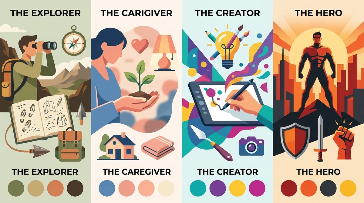
The Four Core Archetypes Every Designer Needs to Know
The Creator
The Creator archetype is all about self-expression, innovation, and making something new. Brands that identify as Creators want to stand out by challenging the status quo. They value artistry, craftsmanship, and originality. Think of brands like Apple, Adobe, or LEGO. Their visual identity often features clean lines, negative space, and a focus on the product itself. Color palettes lean toward neutrals with a single accent color that pops. Typography tends to be modern sans-serif, minimal, and highly legible. The Creator avoids clutter. Every element must feel intentional and designed.
Design approach for The Creator:
– Use plenty of white space to let the work breathe.
– Choose a monochrome or limited color palette with one signature hue.
– Opt for geometric shapes and custom illustrations that feel handmade.
– Typography should be simple but with a unique twist, like a custom glyph or ligature.
The Sage
The Sage archetype represents wisdom, knowledge, and truth. Brands in this space position themselves as trusted authorities. They want to educate and inform, often with a tone that is calm, rational, and objective. Google, The New York Times, and NPR are good examples. Visually, The Sage prefers clarity and structure. Colors are often blue, green, or gray tones that evoke trust and intellect. Typography is serious but friendly, with a strong hierarchy. Layouts are grid-based, data-friendly, and often include infographics or diagrams.
Design approach for The Sage:
– Use a clean, column-based grid for layouts.
– Stick to classic serif or well-crafted sans-serif typefaces with excellent readability.
– Incorporate data visualization elements like charts or icons.
– Colors should be subdued, avoiding loud or overly emotional tones.
The Innocent
The Innocent archetype is about simplicity, happiness, and doing things the right way. It represents brands that feel pure, nostalgic, and honest. Think of Dove, Starbucks in its early days, or Coca-Cola. The Innocent visual style is wholesome and approachable. Colors are soft pastels, whites, and bright primary hues. Typography is rounded, friendly, and often handwritten. Shapes are organic, with lots of curves. The goal is to make people feel safe and reminded of simpler times.
Design approach for The Innocent:
– Use soft, rounded logos and playful icons.
– Choose warm, light colors like pale yellow, soft blue, or dusty pink.
– Typography should be informal, maybe a handwritten script or a friendly sans-serif.
– Backgrounds are often white or light with minimal texture.
The Hero
The Hero archetype is about courage, achievement, and overcoming challenges. Brands that take on the Hero role want to inspire action and make a difference. Nike, FedEx, and Duracell are classic examples. The Hero visual language is bold, dynamic, and confident. Colors include strong reds, blacks, navy, and metallics. Typography is powerful, often using uppercase, heavy weights, and sharp angles. Logos frequently feature motion lines, shields, or forward-leaning shapes. The overall feel is high-energy and unstoppable.
Design approach for The Hero:
– Use high contrast color combos (black and white, red and gold).
– Choose strong, condensed typefaces with heavy strokes.
– Incorporate diagonals, motion lines, or upward-pointing shapes.
– Photography should be action-oriented, with dramatic lighting.
How to Choose and Apply an Archetype: A 3 Step Process
-
Understand the brand’s core desire and fear. Every archetype has a primary motivation. The Creator wants to create something original; The Sage wants to find and share truth; The Innocent wants to experience happiness; The Hero wants to prove worth through acts of courage. Listen to how the client talks about their mission. What do they want to achieve, and what keeps them up at night? That will point you toward the right archetype.
-
Map archetype traits to visual design elements. Once you have a shortlist of one or two archetypes, create a board of visual references: colors, typefaces, shapes, photography styles. For example, if the brand is a marketing consultancy that helps startups grow, it could fit The Sage (inform) or The Hero (overcome challenges). A Sage would use deep blues and clean grids; a Hero would use bold reds and dynamic layouts. Choose the one that feels more authentic to the founder’s personality.
-
Test the archetype against every touchpoint. Apply the archetype to the logo, website, social media graphics, packaging, and even motion design. Does the Instagram post template still feel like The Sage if you add a playful illustration? Probably not. Consistency matters more than any single element. If a design decision feels off, ask yourself: “Would The Innocent use that sharp font?” Often it’s easier to remove one element than to adjust the entire system.
Common Mistakes Designers Make with Archetypes
- Mixing archetypes within the same visual system. A brand can have a primary and a secondary archetype, but the visual identity must serve the primary one. Trying to be both The Creator and The Innocent usually results in confusion.
- Overthinking the archetype choice. Archetypes are frameworks, not straitjackets. You don’t need to follow every single rule. If a brand is mostly The Sage but uses a splash of warm yellow, that’s fine.
- Ignoring the brand’s audience. The archetype should resonate with the target customer. If your client’s audience values bold leadership but the brand chooses The Innocent, the visuals will feel disconnected.
| Archetype | Logo Style | Color Palette | Typography | Photography |
|---|---|---|---|---|
| Creator | Minimal, geometric, custom mark | Neutrals + one accent | Clean sans-serif, modern | Studio shots, product focus |
| Sage | Classic, wordmark, icon | Blues, greens, grays | Serif or serious sans | Educational, infographics |
| Innocent | Rounded, script, organic | Pastels, whites, brights | Handwritten, friendly | Lifestyle, warm tones |
| Hero | Bold, shield, motion lines | Red, black, navy, gold | Heavy, uppercase, condensed | Action, dramatic lighting |
Using Archetypes to Win Client Approval
One of the biggest friction points in a designer-client relationship is subjective feedback. “I just don’t like that blue” is hard to argue against. But when you frame your choices around an archetype, you shift the conversation from personal taste to strategic fit. You can say, “This navy blue supports the Hero archetype because it feels strong and trustworthy. It aligns with your mission to help clients overcome obstacles.” That is much harder to refute. Archetypes give you a defense for your design decisions that is both rational and emotional.
Blockquote:
“The most effective brand identities feel inevitable. When a designer understands the archetype, every color, shape, and font choice becomes obvious. The client may not know the term ‘archetype,’ but they will feel the coherence and confidence in the work.” — Anonymous Design Studio
How Archetypes Fit Into a Larger Brand System
An archetype is not a one-off tool for logo design. It should influence your entire brand system. From the button labels on a website to the tone of voice in copywriting, the archetype keeps everything aligned. For example, a brand with The Creator archetype might use playful microcopy like “Create your masterpiece” while a Sage brand would say “Learn the steps.” As a designer, you can extend the archetype into motion design, iconography, and even the paper stock for printed materials. When you build a full brand system rooted in an archetype, client approval becomes faster and the final product feels more professional. To see how this works end-to-end, check out our guide on how to build a brand style guide that actually gets used.
Keep Your Archetype Alive Across Platforms
Consistency across touchpoints is where most brands stumble. A website that feels like The Hero might have a social media feed that looks like The Innocent. This breaks trust. Use an archetype to audit your existing work. Look at the colors and shapes on your client’s Instagram posts. Do they match their logo? Is the typography on their business card saying the same thing as their email signature? If not, it’s time to realign. The brand audit checklist: is your visual identity working against you can help you catch those mismatches.
Putting Archetypes to Work on Your Next Project
Start small. Pick one brand you are designing for right now (or a personal project). Identify the primary archetype using the three step process above. Then create a mood board with five to six images that reflect that archetype’s visual language. Use that board to guide your logo drafts, color palette, and typography choices. You will be surprised how much time it saves. No more endlessly iterating on two completely different directions. The archetype acts as a filter that only lets through ideas that serve the story.
Your Design Toolkit Just Got Stronger
Brand archetypes are not a theoretical concept you file away after reading. They are a practical decision making tool that every designer should have in their kit. Whether you work on logos, social media templates, or full brand identity systems, applying the right archetype makes your work more coherent, more persuasive, and more enjoyable to present. The next time a client says, “I just want something that looks clean,” ask them what they really mean. Is it the simplicity of The Innocent? The precision of The Sage? The boldness of The Hero? Dig deeper together. Your designs will thank you, and your clients will feel the difference.
Take one of your recent projects and run it through the archetype lens. Does it hold up? If not, you now know exactly what to adjust. Start with the four archetypes we covered, and as you get comfortable, explore the full twelve. But these four will carry you through most design challenges. Use them, share them, and watch your brand identities come alive.