You have spent hours picking the perfect display font for your headings. It looks stunning on the mockup. But when you actually read the page, something feels off. Your eyes get tired. You lose your place. You bounce. You have fallen for the trap that so many DIY website builders and designers fall into: you prioritized the flashy headline over the quiet workhorse. The truth is, your body text font matters more than your headings. Much more.
Headings grab attention. Body text keeps it. Readability, retention, and conversion hinge on how comfortable your paragraphs feel to scan and absorb. Choose a body font that is spacious, well-spaced, and readable at small sizes. Test it on mobile first. A beautiful heading will never rescue cramped, illegible body copy. Your audience reads paragraphs, not headlines.
Why We Obsess Over Headings (And Why That’s a Mistake)
Headings are design candy. They are big, bold, and easy to get right. You can slap on a trendy sans-serif, add a little letter-spacing, and call it a day. But headings exist to do one thing: signal the hierarchy. Once the user lands on your page, they scan the heading, then immediately drop to the body text. If that body text is poorly chosen, set too small, or has bad contrast, the user leaves.
We have seen countless brand audits where the heading font is a gorgeous custom typeface, but the body copy is set in 14px Arial with a line height of 1.3. That is a readability disaster. Your visitor cannot comfortably read your most important content. So all that effort on the headline is wasted.
The Real Workhorse: Body Text
Body text is where your message lives. It carries your product descriptions, your blog posts, your about page, your call to action. If the body font is hard to read, you lose trust. According to the Baymard Institute, poor typography is one of the top reasons users abandon a page. This is not about style. It is about function.
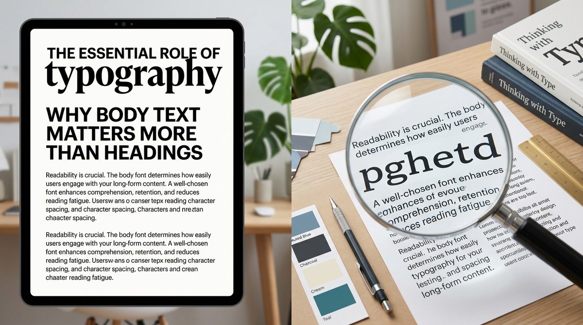
Readability Versus Legibility
Two words that everyone mixes up. Legibility is how easy it is to tell one letter from another. That is a property of the typeface design. Readability is how easy the text is to read in a block. That is affected by font size, line height, line length, and contrast. Your body text needs both, but readability is what matters most for long-form content.
A well-chosen body font with generous line height (around 1.5 to 1.6) and a line length of 50-75 characters can dramatically increase reading speed and comprehension. Headings just do not have that kind of impact because they are short.
3 Steps to Prioritize Body Text in Your Typography System
You do not have to start from scratch. Follow these three steps to rebalance your typography hierarchy today.
-
Set the body text size first. Before you even open the font menu, decide what your base paragraph size will be. For desktop, 18px to 21px is the new minimum. For mobile, 16px is the floor. Do not go smaller. Lock that base size in your design system. Then scale headings up from there. This prevents the common mistake of making headings huge and body text tiny.
-
Choose a body font that works at small sizes. Serif or sans-serif does not matter as much as the font’s x-height, aperture, and spacing. Test your candidate fonts at 16px on a real phone screen. If you have to squint, pass. Popular reliable body fonts include Inter, Source Sans Pro, Merriweather, and Lora. Avoid anything with very thin strokes or tight letter spacing for body copy.
-
Tweak line height and margins before the heading size. Most beginners pump up heading sizes to create contrast. Instead, add more space around paragraphs. Increase line height to 1.5x the font size. Add generous bottom margins to paragraphs. This creates visual rhythm without touching heading styles. Your page will look cleaner and read better.
Common Body Text Mistakes That Kill Readability
- Using a decorative font for body copy. Script, slab serifs with heavy contrast, or condensed fonts belong in headings only. In body text they cause eye strain.
- Setting body text too small. 12px and 14px were acceptable in 2010. In 2026, users expect at least 16px on mobile and 18px on desktop.
- Ignoring line length. A line that spans the full width of a 1440px screen is impossible to read. Aim for 50 to 75 characters per line. Use a container or max-width on your text blocks.
- Low contrast on light backgrounds. Gray text on white looks modern but is unreadable for many. Stick to a dark gray or near-black for body text.
- Forgetting about vertical rhythm. When every element has different spacing, the eye struggles to flow. Consistent baseline spacing makes reading feel effortless.
Technique vs. Mistake: A Quick Reference
| Technique | Why It Works | Common Mistake |
|---|---|---|
| Start with body font size | Ensures readability is the foundation | Setting heading size first, then squeezing body |
| Use a typeface with generous x-height | Letters are easier to read at small sizes | Choosing a trendy thin font for body copy |
| Set line height to 1.4 – 1.6 | Creates breathing room between lines | Line height of 1.2 or default (cramped) |
| Limit line length to 70 characters | Reduces eye fatigue and improves comprehension | Full-width text blocks on large screens |
| Test on mobile before desktop | Catches readability issues early | Only designing on a 27-inch monitor |
Expert Advice: Design Body-First
Oliver Reichenstein, information architect and founder of iA, once wrote that “typography is the foundation of interface design.” He argues that the purpose of a website is to communicate, and communication happens through text. Headings are signposts. Body text is the road. A beautiful signpost on a broken road is useless.
“90% of design is typography. And the other 90% is whitespace.” – Craig Mod
Craig’s point: the space around your paragraphs matters as much as the letters themselves. If you invest your design energy into the body text and the white space that frames it, you will create a reading experience that feels generous and trustworthy. Headings will naturally fall into place because they will have context.
How to Choose the Right Body Font in 2026
You have dozens of options. Here is a simple filter:
- Sans-serif: Works well for tech, SaaS, modern brands. Top picks: Inter, IBM Plex Sans, Source Sans 3.
- Serif: Great for editorial, luxury, long-form content. Top picks: Merriweather, Lora, Literata.
- Variable fonts: Save bandwidth and give you control over weight and width. Look for ones with a readable default “Regular” axis.
Remember that you can pair a distinct heading font with a more neutral body font. That is fine. Just make sure the body font has a large character set (especially if you use special characters or technical terms). Also, test web font loading — a heavy font will delay text rendering and hurt Core Web Vitals.
Typography Hierarchy That Actually Works
A good hierarchy does not need five heading levels. For most websites, H1, H2, and H3 are enough. Your body text sits at the base, and headings create a stepping-stone of size and weight.
Here is a rough scale you can adapt:
- Body: 18px / line height 1.6
- H3: 22px bold / line height 1.4
- H2: 28px bold / line height 1.3
- H1: 36px bold / line height 1.2
The key is that the ratio between body and H1 is not extreme. A 3:1 ratio (body 18px, H1 54px) looks dramatic but breaks the flow. Aim for 2:1 or 2.5:1 at most. This keeps the page cohesive.
Start With Body Text, Then Let Headings Follow
Next time you start a design project, open your typography panel and set the body text first. Lock in the font, size, line height, and color. Then adjust headings to complement it, not dominate it. You will notice an immediate improvement in how your content reads. Your audience will stay longer, understand your message better, and trust you more.
A final tip: run your live site through a readability tool like Hemingway or a simple zoom test. If you have to pinch to read the paragraphs, your body text is too small. Fix that before you change a single heading.
Typography is not about looking good. It is about being understood. And understanding happens in the body text, not the headline.