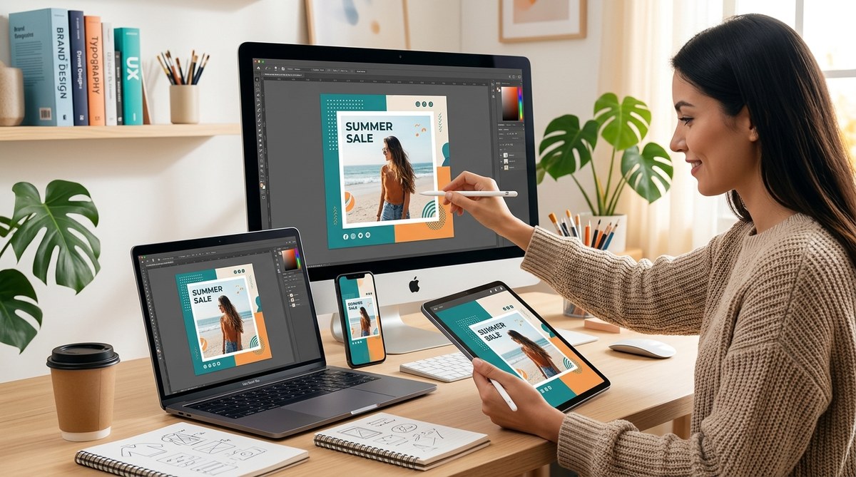
A social media post that looks stunning on your studio monitor might turn into a blurry mess on a friend’s phone. The text gets tiny, the key element gets cropped, and your carefully crafted message becomes unreadable. That is the reality of designing for a world where people scroll through feeds on phones, tablets, laptops, and even foldable screens. The good news? You do not need to create five different versions for every piece of content. With a responsive approach to social media design, you can build one master graphic that scales beautifully across every device your audience uses.
Responsive social media design is about building flexible layouts, choosing legible font sizes, and using safe zones so your message never gets cut off. Test your graphics on multiple screen widths before posting. Use a 4:5 or 1:1 aspect ratio for feeds, and always keep the core text and logo inside the central 80% of the canvas. Mobile users should see your full message without pinching or zooming.
Why This Matters More Than Ever in 2026
The way people consume content on social media has shifted hard toward mobile. Over 85% of Instagram and TikTok sessions now happen on phones. Even LinkedIn, once a desktop heavy platform, sees the majority of its engagement from mobile devices. If your design does not account for these realities, you are effectively hiding your message from most of your audience.
A common trap is designing everything on a desktop screen at 1920 pixels wide. You add beautiful details that only show up in that wide frame. Then you publish, and on a 375 pixel phone screen, the headline wraps to three lines, the call to action button gets covered by the platform’s own UI, and your brand logo sits half cropped off the edge.
Responsive social media design solves this by forcing you to think about the smallest screen first. It is the same principle behind mobile-first web design, but for static and animated posts.
The Core Principles of Responsive Social Graphics
Here are the rules you should apply before you ever hit “publish.” They work across Instagram, Facebook, LinkedIn, Twitter, Pinterest, and TikTok.
- Design with a central safe zone. Keep all critical elements (headline, key visual, logo, CTA) within the middle 80% of your canvas. The outer 10% on each side can get cropped or hidden by platform overlays and phone notches.
- Use a 4:5 aspect ratio for feed posts. Square (1:1) still works, but vertical rectangles give you more breathing room on mobile without being too tall. Avoid perfectly square if you can stretch to 4:5.
- Set minimum font sizes. Body text should never go below 24 pixels on a standard 1080px wide canvas. Headlines need at least 36 pixels. For Story formats (9:16), bump those numbers up by 20%.
- Simplify your background. Busy patterns or gradients look great full width but can become muddled on smaller screens. Use clean backgrounds or solid brand colors behind your text.
- Test on the devices your audience uses. Do not rely on preview alone. Pull up your post on an iPhone SE, a Galaxy S24, and a foldable phone like the Pixel Fold. Check readability on each.
A Step-by-Step Process for Bulletproof Responsive Design
Instead of guessing, follow this four step workflow. It will save you from publishing a post that bombs on half your audience.
-
Start with the smallest canvas in mind. Open your design tool and set the artboard to the smallest common social media feed size. For 2026, that is 1080 x 1350 pixels (a 4:5 ratio) for feed posts, or 1080 x 1920 for Stories. This forces you to prioritize what really matters.
-
Lock your safe zone. Draw a rectangular guide that leaves 10% margin on all sides. Everything that must be seen goes inside that box. Place secondary decorative elements outside it only if you are okay with them getting cropped.
-
Choose font sizes that survive scaling. If you are exporting the graphic at 1080 pixels wide, set headlines to at least 48 points and body copy to 30 points. When the post is displayed on a phone, those sizes will render legibly. Test your text on a mockup of a 375×812 screen (iPhone 14 size).
-
Export with the right settings. Use PNG for images with text (do not compress too hard) or JPEG at 90% quality. For animations, export as MP4 with H.264 codec at 30fps. Always check that your file falls under each platform’s file size limits.
Common Mistakes That Kill Responsiveness
Even experienced designers slip up. Here is a table of frequent errors and how to fix them.
| Mistake | Why It Breaks Responsive Design | The Fix |
|---|---|---|
| Placing text too close to the edge | Platform overlays or phone notches hide your words | Keep all text inside the central 70% safe zone |
| Using very thin font weights | Thin strokes disappear on low resolution phone screens | Use at least medium weight (500) for body text |
| Over-relying on horizontal space | A wide layout forces users to scroll sideways | Design for vertical scrolling only; keep widths narrow |
| Ignoring platform-specific safe areas | Each platform crops differently (e.g., Instagram circular profile pic area) | Research the latest safe zone guides for each network |
| Not previewing on multiple aspect ratios | Your design looks perfect in your tool but breaks in real life | Use a preview tool like BrowserStack or simply test on a phone |
Expert Advice on Scaling Your Social Creative
“Most social media managers overdesign their posts on a large canvas, then get disappointed when the details vanish on mobile. The secret is to treat every graphic like a billboard viewed from a passing car. If the person cannot understand your message in under three seconds while scrolling, it doesn’t matter how pretty the image is.”
– Maria Chen, Senior Designer at Buffer
This quote should stick with you. Simplicity is not boring. It is considerate of your viewer’s limited attention span and screen size.
Tools and Techniques to Validate Your Designs
You don’t need expensive software to test responsiveness. Use these practical methods:
- Mirror your design on a real phone. Take a screenshot of your finished graphic, email it to yourself, and open it on your personal phone. Zoom in and out. Check if you can read the smallest type without effort.
- Use a device preview plugin. If you work in Figma, use the built-in “Mirror” app or the “Preview” panel to switch between iPhone, Android, and tablet frames.
- Create a mobile-first template. Once you have a responsive layout that works, save it as a template. Then reuse it for every post. This saves time and ensures consistency. For a guide on building those templates, see designing consistent social media templates for your brand in under an hour.
- Check your font contrast. Even if the text is large enough, poor contrast with the background can make it invisible on OLED screens. Use the What Is Color Contrast and Why Does It Make or Break Your Designs? guide to learn how to verify your combinations.
Building a Responsive Design System for Your Brand
Consistency across posts is what makes a brand recognizable. When you add responsive thinking into your workflow, you also protect that consistency. A post that looks disjointed on a tablet undermines the trust you’ve built.
Start by setting a few base rules in your brand style guide:
– Minimum font size for all social graphics: 28px on a 1080px canvas.
– Always use a 10% margin safe zone.
– Avoid placing your logo in corners; instead, center it or put it in a consistent position inside the safe zone.
– Use high contrast color combinations, especially for CTA text.
If you need help writing those rules down, our guide on how to build a brand style guide that actually gets used will walk you through the process.
Staying Updated with 2026 Platform Changes
Social media platforms update their display specifications regularly. What worked in 2025 might get flagged as “too wide” this year. The best habit is to bookmark the official guidelines for each platform and revisit them quarterly. You can also follow 2026 social media design trends you need to know to stay ahead of the curve.
At the same time, keep an eye on new device form factors. Foldables and rollable screens are growing in popularity. Your responsive approach should be flexible enough to handle a screen that changes shape mid scroll.
Making Responsive Design Part of Your Daily Workflow
Integrating these practices does not have to slow you down. Once you internalize the safe zone rule and the font size minimums, every new post becomes a reflex. You will stop worrying about how it will look on different devices and start focusing on the message itself.
To make it even easier, build a shared Figma or Canva template with those constraints baked in. Use locked guides, preset text styles, and a consistent color palette. That way your entire team, freelancers and interns included, produce on brand, responsive content every time.
For inspiration on choosing the right colors that work on screen, check out how to choose brand colors that actually convert customers. And if you are still struggling with font choices, the 15 free font combinations that instantly elevate your social media graphics list can kickstart your next design.
Your Simple Test Before Hitting Publish
Before you finalize any social graphic, run this three second check:
– Can you read the headline from an arm’s length on a phone?
– Is the call to action button fully visible without scrolling?
– Does your logo stay inside the safe zone on a square crop?
If you answer yes to all three, you are ready. Responsive social media design does not have to be complicated. It just requires a shift in mindset from “make it look cool” to “make it usable on any screen.” Your audience will thank you with longer engagement and fewer missed messages.
Now go apply these principles to your next batch of posts. Your followers on every device will finally see exactly what you intended.
