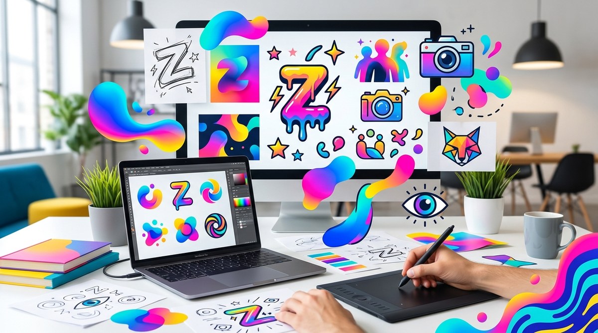
You have a great product. Your brand message is solid. But your logo feels like it belongs on a 2012 resume template. You look at brands like Duolingo, Discord, or Liquid Death and wonder how they pull off that effortless, magnetic vibe with Gen Z audiences.
The answer is not luck. It is a specific set of visual rules that speak directly to how this generation processes information, trusts brands, and decides where to spend their money. Gen Z consumers are the most visually literate generation in history. They grew up with high-speed internet, infinite content feeds, and zero tolerance for anything that feels like a corporate facade. Your logo needs to earn their attention in under two seconds.
Gen Z logo design demands more than minimalism. It requires emotional resonance, digital-first scalability, and a willingness to bend traditional rules. This guide covers the psychology, typography, color strategy, and common pitfalls you need to know to create a logo that feels native to this generation, not like a marketing department trying too hard.
What Makes Gen Z Different From Every Other Audience
Gen Z (born roughly between 1997 and 2012) does not remember a world without smartphones. They do not remember dial-up internet. They have been curating their visual identity on social platforms since middle school. That changes how they judge a logo.
They value authenticity over polish. A logo that looks too perfect or too corporate triggers skepticism. They prefer brands that feel human, even if that means a slightly uneven line or a color that breaks the traditional rules of harmony.
They also value speed. If your logo is hard to read at 48 pixels wide on a mobile screen, it might as well not exist. Gen Z interacts with brands mostly through small screens. Your logo must work as a profile picture, an app icon, and a sticker on a friend’s story.
The 3 Pillars of Gen Z Logo Design
Before you open your design software, understand the three core principles that guide every successful Gen Z logo.
1. Emotional Simplicity
Minimalism is not dead. But Gen Z minimalism looks different from the corporate minimalism of the 2010s. Think of the Slack logo redesign or the way Mailchimp uses playful shapes. The shapes are simple, but the personality is loud.
Your logo should be simple enough to draw from memory. That is the real test. If someone can sketch your logo on a napkin after seeing it twice, you have achieved emotional simplicity.
2. Digital Nativism
A Gen Z logo must look good on a 6-inch phone screen, a smartwatch face, and a Discord server icon. It must also work in dark mode. Many designers forget to test their logos against a black background. Gen Z users spend hours in dark mode apps like Instagram and TikTok. If your logo disappears into the void, you lose credibility.
3. Playful Confidence
Gen Z rejects the “serious business” tone of older brands. They respond to humor, self-awareness, and a touch of irreverence. Your logo can be bold, chunky, and even a little weird. Look at how brands like Liquid Death use heavy typography and aggressive simplicity. It is confident without being arrogant.
A Step-by-Step Process for Designing a Gen Z Logo
Follow these steps to move from a blank canvas to a logo that resonates.
-
Define the brand’s emotional territory. Is your brand chaotic, calm, rebellious, or cozy? Write three words that describe the feeling you want people to have when they see your logo. These words will guide every design decision.
-
Choose a typography-first approach. Many Gen Z logos rely on custom or modified typefaces rather than complex icons. A bold wordmark with a unique letterform often works better than a generic icon paired with a standard font. Learn more about how to choose the perfect font for your brand identity.
-
Select a color palette that breaks rules. Avoid the safe blue-and-gray corporate palette. Gen Z loves unexpected color combinations: neon green with deep purple, coral with olive, electric yellow with charcoal. Use the 60-30-10 color rule to keep it balanced but bold.
-
Test for scalability immediately. Shrink your logo down to 32 pixels. Enlarge it to 2000 pixels. Does it still read well? If the details disappear, simplify further.
-
Add a motion variant. Gen Z expects logos to move. A static logo feels like a relic. Create a simple looping animation, a hover state, or a transition for video intros. Read our guide on how to create memorable logo animations that enhance brand identity.
Typography Rules That Resonate
Typography carries more weight in Gen Z logo design than it does for older demographics. Here is why: Gen Z reads less and scans more. Your logo typeface needs to be instantly legible and emotionally expressive.
| Type Style | Best Use Case | Example Brands |
|---|---|---|
| Chunky sans-serif | Rebellious, streetwear, gaming | Liquid Death, Off-White |
| Rounded sans-serif | Friendly, approachable, wellness | Duolingo, Headspace |
| Variable fonts | Tech-forward, adaptive, modern | Figma, Stripe |
| Hand-drawn or irregular | Authentic, artistic, small-batch | Mailchimp, Glossier |
| Condensed grotesk | Urban, editorial, fashion | Supreme, Vogue |
Avoid thin, elegant serifs. They read as old-fashioned and fragile on mobile screens. Gen Z associates thin serifs with luxury brands their parents buy. That is not the vibe you want unless you are selling $500 candles.
“The most effective Gen Z logos feel like they belong on a sticker, not a boardroom slide. If your logo looks like it could be a Discord emoji, you are on the right track.” — Anonymous Design Team
Color Psychology for Gen Z
Traditional color psychology says blue equals trust. But Gen Z has a more nuanced relationship with color. They associate certain palettes with internet culture, nostalgia, and subcultures.
- Neon and electric colors signal energy, gaming, and digital-native status.
- Muted earth tones signal sustainability, authenticity, and slow living.
- Y2K-inspired pastels (lilac, mint, baby blue) signal nostalgia and irony.
- High-contrast duotones (black and neon green, white and electric orange) signal boldness and clarity.
Avoid muddy browns, beiges, and overly complex gradients that look like they came from a 2015 template. Gradients are still acceptable, but they need to be purposeful, not decorative. Check out the designer’s guide to using gradients without looking outdated.
Logo Mistakes That Repel Gen Z
You can do everything right and still miss the mark. Here are the most common mistakes designers make when targeting Gen Z.
- Using stock iconography. A generic lightbulb or gear icon tells Gen Z you did not put in the effort. They can smell stock art from a mile away.
- Overcomplicating the icon. Too many lines, too many colors, too many layers. Simplicity is not boring. It is respectful of their attention span.
- Ignoring the dark mode test. If your logo has a white background box or relies on thin strokes, it will fail on dark mode interfaces.
- Being too safe. Gen Z respects brands that take a stand. A logo that tries to please everyone pleases no one.
- Choosing a font that is too similar to a famous brand. If your logo looks like a knockoff of Nike or Coca-Cola, you lose all credibility.
For a more complete list, read our article on 7 logo design mistakes that make your brand look unprofessional.
How to Test Your Logo With Real Gen Z Eyes
Do not rely on your own taste. You are not the target audience. Here is a practical testing process.
-
Show your logo to five people between the ages of 18 and 26. Ask them one question: “What does this brand sell or stand for?” If they guess wrong, your logo is not communicating clearly.
-
Place your logo next to three well-known Gen Z brands (like Duolingo, Spotify, or Discord). Does it hold its own visually, or does it look like a lesser version?
-
Test it in context. Put your logo on a mockup of an Instagram profile, a TikTok video overlay, and a website header. Does it feel native to those platforms?
-
Check the “vibe test.” Ask your testers to describe the logo in three words. If they use words like “corporate,” “boring,” or “old,” go back to the drawing board.
A Practical Template for Your Next Logo Project
If you are starting from scratch, use this checklist as your guide.
- [ ] The logo works as a square icon (no text needed).
- [ ] The logo is readable at 32 pixels wide.
- [ ] The logo works on a black background and a white background.
- [ ] The logo has a distinct silhouette (you can recognize it even if blurred).
- [ ] The logo uses no more than two colors (not counting black and white).
- [ ] The logo avoids generic symbols (globes, stars, arrows, gears).
- [ ] The logo has a simple animation or motion variant planned.
- [ ] The logo passes the “napkin test” (someone can draw it from memory).
Building a Logo That Grows With the Brand
Gen Z loyalty is hard to earn but powerful once you have it. Your logo should not just capture attention today. It should have room to evolve as your brand grows. Avoid trends that are too specific to 2026, like certain gradient styles or ultra-thin typefaces that will look dated in two years.
Instead, focus on the emotional core. A logo built on a strong concept, a unique letterform, and a bold color choice will age much better than a logo built on a passing aesthetic. If you want to future-proof your work, learn about how to design a logo that resiliently adapts to future branding trends.
Your Next Move
You now have the framework. The rules are clear: be simple, be bold, be digital-first, and never be boring. The hard part is execution. Start with a single sketch. Test it with real people. Iterate until it feels right.
Gen Z will not wait for you to get it perfect. They will scroll past your brand in an instant. So make that instant count. Open your sketchbook, pick up your stylus, and design something that feels like it belongs in their world, not yours.
