Creating user interfaces that are both accessible and attractive is a challenge many UI and front-end designers face today. The good news is that accessibility doesn’t mean sacrificing style. When done right, accessible UI components can enhance the user experience for everyone, regardless of ability, while still maintaining a polished aesthetic. This guide shares actionable tips, proven techniques, and common pitfalls to help you craft engaging, inclusive interfaces that stand out.
Designing accessible UI components is about balancing inclusive principles with visual appeal. Use contrast wisely, ensure clear states, and test with real users to create interfaces that are both beautiful and usable for all.
Understanding the importance of accessible UI components
Accessibility in UI design goes beyond ticking boxes. It enhances usability for a broad range of users, including those with visual, motor, auditory, or cognitive impairments. Accessible components ensure that everyone can navigate, understand, and interact with your interface confidently. When you embed accessibility into your design process, you create a more inclusive product that reaches a wider audience and reduces user frustration.
But how do you achieve this without compromising visual aesthetics? The secret lies in applying design principles thoughtfully, choosing the right techniques, and testing your work thoroughly. Let’s dive into practical steps to make that happen.
3 core principles for designing accessible UI components
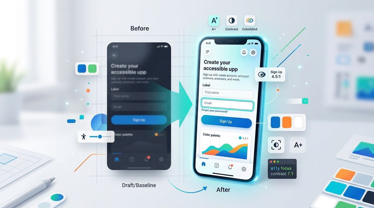
- Prioritize contrast and color accessibility
Colors influence perception and usability. High contrast between text and background improves readability for users with visual impairments. Using tools like WebAIM Contrast Checker can help you verify that your color choices meet WCAG standards. Remember, do not rely solely on color cues; add text labels or icons to reinforce information.
- Design clear focus and interaction states
Focus states guide users who navigate with keyboards or assistive devices. An obvious, distinct focus indicator helps users understand where they are on the page. Use CSS to customize focus styles, making sure they are visible and consistent across components. For example, a prominent outline or glow effect can work well without clashing with your aesthetic.
- Ensure click targets are sizable and well-spaced
Clickable elements should be at least 48 pixels high and wide, with ample spacing. This not only benefits users with motor difficulties but also improves overall usability. Use padding and margin wisely, and avoid cluttered layouts. Templates like Accessible button patterns provide solid starting points.
Practical process for creating accessible UI components
Follow these steps to integrate accessibility into your design workflows seamlessly:
1. Audit your current components
Start by reviewing existing UI elements. Check for issues like low contrast, small touch areas, or hidden focus states. Use accessibility evaluation tools such as Lighthouse or axe to identify problems quickly.
2. Apply inclusive design techniques
- Use color combinations that meet contrast standards.
- Add visible focus styles that align with your visual identity.
- Incorporate descriptive labels for all interactive elements.
- Make sure error messages and notifications are clear and accessible.
3. Test with real users and assistive technologies
Testing is crucial. Use screen readers like NVDA or VoiceOver to verify how your components behave. Conduct usability tests with diverse users to gather feedback. When possible, involve users with disabilities to ensure your components work for everyone.
4. Iterate and refine
Accessibility is an ongoing process. Regularly update your UI based on testing results and new standards. Keep your design system flexible enough to adapt to emerging best practices.
Common mistakes to avoid
| Techniques to Use | Common Mistakes |
|---|---|
| Use strong contrast between text and background | Relying on color alone to convey information |
| Customize focus styles for clarity | Ignoring focus outlines, making keyboard navigation hard |
| Sufficient touch target size and spacing | Small or tightly packed click areas |
| Descriptive, accessible labels | Omitting labels or using vague descriptions |
| Testing with assistive tech | Skipping real-user testing or relying solely on tools |
Tips from the pros
“Designing accessible components is not about making things dull. It’s about creating clarity and confidence for every user. When you prioritize visibility and usability, your aesthetic naturally elevates.” — UI/UX expert
Techniques to enhance accessibility without sacrificing aesthetics
- Use color contrast tools to find a balanced palette that is both vibrant and compliant.
- Add custom focus styles that match your brand’s look but remain highly visible.
- Implement large, clickable areas with subtle hover effects for visual appeal.
- Incorporate icons and labels together to communicate more without clutter.
- Test your designs on various devices and with users from different backgrounds.
Common pitfalls that can undermine your efforts
| Mistake | Why it hurts |
|---|---|
| Relying solely on color | Users with color blindness miss critical information |
| Ignoring focus outlines | Keyboard users lose track of where they are |
| Small touch targets | Difficult for users with motor impairments |
| No testing with real users | Hidden issues go unnoticed, leading to poor user experience |
Final thoughts on designing accessible UI components
Creating interfaces that are inclusive and beautiful is entirely achievable. It begins with understanding your users’ needs and applying design principles that support them. Use contrast wisely, make interaction states clear, and test extensively. Remember, accessibility benefits all users, not just those with disabilities. When you combine aesthetic sensibility with inclusive practices, you build products that truly resonate.
Take these principles and process tips to heart. Experiment with different techniques, gather feedback, and refine your designs. The effort you put in now will pay off by delivering interfaces that are both engaging and usable for everyone. Keep practicing, and make accessibility a natural part of your design journey.