Creating readable, inclusive typography is a cornerstone of accessible design. When your text can be easily read by everyone, regardless of age, ability, or device, your content becomes more welcoming and effective. Good typography isn’t just about choosing a nice font; it involves thoughtful decisions about size, spacing, contrast, and structure. This guide will show you how to make your typography accessible, practical, and stylish at the same time.
Why accessible typography matters in digital design
Accessible typography ensures that your content is legible and comprehensible for users with visual impairments, dyslexia, cognitive differences, or those using small screens. When text is hard to read, users struggle to understand your message, which can lead to frustration and disengagement. By prioritizing accessibility, you create an environment where everyone can access your content comfortably and confidently.
- Clear typography improves user experience
- It complies with legal standards like WCAG
- It broadens your audience reach
- It demonstrates respect for diverse needs
How to create accessible typography step by step
Designing for accessibility involves specific, actionable choices. Here’s a straightforward process to follow:
-
Choose highly legible fonts
Opt for fonts that are simple and familiar. Sans-serif fonts like Arial, Helvetica, or Open Sans are generally easier to read on screens. Avoid overly decorative fonts that can add ambiguity or slow down reading. For users with dyslexia, consider fonts like Dyslexie or OpenDyslexic, which are designed to improve readability. -
Set appropriate font sizes and line spacing
Use at least 16 pixels (or 1em) for body text. Larger sizes are preferable, especially on mobile devices. Line height should be about 1.5 times the font size to prevent crowding. This spacing makes text easier to scan and reduces visual fatigue. -
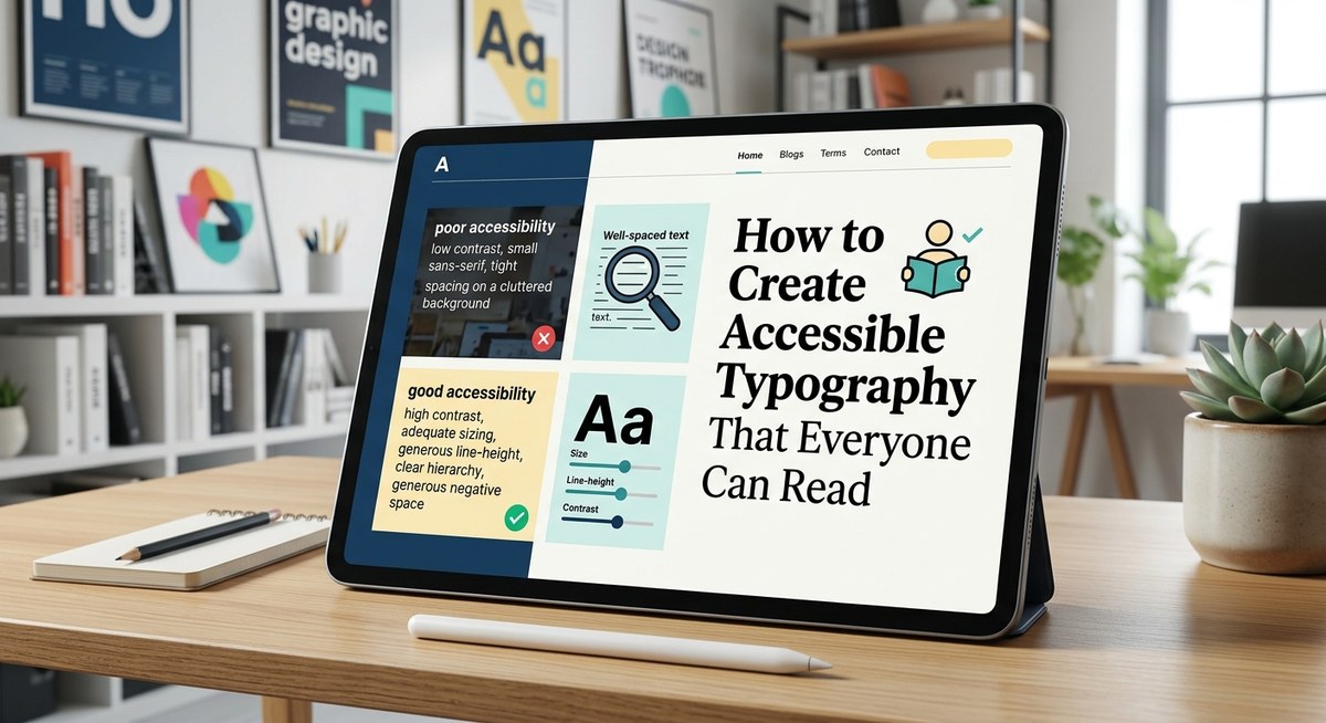
Ensure sufficient contrast between text and background
Contrast is key for readability. Follow WCAG guidelines, which recommend a contrast ratio of at least 4.5:1 for normal text. Dark text on a light background is a safe choice, but always check with contrast tools. Avoid color combinations like red and green, which are problematic for color-blind users. -
Implement clear hierarchy and structure
Use headings, subheadings, and body text logically. Different font sizes, weights, and styles should guide users through your content naturally. Keep font variations minimal to avoid confusion. -
Adjust line length and avoid justified text
Aim for 45 to 75 characters per line. Too long or too short lines cause strain. Left-align your text to prevent uneven spacing that can distract or confuse readers. -
Use sufficient spacing and avoid clutter
Whitespace around text blocks makes content more digestible. Maintain consistent margins and padding to separate sections clearly.
Practical techniques and common pitfalls
To help you visualize best practices, here’s a table highlighting techniques and mistakes:
| Technique | Mistake |
|---|---|
| Use a font size of at least 16px for body text | Using small fonts like 10px or 12px |
| Maintain a line height of 1.5 | Tight line spacing that causes crowding |
| Ensure contrast ratio of 4.5:1 or higher | Combining light text on a light background |
| Use familiar, simple fonts | Decorative fonts with complex designs |
| Keep line length between 45-75 characters | Long, unreadable lines exceeding 100 characters |
| Left-align text | Justified text that creates uneven spacing |
“Prioritize readability over style by choosing straightforward fonts and clear hierarchy. Accessibility is about making content usable for everyone, not just aesthetic perfection.” — Accessibility design expert
Techniques to improve readability and avoid mistakes
Here’s a quick overview of techniques to use and pitfalls to avoid:
Techniques:
- Use bold or semi-bold weights for headings to create visual cues.
- Apply ample line spacing to separate lines clearly.
- Use high-contrast colors approved by WCAG.
- Limit font variations to maintain consistency.
- Test your typography on different devices and with accessibility tools.
Mistakes to avoid:
- Using tiny fonts in footnotes or disclaimers.
- Overusing italics or bold that can reduce clarity.
- Justifying text, which can create uneven word spacing.
- Combining too many different fonts or styles.
- Ignoring contrast ratios, especially on mobile screens.
| Techniques | Mistakes |
|---|---|
| Use large enough font sizes | Small fonts that strain the eyes |
| Provide enough line spacing | Tight lines that hinder reading |
| Follow contrast guidelines | Low contrast that reduces visibility |
| Limit font styles | Overly varied typography that confuses |
| Test your design | Relying solely on visual judgment |
Expert advice on accessible typography
“Designing accessible typography isn’t just about meeting standards, it’s about understanding your users’ needs. When in doubt, test with real users and accessibility tools.” — Usability specialist
Incorporating accessible typography into your workflow
Making your typography accessible should be part of your regular design process. Here are some tips to embed these practices:
- Always check contrast ratios with tools like WebAIM’s contrast checker.
- Use scalable units like rems or ems for font sizing.
- Create style guides that specify font choices, sizes, and spacing.
- Test your designs on various devices and with assistive technologies.
- Educate your team on accessibility principles to maintain consistency.
Final thoughts: making your typography work for everyone
Accessible typography isn’t a one-time setup; it’s an ongoing commitment to inclusivity. Start by selecting simple, legible fonts and applying thoughtful spacing and contrast. Use testing tools and gather feedback from diverse users. With these steps, you can craft content that invites everyone to engage, learn, and enjoy your digital content.
By integrating accessible typography into your design process, you create a more inclusive online environment. Remember, readability is fundamental to communication. Implement these strategies, and your content will be both beautiful and usable for all.