Achieving consistent, accurate colors in printing can be a challenge. Even experienced designers and print professionals often find that colors look different from screen to print. Variations can lead to frustration, wasted resources, and compromised brand integrity. The good news is that mastering print color management is within reach. With a clear understanding of core principles, tools, and workflows, you can deliver vibrant, true-to-design prints that impress every time.
Print color management is essential for consistent, accurate colors. By understanding color profiles, calibration, and workflow best practices, designers can ensure their printed materials match digital designs precisely, saving time and resources.
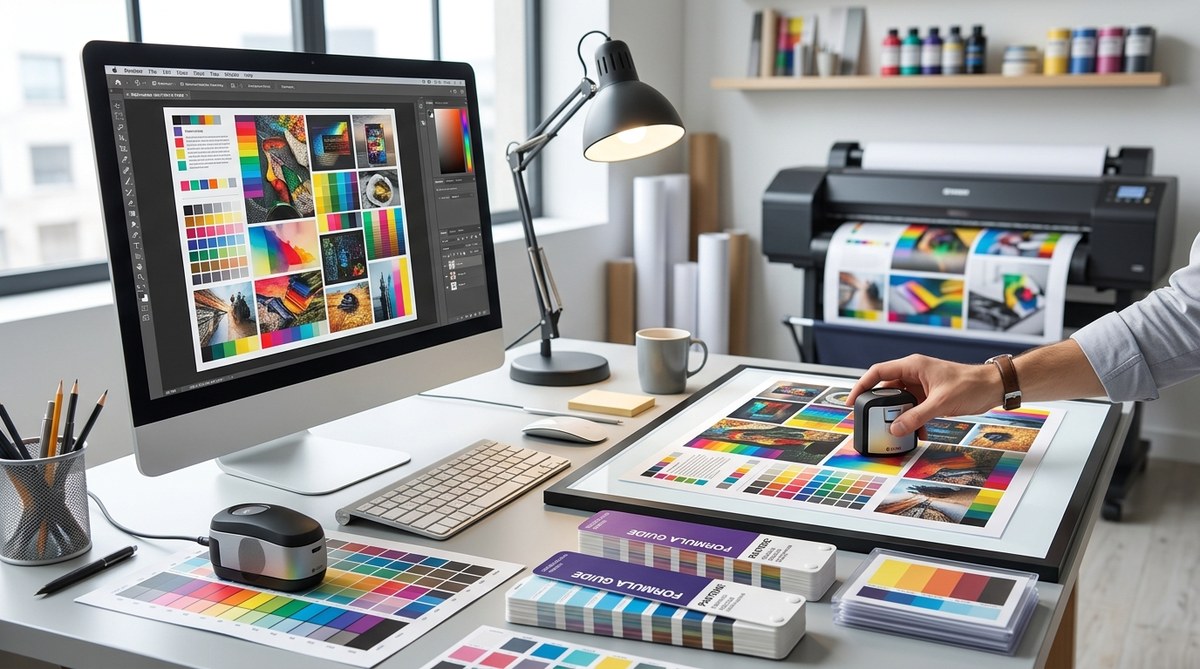
The importance of understanding color profiles and workflows
Color management in print is about controlling how colors are translated from your digital file to the physical print. It involves a combination of using the right color profiles, calibrating equipment, and following consistent workflows. When these elements are aligned, your printed colors will match your digital vision more closely.
Colors on your screen are displayed through RGB (red, green, blue) color mode, which is designed for digital devices. In contrast, print uses CMYK (cyan, magenta, yellow, black) inks. Converting between these modes can introduce discrepancies if not managed properly. Proper print color management ensures that colors look vibrant and consistent in the final product.
Practical steps to improve print color accuracy
Here are five key steps to elevate your print color management process:
-
Use standardized color profiles
Always embed and assign ICC profiles to your digital files. For printing, CMYK profiles such as US Web Coated SWOP or ISO Coated v2 are common standards. These profiles serve as a common language between your design software and the printer, ensuring color consistency.
Tip: When exporting files, select the correct color profile in your design software. This helps maintain color fidelity during printing. -
Calibrate and profile your equipment
Regular calibration of monitors and printers is vital. Use calibration tools to ensure your screen displays colors accurately and your printer produces consistent results. Create custom ICC profiles for your printer and paper type to fine-tune color reproduction.
Expert advice: “Calibrating your devices regularly prevents surprises and keeps your workflow reliable,” advises a printing veteran. -
Choose the right paper and inks
Different papers react differently to inks. Matte, gloss, or textured papers each have unique color characteristics. Select paper types that match your project’s needs and ensure your printer’s ink settings are optimized for that paper.
Scanning tip: Always run test prints on your chosen paper before full production. -
Implement a proofing process
Proofing allows you to see how colors will appear when printed. Use high-quality proofing papers and devices, or request physical proofs from your printer. Compare proofs with your digital design and make adjustments as needed.
Pro tip: Soft proofing on calibrated monitors can help visualize color shifts before printing. -
Establish a consistent workflow
Create standard procedures for preparing files, color converting, and proofing. Consistency minimizes errors and ensures repeatable results. Document your process so team members and printers follow the same steps.
Note: Clear communication with your print partner is key to achieving the desired outcome.
Common pitfalls and how to avoid them
Despite best efforts, mistakes happen. Here’s a quick comparison to help identify and prevent common issues:
| Technique / Mistake | What it Looks Like | How to Fix It |
|---|---|---|
| Ignoring ICC profiles | Colors look dull or oversaturated | Always embed the correct ICC profile for your output device |
| Using uncalibrated devices | Inconsistent color results between prints | Regularly calibrate your monitor and printer |
| Relying solely on screen proofs | Final print differs significantly from digital preview | Request physical proofs or use soft proofing with calibrated monitors |
| Not matching paper and inks | Colors appear washed out or overly dark | Test different paper and ink combinations during proofing |
| Overlooking workflow consistency | Variability in print quality | Standardize and document your processes |
“Effective print color management hinges on consistency and attention to detail at every step,” says a seasoned print technician. Staying disciplined with calibration, profiles, and workflows is the secret to reliable, vibrant results.
Techniques and mistakes in print color management
To clarify what works and what can go wrong, here is a simple overview:
| Technique / Practice | Benefits | Common Mistakes |
|---|---|---|
| Embedding ICC profiles | Ensures color intent is maintained | Forgetting to embed profiles before printing |
| Regular calibration | Maintains device accuracy | Skipping calibration sessions |
| Using proofing tools | Predicts final appearance | Relying only on digital previews |
| Consistent workflow | Reproducible results | Changing processes without documentation |
| Selecting appropriate paper | Accurate color rendering | Using incompatible paper and ink settings |
Final tips for flawless print color results
- Always work with a calibrated monitor and printer.
- Use high-quality, color-managed software for your designs.
- Communicate clearly with your print provider about expectations.
- Run test prints to refine your color settings.
- Keep detailed records of profiles, calibration dates, and paper types used.
“The key to successful print color management is patience and precision,” shares an experienced printer. Take the time to calibrate, proof, and adjust with care.
Making print color management part of your routine
Incorporating these practices into your workflow transforms your print outcomes. Over time, you’ll develop an intuitive sense of how colors behave across devices and media. This consistency builds trust with clients and elevates your brand’s visual impact.
Remember, every printed piece is an extension of your design vision. Proper color management ensures that your intent translates faithfully from screen to paper. Start small by calibrating your devices and creating standard procedures. With patience and attention, you can produce prints that are as vibrant and precise as your digital designs.
Mastering print color management for confident, consistent results
Keep experimenting and refining your process. The more you understand the nuances of color profiles, calibration, and workflow, the more control you gain over your print outcomes. When you approach print projects with a solid system, vibrant, true-to-design results become a standard, not an exception. Your clients and your brand will thank you for the consistent quality that only proper print color management can deliver.