Choosing between serif and sans serif fonts feels like a small decision. But that choice sends a powerful signal to your audience before they read a single word.
The shape of your letters influences how people perceive your brand, whether they trust your message, and how long they engage with your content. Understanding the psychology behind these typefaces helps you make intentional decisions that support your goals instead of working against them.
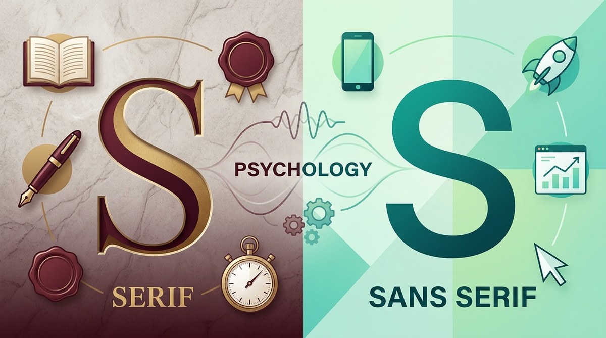
Serif fonts signal tradition, authority, and formality through their decorative strokes, making them ideal for established brands and long-form print. Sans serif fonts communicate modernity, clarity, and approachability through their clean lines, performing better in digital interfaces and contemporary brands. The right choice depends on your audience expectations, medium, and the emotional response you want to trigger. Understanding these psychological associations lets you choose typefaces that reinforce your message instead of contradicting it.
What serifs actually do to reader perception
Serifs are the small strokes or feet at the ends of letterforms.
These decorative elements appeared in Roman inscriptions carved in stone. Stonemasons added them to prevent chipping at letter edges and create cleaner endpoints.
That historical connection still influences how we perceive serif fonts today. They carry associations with tradition, permanence, and established authority.
Research shows readers attribute different personality traits to serif typefaces. A 2012 study published in the journal “Computers in Human Behavior” found that serif fonts increased perceptions of:
- Stability
- Reliability
- Respectability
- Formality
- Tradition
Banks, law firms, and academic institutions favor serif fonts because these associations align with their brand positioning. When you see Times New Roman on a legal document or Garamond in a university publication, those choices reinforce institutional credibility.
The strokes also affect reading patterns. Serifs create horizontal flow that guides the eye along lines of text. This makes them particularly effective for long-form printed content like books, newspapers, and reports.
But context matters enormously. A serif font that builds trust in a financial report might feel stuffy and outdated on a tech startup’s website.
How sans serif fonts changed communication
Sans serif literally means “without serif” in French.
These typefaces emerged in the early 19th century but gained widespread popularity in the 20th century alongside modernist design movements. Designers like Jan Tschichold and Herbert Bayer championed sans serif fonts as symbols of progress and clarity.
That modernist heritage shapes current perceptions. Sans serif fonts communicate:
- Simplicity
- Honesty
- Approachability
- Modernity
- Efficiency
Tech companies overwhelmingly choose sans serif typefaces. Google, Apple, Microsoft, and Meta all use custom sans serif fonts across their brands. These choices signal innovation and forward thinking.
Sans serif fonts also perform better on screens. Digital displays use pixels to render letterforms. The clean, simple shapes of sans serif characters reproduce more clearly at small sizes and lower resolutions than the fine details of serif strokes.
A 2013 study from Software Usability Research Laboratory found that sans serif fonts improved reading speed on screens by an average of 8.5% compared to serif alternatives.
But “better for screens” doesn’t mean “always better.” Context and audience expectations still determine the right choice.
The readability debate that won’t die
Designers have argued about serif versus sans serif readability for decades.
Traditional wisdom claimed serif fonts improved readability in print by guiding the eye along text lines. Digital design introduced the opposite claim: sans serif fonts read better on screens.
Current research shows both claims oversimplify reality.
A 2020 meta-analysis in “Visible Language” reviewed 72 studies on typeface readability. The conclusion? Font category (serif vs sans serif) matters less than specific design qualities like x-height, character width, and stroke contrast.
Well-designed fonts from either category can achieve excellent readability. Poorly designed fonts from either category create reading friction.
What actually affects reading comprehension:
- X-height ratio: Taller lowercase letters relative to capitals improve legibility at small sizes
- Character spacing: Adequate space between letters prevents crowding
- Stroke weight: Consistent thickness maintains clarity
- Distinctive letterforms: Clear differences between similar characters like I, l, and 1
Georgia (serif) and Verdana (sans serif) both work well on screens because Matthew Carter designed them specifically for digital display with these qualities built in.
The medium still influences optimal choices. Print allows finer detail reproduction, making traditional serif fonts viable for body text. Screens benefit from simplified shapes, giving sans serif fonts a practical advantage at smaller sizes.
Matching fonts to emotional goals
Typography triggers emotional responses before conscious thought.
Your font choice sets an emotional tone that either supports or contradicts your message. Mismatches create cognitive dissonance that undermines communication.
Consider these scenarios:
A luxury watch brand using Comic Sans destroys perceived value. A children’s toy company using Bodoni feels cold and inaccessible. A tech startup using Blackletter seems confused about its identity.
Each mismatch happens because the font’s psychological associations conflict with the brand’s intended positioning.
Here’s how serif and sans serif fonts typically align with emotional goals:
| Emotional Goal | Better Choice | Why It Works |
|---|---|---|
| Trust and authority | Serif | Historical associations with established institutions |
| Modern innovation | Sans serif | Clean lines signal forward thinking |
| Warmth and friendliness | Sans serif | Approachable, informal character |
| Sophistication | Serif | Refined details suggest attention to quality |
| Clarity and honesty | Sans serif | Straightforward forms match direct communication |
| Timelessness | Serif | Classical roots transcend trends |
These patterns aren’t absolute rules. Context and execution matter enormously.
A humanist sans serif like Gill Sans can feel warm and approachable. A slab serif like Rockwell communicates strength and modernity. The specific typeface you choose within each category shapes the psychological impact.
What makes a brand memorable? 7 psychology-backed design principles explores how visual choices including typography create lasting impressions.
When serif fonts strengthen your message
Serif fonts work best when you need to establish credibility, tradition, or sophistication.
Long-form print content: Books, magazines, and reports benefit from serif body text. The horizontal flow created by serifs reduces eye fatigue during extended reading sessions.
Formal communications: Legal documents, academic papers, and official correspondence gain authority from serif typefaces. The formality matches reader expectations for these contexts.
Heritage brands: Companies with long histories use serif fonts to emphasize their established presence. Brooks Brothers, Tiffany & Co., and The New York Times all lean into serif typography to signal their legacy.
Luxury positioning: High-end fashion, jewelry, and hospitality brands favor serif fonts. The refined details suggest craftsmanship and attention to quality.
Print advertising: Serif headlines in magazine ads create visual contrast with sans serif body copy while maintaining readability.
Specific serif categories serve different purposes:
- Old Style serifs (Garamond, Caslon): Classical, readable, traditional
- Transitional serifs (Baskerville, Times New Roman): Balanced, versatile, authoritative
- Modern serifs (Bodoni, Didot): Dramatic, elegant, fashion-forward
- Slab serifs (Rockwell, Courier): Bold, sturdy, retro-modern
The subcategory you choose fine-tunes the psychological message within the broader serif framework.
When sans serif fonts serve you better
Sans serif fonts excel in contexts demanding clarity, modernity, or approachability.
Digital interfaces: Websites, apps, and software prioritize sans serif fonts for body text. Clean letterforms render clearly across devices and screen resolutions.
Wayfinding and signage: Airports, highways, and public spaces use sans serif fonts for maximum legibility at distance and speed. Helvetica dominates this category for good reason.
Contemporary brands: Startups and companies positioning themselves as innovative choose sans serif typography. The clean aesthetic signals current thinking.
Informal communication: Marketing materials, social media graphics, and casual correspondence feel more approachable in sans serif fonts.
Technical content: User manuals, data sheets, and instructional materials benefit from sans serif clarity. Readers can process information without decorative elements adding visual noise.
Sans serif subcategories create different impressions:
- Grotesque sans (Akzidenz-Grotesk, Franklin Gothic): Industrial, straightforward, utilitarian
- Neo-grotesque sans (Helvetica, Arial): Neutral, professional, ubiquitous
- Humanist sans (Gill Sans, Frutiger): Warm, organic, friendly
- Geometric sans (Futura, Avenir): Modern, clean, architectural
Matching the subcategory to your specific needs amplifies the psychological impact.
How to choose the perfect font for your brand identity provides a framework for selecting typefaces that reinforce your positioning.
The mixing strategy that actually works
Combining serif and sans serif fonts creates visual hierarchy and adds personality.
This pairing strategy works because contrast helps readers navigate content. Different font styles signal different types of information.
The most common approach pairs serif headlines with sans serif body text or vice versa. This combination provides visual interest while maintaining readability.
Three rules make font mixing successful:
- Create clear contrast: Choose fonts different enough to look intentional, not accidental
- Limit your selection: Two fonts (one serif, one sans serif) cover most needs
- Match the mood: Both fonts should support the same emotional tone despite different structures
A geometric sans serif like Futura paired with a modern serif like Didot creates a sophisticated, fashion-forward combination. Both fonts share clean lines and contemporary sensibility despite different structures.
A humanist sans serif like Frutiger paired with an old style serif like Garamond creates a warm, approachable combination. Both fonts have organic, human qualities that harmonize.
Mismatched moods create visual discord. Pairing the playful Comic Sans with the formal Trajan fails because their emotional messages contradict each other.
Common successful pairings:
- Playfair Display (serif) + Source Sans Pro (sans serif): Editorial elegance
- Merriweather (serif) + Open Sans (sans serif): Readable versatility
- Lora (serif) + Montserrat (sans serif): Modern sophistication
- Crimson Text (serif) + Raleway (sans serif): Clean professionalism
How to choose the perfect font pairing for your logo design offers specific techniques for combining typefaces effectively.
Testing your typography choices
Assumptions about font psychology don’t always match reality for your specific audience.
Testing validates or challenges your typographic decisions before full implementation.
A/B testing: Create two versions of the same content with different font choices. Measure engagement metrics like time on page, scroll depth, and conversion rates. Statistical differences reveal which typography performs better for your goals.
Readability testing: Ask representative users to read sample content in different typefaces. Measure reading speed and comprehension through follow-up questions. This reveals functional performance beyond aesthetic preference.
Perception surveys: Show mockups using different fonts. Ask participants to rate attributes like trustworthiness, modernity, or approachability. This quantifies the psychological associations your audience actually makes.
Context testing: View your typography choices across different devices, sizes, and backgrounds. What works beautifully on a desktop monitor might fail on a mobile screen.
Three practical testing steps:
- Define success metrics: Decide what “better” means for your project (readability, brand perception, conversion, engagement)
- Create controlled variations: Change only the typography variable between test versions
- Gather sufficient data: Test with enough participants or pageviews to reach statistical significance
Testing prevents expensive mistakes. A financial services company might assume serif fonts build more trust, but testing could reveal their younger target audience perceives sans serif fonts as more honest and transparent.
Your specific context, audience, and goals determine the right choice. Testing replaces assumptions with evidence.
Building typography into your brand system
Consistent typography reinforces brand recognition across every touchpoint.
How to build a brand style guide that actually gets used helps you document your typographic decisions so everyone on your team applies them correctly.
Your brand typography system needs:
Primary typeface: The main font representing your brand personality. This appears in headlines, key messages, and prominent positions.
Secondary typeface: A complementary font for body text and supporting content. This prioritizes readability while harmonizing with your primary choice.
Hierarchy rules: Clear specifications for when to use each font, at what sizes, and with what styling (bold, italic, etc.).
Technical specifications: Font files, licensing information, and fallback options for different platforms.
Usage examples: Visual references showing correct application across different contexts (website, print, social media, presentations).
A complete typography system might specify:
- Headlines: Playfair Display Bold, 48pt
- Subheadings: Playfair Display Semibold, 32pt
- Body text: Source Sans Pro Regular, 16pt
- Captions: Source Sans Pro Italic, 14pt
- Buttons: Source Sans Pro Bold, 14pt, all caps
These specifications remove guesswork and ensure consistency as your brand scales.
“Typography is the detail and the presentation of a story. It represents the voice of an atmosphere, or historical setting of some kind. It can do a lot of things.” — Cyrus Highsmith, type designer
The psychological impact of your typography compounds with consistent application. Every exposure reinforces the associations you’re building.
Why your small business needs a brand system, not just a logo explains how systematic design choices including typography create cohesive brand experiences.
Common typography mistakes that undermine psychology
Even designers who understand font psychology make preventable errors.
Mistake 1: Choosing fonts based on personal preference
Your taste doesn’t matter. Your audience’s perception does.
A founder who loves ornate Victorian serifs might choose Blackletter for their modern SaaS company. The psychological mismatch confuses potential customers regardless of the founder’s aesthetic preferences.
Mistake 2: Using too many typefaces
Every additional font dilutes your message and creates visual chaos.
Limit yourself to two fonts maximum for most projects. One serif and one sans serif covers nearly every need. Adding a third font rarely improves communication and often degrades it.
Mistake 3: Ignoring technical performance
Beautiful typography that loads slowly or renders poorly fails functionally.
Web fonts add page weight. Obscure typefaces might not display correctly across all devices. Test technical performance alongside aesthetic appeal.
Mistake 4: Following trends blindly
Trendy fonts date quickly and might not match your brand personality.
Ultra-thin sans serif fonts became popular in the mid-2010s. Many brands adopted them without considering accessibility implications. Low-contrast letterforms create reading difficulties for users with visual impairments.
Mistake 5: Neglecting hierarchy
Using the same font at the same size for everything eliminates visual navigation.
Create clear size and weight differences between headlines, subheadings, body text, and captions. This hierarchy guides readers through your content intuitively.
| Mistake | Psychological Impact | Fix |
|---|---|---|
| Mismatched formality | Confusion, distrust | Align font personality with content tone |
| Poor contrast | Frustration, abandonment | Ensure sufficient size and weight differences |
| Inconsistent application | Unprofessional perception | Document and follow typography standards |
| Ignoring accessibility | Exclusion of users | Test with screen readers and contrast checkers |
| Trend chasing | Dated appearance | Choose timeless fonts that age well |
7 typography mistakes that make your designs look unprofessional identifies additional pitfalls and solutions.
Applying psychology to real projects
Theory means nothing without application.
Here’s how to use serif vs sans serif psychology in actual design decisions:
For a law firm website: Choose a transitional serif like Baskerville for headlines to communicate authority and tradition. Pair with a humanist sans serif like Frutiger for body text to maintain approachability. This combination signals expertise without intimidation.
For a fitness app: Select a geometric sans serif like Avenir for all typography. The clean, energetic letterforms match the brand’s modern, active positioning. Avoid serifs entirely as they would introduce formality that contradicts the casual, motivational tone.
For a literary magazine: Use an old style serif like Garamond for body text to honor publishing tradition and optimize print readability. Add a contemporary sans serif like Helvetica for headlines and captions to prevent the design from feeling dated.
For a children’s product: Choose a friendly humanist sans serif like Quicksand with rounded terminals. The approachable, playful character matches the target audience. Serif fonts would introduce inappropriate formality.
For a financial report: Combine a slab serif like Rockwell for headlines (communicating stability and strength) with a neo-grotesque sans serif like Helvetica for data tables (maximizing clarity and legibility).
Each decision starts with understanding your audience’s expectations and your communication goals. The font choice follows naturally from that foundation.
Typography decisions that match your medium
The platform where your typography appears changes optimal choices.
Print materials: Higher resolution allows finer details. Serif fonts perform well in body text. Consider paper texture and ink absorption in your selection.
Websites: Variable screen sizes and resolutions favor sans serif fonts for body text. Ensure your choices include proper web font files and load efficiently.
Mobile apps: Small screens demand maximum clarity. Sans serif fonts at appropriate sizes prevent eye strain. Test on actual devices, not just desktop simulators.
Presentations: Viewing distance matters enormously. Choose fonts with strong character differentiation and avoid thin weights that disappear when projected.
Social media graphics: Attention spans are short. Bold, high-contrast typography grabs attention. Sans serif fonts typically perform better in these contexts.
Email newsletters: Rendering varies across email clients. Stick with web-safe fonts or ensure proper fallbacks. Sans serif fonts offer more consistent display.
Medium-specific considerations:
- Print: 10-12pt for body text, serif fonts work well
- Desktop web: 16-18px for body text, either category works
- Mobile web: 16px minimum for body text, sans serif preferred
- Presentations: 24pt minimum, high-contrast sans serif
- Social graphics: Large, bold typography regardless of category
How to improve text readability in web and mobile designs provides specific techniques for optimizing typography across digital platforms.
Your typography reflects your values
Every font choice communicates whether you intend it or not.
Serif fonts tell your audience you value tradition, authority, and refinement. Sans serif fonts signal that you prioritize clarity, modernity, and accessibility.
Neither category is inherently better. The right choice depends on your brand positioning, audience expectations, and communication context.
Understanding the psychology behind these typefaces lets you make intentional decisions. Your typography can reinforce your message and strengthen your brand instead of working against you.
Start by auditing your current typography. Does it match the perception you want to create? Does it serve your audience’s needs? Does it perform well across all your platforms?
Then make changes based on evidence, not assumptions. Test different options. Measure results. Build a typography system that works consistently across your brand.
The fonts you choose matter more than most people realize. Make them count.