You’ve probably heard both terms thrown around in design meetings, print shops, and software menus. DPI. PPI. Sometimes used interchangeably. Sometimes debated with surprising passion. But here’s the…
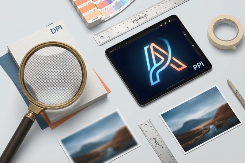
You’ve probably heard both terms thrown around in design meetings, print shops, and software menus. DPI. PPI. Sometimes used interchangeably. Sometimes debated with surprising passion. But here’s the…
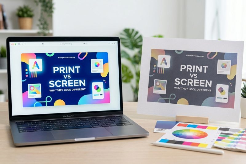
You’ve spent hours perfecting your design on screen. The colors are vibrant, the contrast is beautiful, everything looks exactly how you want it. Then you print it, and the result is a muddy,…
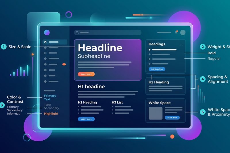
You open an app and know exactly where to look. The headline grabs you. The subheading explains. The body text feels easy to read. That’s not luck. It’s typography hierarchy doing its job. Good…

Navigation can make or break your digital product. Users abandon websites and apps when they can’t find what they need within seconds. The right navigation design patterns solve this problem by…

Your customer sees your Instagram post in the morning, visits your website at lunch, and receives your email newsletter in the evening. If each feels like it came from a different company, you’ve got…
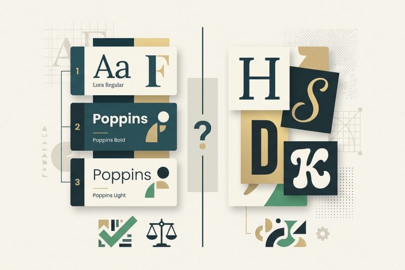
Most designers learn the two-font rule early on, but then they see beautiful designs using three, four, or even five typefaces. The confusion is real. The truth is, there’s no magic number that works…
Variable fonts promise to simplify your workflow and speed up your site. One file replaces dozens of static font files. You get infinite design flexibility without the bloat. But if you implement…
Your logo needs to work at 16 pixels and 16 feet. That’s the reality of modern branding. One day it’s a tiny app icon on someone’s phone. The next, it’s printed on a billboard beside the highway. If…
Your brand looks great today. But what happens when you launch a new product line, hire your first marketing manager, or expand into a second location? Most businesses hit a wall. The logo that…
Your brand shows up everywhere. Your website. Your Instagram posts. Your business cards. Your email signature. But does it all look like it comes from the same company? Most small businesses don’t…