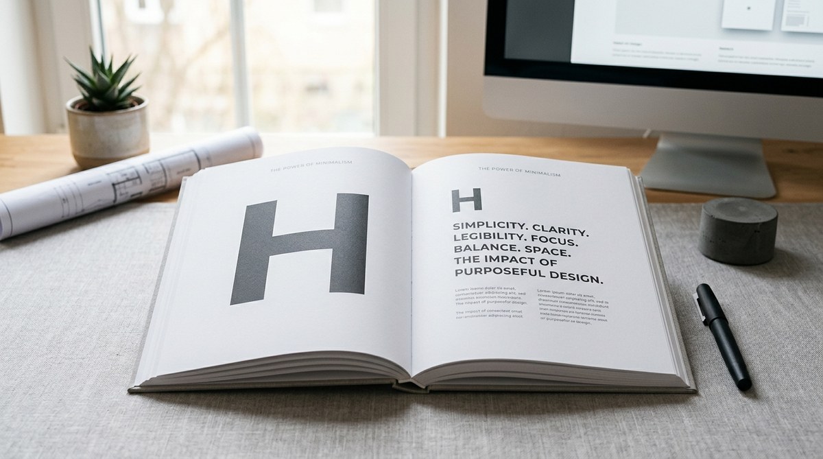
You already know that a well-placed font can make or break a layout. But when you strip everything else away, typography becomes the star of the show. Minimalist typography isn’t about being boring. It’s about using type with intention, letting each letter, line, and gap do the heavy lifting. When done right, your message lands harder, your brand feels more confident, and your audience stays longer. Let’s get into why this approach works and how you can apply it today.
Minimalist typography boosts impact by removing the visual noise that competes with your message. To master it, focus on three pillars: choose a single high-quality typeface, create strong contrast through size and weight, and use generous white space. Avoid decorative fluff, inconsistent spacing, and low contrast. The result is a design that feels premium, trustworthy, and easy to read.
Why Less Is More in Typography
Every extra font, ornament, or shadow you add comes with a cost. That cost is attention. When your design is cluttered, readers have to work harder to find what matters. Minimalist typography flips that equation. By cutting the noise, you give the words room to breathe.
Think about the last app or website that felt calm and effortless to use. Chances are it relied on a simple type system. Companies like Apple, Medium, and Google have built entire brand identities around clean typography. They understand that when people don’t notice the type itself, they can focus on the content.
Minimalist typography also scales better. A bold headline in Helvetica Neue looks just as good on a billboard as it does on a phone screen. The same cannot be said for a heavily decorated font with thin strokes and complex curves. Consistency across devices is a serious advantage in 2026.
The Anatomy of Minimalist Typography
To get high impact with few elements, you need to master a handful of fundamentals. These aren’t rules written in stone, but they work in almost every scenario.
1. Typeface Selection
Stick to one strong typeface at first. If you need variety, use a second as an accent. The best minimalist fonts are neutral, geometric, or humanist sans serifs. Think Inter, Lato, or Work Sans. Serifs like EB Garamond or Libre Baskerville can work too, especially for long-form editorial. The key is to avoid anything with excessive personality or decoration. Your typeface should never steal the show. It should set the stage.
2. Hierachy Through Weight and Size
Without colors, icons, or images, your hierarchy must come from type alone. Use three or four sizes. A massive headline, a medium subhead, and a comfortable body size. Mix in bold and regular weights. Creating contrast between these levels tells the reader where to start and what is important.
If you want a deeper understanding of this, read what font hierarchy really means and how to apply it.
3. White Space as a Design Tool
White space is not empty space. It is a deliberate pause. Surround your headlines with generous margins. Increase line height to 1.5x or 1.6x for body text. Add breathing room around buttons and links. When you cut visual clutter, white space becomes the frame that makes the type feel expensive.
4. Contrast and Legibility
Minimalist typography fails if people cannot read it easily. Avoid low contrast colors like light gray on white. Stick to black or a deep dark gray on white, or white on a dark background. Ensure your font sizes meet accessibility standards (at least 16px for body text on web). For more on this, check out how to improve text readability in web and mobile designs.
How to Apply Minimalist Typography in 5 Steps
Here is a practical process you can start using today.
-
Start with a single typeface. Pick one reliable sans serif or serif. Use it for everything: headlines, body, captions. This forces you to build hierarchy through size and weight instead of font changes.
-
Define your type scale. Choose three sizes: a large Headline (around 60px desktop), a Subhead (around 24px), and Body (16px). Write them down in your design system.
-
Set generous line spacing. For body text, set line-height to at least 1.5. For headlines, 1.1 to 1.2. This prevents text from feeling cramped.
-
Limit your palette. Use no more than two colors: one for text, one for accents or links. Black and a single accent color work well.
-
Remove everything unnecessary. Go through your layout and delete any borders, drop shadows, or decorative elements that do not add clarity. If a line or icon isn’t helping, cut it.
Common Pitfalls and How to Avoid Them
Even experienced designers fall into these traps. Here is a table of mistakes and their fixes.
| Mistake | Why It Hurts | Fix |
|---|---|---|
| Too many fonts | Clutters the visual hierarchy and confuses the brand | Use one family, or at most two with distinct roles |
| Low contrast text | Strains eyes and fails accessibility checks | Use at least 4.5:1 contrast ratio for body text |
| Inconsistent spacing | Makes the design feel sloppy and unprofessional | Define standard margins and stick to a vertical rhythm |
| Overusing uppercase | Reduces readability and screams instead of talks | Reserve uppercase for short headlines or labels |
| Ignoring line length | Lines longer than 70 characters tire the eyes | Keep line length between 50 and 70 characters (including spaces) |
These are some of the most common issues. If you see them in your work, you are not alone. The fix is often a single adjustment.
Expert Advice on Staying Minimal
“Typography is the craft of arranging letters so the reader is never aware of the arrangement. The best type is invisible. The moment a reader says ‘nice font,’ you have probably failed.”
— Inspired by classic design wisdom, this quote reminds us that minimal typography is about communication, not decoration.
That is the goal. When a user scrolls past your design and absorbs the message without pausing to examine the font, you have succeeded. The type fades into the background because it serves the content.
When to Break the Rules
Minimalist typography is not the answer for every project. There are moments when a bold, experimental font or a playful layout is exactly what the brief calls for. Here are a few situations where you might bend the minimalist approach:
- Branding for a children’s toy line — a whimsical, rounded font adds personality.
- Event posters for a music festival — loud, stacked typography can create energy.
- Editorial design for a niche magazine — a strong editorial serif with dramatic contrast can set the tone.
The trick is to break the rules on purpose, not by accident. Know why you are adding that extra weight or ornament, and ensure it serves the message.
Tools to Help You Master Minimalist Typography
You do not need expensive software to practice. Here are a few free tools that make type experimentation easy:
- Google Fonts — thousands of high-quality typefaces, all free.
- Type Scale — a web tool to generate a harmonious type scale.
- Check My Colours — test contrast ratios for accessibility.
- Figma — use its text styles panel to define system scales.
For a deeper look at combining multiple fonts tastefully, see how to pair Google fonts like a pro. If you are wondering whether you should ever use more than two fonts, this article covers the trade-offs clearly.
Your Next Design Challenge
Now it is your turn. Pick a current project and strip it down. Remove every element that isn’t essential. Replace any decorative font with a clean, neutral one. Double the white space around the main heading. Then step back and see how the design feels.
You might be surprised how much power comes from simplicity. Minimalist typography is not a restriction. It is a framework that frees your message to shine. Try it on one page, one slide, or one post. Then keep going.
