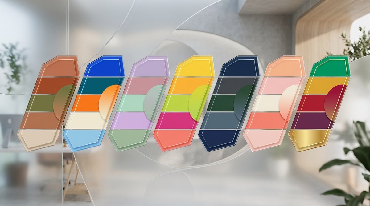
The year 2026 is bringing a fresh wave of color confidence. After years of muted neutrals and safe beiges, the design world is leaning into bolder, more personal choices. Think sunset oranges, icy blues, and earthy greens that feel alive. These aren’t just colors for the runway or the gallery. They are showing up in living rooms, brand identities, social media feeds, and even the apps on your phone. The new palettes balance emotional warmth with digital clarity. They invite you to take risks while still feeling grounded. Whether you are a graphic designer looking to refresh a brand system, an interior decorator planning a client’s living room, or a fashion enthusiast curating your next capsule wardrobe, these color trends 2026 will give you a head start.
Color trends 2026 center on expressive yet approachable hues. The top palettes include Persimmon Punch, Icy Blue, Jadeite, Black Plum, Wasabi, Warm Sand, and Electric Tangerine. To use them well, pair one trend color with a neutral base, apply the 60-30-10 rule, and test in real light. These palettes work for branding, interiors, and fashion when you keep contrast and intention high.
The Big Shift in 2026 Color Palettes
Why are these colors taking over? The post-pandemic craving for comfort has evolved. People now want spaces and brands that reflect personality, not just safety. At the same time, technology is influencing palettes. The rise of augmented reality and high-contrast screens pushes designers toward colors that pop without feeling aggressive. The result is a collection of shades that feel both nostalgic and futuristic.
A key theme this year is grounded vibrancy. Each trend color has a strong presence but sits on a solid base. For example, a bright orange is paired with a warm beige, not pure white. A cool blue is anchored by a deep charcoal. This approach makes even bold colors feel livable.
“The best color trends 2026 are the ones that surprise you without overwhelming you. They have a soul.” — Lydia Chen, Color Strategist at Studio Chroma
The 7 Color Trends 2026 You Need to Know
1. Persimmon Punch
Persimmon Punch is a vibrant reddish-orange that sits between tomato and burnt sienna. It is the energy of a sunset but grounded by earthy undertones.
Where you will see it: Feature walls in living rooms, accent chairs, hero product packaging, and statement coats. It pairs beautifully with Warm Sand and muted teal.
How to use it: Start with a small accent. A Persimmon Punch throw pillow or a single piece of wall art can transform a neutral room. For branding, use it as a call-to-action button color or a logo accent. Check the contrast against its background to ensure readability.
2. Icy Blue
Icy Blue is a cool, airy blue with a hint of frost. Think of a winter sky just after a storm. It is calm without being cold.
Where you will see it: Bathroom tiles, website backgrounds, lightweight sweaters, and social media templates.
How to use it: Icy Blue works best as a dominant background color. It creates a sense of openness. Pair it with White for a minimalist look or with Black Plum for dramatic contrast. In digital design, Icy Blue reduces eye strain and feels modern.
3. Jadeite
Jadeite is a rich green with a blue undertone. It is deeper than mint but lighter than forest. This color trend 2026 draws from nature and luxury.
Where you will see it: Kitchen cabinets, statement pieces of furniture, editorial layouts, and jewelry design.
How to use it: Use Jadeite as a secondary color in the 60-30-10 rule. Let it cover about 30% of a space. It pairs well with Warm Sand, Persimmon Punch, and creamy whites. In brand design, Jadeite signals growth, stability, and a touch of elegance.
4. Black Plum
Black Plum is a dark purple that almost looks black in low light. It is sophisticated and moody.
Where you will see it: Accent walls in bedrooms, high-end packaging, evening wear, and logo lockups.
How to use it: Black Plum is best as a dramatic accent or a neutral alternative to black. Use it sparingly because it absorbs light. Pair it with Icy Blue or Electric Tangerine for a pop. In typography, black plum text on a white background feels luxurious without being harsh.
5. Wasabi
Wasabi is a zesty green-yellow that sits between chartreuse and olive. It is sharp, fresh, and slightly unexpected.
Where you will see it: Kitchen accessories, plant pots, streetwear, and infographic highlights.
How to use it: Wasabi is an accent color by nature. It works well in small doses. Use it for borders, highlights, or small graphic elements. Combine it with neutral grays or Warm Sand. In fashion, a Wasabi bag or shoes can elevate an all-black outfit.
6. Warm Sand
Warm Sand is a beige with a pinkish undertone. It is not your basic beige. It feels sun-kissed and natural.
Where you will see it: Wall paint, upholstery, packaging backgrounds, and email newsletter backgrounds.
How to use it: Warm Sand is the perfect neutral for 2026. It replaces cool grays and cold whites. Use it as the dominant 60% color in any palette. It makes other colors look richer. In building a brand style guide, start with Warm Sand as your base and layer in accent colors.
7. Electric Tangerine
Electric Tangerine is a neon-tinged orange that sits between tangerine and coral. It is pure energy.
Where you will see it: Sports apparel, event flyers, social media graphics, and nightlife interiors.
How to use it: This color demands attention. Use it as a 10% accent in the 60-30-10 rule. Apply it to buttons, links, or highlights. To make it work for a mature audience, pair it with Black Plum or a deep charcoal. Avoid pairing it with other brights unless you want a maximalist look.
How to Incorporate These Color Trends 2026 into Your Work
Using a trend palette well requires more than picking a favorite shade. Follow this simple process to make sure your choice lands right.
-
Define the mood. Write down three words that describe the feeling you want. For example: “calm, trustworthy, modern” or “playful, premium, bold.” This will guide your palette selection.
-
Select one trend color and a neutral. Pick one from the list above. Then choose a neutral base: Warm Sand, white, light gray, or black plum (if you want a dark base). This prevents the trend from overwhelming the project.
-
Test in context. Apply the palette to a real mockup. Look at it on a screen, printed, or in the actual room. Adjust saturation or lightness if needed. A color that looks great on a monitor may feel too intense on a wall.
Common Mistakes When Using Trend Colors
| Mistake | Why It Happens | Fix |
|---|---|---|
| Using too many trend colors | Excitement about all the new shades | Limit to one trend color per project |
| Ignoring contrast | Similar value between trend and background | Use the 60-30-10 rule |
| Skipping the neutral anchor | The palette feels loud and chaotic | Always include a neutral or dark base |
| Forgetting the audience | The trend doesn’t match brand tone | Check the psychology of color before committing |
| Not testing in real light | Color looks different in natural vs artificial light | Always view a physical sample in the space |
Characteristics of the 2026 Color Movements
If you want to predict which shades will work for your project, these patterns can help:
- Unexpected pairings. Bright orange with muted beige, icy blue with deep plum. The tension between warm and cool is intentional.
- Texture matters. The same shade looks different on matte paint, glossy packaging, or woven fabric. Consider the surface.
- Digital-first thinking. Many of these colors were chosen because they render well on screens. They have enough saturation to look clear on mobile devices.
- Slow adoption. These are not throwaway fads. They are designed to last for at least three to five years, making them safe for branding investments.
Building a Cohesive System Around One Trend
Once you pick a trend color, you need the supporting cast. A cohesive color scheme uses the trend for accent, a neutral for background, and a third color for contrast. For example, a brand targeting young professionals might use Icy Blue as a background, Warm Sand for cards, and Black Plum for headlines.
If you are a designer working with a client, present the palette with a real-world application. Show a mockup of their website, a storefront, or a product label using the trend. This makes the decision easier.
For interior designers, remember that lighting changes everything. A Persimmon Punch wall in a north-facing room will look different than one in a south-facing room. Always paint a sample and live with it for a few days.
Your Next Step with Color Trends 2026
The seven palettes above give you a solid starting point for any creative project this year. Whether you are choosing brand colors that actually convert or repainting your living room, these shades are built for confidence. Start small. Pick one trend color that resonates with your project’s mood. Pair it with a neutral you trust. Then watch how it transforms the feel of the space or the brand. The best designs in 2026 will not be afraid of color. They will use it with intention. So go ahead, try Persimmon Punch on a pillow or Wasabi on a button. See how it feels. You might discover a new favorite.
