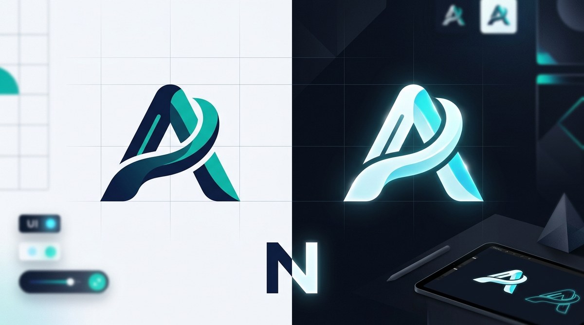
Dark mode has moved from a trendy feature to a default setting. Millions of users now browse social media, read emails, and check websites with dark backgrounds. If your logo disappears, glows weirdly, or looks muddy against a dark screen, you are losing brand recognition. The good news is that adapting your logo for dark mode does not require a full rebrand. A few smart adjustments can make your mark feel right at home on any interface.
Dark mode forces your logo to work against a deep background instead of white. To succeed, you need high contrast, adjusted colors, and sometimes a separate dark mode version. This guide walks you through checking contrast, choosing the right file formats, and avoiding common pitfalls so your logo stays recognizable and professional everywhere.
Why Standard Logos Fail on Dark Backgrounds
Most logos are designed on white or light backgrounds. When you drop them onto a dark surface, several things can go wrong.
- Thin strokes vanish. Hairline details become invisible against black or dark gray.
- Light colors blend in. Pastel yellows, pinks, and light grays disappear into the background.
- Opacity issues arise. Logos that rely on transparency may look washed out or show unintended color shifts.
- Glow effects look cheap. Adding a white stroke or drop shadow to force visibility often makes the logo feel unpolished.
The core problem is that darkness affects how we perceive color and contrast. A vibrant blue on white can look dull on black. A saturated orange may become hard to read. That is why you cannot simply invert your logo and call it done.
A Simple 5 Step Process
-
Audit your current logo on a dark background. Drop it into a dark gray (#121212) and a pure black background. Look at all elements: text, icons, gradients. Make note of anything that becomes hard to see or loses its shape.
-
Create a dedicated dark mode version. This does not mean redesigning from scratch. Often you just need to shift colors. Lighten the main brand hue slightly, increase saturation, and add a subtle outline or inner shadow for separation. For example, a navy blue logo on white can become a lighter cyan on dark. Avoid pure white for text; use a soft off-white like #F5F5F5 to reduce eye strain.
-
Test contrast using accessibility tools. Use the WebAIM contrast checker or a browser plugin to ensure your logo meets WCAG AA standards (4.5:1 for normal text, 3:1 for large elements). This is especially important if your logo includes text or detailed symbols.
-
Export in the right file formats. You need SVG for scalable use, PNG with a transparent background for apps, and sometimes a light version with a white background for dark mode email templates. Remember to include both the standard and dark mode files in your brand kit.
-
Update your brand guidelines. Document the exact hex codes for dark mode, specify when to use each version, and provide examples of correct and incorrect usage. This prevents other team members from accidentally using the wrong file.
“A logo that works in both light and dark modes is not a luxury anymore. It is a requirement for any brand that appears on screens. Start with contrast, then adjust colors. Your audience will thank you.” – Sarah Chen, Brand Strategy Lead at DesignForward
Color and Contrast: A Practical Table
The table below shows common logo color types and how they behave in dark mode, plus the best fix.
| Original Color Type | Behavior on Dark Background | Recommended Adjustment |
|---|---|---|
| Dark blue, deep purple | Disappears into black | Lighten by 30-40%, increase saturation |
| Yellow, light orange | Looks good but may feel dull | Keep as is or bump saturation slightly |
| White / off-white | Hard edges; can cause halation | Use tinted white (#F0F0F0) and add a subtle shadow |
| Red, green | Can look muddy if low saturation | Increase vibrance; avoid pure red on pure black |
| Gradients | Often lose contrast at edges | Simplify to solid colors or add a thin stroke along the gradient path |
| Transparent elements | Unpredictable on dark | Convert to solid shapes or add a background layer |
Common Mistakes to Avoid
- Using a white stroke around the logo. This looks dated and adds unnecessary visual noise. Instead, increase the logo’s internal contrast.
- Assuming the inverted version is enough. Inverting colors rarely works because perceived brightness changes. A dark blue logo on white becomes a light blue on dark, which can look pale.
- Forgetting about hover states. In dark mode interfaces, links and interactive elements often have different hover colors. Make sure your logo adapts to those states too.
- Not testing on actual devices. What looks good on a MacBook Pro screen may look terrible on an Android phone in dark mode. Always check on multiple screens.
- Delivering only one file. Clients need both light and dark versions. Always package them together.
Tools to Help You Test and Adjust
Whether you are a solo designer or part of a brand team, these resources can simplify your workflow.
- 10 Free Tools to Test Your Logo Design Before Launch will help you catch contrast issues early.
- Understanding What Is Color Contrast and Why Does It Make or Break Your Designs? is essential for dark mode success.
- If you are building a full brand system, read Why Your Small Business Needs a Brand System, Not Just a Logo.
Making Dark Mode a Natural Part of Your Brand
Dark mode adaptation should feel like an extension of your existing identity, not a separate design. When you get it right, users will not notice the effort. They will just see a logo that belongs wherever they look.
Start by updating your brand style guide to include dark mode specifications. List the exact hex codes, preview both versions side by side, and show examples of correct usage on dark backgrounds. This small investment saves hours of future headaches.
Your logo is the face of your brand. In 2026, that face needs to look good in the light and in the dark. Take the steps above, test thoroughly, and you will have a logo that works everywhere. Your audience will appreciate the consistency, and your brand will feel modern and professional no matter which mode they choose.
