Designing text that invites readers to keep going is both an art and a science. Good typography makes your content easier to read, more engaging, and ultimately more persuasive. When line length is just right and letter spacing is carefully tuned, your audience can absorb information effortlessly. Small adjustments can significantly enhance user experience, whether you are crafting a blog post, a website, or a digital product. Let’s look at how you can refine your typography with practical, easy-to-apply tips.
Optimizing line length and letter spacing enhances readability by guiding eye movement smoothly and reducing strain. Applying best practices in typography ensures your content remains engaging and accessible across devices and audiences.
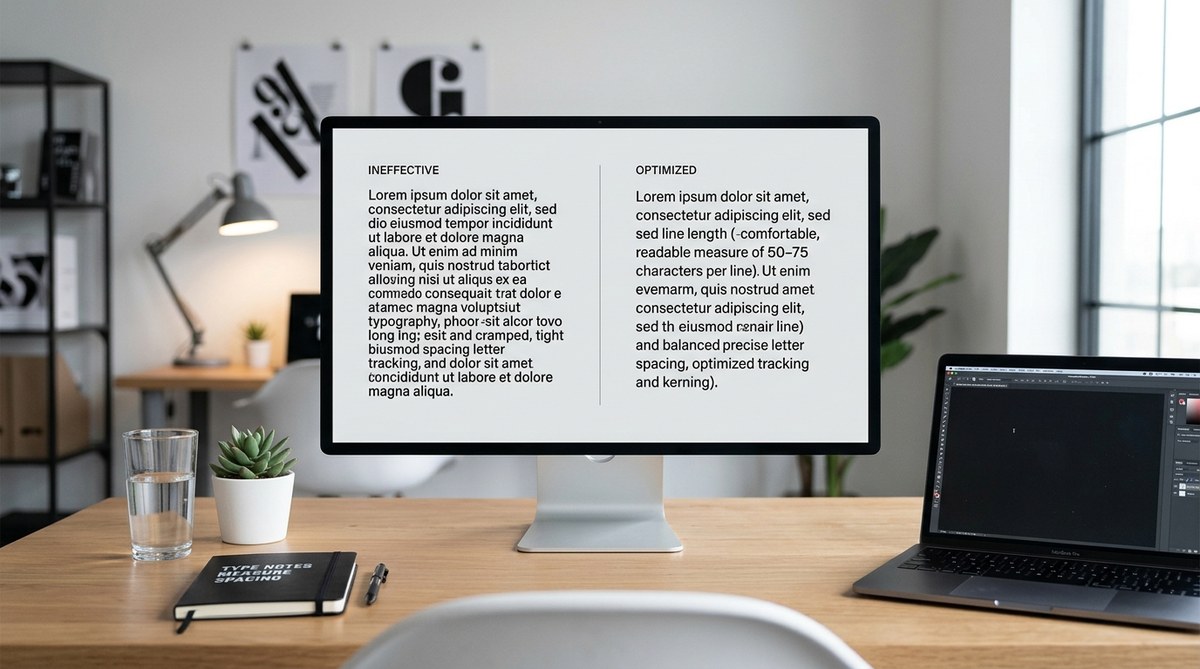
Why line length and letter spacing are crucial for readability
Typography is more than just choosing a font. It’s about how the text flows on the page or screen. When line length and letter spacing are off, readers will struggle, lose interest, or misinterpret your message. Proper line length prevents eye fatigue, while adequate letter spacing ensures clarity and avoids crowding.
Good typography reduces cognitive load. It allows readers to focus on your message without distraction. Small tweaks to line length and letter spacing can make your content appear more professional, inviting, and easy to scan.
How to set optimal line length for easy reading
Line length refers to the number of characters per line. The right length balances readability and efficiency. Too short, and your text appears choppy; too long, and readers strain trying to track across the page.
1. Follow the 50 to 75 character rule
A simple rule for comfortable reading is to aim for 50 to 75 characters per line, including spaces. This range supports smooth eye movement and reduces fatigue. When designing for web, set your CSS to keep line length within this range, using max-widths in ch units (character units) for precision.
2. Adjust line length based on device and context
On mobile screens, keep lines shorter—around 40 to 50 characters—to accommodate smaller viewports. On desktop, you can extend to 75 characters. Use responsive CSS techniques to adapt line length dynamically, ensuring a consistent reading experience across devices.
3. Test with real content and users
Use tools like measuring the character count or visual tests. Adjust your layout until the flow feels natural. Remember, the goal is to make reading feel effortless, not a chore.
The impact of letter spacing on clarity
Letter spacing, or tracking, influences how easily individual characters are distinguished. Proper spacing makes words legible and prevents characters from merging, especially in larger blocks of text or decorative fonts.
1. Keep letter spacing consistent
Avoid cramming letters too close together or spreading them too far apart. A good starting point is to set tracking at 0 in your design software or CSS unless the font designer recommends otherwise.
2. Adjust for font and size
Some fonts need more space at larger sizes, while others work better with tighter tracking. For headings, slightly increased letter spacing can improve readability and add visual interest.
3. Be mindful of accessibility
For users with visual impairments or dyslexia, increased letter spacing can help distinguish characters more clearly. Test your typography with diverse audiences to find a balance that supports all readers.
Practical process to improve your typography
Implementing these tips involves a step-by-step approach. Here’s a simple process:
- Choose your font wisely: Select a font known for readability. Sans-serif fonts like Arial or Helvetica are often preferred for digital content, while serif fonts can work well in print or long-form reading.
- Set line length in CSS: Use a max-width in
chunits to control line length. For example,max-width: 70chkeeps lines within the optimal range. - Adjust letter spacing: Use CSS letter-spacing property to fine-tune spacing. Start with
0px, then tweak by small increments (like0.02em) to improve clarity. - Test across devices and browsers: Check how your content looks on desktops, tablets, and smartphones. Make adjustments to ensure consistency and comfort.
- Solicit feedback: Ask users or colleagues to read your content and provide input on readability. Use their insights to refine further.
Common mistakes and how to avoid them
| Techniques | Mistakes to avoid |
|---|---|
| Setting line length too long | Overwhelming the reader, causing fatigue |
| Using fixed line widths without responsiveness | Content breaks on various devices |
| Crowding characters with too tight spacing | Reducing legibility, causing confusion |
| Overly wide letter spacing | Making text appear disjointed or unprofessional |
| Ignoring accessibility needs | Alienating users with visual or reading difficulties |
“Remember, the goal is to create a visual rhythm that guides the reader effortlessly through your content.” — typography expert
Tips for applying letter spacing and line length effectively
- Use responsive units for line length to adapt to different screens
- Adjust letter spacing slightly for headings to create visual hierarchy
- Keep consistent spacing throughout your content
- Use tools like CSS frameworks or typography plugins to maintain balance
- Test with real users to identify pain points
Tools and templates to streamline your typography work
- CSS units like
chfor precise line length control - Typography testing tools such as Type Scale for consistent sizing
- Accessibility checkers to evaluate font legibility
- Templates that specify optimal line length and spacing for different layouts
Final thoughts on mastering readability
Refining your typography isn’t about making everything perfect. It’s about creating a comfortable reading experience that invites your audience to engage. Small, intentional adjustments to line length and letter spacing can transform your content from good to exceptional. Regular testing and feedback ensure your design remains user-centered. Remember, the best typography adapts to your content and audience needs. Keep experimenting, and your readers will thank you.
Keep your typography inviting and clear
Applying these practical tips helps you craft text that feels natural and effortless to read. Whether you’re designing a website, a newsletter, or a report, focusing on line length and letter spacing pays off. Your audience will find it easier to digest your message, stay engaged, and return for more. Take the time to fine-tune your typography, and watch your content’s impact grow.