Designing with gradients can bring a vibrant, dynamic feel to your user interfaces. When used thoughtfully, gradients help guide user attention, add depth, and create memorable visuals. But many worry that gradients might make their designs look outdated or overly flashy. The good news is that when approached with care, gradients can be a powerful tool for modern UI design that feels fresh and sophisticated.
Using gradients in UI design is about balance. When combined with clean layouts, thoughtful color choices, and subtle transitions, gradients can enhance your interface without looking outdated. Focus on applying modern techniques and avoid overdoing it for a contemporary, polished look.
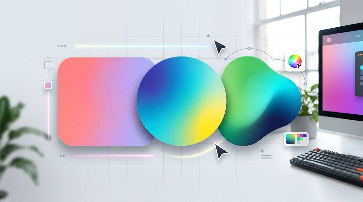
Understanding the Modern Approach to Gradients
Gradients have been around since the dawn of digital design, but their style and application have evolved tremendously. Today, gradients are not just bright, rainbow-like backgrounds but are refined, subtle, and integrated seamlessly into UI components. A contemporary gradient often features soft transitions, muted palettes, or subtle overlays that complement the overall aesthetic.
The key is to use gradients to support the user experience. They should add visual interest without distracting or overwhelming the user. Think about gradients as a way to create depth or focus, not just as eye-catching backgrounds.
Practical Tips for Using Gradients in UI Design
Follow these steps to incorporate gradients that look current and professional:
-
Choose the right gradient type
There are several types of gradients to consider. Linear gradients are the most common, moving smoothly from one color to another in a straight line. Radial gradients emanate from a central point, ideal for highlighting buttons or focal areas. Angular and diamond gradients can add a unique touch but should be used sparingly. -
Opt for subtle color transitions
Bright, contrasting gradients can feel dated. Instead, select colors that are close on the color wheel or have similar saturation levels. This creates a gentle transition that feels modern. For example, a gradient from soft peach to blush pink or from muted teal to cool blue works well. -
Limit the number of color stops
Using too many stops can make a gradient look busy or cluttered. Stick to two or three stops maximum. This keeps the transition smooth and minimalist, aligning with current design trends. -
Apply gradients to supporting elements
Instead of making gradients the focal point, integrate them into UI elements like buttons, cards, or overlays. This approach adds depth without overwhelming the interface. -
Combine gradients with flat design principles
Pair gradients with clean, simple typography and layout. This contrast helps the gradient stand out without making the overall design feel outdated. -
Use transparency and overlays
Adding transparency to gradients or layering them over images can produce sophisticated effects. For example, a semi-transparent gradient overlay on a hero image creates a harmonious balance between content and background. -
Test on different devices and lighting
Gradients can look different across screens. Always preview your designs on various devices and in different lighting conditions to ensure they stay modern and appealing.
Common Mistakes to Avoid
| Technique | Mistake | Why it hurts your design |
|---|---|---|
| Bright, rainbow gradients | Using overly saturated, multicolor backgrounds | Looks busy and outdated |
| Multiple color stops | Crowding the gradient with many transitions | Creates a jagged or cluttered appearance |
| Heavy gradients on large surfaces | Applying bold gradients across entire backgrounds | Can overwhelm the user and distract from content |
| Ignoring contrast | Not considering accessibility | Reduces readability and usability |
| Clashing palettes | Combining unharmonious colors | Creates visual discord |
Expert advice: “A subtle gradient with a muted palette can add sophistication to your UI. Think of gradients as a way to add depth, not chaos.” – Jane Doe, UX designer
Techniques to Keep Your Gradients Trendy
- Use monochromatic gradients for a sleek, unified look.
- Incorporate duotone effects by combining two harmonious colors.
- Apply soft pastel gradients for a gentle, modern feel.
- Experiment with diagonal or angular gradients for a dynamic vibe.
- Combine gradients with flat design elements for contrast.
Tools for Creating Modern Gradients
- Figma and Adobe XD offer intuitive gradient editors.
- CSS gradient generators like CSS Gradient allow quick experimentation.
- Coolors can help you find harmonious color palettes for your gradients.
Inspiring Examples To Elevate Your UI
- A login screen with a subtle teal to blue gradient overlay creates a calming, professional look.
- A call-to-action button with a gentle pink to purple gradient draws attention without feeling gaudy.
- Card backgrounds with soft, muted gradients add depth while maintaining minimalism.
- Overlays on images that fade from transparent to semi-opaque tones enhance readability and visual interest.
Final thoughts on using gradients in UI design
Gradients are no longer a relic of the past when used recklessly. When implemented with an eye for modern aesthetics and user experience, they turn into a subtle but powerful design element. Keep your gradients understated, harmonious, and purpose-driven. Test your choices in real-world conditions and always prioritize accessibility.
With these tips and a thoughtful approach, you can incorporate gradients that look fresh, current, and professional. Remember, the goal is to enhance usability and visual appeal without sacrificing clarity or simplicity.
Elevating Your UI with Thoughtful Gradients
Gradients, when used intentionally, can help create interfaces that are engaging and memorable. Avoid the temptation to overuse them or rely on outdated color combinations. Instead, focus on subtle, well-crafted transitions that support your overall design narrative. With practice, your gradient applications will become a natural part of your toolkit, elevating your UI designs to the next level.
Happy designing!