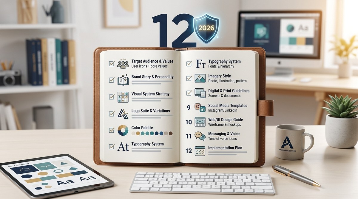
Building a visual identity system that truly holds up is harder than it looks. You have your logo, a color palette you like, and a few fonts you cycle through. But when you step back, something feels off. The colors don’t work on your app’s dark mode. The logo looks tiny on your Instagram story. Your business cards don’t match your website. That’s where a proper brand identity checklist saves you time, money, and a lot of headaches.
A future-proof brand identity checklist helps you catch gaps before they become expensive problems. This 12-step guide covers everything from logo flexibility and color accessibility to typography scaling and file delivery. By the end, you will have a complete visual system that works across print, digital, social media, and emerging platforms, ready for the demands of 2026.
Why You Need a Structured Brand Identity Checklist
Most brands start with a logo and then try to retrofit everything else around it. That approach leads to inconsistency. Your website looks one way, your social media looks another, and your print materials look like they belong to a different company entirely.
A brand identity checklist forces you to think about every touchpoint before you launch. It turns your visual system into something that can grow with your business. And in 2026, when new platforms and formats keep popping up, having a flexible system is not a luxury. It is a necessity.
Let’s walk through the exact steps you need to take.
Step 1: Lock Down Your Core Logo and Its Variations
Your primary logo is the hero. But it cannot do all the work alone. You need a family of logo variations that fit different spaces.
Start with these four versions:
- Primary logo (full horizontal or stacked version)
- Secondary logo (a simplified version for smaller spaces)
- Icon or symbol (just the mark, no text)
- Favicon (the tiny version for browser tabs and app icons)
Each version should feel like it belongs to the same family. They should share the same shapes, proportions, and visual language. If your icon looks completely different from your primary logo, you have a problem.
For a deeper look at this, check out our guide on why your logo needs a secondary version and how to create one.
Step 2: Define Clear Color Specifications for Every Medium
A color is not a color until you define it across every format. You need:
- HEX codes for web and digital use
- RGB values for screen design
- CMYK values for print
- Pantone (PMS) numbers for consistent print production
Do not stop at the main palette. Define your secondary and accent colors too. And always include a neutral palette (whites, grays, blacks) because those get used more than you think.
Here is a simple table to organize your color specs:
| Color Role | HEX | RGB | CMYK | Pantone |
|---|---|---|---|---|
| Primary Blue | #0057B8 | 0,87,184 | 100,53,0,28 | 2945 C |
| Secondary Green | #00A86B | 0,168,107 | 80,0,70,0 | 7729 C |
| Accent Gold | #FFD700 | 255,215,0 | 0,16,100,0 | 116 C |
| Neutral Dark | #1A1A1A | 26,26,26 | 0,0,0,90 | Black 6 C |
If you want to learn more about building a palette that works everywhere, read how to create a cohesive brand color palette that works across print and digital.
Step 3: Choose Typography That Scales and Performs
Fonts are not just about looks. They affect readability, loading times, and brand recognition. Your typography checklist should include:
- Primary headline font (usually a display or bold typeface)
- Body copy font (optimized for long-form reading)
- UI font (for buttons, labels, and navigation)
- Fallback fonts (for when your primary font fails to load)
Test your fonts at different sizes. A font that looks beautiful at 48px might be unreadable at 14px. Also check how your fonts render on mobile screens and in different browsers.
For expert advice on picking typefaces that last, consider this:
“The best brand fonts are the ones you forget are there. They should support the message without stealing attention. If someone notices your font before they read your words, you chose the wrong one.” – Anonymous Design team
If you want to avoid common pitfalls, read about 7 typography mistakes that make your designs look unprofessional.
Step 4: Create a Photography and Imagery Style Guide
Your brand identity checklist must include rules for photography. This is where many systems fall apart. You need to define:
- Photo style (bright and airy vs. dark and moody)
- Composition rules (centered subjects, rule of thirds, or off-center)
- Color grading (warm tones, cool tones, or desaturated)
- Subject guidelines (lifestyle shots, product-only, or abstract)
- Illustration style (if you use illustrations, define the line weight, color usage, and level of detail)
Without these rules, your marketing team will pull images from free stock sites that clash with your brand. Your visual identity will feel scattered.
Step 5: Design Your Iconography System
Icons are a silent language. They guide users through your website, app, and printed materials. Your icon system should be consistent in:
- Stroke weight (all icons should use the same thickness)
- Corner radius (rounded or sharp corners, pick one)
- Size and spacing (all icons should fit within the same bounding box)
- Style (filled, outlined, or a mix)
If you use a mix of filled and outlined icons across different platforms, users will notice the inconsistency even if they cannot name it.
Step 6: Build Templates for Every Marketing Channel
A brand identity checklist is useless if it does not include templates. Templates make consistency automatic. You need templates for:
- Social media (Instagram posts, stories, LinkedIn banners)
- Email marketing (newsletter headers, footer signatures)
- Presentations (slide decks, pitch decks)
- Documents (proposals, invoices, reports)
- Print materials (business cards, letterheads, brochures)
Each template should lock in your logo placement, color usage, and typography. This way, anyone on your team can create on-brand content without needing a designer.
For a practical approach, read designing consistent social media templates for your brand in under an hour.
Step 7: Test Your Logo at Every Possible Size
A logo that looks great on a billboard might look like a blurry blob on a favicon. Test your logo at these sizes:
- Large (billboard, trade show banner)
- Medium (website header, business card)
- Small (social media avatar, app icon)
- Tiny (favicon, browser tab)
If your logo loses detail at small sizes, simplify it. Remove thin lines, small text, and intricate shapes. Your logo should be recognizable even when it is 16×16 pixels.
Step 8: Verify Accessibility and Contrast Standards
Accessibility is not optional anymore. In 2026, it is a baseline expectation. Your brand identity checklist must include:
- Color contrast ratios (WCAG AA requires 4.5:1 for normal text, 3:1 for large text)
- Text readability (avoid light text on light backgrounds)
- Touch target sizes (buttons and links should be at least 44×44 pixels)
- Alt text guidelines (define how to describe your logo and images)
Ignoring accessibility means excluding a significant portion of your audience. It also puts you at risk for legal issues.
Step 9: Define Your Brand’s Motion and Animation Rules
Static visuals are not enough anymore. Your brand needs motion guidelines for:
- Logo animation (how does your logo appear on video intros?)
- Button hover states (color change, scale, or shadow)
- Page transitions (fade, slide, or no animation)
- Loading animations (spinners, progress bars, or skeleton screens)
Keep animations subtle. Overly flashy motion feels unprofessional and can cause motion sickness for some users.
Step 10: Organize Your File Library for Easy Access
Your brand identity checklist should end with a file management system. If your team cannot find the right file, they will use the wrong one. Set up your file library with these folders:
- Logos (subfolders for primary, secondary, icon, and favicon)
- Colors (palette files, swatch libraries)
- Fonts (licensed font files, web font kits)
- Templates (Canva, Figma, Adobe, and Microsoft files)
- Assets (patterns, textures, icons, illustrations)
- Guidelines (your brand style guide PDF)
Name your files clearly. Use a consistent naming convention like “BrandName_Logo_Primary_Horizontal_RGB.png”. Avoid vague names like “final_logo_v3.png”.
Step 11: Create a One-Page Brand Cheat Sheet
Your full brand style guide might be 50 pages long. That is great for reference. But your team needs something they can glance at in five seconds.
Create a one-page cheat sheet that includes:
- Your logo (in its most common version)
- Your primary color palette (3 to 5 colors)
- Your font pairings (headline and body)
- Your brand voice keywords (3 to 5 adjectives)
- Your logo usage rules (what not to do)
Print this cheat sheet and put it in every meeting room. Add it to your company’s Google Drive. Make it the default background on your team’s Slack channel.
Step 12: Schedule a Quarterly Brand Audit
A brand identity checklist is not a one-time task. Your visual system will drift over time. New team members will make small changes. Different platforms will force you to adapt.
Schedule a review every three months. Check for:
- Logo usage (are people using the correct versions?)
- Color consistency (do all materials match your specs?)
- Font compliance (are people using the right typefaces?)
- Template adherence (are social posts following the templates?)
If you find drift, correct it. If you find that your guidelines are too restrictive, update them. A brand identity system should be a living document, not a museum piece.
For a structured way to check your current system, use our brand audit checklist to see if your visual identity is working against you.
Common Brand Identity Mistakes to Avoid
Even with a solid checklist, mistakes happen. Here are the most common ones and how to fix them:
| Mistake | Why It Happens | How to Fix It |
|---|---|---|
| Using too many colors | No defined palette limits | Stick to 3 to 5 core colors |
| Inconsistent logo usage | No logo variation rules | Create a one-page logo usage guide |
| Ignoring mobile formats | Designing for desktop first | Test every asset at mobile sizes |
| Skipping accessibility | Not a priority during design | Run contrast checks before launch |
| No template system | Relying on memory | Build templates in Canva or Figma |
Putting Your Brand Identity Checklist Into Action
You now have a complete 12-step brand identity checklist. But a checklist only works if you use it. Start with the areas where you have the most inconsistency. Maybe your logo variations are a mess. Maybe your color specs are incomplete. Pick one step, fix it, and move to the next.
Do not try to overhaul everything in one weekend. That leads to burnout and sloppy work. Give yourself a timeline. Maybe one step per week. By the end of three months, your visual system will be tighter, more professional, and ready for whatever 2026 throws at you.
If you want to go deeper into any of these areas, check out how to build a brand style guide that actually gets used. It will help you document everything you just checked off your list.
Your brand identity is worth the effort. A solid visual system builds trust, saves time, and makes your business look like it belongs in the big leagues. Start with step one today.
