Struggling with dull, frustrating blank screens or slow-loading moments? You’re not alone. Many products overlook the power of well-crafted empty states and loading screens. When done right, these moments can actually become opportunities to guide, educate, and delight users instead of turning them away. With the right approach, you can turn a potential point of frustration into a chance to build trust and keep users engaged.
Designing engaging empty states and loading screens transforms potential frustration points into opportunities for delight and guidance. Clear, thoughtful design keeps users engaged, reduces churn, and enhances overall experience.
Why engaging empty states and loading screens matter
Many designers focus on core functionality, often neglecting the moments when screens are empty or content loads. Yet, these are critical touchpoints that influence user perception. A well-designed empty state can tell a story, set expectations, and motivate users to take action. Similarly, loading screens that feel meaningful and interactive can reduce perceived wait times and prevent frustration.
By paying attention to these moments, you help users understand what’s happening, why, and what they can do next. This prevents confusion, reduces bounce rates, and turns potentially boring or annoying moments into brand-building opportunities.
How to craft compelling empty states and loading screens
Creating engaging empty states and loading screens involves a mix of clarity, personality, and purpose. Here are steps to help you design with intent:
1. Define the purpose of each state
Start by understanding what the user is supposed to do next. Is it a no-data situation, a completed action, or a loading delay? Clarify the goal for each scenario. For example, an empty inbox should encourage users to start organizing their messages, while a loading screen should reassure users that content is on its way.
2. Use helpful and friendly copy
Your messaging should be concise, encouraging, and aligned with your brand voice. Instead of a generic “No Data,” try “Looks like your inbox is empty. Let’s get started by adding your first message.” Clear instructions help users feel guided rather than lost.
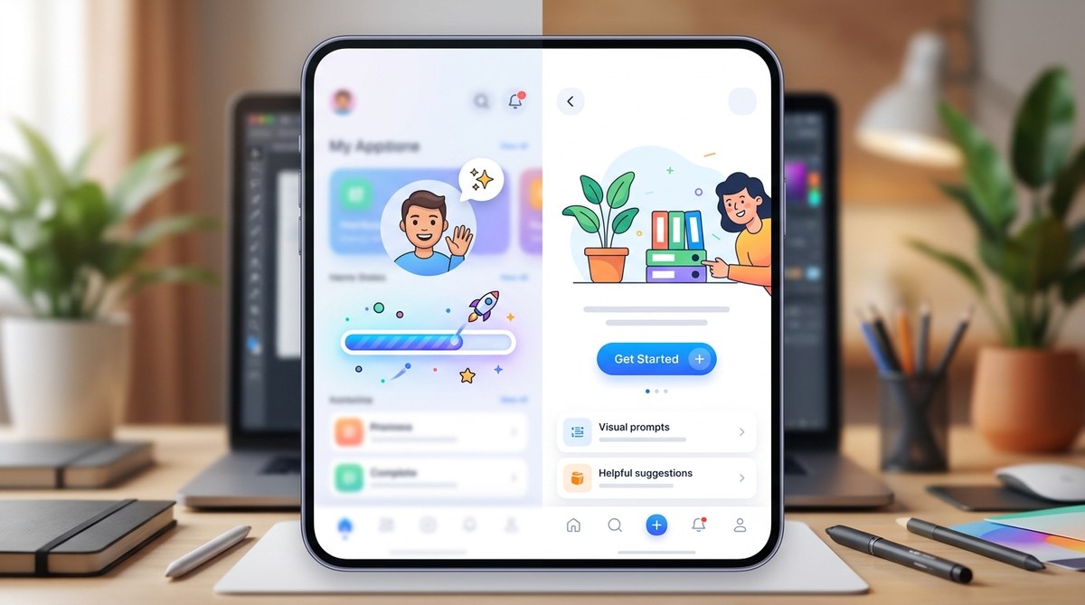
3. Incorporate visual cues and microinteractions
Visual elements like illustrations, icons, or animations can make empty states more inviting. For loading screens, consider animated progress indicators or playful microinteractions that entertain while waiting. These elements should be lightweight and purposeful, reducing perceived wait times.
4. Motivate users to take action
Every empty state should include a clear call-to-action (CTA). Whether it’s “Add your first item,” “Start a new project,” or “Refresh to see updates,” guiding users to the next step keeps them engaged and prevents frustration.
5. Show off your brand personality
Inject personality and tone into your empty states and loading screens to make the experience memorable. Use illustrations or copy that reflect your brand voice, whether playful, professional, or quirky.
6. Test and iterate
Use usability testing to see how real users respond. Observe if they understand the message and whether the visuals motivate action. Adjust your copy, visuals, or CTA based on feedback to improve engagement and clarity.
Techniques and pitfalls in designing empty states and loading screens
Here’s a quick comparison table to clarify effective techniques versus common mistakes:
| Technique | What it accomplishes | Common mistake | Why it fails |
|---|---|---|---|
| Use friendly illustrations | Adds warmth and personality | Using generic or irrelevant images | Breaks immersion and feels impersonal |
| Include clear CTAs | Guides users to next steps | Leaving screens blank or unclear | Users get stuck or abandon the app |
| Keep messaging concise | Reduces confusion | Overloading with text | Overwhelms and distracts users |
| Animate loading indicators | Reduces perceived wait time | Overly long or distracting animations | Frustrates users or feels unprofessional |
| Personalize empty states | Builds emotional connection | Generic messages | Feels cold and disconnected |
Expert tip: “Always design empty states as an extension of your brand. They should feel like a natural part of the journey, not an afterthought.” – UX expert Jane Doe
Techniques to avoid mistakes:
- Overloading users with information during loading screens
- Using confusing or negative messaging in empty states
- Relying solely on static images without interaction or motion
- Ignoring accessibility in visual and textual content
- Neglecting mobile responsiveness and performance
Practical process for designing engaging empty states and loading screens
Follow these steps to embed engagement into these moments:
- Identify all scenarios where your users might encounter empty or loading screens. Map out the user journey.
- Define goals and messages relevant to each scenario. Decide what you want users to feel and do.
- Choose visuals and copy that align with your brand tone and purpose. Use illustrations or microinteractions to make these moments delightful.
- Design clear CTAs that motivate users to continue their journey.
- Prototype and test with real users. Gather feedback on clarity, tone, and engagement.
- Refine based on data and feedback. Keep iterating to improve the experience.
Inspiration from top brands
Look at how brands like LinkedIn and Amazon handle empty states. For instance, LinkedIn uses friendly illustrations accompanied by encouraging copy like “Start building your professional network.” Amazon’s empty search results show playful animations with suggestions for refining your search. These examples show that thoughtful visuals and messaging turn a neutral point into a positive experience.
Techniques and mistakes overview
| Techniques | Benefits | Mistakes to avoid |
|---|---|---|
| Visual storytelling | Builds emotional connection | Generic or irrelevant visuals |
| Clear, action-oriented copy | Guides user behavior | Vague or negative messages |
| Lightweight animations | Reduce perceived waits | Distracting or slow animations |
| Personalization | Foster brand loyalty | Overly generic content |
Final thoughts: making the most of every pixel
Thinking beyond just functionality helps you craft experiences that are memorable. Empty states and loading screens are more than temporary moments—they’re opportunities to reinforce your brand, educate your users, and keep engagement high. By focusing on clarity, personality, and purposeful design, you turn these moments into a seamless part of the user journey.
Remember, the goal is to make users feel understood and guided. Every message, visual, or microinteraction should serve a purpose. When you do this consistently, frustrating moments fade away and your product becomes more enjoyable to use.
Transforming frustration into engagement in every screen
In the end, the way you approach these silent moments shapes user perceptions and loyalty. Even simple touches like friendly illustrations, helpful copy, and subtle animations can make a difference. Apply these principles to your next project and watch how users respond positively to your thoughtful, engaging approach. Your users will thank you for making their experience smoother, warmer, and more human.