Choosing the right color system for your print project can feel overwhelming. Do you go with spot colors for consistency and vibrancy? Or opt for process colors if you need full-color images? Knowing the differences helps you make smarter choices, saving time and money while achieving your desired look.
[Deciding between spot colors and process colors depends on your project needs](https://en.wikipedia.org/wiki/Color_management). Spot colors offer precision and brand consistency, ideal for logos and specific shades. Process colors, using CMYK, are suited for full-color images and complex graphics. Understanding these differences helps you choose the best method for your print jobs, balancing cost, quality, and time effectively.
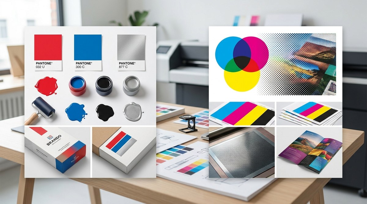
What Are Spot Colors and How They Shape Your Prints
Spot colors are pre-mixed inks created to match specific shades. They’re often associated with Pantone, a popular color matching system, but can include custom mixes too. When you select a spot color, you’re choosing a specific, consistent hue that will look the same across every print run.
Spot colors are especially useful when your project demands brand accuracy. For example, a luxury watch brand may require that their logo’s gold tone appears exactly the same on every product packaging. Using spot colors ensures that the color remains consistent regardless of printing batch or location.
Characteristics of Spot Colors
- Precise color matching like Pantone colors or custom blends
- High opacity, resulting in vibrant and solid coverage
- Limited color palette—usually used for specific shades, not photographs
- Cost per color—more expensive if many shades are needed
- Special finishes like metallics or neons for unique effects
Applications of Spot Colors
Spot colors are perfect for logos, brand colors, and metallic or neon finishes. They shine in projects where color accuracy and consistency are critical. Think branding for a corporate identity or packaging that emphasizes luxury or special effects.
Understanding Process Colors and the Power of CMYK
Process colors, primarily using the CMYK color model, are designed for full-color printing. They work by layering four inks—cyan, magenta, yellow, and black—to produce a broad spectrum of hues. This method is efficient for printing photographs, detailed graphics, or designs with many color variations.
When you print using process colors, you’re essentially mixing ink layers on the page. This allows for complex images and gradients but can sometimes lead to color shifts or inconsistencies if not managed carefully.
How CMYK Process Colors Function
- Color blending through layered ink dots
- Versatility—can produce millions of colors from just four inks
- Cost-effective for multi-colored images
- Less precise color matching—colors may vary slightly between batches
- Suitable for photographs, detailed illustrations, and designs with many hues
When to Use Process Colors
Process colors excel for high-quality photographs, posters, brochures, and any project where detailed imagery dominates. They are the go-to option for printing full-color artwork efficiently and cost-effectively.
How Spot and Process Colors Are Printed
Understanding the printing process helps clarify when and why to pick each method.
Spot Color Printing
Spot colors are printed using dedicated printing plates for each color. These plates transfer the pre-mixed ink directly onto the material. Because the ink is solid and consistent, the resulting color is vibrant and precise.
Process Color (CMYK) Printing
Process colors use four (or more) halftone plates, each applying a different ink layer. The dots of CMYK inks blend visually to produce the full spectrum of colors. This process is ideal for images with many hues but can sometimes produce slight color variations.
Hybrid Techniques
Some projects combine spot and process colors. For example, a brochure may use CMYK for images and a specific spot color for a logo or brand element. Hybrid printing offers flexibility for complex designs.
Comparing Spot and Process Colors
| Aspect | Spot Colors | Process Colors (CMYK) |
|---|---|---|
| Color precision | Very high, consistent | Slight variability |
| Cost | Higher for many shades | Cost-effective for full-color images |
| Use case | Logos, branding, metallics | Photos, detailed graphics |
| Number of colors | Limited, specific shades | Millions of hues from four inks |
| Printing plates | Dedicated per color | Four halftone plates |
| Flexibility | Less flexible | Very flexible |
When To Choose Spot Colors
- Your project requires exact color matching, such as a logo or brand colors
- You want a vibrant, opaque finish, especially with metallic, neon, or special effect inks
- You need consistent color across multiple print runs
- The design features a limited palette of specific shades
- You’re printing on substrates that benefit from solid, dense colors
“Spot colors are invaluable when brand consistency and precise branding are essential. They give a level of accuracy that process colors can’t always match, especially with metallic or specialty inks.” — print industry expert
When Process Colors Make Sense
- Your project involves photographs or designs with many colors and gradients
- Cost efficiency is a priority, especially for high-volume runs
- You want to reproduce complex, detailed images without managing multiple special inks
- Flexibility in color selection is necessary, as CMYK can produce diverse hues
- The design includes detailed shading, photo-realistic images, or full-color illustrations
Practical Tips for Making the Right Choice
- Identify your primary goal. Is it brand consistency or detailed imagery?
- Consider your budget. Spot colors tend to be pricier if many shades are required.
- Evaluate color accuracy needs. Do you need exact color matches? Spot colors are better.
- Assess the design complexity. Use process colors for photos and intricate graphics.
- Think about finish effects. Metallic or neon effects often demand spot inks.
- Test with samples. Always request proofs to see how colors turn out before full production.
Common Pitfalls and How to Avoid Them
| Mistake | Explanation | Solution |
|---|---|---|
| Overusing spot colors | Can become costly | Limit to essential shades |
| Relying solely on process colors for brand colors | Slight color variations | Use spot colors for logos and key branding elements |
| Not testing proofs | Unexpected color shifts | Always review printed samples |
Final Checklist for Your Print Project
- Define your key colors and their purpose
- Decide whether your project needs spot or process colors
- Request color proofs to verify appearance
- Budget for the number of inks involved
- Coordinate with your printer for optimal results
Final Thoughts on Color Choice in Printing
Choosing between spot colors and process colors hinges on your project goals, budget, and design complexity. Spot colors offer unmatched accuracy and special effects, making them ideal for branding and premium finishes. Process colors provide versatility and cost efficiency for complex, colorful images. Balancing these factors ensures your print results align perfectly with your vision.
Making Color Decisions That Stick
Armed with a clear understanding of spot versus process colors, you can approach your next project with confidence. Whether you’re printing a logo or a full-color brochure, selecting the right method saves you money and ensures your designs look their best. Remember to communicate with your printer, request samples, and always review proofs. Applying these principles helps you achieve consistent, high-quality results every time.