Scroll through any social media feed and you’ll notice something. The posts that make you stop aren’t always the ones with perfect photography or clever copy. They’re the ones that hit you with the right color at the right moment.
Color isn’t decoration. It’s a strategic tool that can make your audience pause, feel something, and take action. Understanding color psychology in social media means knowing which hues trigger curiosity, trust, urgency, or calm, and then using that knowledge to design posts that perform.
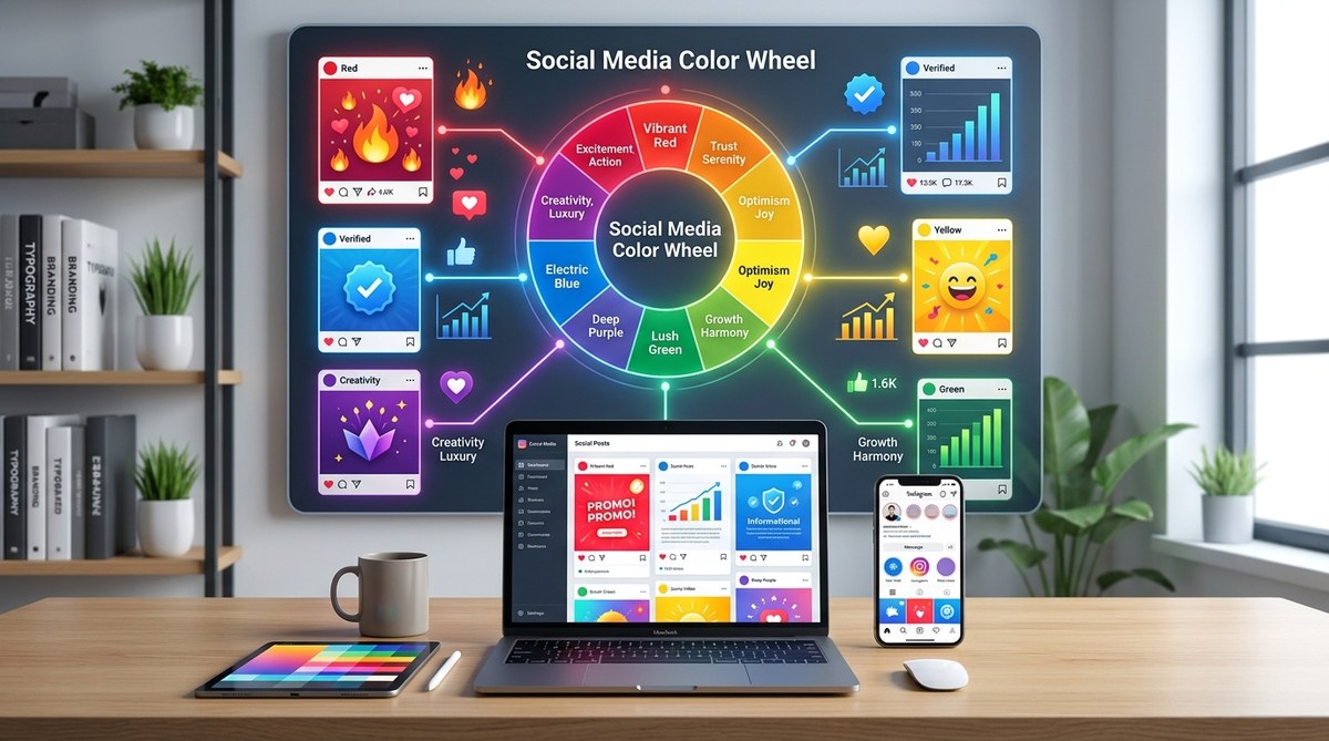
Color psychology in social media is about matching emotional triggers to audience intent. Red creates urgency, blue builds trust, yellow grabs attention, and green signals growth. High-performing posts use color strategically, not randomly. Apply contrast, limit your palette to three colors, and test variations to find what resonates with your specific audience and platform.
Why color choices affect social media performance
Your brain processes color faster than text or shapes. That split-second reaction determines whether someone scrolls past your post or stops to engage.
Different colors trigger different emotional responses. Red raises heart rate and creates urgency. Blue lowers stress and builds trust. Yellow sparks optimism and grabs attention. Green suggests balance and growth.
These reactions aren’t random. They’re rooted in biology, culture, and learned associations. A financial services brand using bright pink might confuse viewers who associate that color with playfulness, not security. A wellness coach using dark gray might signal seriousness when their audience craves warmth and energy.
Platform context matters too. Instagram skews visual and emotional. LinkedIn leans professional and informative. TikTok favors bold and energetic. Your color choices need to match not just your message, but where that message appears.
How each color performs on social platforms
Let’s break down the psychological impact of major colors and how they translate to social media engagement.
Red increases urgency and excitement. Use it for limited-time offers, product launches, or calls to action. Too much red can feel aggressive, so pair it with neutral tones.
Blue communicates trust and stability. It’s why so many tech companies and financial institutions use it. On social media, blue works well for educational content, testimonials, and thought leadership posts.
Yellow demands attention and radiates positivity. It’s effective for announcements, celebrations, and uplifting messages. Yellow can strain the eyes in large doses, so use it as an accent.
Green represents growth, health, and harmony. Perfect for wellness brands, sustainability content, and success stories. Dark greens feel luxurious. Bright greens feel fresh.
Orange combines red’s energy with yellow’s friendliness. It’s approachable and enthusiastic. Use orange for community-building content and casual announcements.
Purple suggests creativity and premium quality. It works for luxury brands, creative services, and aspirational content. Light purple feels whimsical. Deep purple feels sophisticated.
Black conveys elegance and authority. It’s powerful for high-end products and bold statements. Too much black can feel heavy, so balance it with white space.
White creates clarity and simplicity. It’s not boring when used strategically. White backgrounds make colorful elements pop and improve readability.
Building a color strategy for your posts
Random color choices create visual noise. Strategic color choices create recognition and emotional consistency.
Start with your brand palette. If you don’t have one yet, how to choose brand colors that actually convert customers walks through the process. Your social posts should pull from these established colors to maintain brand recognition.
Apply the 60-30-10 rule. Use your dominant brand color for 60% of the design, a secondary color for 30%, and an accent color for 10%. This creates visual balance without overwhelming viewers. Learn more about the 60-30-10 color rule and how to apply it.
Match colors to content type:
- Educational posts: Cool blues and greens for calm, focused learning
- Promotional posts: Warm reds and oranges for energy and urgency
- Inspirational posts: Purples and golds for aspiration and achievement
- Community posts: Friendly oranges and teals for approachability
Consider platform-specific performance. Instagram users engage more with warm, saturated colors. LinkedIn audiences respond to professional blues and grays. TikTok thrives on high-contrast, bold combinations.
Testing what actually works for your audience
Theory only takes you so far. Real performance data tells you what your specific audience responds to.
Run A/B tests with color variations. Create two versions of the same post with different color schemes. Post them at similar times and compare engagement rates. Track likes, comments, shares, and click-throughs.
Pay attention to contrast ratios. Low contrast makes text hard to read and reduces engagement. High contrast improves readability and accessibility. Use what is color contrast and why does it make or break your designs to check your combinations.
Test seasonal variations. Colors that work in summer might feel off in winter. Holiday periods create opportunities for themed palettes that align with viewer expectations.
Monitor competitor performance. What colors are top performers in your niche using? You’re not copying them, you’re gathering market intelligence about what resonates with your shared audience.
Document your findings. Create a simple spreadsheet tracking color combinations, post types, and engagement metrics. Patterns will emerge over time.
Practical color application steps
Here’s how to implement color psychology in your next batch of social posts:
-
Identify your post goal. Are you educating, selling, inspiring, or building community? Each goal pairs with different emotional triggers.
-
Select your primary color based on emotion. Match the color to the feeling you want to create. Urgency gets red. Trust gets blue. Joy gets yellow.
-
Add complementary colors for balance. Use a color wheel or generator to find harmonious combinations. 7 free color palette generators every designer should bookmark provides tested tools.
-
Check contrast and readability. Make sure text is legible against backgrounds. Test on mobile screens where most social viewing happens.
-
Apply consistently across your content calendar. Use similar color treatments for similar content types. This trains your audience to recognize post categories at a glance.
-
Review and refine monthly. Look at your top-performing posts. What colors appear most often? Double down on what works.
Common color mistakes that hurt engagement
Even experienced designers make these errors. Avoid them and you’ll outperform most of your competition.
| Mistake | Why It Hurts | How to Fix |
|---|---|---|
| Using too many colors | Creates visual chaos and dilutes message | Limit to 3 colors per post |
| Ignoring platform conventions | Looks out of place and unprofessional | Study top performers on each platform |
| Poor text contrast | Reduces readability and accessibility | Use contrast checker tools |
| Inconsistent brand colors | Weakens brand recognition | Document and follow your palette |
| Following trends blindly | Can clash with brand identity | Adapt trends to your established colors |
| Forgetting color blindness | Excludes 8% of male viewers | Test with colorblind simulation tools |
Another frequent mistake is using colors that contradict your message. A post about relaxation shouldn’t use aggressive reds. A sale announcement shouldn’t use calming pastels. Align color emotion with content emotion.
Some creators make everything bright and saturated, thinking it will grab attention. It does, but it also exhausts viewers. Mix bold moments with calm ones to give eyes a rest.
Others play it too safe with endless neutrals. Gray and beige have their place, but social media rewards visual courage. Don’t be afraid to use color with intention.
Platform-specific color strategies
Each social platform has its own visual culture. Adapt your color approach accordingly.
Instagram favors cohesive feeds with consistent color stories. Users often plan their grids around specific palettes. Your individual posts should work alone and as part of a larger visual narrative. Warm, saturated colors typically perform well. Pastels work for lifestyle and wellness brands.
Facebook has an older demographic that responds to clear, readable designs. Higher contrast works better here. Blues and greens build trust. Red works for urgency but use it sparingly.
LinkedIn demands professional color choices. Stick to blues, grays, and muted accent colors. Overly bright or playful palettes can undermine credibility. That said, don’t be boring. Strategic pops of color in charts or callouts improve engagement.
TikTok thrives on bold, high-energy color combinations. Bright pinks, electric blues, and neon accents perform well. The platform moves fast, so colors need to pop immediately. Subtle doesn’t work here.
Twitter (or X) moves at conversation speed. Color helps your posts stand out in fast-scrolling feeds. High contrast and bold typography with strategic color accents work best. Avoid complex gradients that don’t render well in small preview sizes.
Pinterest is a visual search engine. Users actively look for inspiration. Color-coordinated pins perform better in search results. Consider seasonal color trends and what users are searching for.
Creating color templates that save time
You don’t need to reinvent your color strategy for every post. Build reusable templates that maintain consistency while allowing flexibility.
Create 5-7 template designs with your established color palette. Assign each template to a content type: tips, quotes, announcements, behind-the-scenes, user-generated content, promotions, and questions.
Use the same color zones consistently. Put headlines in your primary brand color. Keep backgrounds in your secondary color. Reserve your accent color for calls to action and important details.
Designing consistent social media templates for your brand in under an hour shows you how to set up a template system that speeds up production without sacrificing quality.
Save color codes in a reference document. Include hex codes, RGB values, and CMYK if you’re also doing print. This prevents color drift over time as different team members create content.
Build seasonal variations. Keep your core brand colors but adjust accent colors for holidays, seasons, or campaigns. This keeps content fresh while maintaining recognition.
Measuring color impact on engagement
Track these metrics to understand how color choices affect performance:
- Engagement rate by color scheme: Group posts by dominant color and compare average engagement.
- Click-through rate on CTAs: Test different button colors and track which drives more clicks.
- Time spent on post: Some platforms provide this data. Certain color combinations may hold attention longer.
- Share rate: Highly shareable posts often use specific color formulas. Identify yours.
- Follower growth correlation: Do certain color periods align with follower spikes?
Use your platform’s native analytics first. Instagram Insights, Facebook Analytics, and LinkedIn Analytics all provide engagement data. Export it monthly and add color tags to each post for analysis.
Third-party tools like Later, Hootsuite, or Sprout Social can help you visualize color performance over time. Some even offer color analysis features that identify your best-performing palettes automatically.
Don’t obsess over daily fluctuations. Look for patterns over 30, 60, and 90-day periods. Color psychology works at scale, not in single posts.
Adapting color psychology to your niche
Generic color advice only takes you so far. Your specific industry and audience have unique associations and expectations.
Fitness and wellness brands typically use energizing oranges, calming greens, and motivating reds. But a yoga instructor might lean more green and purple, while a CrossFit gym might emphasize red and black.
Food and beverage brands use warm colors that stimulate appetite. Red, orange, and yellow are common. But a health food brand might use more greens and earth tones to signal natural ingredients.
Tech and SaaS companies often default to blue for trust and innovation. But standing out in a sea of blue might mean incorporating unexpected accent colors like coral or teal.
Creative services have more freedom to experiment with bold, unconventional palettes. Your color choices can demonstrate your design skills directly.
B2B services need to balance professionalism with approachability. Too corporate feels cold. Too casual feels unprofessional. Mid-tone blues with warm accent colors often work well.
Study your top three competitors. What colors dominate their feeds? Now look at the top performers in your niche who aren’t direct competitors. What patterns emerge? Use this research to inform your strategy, not copy it.
“The colors you choose aren’t just aesthetic decisions. They’re strategic tools that communicate emotion, build recognition, and drive action. Test, measure, and refine until you find the combinations that resonate with your specific audience.”
Making color work harder across your brand
Color psychology in social media shouldn’t exist in isolation. Your social colors should connect to your broader brand system.
If you haven’t formalized your brand colors yet, how to build a brand style guide that actually gets used provides a practical framework. Document your primary, secondary, and accent colors with specific use cases for each.
Maintain consistency across touchpoints. Your website, email newsletters, and social posts should feel like they come from the same brand. This doesn’t mean using identical designs everywhere, but color should be a connecting thread.
Consider how your colors translate across platforms. What looks vibrant on Instagram might feel overwhelming on LinkedIn. Create platform-specific variations that maintain brand recognition while respecting platform culture.
Think about accessibility from the start. How to build an accessible color palette without sacrificing style shows you how to choose colors that work for everyone, including viewers with color vision deficiencies.
Your color strategy starts now
Color psychology in social media isn’t about following rigid rules. It’s about understanding emotional triggers and testing what moves your specific audience to action.
Start small. Pick one content type and experiment with three different color approaches over the next two weeks. Track engagement carefully. Let the data guide your next decisions.
Build from there. As you identify what works, codify it into templates and guidelines. Share these with anyone who creates content for your brand. Consistency compounds over time.
Remember that color trends shift, platform algorithms change, and audience preferences evolve. What works today might need adjustment in six months. Stay curious, keep testing, and let performance data inform your strategy more than design trends or personal preference.
Your next post is an opportunity to apply one color psychology principle. Choose one, implement it, and measure the result. That’s how you build a color strategy that actually improves performance instead of just looking nice.