Dark mode has moved beyond a nice-to-have feature. Users expect it. Operating systems default to it. Battery life depends on it. And if your interface doesn’t offer it, you’re already behind.
But here’s the thing: slapping a dark background on your existing UI isn’t dark mode. It’s a broken interface with readability issues, failed contrast ratios, and angry users.
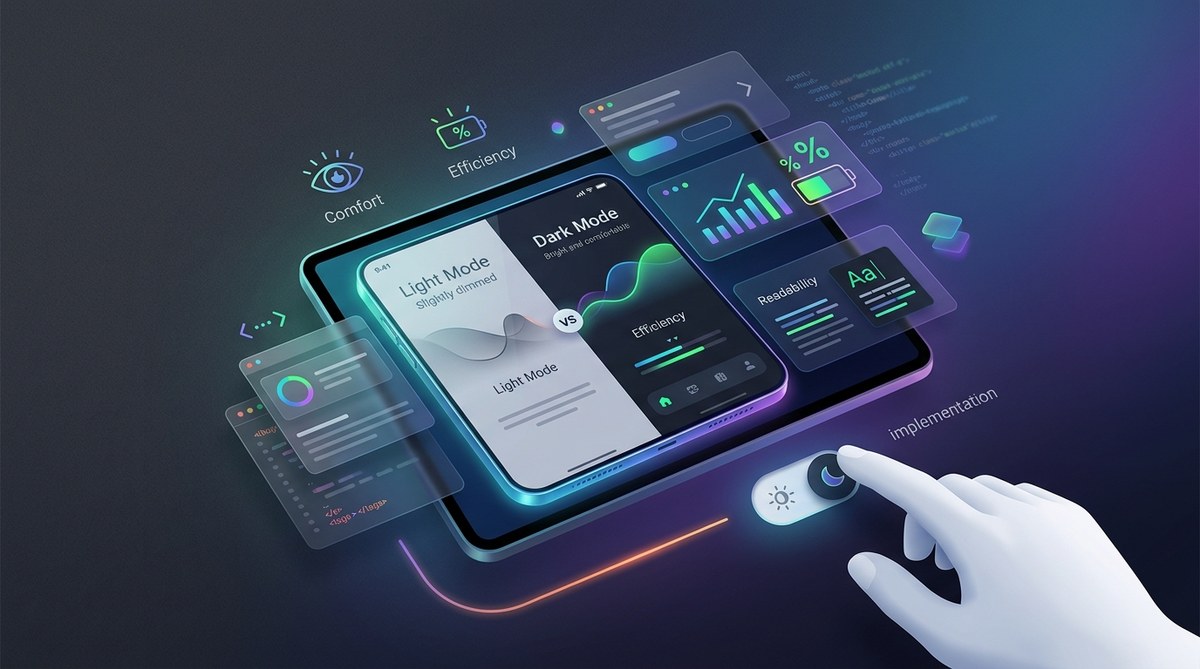
Real dark mode UI implementation requires rethinking your color system, adjusting your contrast ratios, and building flexibility into every component. This guide walks you through the exact process, with practical examples you can apply today.
Dark mode UI implementation goes far beyond inverting colors. It requires a semantic color system, proper contrast ratios (minimum 4.5:1 for text), adjusted elevation shadows, and theme-aware components. Build your system with CSS custom properties or design tokens, test across devices, and never use pure black backgrounds. Done right, dark mode reduces eye strain, saves battery life, and improves accessibility for millions of users.
Why dark mode matters beyond aesthetics
Dark mode reduces eye strain in low-light environments. That’s the user benefit everyone talks about.
But there’s more. OLED screens consume less power when displaying dark pixels. For mobile users, that translates to tangible battery savings. Some studies show up to 60% power reduction on OLED displays at maximum brightness.
Accessibility matters too. Users with light sensitivity, migraines, or certain visual impairments rely on dark interfaces. For them, it’s not a preference. It’s a necessity.
And let’s talk about context. Your users aren’t always sitting at a desk in a well-lit office. They’re checking your app at 11 PM in bed. They’re using your website on a plane with dimmed cabin lights. They’re working late shifts in dark rooms.
A proper dark mode respects these contexts. It shows you understand how people actually use your product.
Building a semantic color system
Stop thinking in terms of “light blue” and “dark gray.” Start thinking semantically.
Your color system needs variables like --color-background, --color-surface, --color-primary, and --color-text. These tokens adapt based on the active theme.
Here’s a basic CSS custom property setup:
:root {
  --color-background: #ffffff;
  --color-surface: #f5f5f5;
  --color-text: #1a1a1a;
  --color-primary: #0066cc;
}

[data-theme="dark"] {
  --color-background: #121212;
  --color-surface: #1e1e1e;
  --color-text: #e0e0e0;
  --color-primary: #4d9fff;
}
Notice how the primary color shifts slightly lighter in dark mode? That’s intentional. Colors need different values to maintain the same perceived brightness across themes.
Your components reference these variables, never hard-coded hex values:
.card {
  background: var(--color-surface);
  color: var(--color-text);
}
Now theme switching happens automatically. Change the data-theme attribute, and every component updates.
This approach scales. Add a high-contrast mode? Create another set of tokens. Need a brand-specific theme? Same system, different values.
Understanding contrast ratios in dark mode
WCAG requires a 4.5:1 contrast ratio for normal text and 3:1 for large text. These numbers don’t change in dark mode.
But achieving them does.
Pure white text (#ffffff) on pure black (#000000) creates a 21:1 ratio. That sounds good until you realize it causes eye strain. The extreme contrast makes text appear to “vibrate” or “glow,” especially at smaller sizes.
Better approach: use off-white text (#e0e0e0 or similar) on a dark gray background (#121212). This brings you closer to 15:1, which is still excellent for accessibility without the harshness.
Your contrast requirements by element type:
| Element Type | Minimum Ratio | Recommended Dark Mode |
|---|---|---|
| Body text | 4.5:1 | 12:1 to 15:1 |
| Large headings | 3:1 | 10:1 to 12:1 |
| UI controls | 3:1 | 8:1 to 10:1 |
| Disabled states | 2:1 | 4:1 to 5:1 |
Test every color combination. Tools like WebAIM’s contrast checker or browser DevTools can verify ratios automatically.
What is color contrast and why does it make or break your designs? covers the fundamentals if you need a deeper foundation.
Implementing elevation and shadows
Drop shadows don’t work the same way in dark mode. A subtle gray shadow on a white background becomes invisible on dark gray.
Material Design’s elevation system offers a smart solution: lighter surfaces for elevated elements.
Instead of shadows, increase the background lightness:
:root {
  --elevation-0: #121212;
  --elevation-1: #1e1e1e;
  --elevation-2: #232323;
  --elevation-3: #282828;
}
Cards sit at elevation-1. Modals at elevation-2. Tooltips at elevation-3.
You can still use shadows for depth, but make them more pronounced:
[data-theme="dark"] .card {
  box-shadow: 0 2px 8px rgba(0, 0, 0, 0.6);
}
The increased opacity (0.6 instead of 0.1) ensures visibility against dark backgrounds.
Some designers combine both approaches: lighter backgrounds plus subtle shadows. Test what works for your visual language.
Adjusting color palettes for dark mode
Your brand colors need dark mode variants. Not every color translates directly.
Bright, saturated colors appear overpowering on dark backgrounds. They need desaturation and brightness adjustments.
Here’s a practical workflow:
- Start with your light mode primary color
- Increase lightness by 10-20%
- Decrease saturation by 5-10%
- Test against your dark background
- Adjust until it feels balanced
For example, if your light mode primary is hsl(210, 100%, 50%) (a saturated blue), your dark mode variant might be hsl(210, 90%, 60%).
Secondary and accent colors follow the same pattern. The goal: maintain your brand identity while respecting the dark environment.
How to build an accessible color palette without sacrificing style provides additional techniques for maintaining brand consistency across themes.
Handling images and media
Photos and illustrations designed for light backgrounds often look wrong in dark mode. High-contrast images appear to “pop out” uncomfortably.
Options for handling this:
- Reduce opacity: Apply 80-90% opacity to photos in dark mode
- Add subtle overlays: A 5-10% black overlay can integrate images better
- Use border treatments: Light borders (1px, 20% white) separate images from backgrounds
- Implement smart inversion: Automatically adjust image brightness based on theme
[data-theme="dark"] img {
  opacity: 0.9;
  border: 1px solid rgba(255, 255, 255, 0.1);
}
Icons need special attention. Colorful icons often need dark mode variants. Simple approach: provide two versions and swap based on theme.
For logos, offer both light and dark versions. Never force users to see a white logo on a white header or black logo on a black footer.
Creating theme-aware components
Every component in your system needs theme awareness built in from the start.
Buttons provide a good example. Your light mode button might have:
.button {
  background: var(--color-primary);
  color: white;
  border: 1px solid var(--color-primary);
}

.button:hover {
  background: var(--color-primary-dark);
}
In dark mode, you might need to adjust the hover state more dramatically because the background is already dark:
[data-theme="dark"] .button:hover {
  background: var(--color-primary-light);
  border-color: var(--color-primary-light);
}
Form inputs require careful consideration. Light mode typically uses white backgrounds with gray borders. Dark mode might use slightly lighter surfaces than the page background:
[data-theme="dark"] input {
  background: var(--elevation-1);
  border: 1px solid rgba(255, 255, 255, 0.2);
  color: var(--color-text);
}
The key principle: components should never assume their background color. Always use semantic tokens that adapt.
Building the theme toggle
Users need an obvious way to switch themes. Placement matters.
Common patterns:
- Header utility area: Next to search or account icons
- Settings panel: Grouped with other preferences
- Footer: For less prominent placement
- Floating button: For apps where theme is critical
The toggle should indicate the current state clearly. A sun/moon icon works, but add a label for clarity.
<button class="theme-toggle" aria-label="Toggle dark mode">
  <span class="theme-icon" aria-hidden="true"></span>
  <span class="theme-label">Dark mode</span>
</button>
Remember the user’s choice. Store it in localStorage and apply it before the page renders to avoid flash of wrong theme:
const theme = localStorage.getItem('theme') || 'light';
document.documentElement.setAttribute('data-theme', theme);
Respect system preferences too:
if (!localStorage.getItem('theme')) {
  const prefersDark = window.matchMedia('(prefers-color-scheme: dark)').matches;
  const theme = prefersDark ? 'dark' : 'light';
  document.documentElement.setAttribute('data-theme', theme);
}
This gives users the best default while allowing manual override.
Testing across devices and contexts
Dark mode looks different on every screen technology. OLED displays show true blacks. LCD screens show dark grays. Older monitors might have poor contrast.
Test on:
- Multiple mobile devices (iOS and Android)
- Different desktop monitors (IPS, TN, OLED)
- Various browsers (Chrome, Safari, Firefox)
- Different ambient lighting conditions
Pay attention to:
- Text readability at different sizes
- Color distinction between interactive elements
- Shadow visibility and depth perception
- Image integration and borders
Use accessibility tools to verify contrast ratios automatically. Browser DevTools include contrast checkers that work in real-time.
How to improve text readability in web and mobile designs offers additional testing strategies for text-heavy interfaces.
Common mistakes to avoid
Here are the errors that break dark mode implementations:
| Mistake | Why It Fails | Better Approach |
|---|---|---|
| Using pure black (#000000) | Creates eye strain and harsh contrast | Use #121212 or similar dark gray |
| Inverting all colors automatically | Breaks brand identity and accessibility | Manually adjust each color for dark mode |
| Forgetting disabled states | Low contrast becomes invisible | Increase opacity or lightness for disabled elements |
| Ignoring form validation colors | Red and green lose meaning in dark mode | Test error/success colors for sufficient contrast |
| Hard-coding color values | Makes theme switching impossible | Use CSS custom properties or design tokens |
| Skipping image adjustments | Photos appear too bright and jarring | Reduce opacity or add subtle overlays |
The pure black mistake deserves emphasis. Material Design, Apple Human Interface Guidelines, and most major design systems recommend against pure black. The slight lightness (#121212) reduces eye strain significantly.
Documenting your dark mode system
Your team needs clear documentation. How to build a brand style guide that actually gets used applies here too.
Document:
- All color tokens and their purpose
- Contrast ratio requirements
- Component-specific theme adjustments
- Image handling guidelines
- Testing procedures
Include visual examples. Show correct and incorrect implementations side by side.
For design systems, create a dedicated dark mode section. Show every component in both themes. Specify which properties change and why.
Developers need access to token values in their preferred format (CSS, Sass, JavaScript objects). Designers need the same values in Figma or Sketch.
Keep documentation updated as your system evolves. Dark mode isn’t a one-time implementation. It grows with your product.
Maintaining consistency across platforms
Your dark mode should feel consistent whether users access your product on web, iOS, Android, or desktop apps.
This doesn’t mean identical. Each platform has conventions users expect. iOS users expect system-level dark mode integration. Android users expect Material Design elevation patterns.
But your brand colors, typography hierarchy, and core visual language should remain recognizable.
Create platform-specific guidelines that adapt your core system:
- Web: CSS custom properties and media queries
- iOS: UIColor with dynamic color assets
- Android: Theme attributes and night mode qualifiers
- Desktop: Platform-specific theme APIs
How to maintain brand consistency across multiple platforms without losing your mind provides frameworks for managing multi-platform design systems.
Performance considerations
Dark mode shouldn’t slow down your site. But poor implementation can.
Avoid theme-switching flicker. Apply the theme before rendering:
Place this inline script in your <head> before any stylesheets load.
For CSS custom properties, modern browsers handle them efficiently. No performance concerns for reasonable usage (under 100 variables).
If you’re swapping entire stylesheets, preload both:
Image handling can impact performance. If you’re loading different images per theme, use responsive image techniques:
<picture>
  <source srcset="hero-dark.jpg" media="(prefers-color-scheme: dark)">
  <img src="hero-light.jpg" alt="Hero image">
</picture>
This prevents loading both versions unnecessarily.
Accessibility beyond contrast
Contrast ratios matter, but dark mode accessibility goes further.
Focus indicators need adjustment. A blue outline visible on white might disappear on dark backgrounds. Increase thickness or add a contrasting border:
[data-theme="dark"] *:focus {
  outline: 2px solid var(--color-primary);
  outline-offset: 2px;
}
Screen readers should announce theme changes. Add live region updates:
<div role="status" aria-live="polite" class="sr-only">
  Dark mode enabled
</div>
Motion preferences matter too. Some users with vestibular disorders need reduced motion. Combine theme and motion preferences:
@media (prefers-reduced-motion: reduce) {
  [data-theme="dark"] * {
    transition: none !important;
  }
}
Test with actual assistive technology. Run your dark mode through screen readers, voice control, and keyboard navigation.
Future-proofing your implementation
Design systems evolve. Your dark mode implementation should accommodate change without breaking.
Use semantic naming that describes purpose, not appearance:
- Good:
--color-interactive,--color-surface-raised - Bad:
--color-blue-500,--color-gray-800
Build flexibility into your token structure. Allow for multiple themes beyond light and dark:
[data-theme="light"] { /* light values */ }
[data-theme="dark"] { /* dark values */ }
[data-theme="high-contrast"] { /* high contrast values */ }
Consider auto mode that respects system preferences but allows manual override. Many users want “follow system” as the default with the option to force light or dark.
Version your design tokens. When you update your color system, maintain backwards compatibility or provide clear migration paths.
Making dark mode your default
Some products work better with dark mode as the default. Code editors, video editing software, and creative tools often default to dark interfaces.
If your product fits this category, flip the script. Design dark mode first, then create a light theme as the alternative.
This approach ensures your dark mode receives proper attention instead of being treated as an afterthought.
How to create a consistent design system for your first app covers building design systems from scratch, applicable whether you start with light or dark.
Putting dark mode into practice
Dark mode UI implementation isn’t about flipping a switch. It’s about building a flexible, accessible, semantic color system that respects user preferences and contexts.
Start with your color tokens. Build theme awareness into every component. Test thoroughly across devices and lighting conditions. Document your system so your team can maintain it.
Your users will notice. Lower eye strain, better battery life, and interfaces that work in any environment. That’s the real value of proper dark mode implementation.
Pick one section of your interface. Build the color system. Test it in both themes. Then expand. You don’t need to ship everything at once. But start building the foundation today.