Your design looks perfect on screen. Colors pop, text is crisp, and every detail sits exactly where you want it. Then the printed version arrives. The colors are muddy. The edges look pixelated. Your …
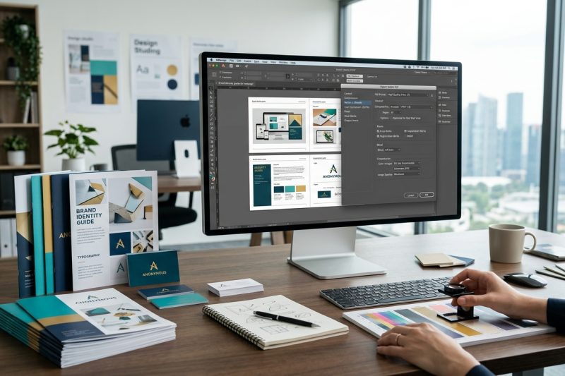
Your design looks perfect on screen. Colors pop, text is crisp, and every detail sits exactly where you want it. Then the printed version arrives. The colors are muddy. The edges look pixelated. Your …
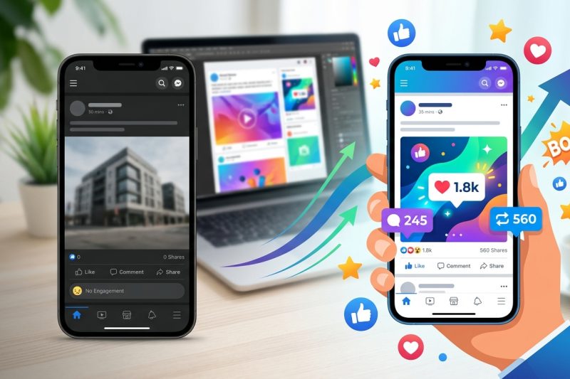
You post consistently. You follow the trends. You add hashtags. Yet your social media engagement sits at zero. The problem isn’t your posting schedule or your caption length. It’s your design. Most lo…
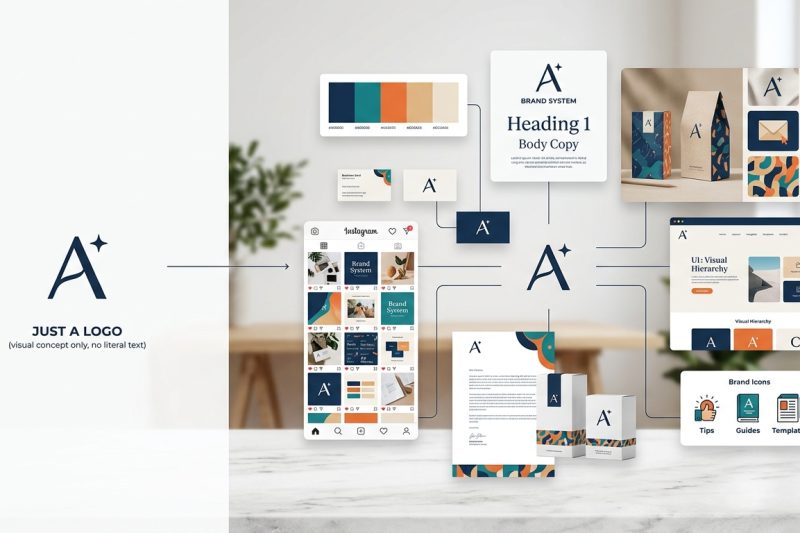
You just paid someone to design a logo. It looks great. You slap it on your website, print some business cards, and call it a day. Three months later, your Instagram posts look nothing like your websi…

More than 60% of web traffic now comes from mobile devices. That number keeps climbing. If your interface doesn’t work perfectly on a smartphone, you’re losing users before they even see your content….
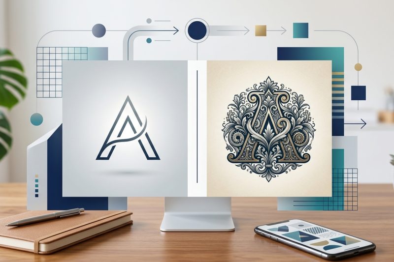
Your logo will appear on business cards, websites, social media profiles, packaging, and maybe even billboards. It needs to work everywhere. But before you can design it, you need to answer one fundam…
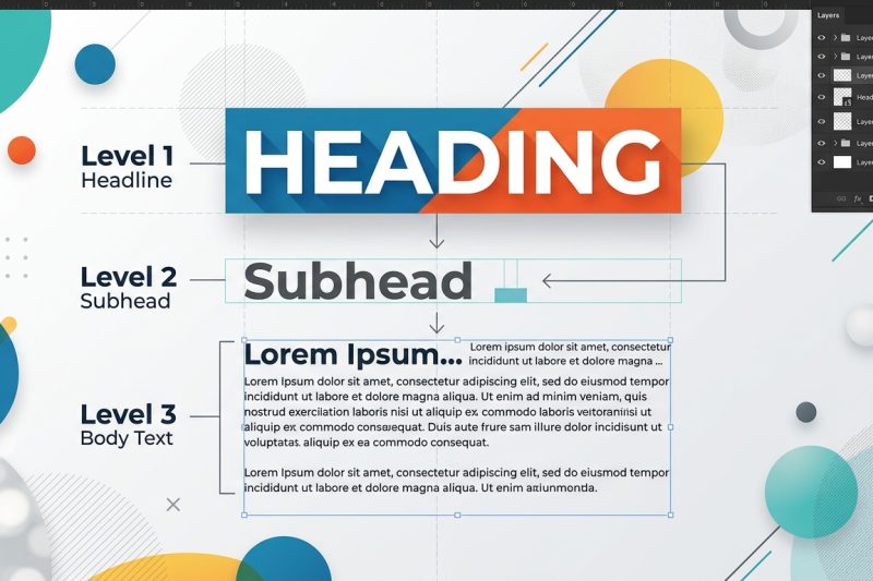
You open a website and instantly know where to look. Your eye moves from the headline to the subhead, then down to the body text without conscious effort. That’s typographic hierarchy at work, and it’…

You’ve picked a color palette. You’ve laid out your design. But when you step back, something feels off. Text looks muddy. Buttons disappear. Users squint at your interface. The problem isn’t your col…
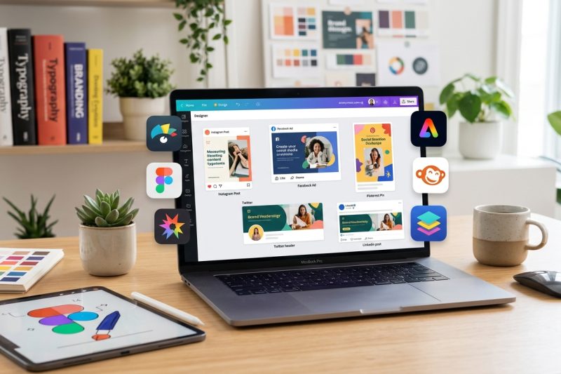
Canva dominates social media design tools, but it’s not the only option worth your time. If you’ve hit a wall with template limitations, pricing tiers, or feature gaps, you’re probably wondering what …

Good interfaces feel invisible. You tap a button and something happens. You scan a menu and find what you need. You complete a task without thinking twice. Bad interfaces make you work. They hide impo…
You’ve designed the perfect business card. Colors look great. Typography is on point. You send it to the printer feeling confident. Then it comes back with thin white borders around the edges. Or wors…