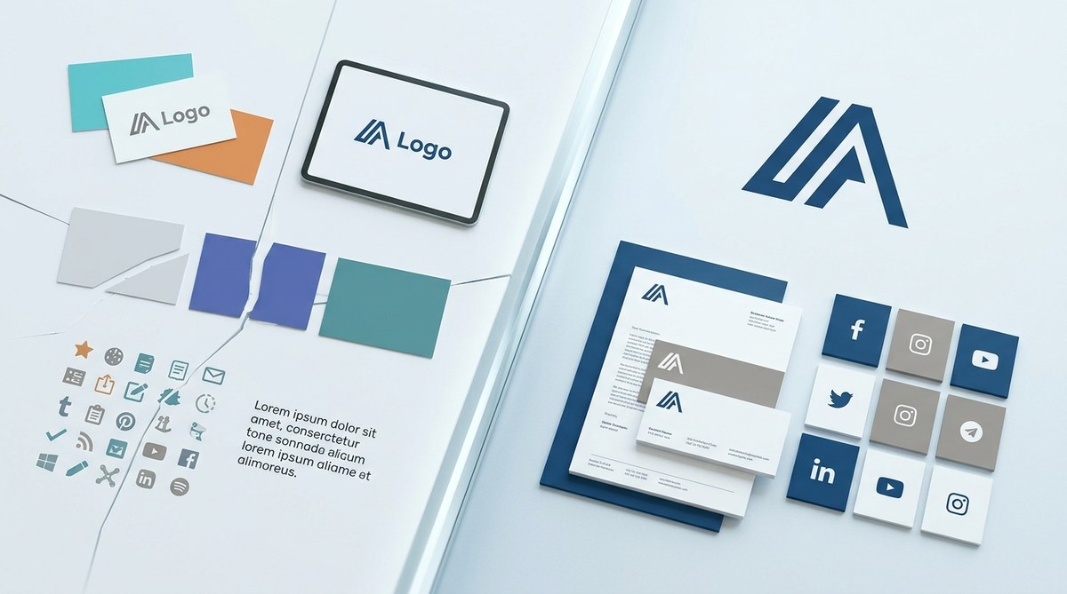
You run a business, you pour your heart into your logo, you pick the perfect brand colors, and you finally nail that signature tone of voice. Then a customer sees your Instagram post, clicks to your website, and feels like they landed on a completely different company. That split second of confusion is what happens when brand inconsistencies creep into your daily operations. They are usually tiny, almost invisible. But over time, each mismatch erodes the trust you worked so hard to build. The good news is that most of these errors are fixable once you know where to look.
Brand inconsistencies do not always scream for attention. They show up as mismatched fonts on different pages, a tone that shifts from professional to slang on social media, or a logo that looks distorted on mobile. Each gap quietly lowers your credibility. The fix involves a clear style guide, regular audits, and training your team to spot drift before it becomes a habit.
The Real Cost of a Slightly Off Logo
Imagine a potential client sees your perfectly polished LinkedIn banner. It uses your primary sans-serif font, your exact brand blue, and a clean layout. Then they check your Google Business profile and find a cropped version of your logo with a different shade of blue. At the same time, your email signature uses a third logo variation. That inconsistency, repeated across just three touchpoints, signals carelessness. It suggests you do not pay attention to details, which is the last thing a small business owner wants to communicate.
Brand inconsistencies do not just confuse customers. They force your brain to work harder. When a logo changes shape or a color shifts slightly, the viewer subconsciously pauses. That pause breaks the flow of recognition. Over time, your brand becomes harder to remember, and your marketing dollars lose efficiency.
The Seven Subtle Inconsistencies That Hurt Most
You already know the obvious mistakes like using two different logos. But the dangerous ones hide in plain sight. Here is a rundown of the most common brand inconsistencies that quietly drain your credibility, along with a table to help you spot them at a glance.
| Inconsistency Type | What It Looks Like | Why It Hurts | How to Fix |
|---|---|---|---|
| Color drift | Slight variations of your primary color on different platforms | Breaks visual recognition, feels sloppy | Document exact HEX, RGB, and CMYK values for every color |
| Font swaps | Mixing a serif headline with a different sans-serif body font | Creates visual noise, lowers readability | Choose two fonts max and use them consistently across all assets |
| Tone misalignment | Friendly copy on Instagram, formal language in emails | Confuses brand personality, feels fake | Write a brand voice chart with do/don’t examples |
| Logo distortion | Logo stretched, cropped, or placed on a wrong background | Looks unprofessional, undermines quality | Create a logo usage guide with clear spacing rules |
| Photo style clash | Some images are bright and candid, others dark and staged | Disturbs visual harmony, feels disjointed | Define a photo style (lighting, composition, filters) |
| Inconsistent formatting | Headers sized differently on web vs. social graphics | Reduces polish, amateurish | Set a typographic scale and stick to it everywhere |
| Disconnected messaging | Tagline changes depending on the channel | Weakens brand story, confuses value proposition | Lock in one core message and repeat it with minor variations |
How to Run a Brand Consistency Audit in Three Steps
You do not need to hire a big agency to catch these gaps. A simple structured review can uncover most issues. Follow this numbered process.
-
Gather every asset you own. Collect your logo files, social media templates, email signatures, business cards, website screenshots, presentation decks, and any printed materials. Put them all in one folder. This step alone often reveals duplicates or outdated versions.
-
Compare each asset against your brand guide. If you do not have a brand guide yet, that is the first project. Check colors, fonts, logo usage, tone of voice, and image style. For each asset, ask: does this match the guide exactly? If the guide does not exist, use your best guess for what you would want the standard to be.
-
Score each asset on a simple pass/fail scale. Note the specific mismatch for every failure. Then prioritize fixes. Fix the most visible touchpoints first (homepage, social media profile photos, email signatures). Then tackle internal documents and lower visibility items.
This three-step audit can be done in an afternoon. Schedule it every six months to catch drift before it builds.
The Visual Identity Traps That Trip Up Small Teams
Many business owners treat their brand as a logo plus a color. That is too narrow. Your visual identity includes spacing, imagery style, icon usage, and even the way you crop photos. Here are three common traps that lead to brand inconsistencies.
- Relying on Canva templates without customizing. Free templates are tempting, but they often use fonts and colors outside your palette. Always override the template with your own brand settings before publishing.
- Using different logo versions on every platform. Some platforms require a horizontal logo, others prefer a square icon. That is fine. But all versions must feel like they belong to the same family. If your icon is a completely different shape or weight, it creates confusion.
- Ignoring the white space around your logo. A logo that touches the edge of a graphic or sits too close to text looks careless. Establish a minimum clear space (usually the height of the logo’s cap letter) and enforce it everywhere.
“Your brand is what other people say about you when you leave the room.” Jeff Bezos said that, but it applies perfectly here. If your visuals tell different stories on different channels, people will talk about your inconsistency instead of your service.
Tone of Voice Drift: The Silent Credibility Killer
Visual mismatches are easy to spot. Tone of voice drift is harder to catch because it happens gradually. You start a newsletter with a warm, friendly tone. Then a guest writer adds a more formal paragraph. Later, a new social media manager uses industry jargon. Soon your brand sounds like three different people.
The fix is straightforward: create a brand voice document that defines your personality (professional but approachable, confident but humble, etc.) and gives specific examples of phrases to use and avoid. Train every person who writes on behalf of the company. Include your email autoresponders, chatbot scripts, and even your invoice headers.
Why Platform Specific Constraints Trap You
Every platform has its own rules. Instagram favors square or vertical images. LinkedIn prefers horizontal banners. Email clients render fonts differently. It is easy to let those constraints push you into brand inconsistencies.
The solution is to design flexible assets that adapt gracefully. For example, create a primary logo that works as a full lockup, a secondary version that works in a square, and a icon only version. Set up design templates for each platform that use the correct dimensions but retain your brand colors, fonts, and spacing. This way, you never have to recreate from scratch.
When to Revisit Your Foundation
Sometimes brand inconsistencies happen because your original identity no longer fits. A logo designed five years ago may feel dated. A color palette chosen on a whim may not work on mobile screens. A tone that worked for a solo founder may feel wrong for a growing team.
If you find yourself constantly fighting to make old assets work, it may be time for a refresh. You do not need a full rebrand. Simply updating your brand guide to reflect current realities can eliminate many inconsistencies. A good rule is to review your brand guidelines every year and ask: does this still represent us?
Building a System That Prevents Drift
A brand consistency strategy only works if it is easy to follow. Create a central hub (like a shared Google Drive folder or a Notion workspace) where every approved asset lives. Give each file a clear naming convention. For example:
– logo-primary-blue-horizontal.png
– logo-secondary-white-square.jpg
Include a one page brand cheat sheet that sums up colors, fonts, logo rules, and tone. Share it with everyone on your team. Make it the first thing a new hire reads.
Use tools like Canva Brand Kit, Figma design systems, or even a simple PDF checklist to keep everyone aligned. The goal is to make the right choice the easiest choice.
One Final Check Before You Publish Anything
Before you hit publish on your next social post, email campaign, or print piece, run it through a brand consistency checklist. Ask:
– Does this use the correct primary logo?
– Are the colors exactly matching our palette?
– Is the font one of our approved typefaces?
– Does the tone match our brand voice guide?
– Do the photos look like they came from the same shoot?
That simple habit alone will stop most brand inconsistencies before they reach the world.
Make Consistency Your Competitive Advantage
Every time a customer sees the same colors, the same tone, the same quality in your visuals, they build a little more trust. That trust compounds. It makes them choose you over a competitor because you feel reliable and professional. Brand inconsistencies are not just a design problem. They are a trust problem. And trust, once eroded, is expensive to rebuild.
Start today. Grab a screenshot of your website and compare it to your latest Instagram post. Look at the logo, the colors, the font, the vibe. If they feel like siblings from the same family, you are in good shape. If they feel like strangers at a party, you know exactly what to fix.
For more hands on help, check out our guide on how to build a brand style guide that actually gets used. And if you want to see how your current identity measures up, take our brand audit checklist. Your customers will thank you.
