Transforming your design work to communicate clearly and effectively is vital in 2026. With the rapid evolution of digital interfaces and print media, mastering the right typography techniques can make your visuals stand out and convey your message effortlessly. This guide dives into actionable strategies and current trends to help you achieve exceptional clarity in your typography. Whether you’re designing websites, branding materials, or social media graphics, these insights will elevate your craft.
Effective typography in 2026 hinges on clarity, hierarchy, and accessibility. Use contrast wisely, embrace variable fonts, and prioritize readability across all platforms to ensure your designs communicate seamlessly and leave a lasting impression.
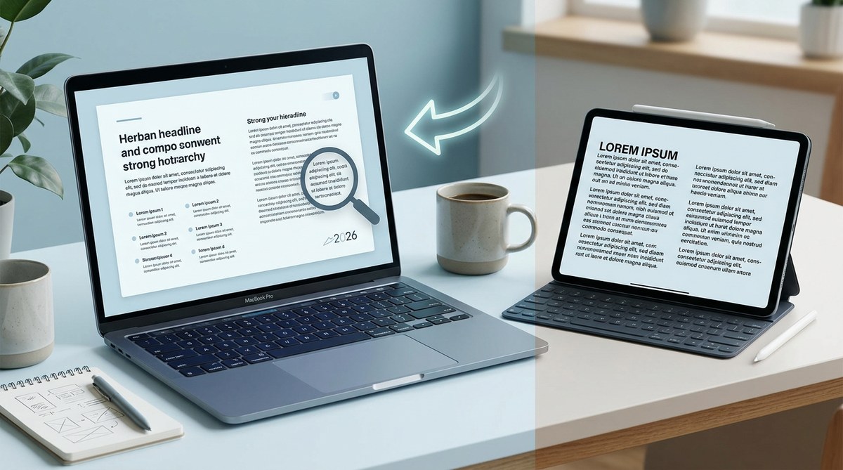
Prioritize readability with intelligent contrast and spacing
Good typography starts with readability. In 2026, the ability to quickly grasp information depends on how well your text can be seen and understood. Contrast plays a significant role here. Dark text on light backgrounds remains a reliable choice, but modern designs also experiment with subtle variations to create visual interest without sacrificing clarity.
Spacing, including line height and letter spacing, impacts how easily the eye moves through your content. Too tight and your text becomes crowded; too loose and it looks disconnected. Aim for a comfortable balance that guides the reader naturally.
To get the best results, test your typography on different screens and print formats. Use tools to simulate various conditions and ensure your contrast remains accessible for all users, including those with visual impairments.
Master the art of visual hierarchy in typography
Creating a clear visual hierarchy helps viewers navigate your content instinctively. In 2026, this means leveraging size, weight, color, and placement consciously. Larger sizes naturally draw attention, so reserve bold and prominent fonts for headings and key messages. Subheadings should be slightly smaller but still distinct, while body copy remains legible at smaller sizes.
Variable fonts are increasingly popular for dynamic hierarchy because they allow smooth transitions between weights and styles. Use contrasting font weights to emphasize important points and guide the eye through your layout.
Remember, consistency is key. Establish a hierarchy system in your style guide and apply it uniformly across all media to enhance comprehension and brand recognition.
Embrace modern font pairing and pairing tools
Combining fonts effectively can elevate your design’s clarity. In 2026, pair a clean, sans-serif font with a more expressive serif or display font to create contrast and hierarchy. Avoid using more than two or three fonts in one project to keep the message clear.
Tools like the latest font pairing generators and style guides can assist in selecting harmonious combinations. Focus on fonts that share similar x-heights or letterforms to prevent clashes. Pay attention to mood and personality—serifs evoke tradition, while sans-serifs feel modern.
Experiment with font weights and sizes to find balanced combinations that improve readability without overwhelming the viewer.
Use grid systems and alignment for precision
Incorporating grid systems ensures your typography aligns perfectly within your layout. Consistent alignment reduces visual noise and enhances clarity. In 2026, many designers favor modular grids and responsive frameworks that adapt across devices.
Align text to the grid, and avoid irregular spacing that disrupts flow. Use margins and padding smartly to create breathing space, especially for headings and call-to-actions. This consistency helps viewers scan your content smoothly.
Remember, well-structured layouts not only look professional but also facilitate quick comprehension.
Leverage accessibility principles and inclusive design
Typography that is accessible benefits everyone. In 2026, this includes selecting high-contrast color combinations, avoiding overly decorative fonts for body text, and maintaining sufficient font size.
Use tools to check your designs against accessibility standards like WCAG. For instance, ensure your text can be read comfortably by users with visual impairments or color deficiencies.
Inclusive typography also considers language and cultural differences. Opt for fonts that support a broad range of characters and scripts to reach more audiences effectively.
“Designing for accessibility isn’t just a requirement; it’s an opportunity to make your message reach wider and be understood better.” — industry expert
Practical process to implement effective typography in your projects
- Assess your content: Determine the message and audience. Identify key points that need emphasis and plan your hierarchy accordingly.
- Select appropriate fonts: Choose fonts that match the tone and support accessibility. Use pairing tools to find harmonious combinations.
- Establish visual hierarchy: Define sizes, weights, and colors for headings, subheadings, and body text. Create a style guide for consistency.
- Apply grid and alignment principles: Structure your layout with grids, and align text to create order and flow.
- Test across platforms: Check readability and contrast on screens, print, and different lighting conditions. Adjust as needed.
- Refine for accessibility: Use accessibility tools to ensure your typography works for all users. Incorporate feedback from real users if possible.
Common pitfalls to avoid in typography for clarity
| Techniques to use | Common mistakes | Impact |
|---|---|---|
| High contrast between text and background | Using low contrast colors | Reduced readability |
| Consistent hierarchy | Ignoring size and weight differences | Confusing content flow |
| Proper line spacing | Crowded or sparse lines | Strained reading experience |
| Responsive font sizes | Fixed sizes for all devices | Poor mobile readability |
| Clear font pairing | Mixing overly similar or clashing fonts | Visual noise and confusion |
Quick tips for staying current with typography trends
- Use variable fonts to create dynamic and adaptable text styles.
- Incorporate minimalist sans-serif fonts for clarity and modernity.
- Experiment with bold, oversized headlines for impact.
- Maintain simplicity by limiting font choices.
- Prioritize accessibility to reach all audiences effectively.
Final thoughts on mastering typography clarity in 2026
In the fast-paced world of design, clarity remains king. Applying these techniques — from thoughtful contrast and hierarchy to inclusive and accessible typography — will ensure your visuals communicate with precision. Keep testing and refining your approach, and stay aware of emerging tools and trends. Your audience will appreciate the ease of reading and the professionalism your typography conveys.
Remember, great typography isn’t just about style. It’s about making your message understood effortlessly. Apply these tips confidently, and your designs will speak clearly in 2026 and beyond.