Typography can make or break your design. Two fonts that look great individually can clash horribly when placed together, while the right combination creates instant visual harmony. The good news? You…
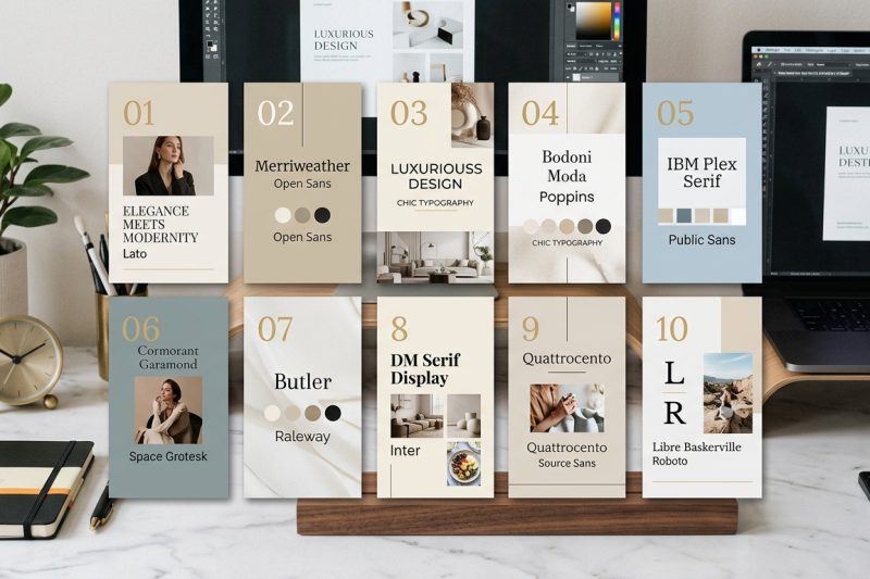
Typography can make or break your design. Two fonts that look great individually can clash horribly when placed together, while the right combination creates instant visual harmony. The good news? You…
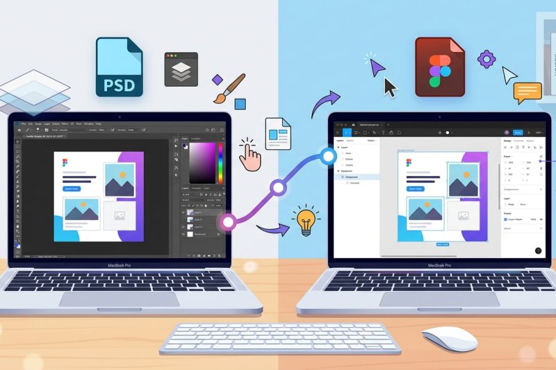
You’ve downloaded a beautiful Figma template, opened the file, and now you’re staring at a screen full of panels, layers, and tools you’ve never seen before. Don’t panic. Figma looks intimidating at f…

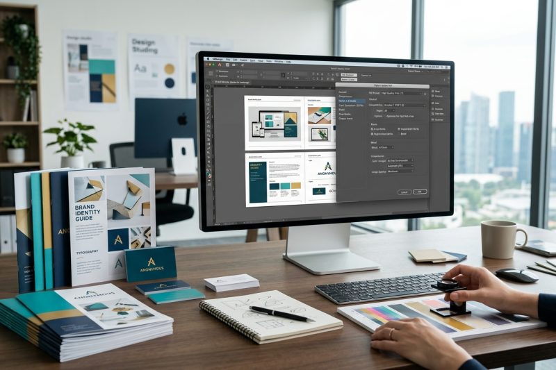
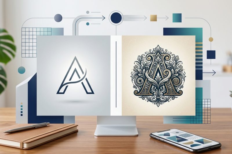
You’ve designed the perfect logo. Your client loves it. Now they’re asking for the files, and you freeze. What formats do they actually need? How many versions should you send? And what’s the differen…
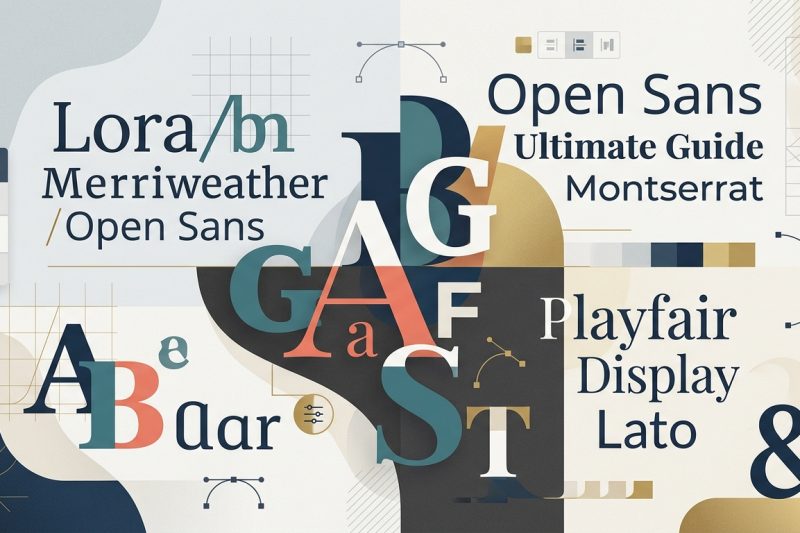
Choosing the right fonts for your design project can feel overwhelming when Google Fonts offers over 1,400 typefaces. The good news? You don’t need to be a typography expert to create beautiful, profe…
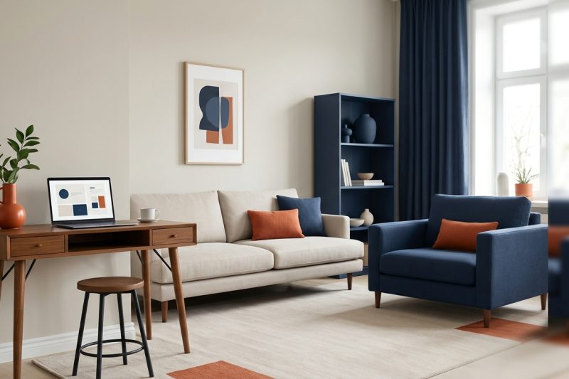
You’ve picked the perfect paint color, bought throw pillows, and added artwork. But somehow your room still feels off. The colors clash instead of complement, and nothing looks quite as polished as th…
Your design looks perfect on screen. Colors pop, text is crisp, and every detail sits exactly where you want it. Then the printed version arrives. The colors are muddy. The edges look pixelated. Your …
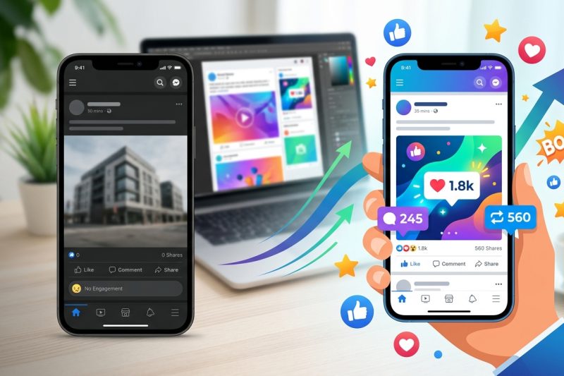
You post consistently. You follow the trends. You add hashtags. Yet your social media engagement sits at zero. The problem isn’t your posting schedule or your caption length. It’s your design. Most lo…
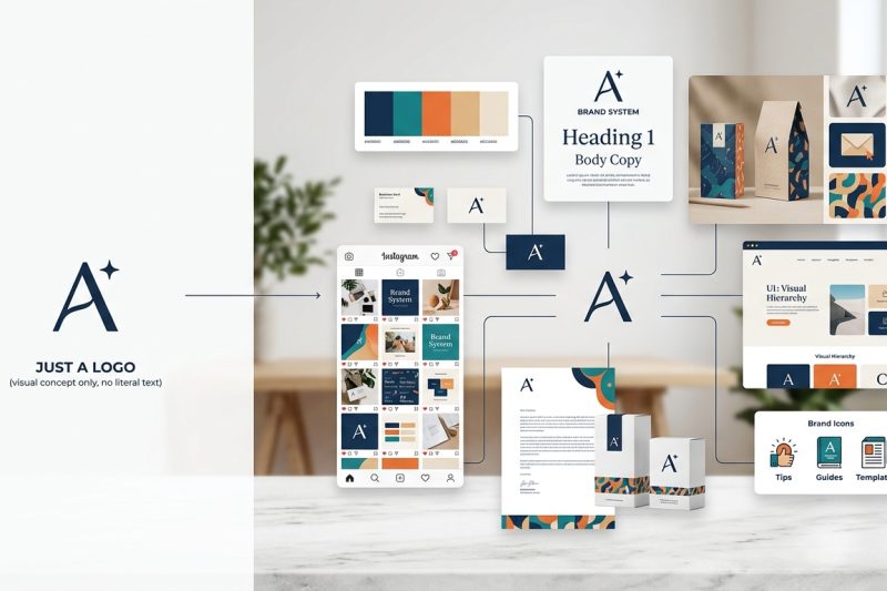
You just paid someone to design a logo. It looks great. You slap it on your website, print some business cards, and call it a day. Three months later, your Instagram posts look nothing like your websi…
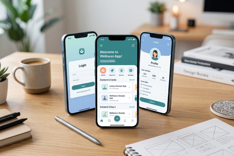
More than 60% of web traffic now comes from mobile devices. That number keeps climbing. If your interface doesn’t work perfectly on a smartphone, you’re losing users before they even see your content….
Your logo will appear on business cards, websites, social media profiles, packaging, and maybe even billboards. It needs to work everywhere. But before you can design it, you need to answer one fundam…