You’ve designed the perfect business card. Colors look great. Typography is on point. You send it to the printer feeling confident. Then it comes back with thin white borders around the edges. Or wors…
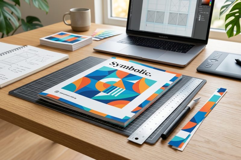
You’ve designed the perfect business card. Colors look great. Typography is on point. You send it to the printer feeling confident. Then it comes back with thin white borders around the edges. Or wors…
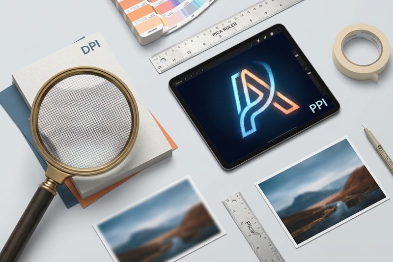
You’ve probably heard both terms thrown around in design meetings, print shops, and software menus. DPI. PPI. Sometimes used interchangeably. Sometimes debated with surprising passion. But here’s the…
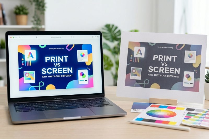
You’ve spent hours perfecting your design on screen. The colors are vibrant, the contrast is beautiful, everything looks exactly how you want it. Then you print it, and the result is a muddy,…
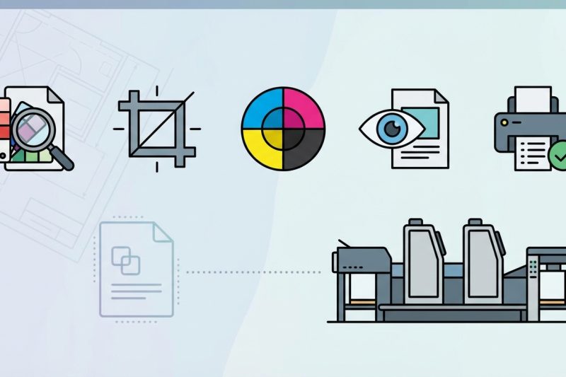
You’ve designed the perfect brochure. The layout sings. The colors pop. You export the PDF, send … 5 Pre-Flight Checks Every Designer Should Run Before Sending Files to PrintRead more
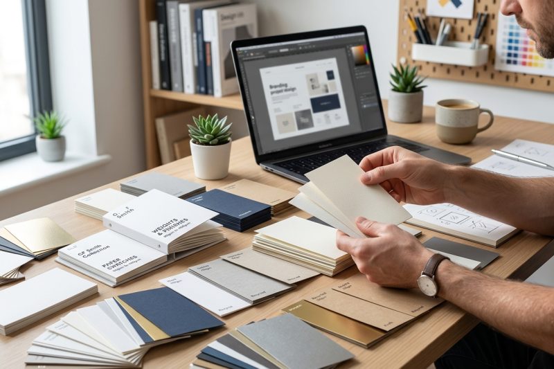
You’ve spent hours perfecting your design. Colors are balanced. Typography is crisp. Layout is flawless. Then … How to Choose the Right Paper Stock for Your Design ProjectRead more
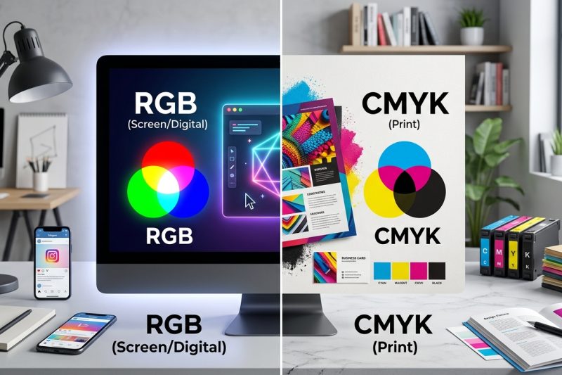
You send your design to the printer feeling confident. Days later, your printed materials arrive and the vibrant blues look muddy. The bright greens turned dull. Your client is unhappy, and you need…
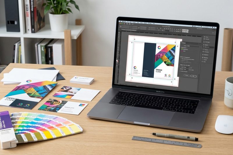
You’ve designed the perfect flyer. The colors pop, the layout sings, and your client loves it. Then the printer rejects your file. Again. Maybe it’s the wrong color mode, missing bleed, or a…