The social media feed is getting louder every day. In 2026, standing still in your design strategy means getting buried. The brands that win attention are the ones that take risks with bold typography…
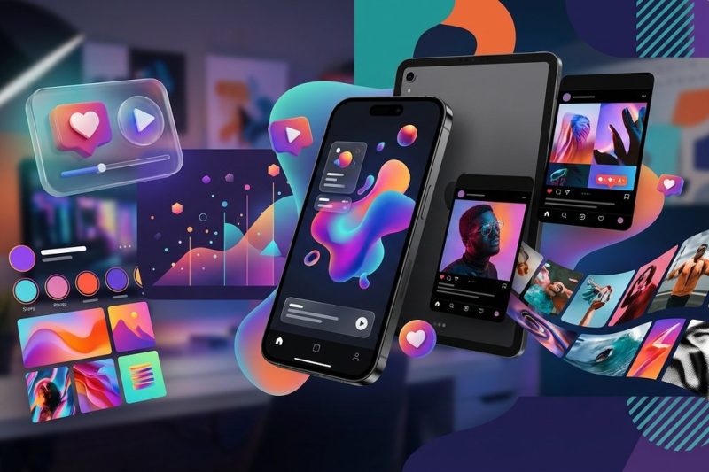
The social media feed is getting louder every day. In 2026, standing still in your design strategy means getting buried. The brands that win attention are the ones that take risks with bold typography…
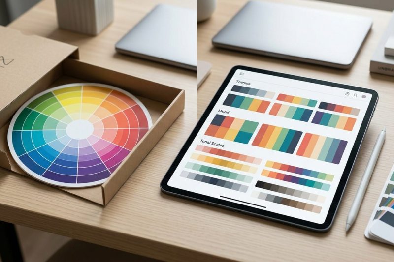
The color wheel has been the default tool for picking colors for as long as most of us can remember. Art schools teach it. Design books preach it. Every blog post about color theory starts with it. Bu…
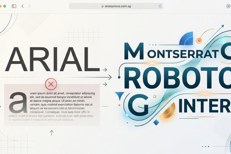
The default is rarely the best. Arial ships with every operating system, every browser, and every word processor on the planet. It is the path of least resistance. But for designers and developers who…
You have one main logo. You love it. You spent time (and probably money) getting it just right. But here is the hard truth: that single logo will not work everywhere. Shrink it down for a social media…
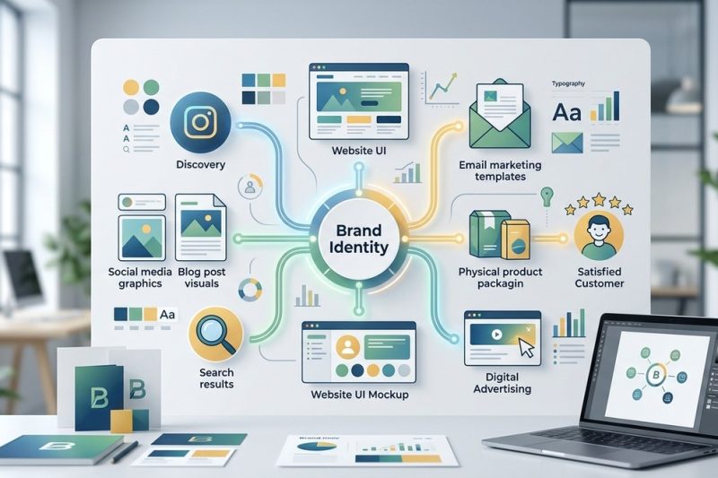
You have a beautiful brand style guide. Your logo is sharp. Your color palette is meticulously chosen. But when a customer experiences your brand, does it feel like one unified story? Or does it feel …

Building a strong, recognizable brand goes beyond just a logo or catchy slogan. It’s about creating a seamless, consistent identity that resonates with your audience across all touchpoints. When your …

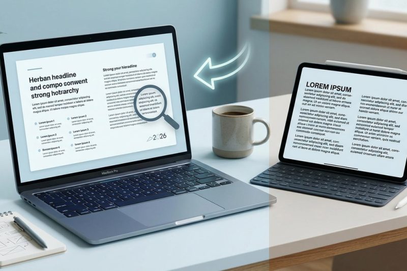
Understanding how viewers perceive visual information is central to designing effective projects. When you master visual hierarchy in design, you guide the viewer’s eye naturally to what matters most….
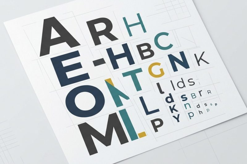
Creating a clear and compelling visual hierarchy through typography is a cornerstone of effective design. When done right, it guides viewers effortlessly through your content, emphasizing the most imp…

Building a consistent visual identity is essential for any brand aiming to stand out and be remembered. Among all design elements, typography plays a pivotal role in shaping how your audience perceive…
Transforming your design work to communicate clearly and effectively is vital in 2026. With the rapid evolution of digital interfaces and print media, mastering the right typography techniques can mak…