Designing with gradients can bring a vibrant, dynamic feel to your user interfaces. When used thoughtfully, gradients help guide user attention, add depth, and create memorable visuals. But many worry…
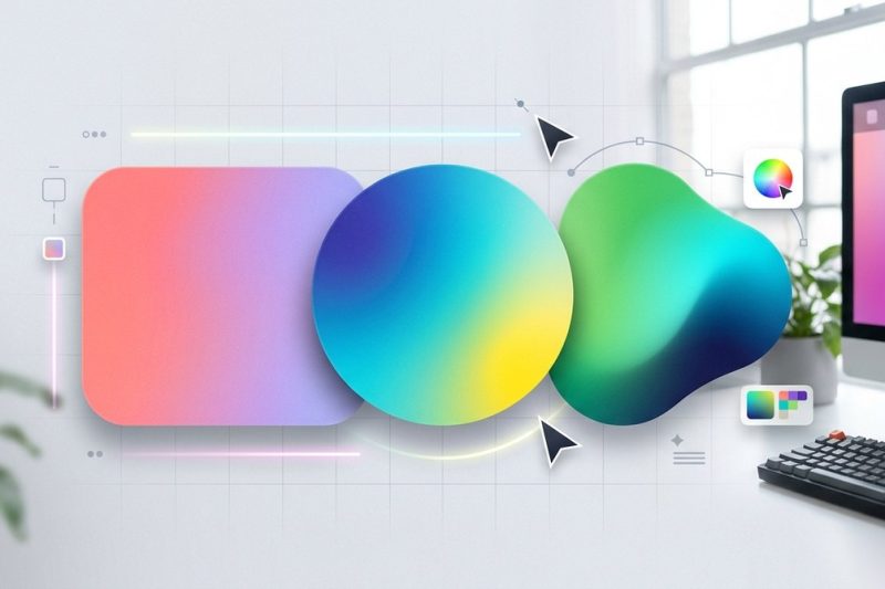
Designing with gradients can bring a vibrant, dynamic feel to your user interfaces. When used thoughtfully, gradients help guide user attention, add depth, and create memorable visuals. But many worry…
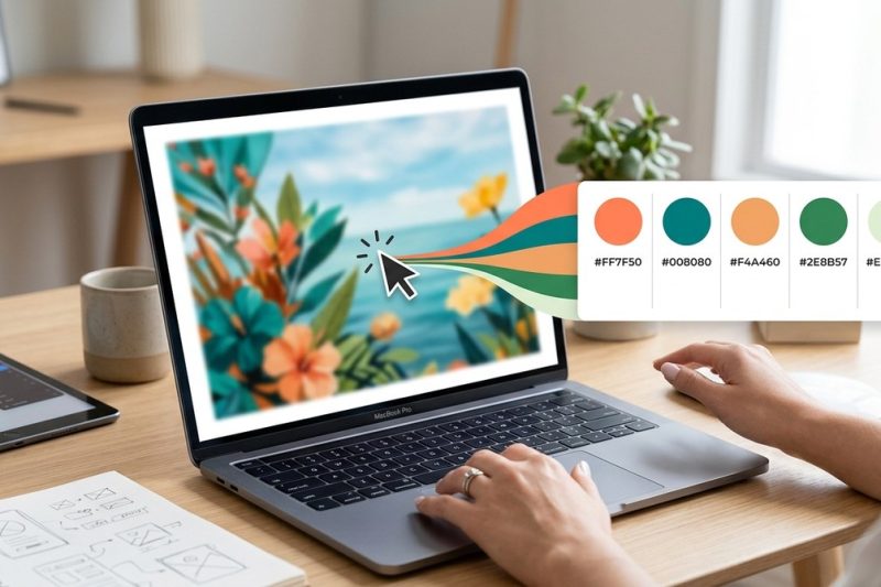
Creating a compelling color palette from an image can transform your design projects. Whether you’re working on branding, digital artwork, or personal projects, having a well-chosen set of colors make…
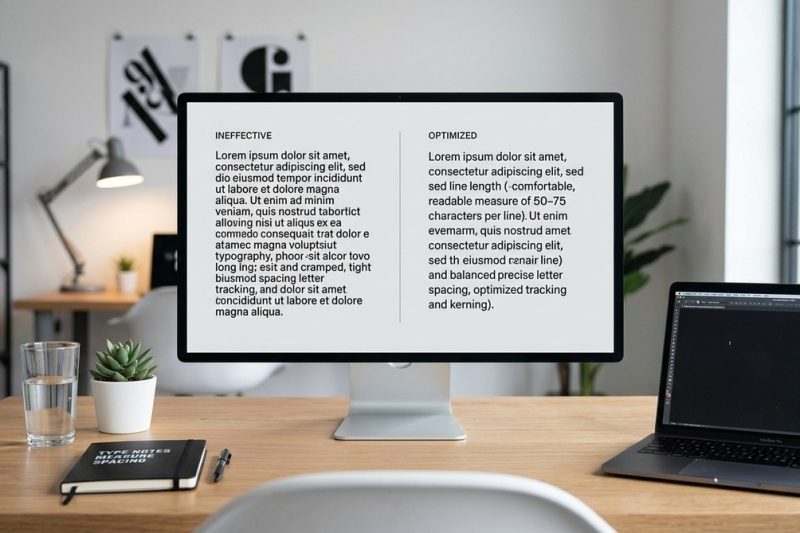
Designing text that invites readers to keep going is both an art and a science. Good typography makes your content easier to read, more engaging, and ultimately more persuasive. When line length is ju…
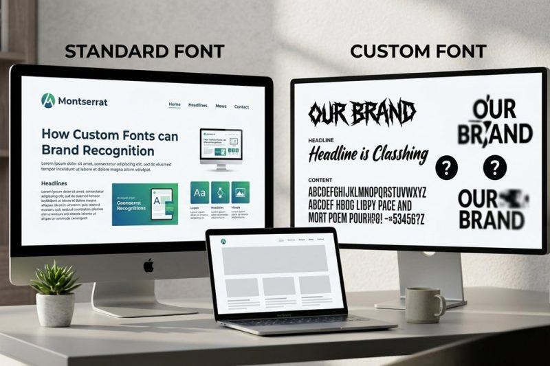
Brands often think that choosing a unique font makes their identity stand out. But is that always true? Do custom fonts hurt brand recognition? The answer depends on how you select and implement fonts…
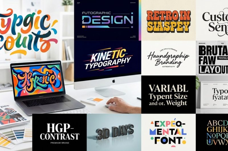
Thinking about how typography will influence branding in 2024? It’s not just about choosing fonts anymore. It’s about crafting visual stories that resonate, surprise, and stand out across every platfo…
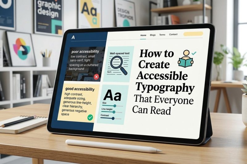
Creating readable, inclusive typography is a cornerstone of accessible design. When your text can be easily read by everyone, regardless of age, ability, or device, your content becomes more welcoming…
Using negative space in logo design is a clever way to embed hidden messages and create visual interest. When done right, it turns a simple mark into a storytelling tool that captures attention and sp…
When a client expresses dissatisfaction with your logo design, it can feel like a personal rejection. You’ve invested time and creativity, only to hear that they dislike what you’ve crafted. It’s a co…
Creating a logo that feels balanced and visually appealing is a challenge many designers face. The grid method offers a straightforward way to bring structure, consistency, and geometric harmony into …
Creating a logo that resonates with your industry is more than just choosing a pretty icon or stylish font. It requires understanding the unique language each sector speaks visually. A logo should do …